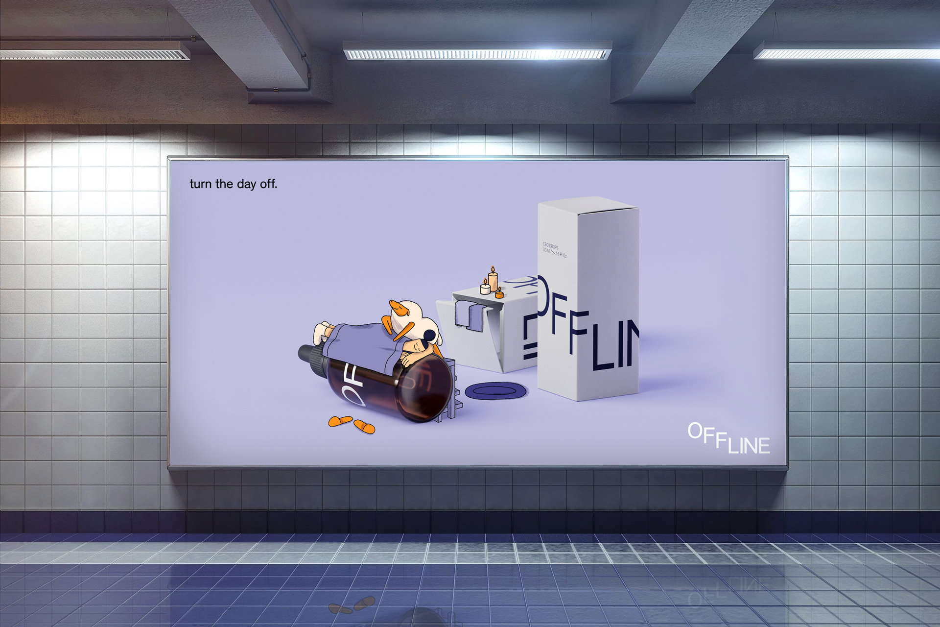
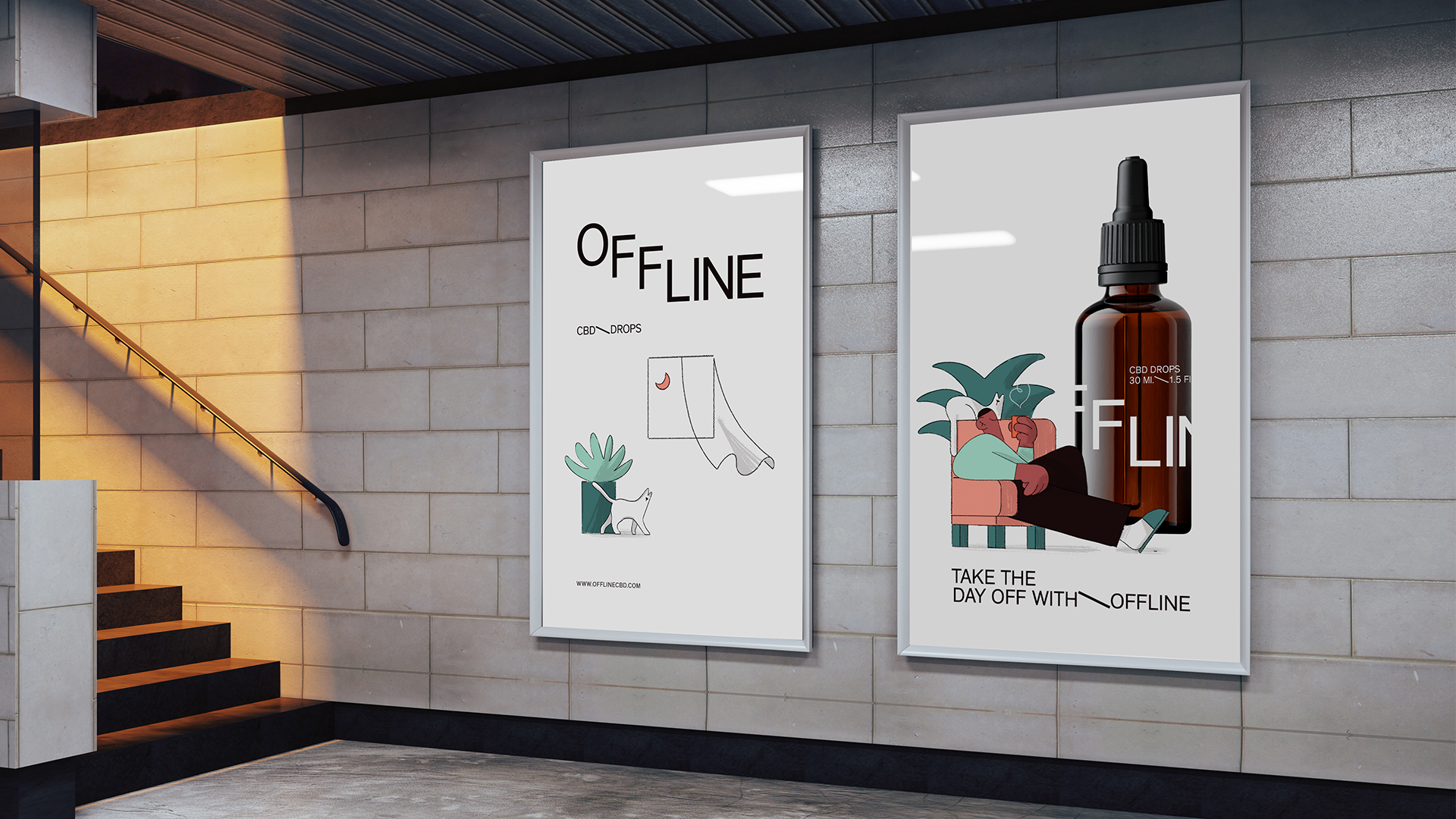
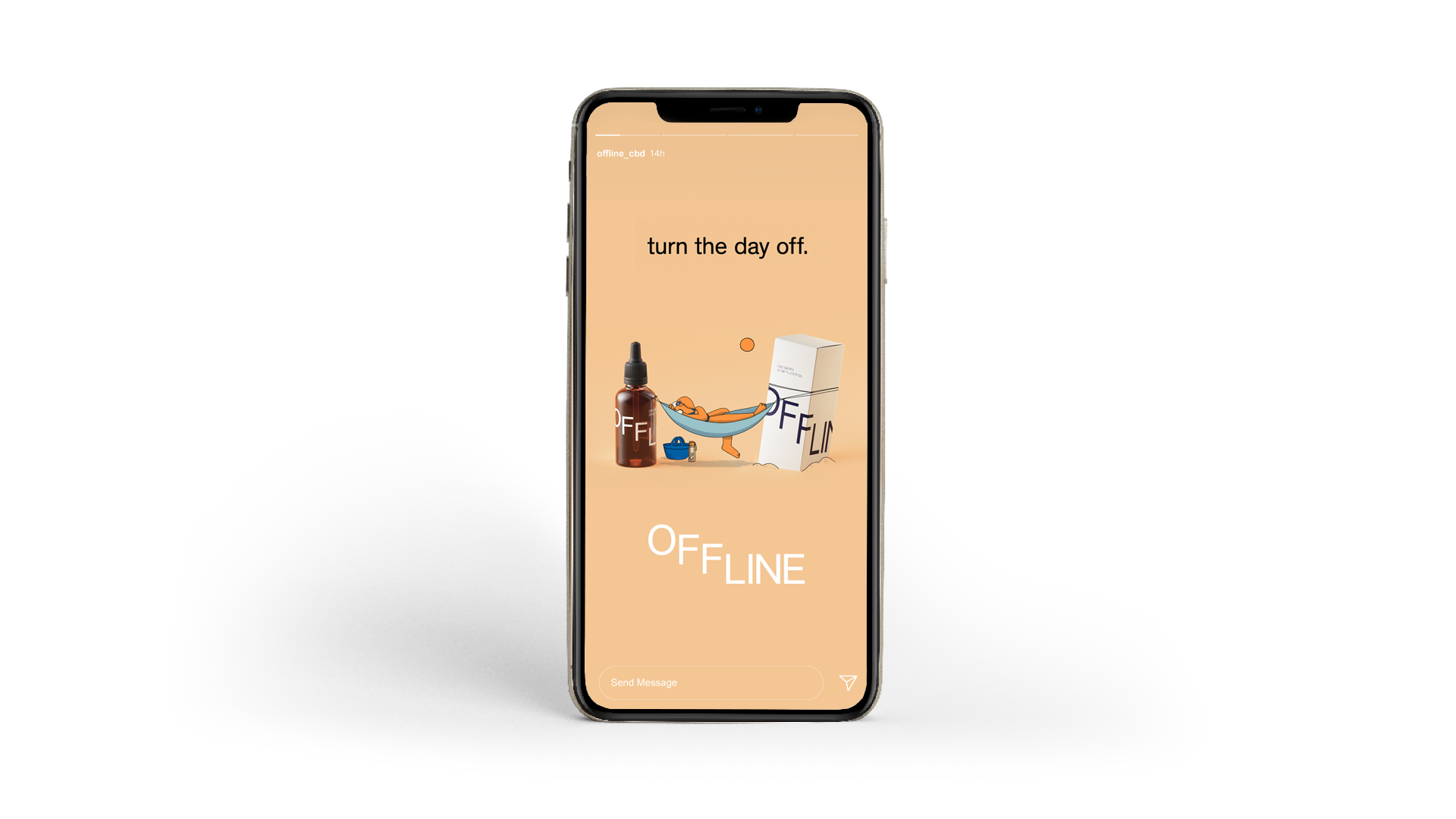
We’re often asked about our process when it comes to our product and brand visual language work, and because there’s no better way to teach something than by showing it, we went ahead and created a brand from start to finish, to show you exactly how we approach this type of collaboration the Niceshit way.
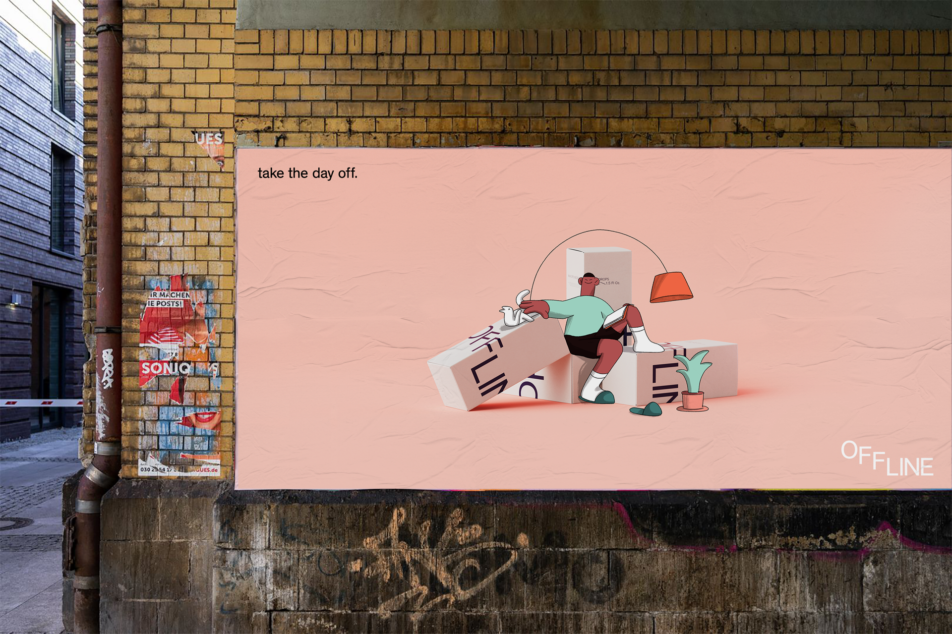
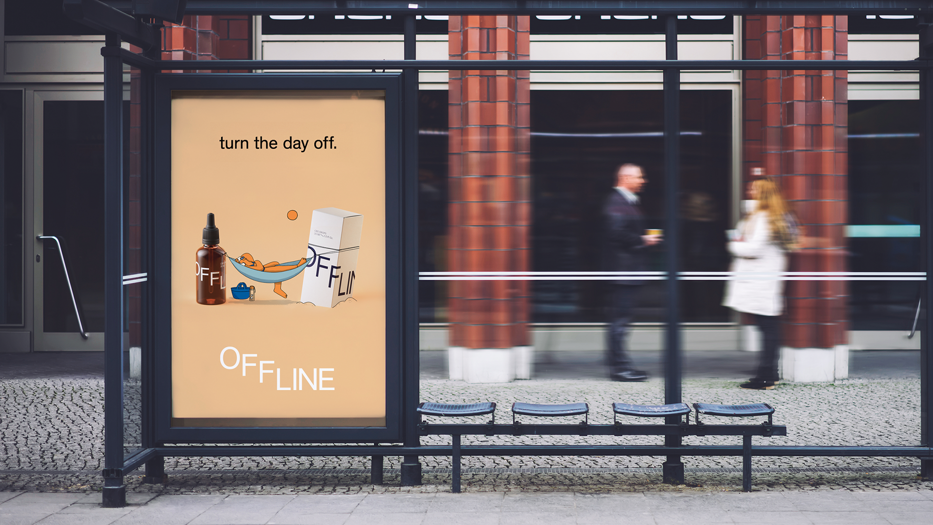
We bring to you Offline CBD – an extensive launch campaign and cross-platform visual language, to show you exactly how we would approach this task for a real-world product.
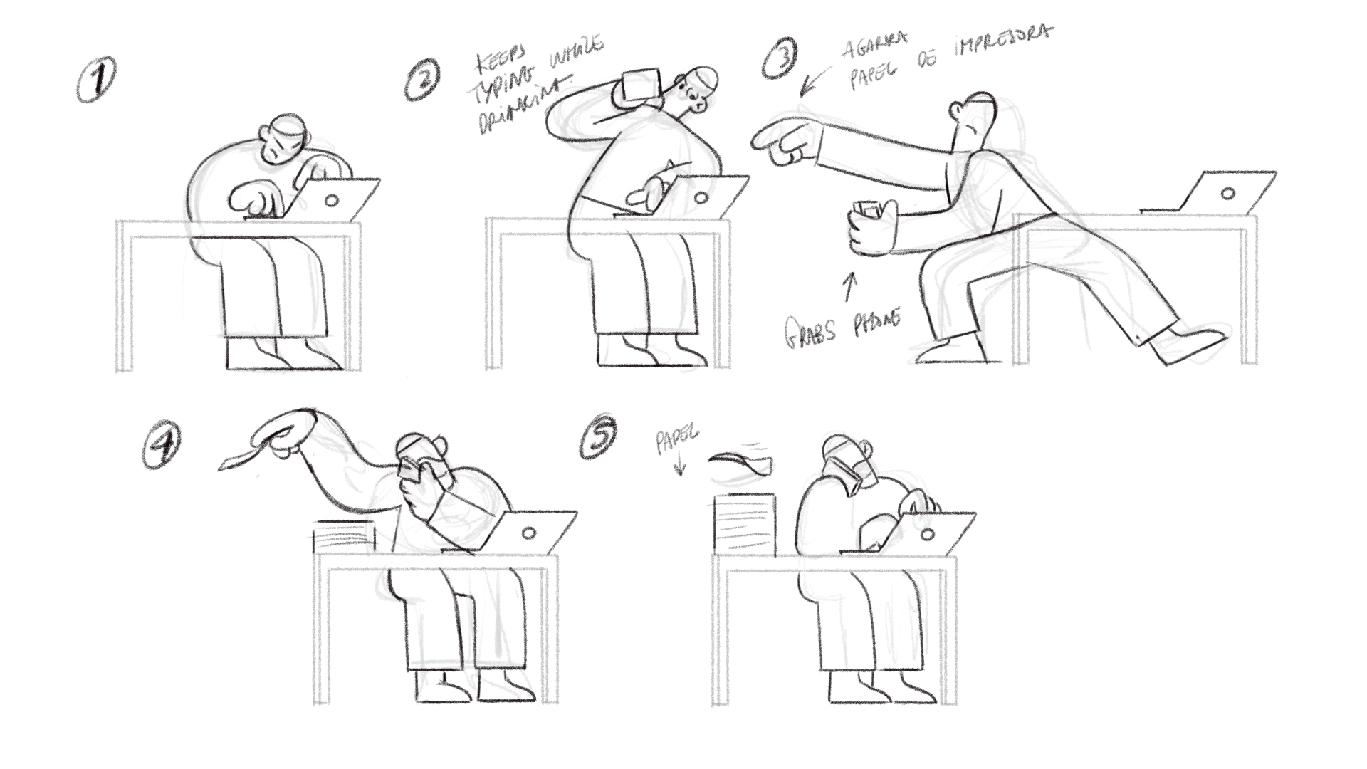
Below you’ll see some make-of and process content – from our studio whiteboard to bespoke music to final render.
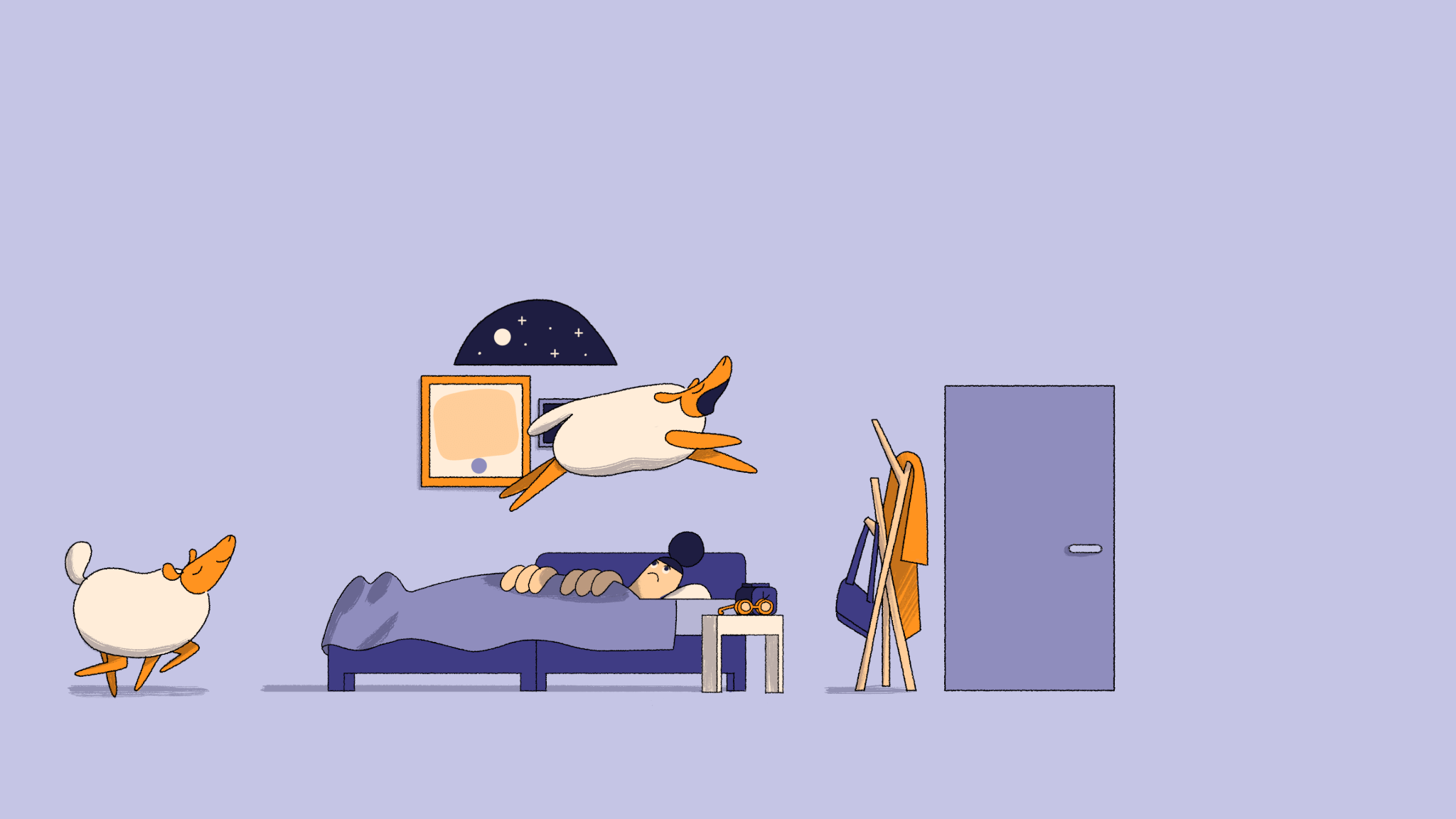
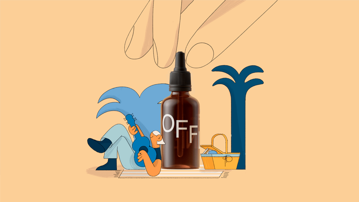
We tend to rely on solid, consistent systems when creating campaigns. For Offline we developed a simple and efficient structure as we wrote these scripts: a very straight forward narrative using the product as the knob that takes you from before to after the treatment.
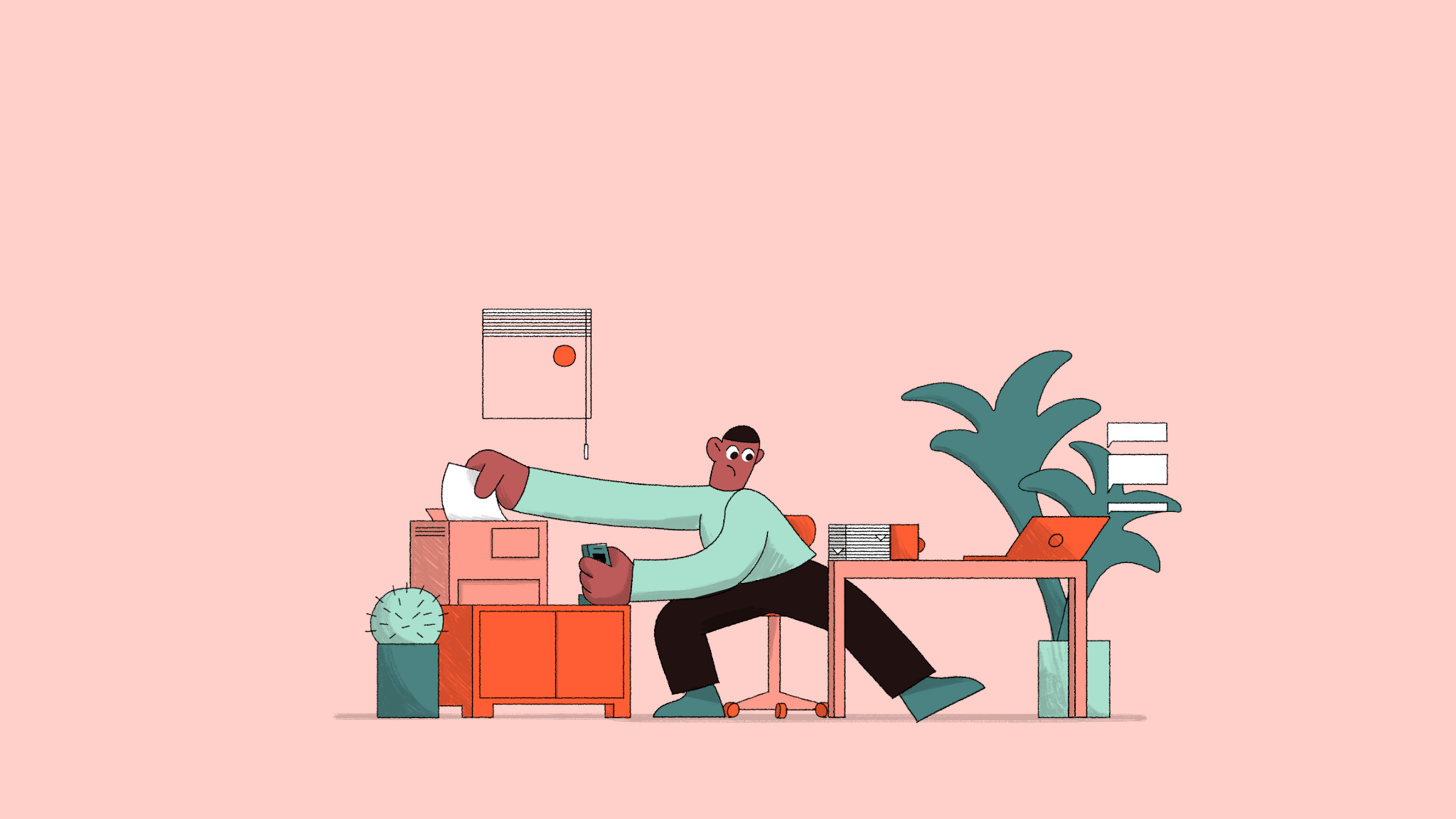
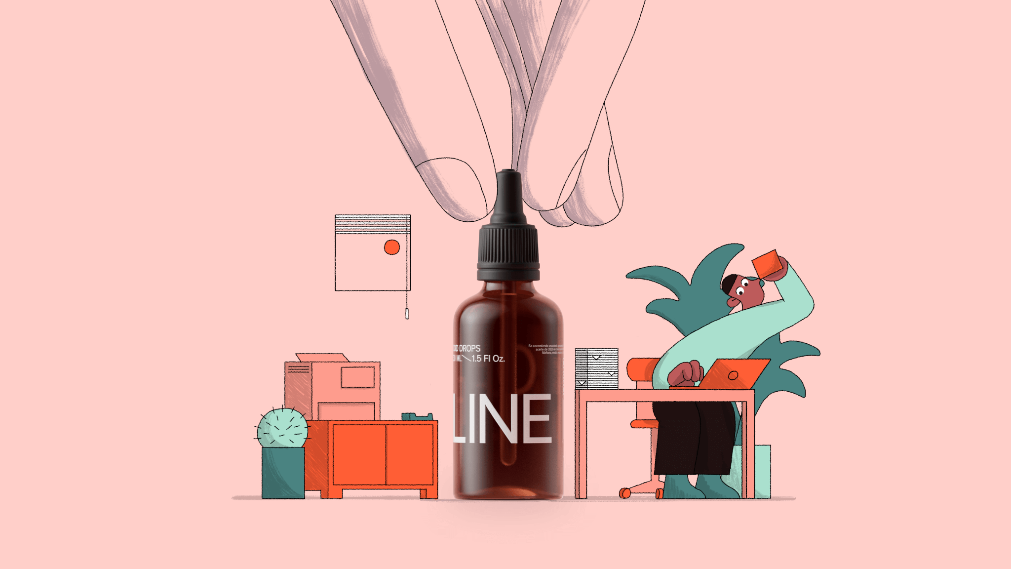
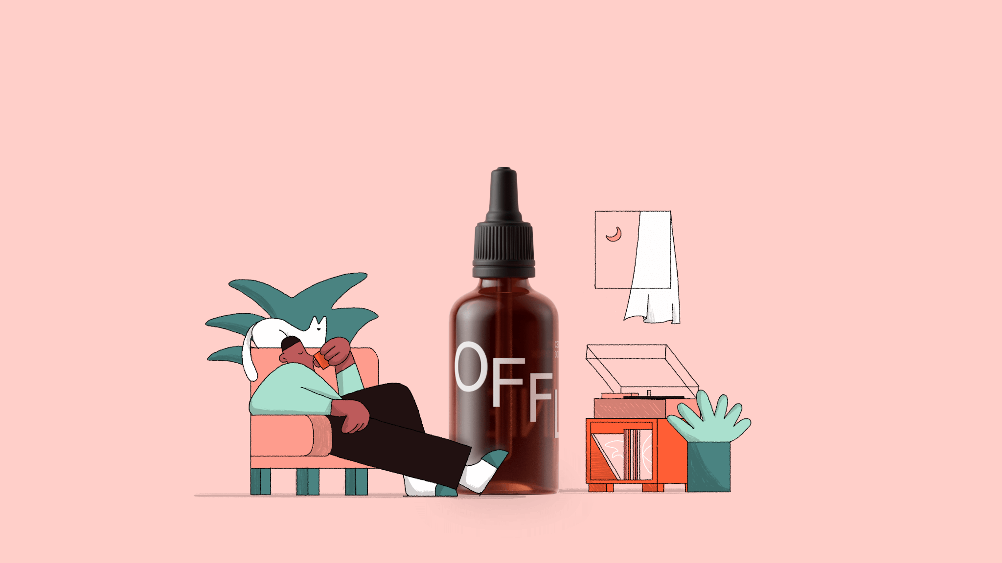
How the product itself is represented and integrated into the worlds we create is hugely important to us – with 2d, 3d, and live action capabilities all under our studio roof, this project exemplifies how we create beautifully naturalistic hybrid work that feels fresh, unique, and memorable for every client we work with.
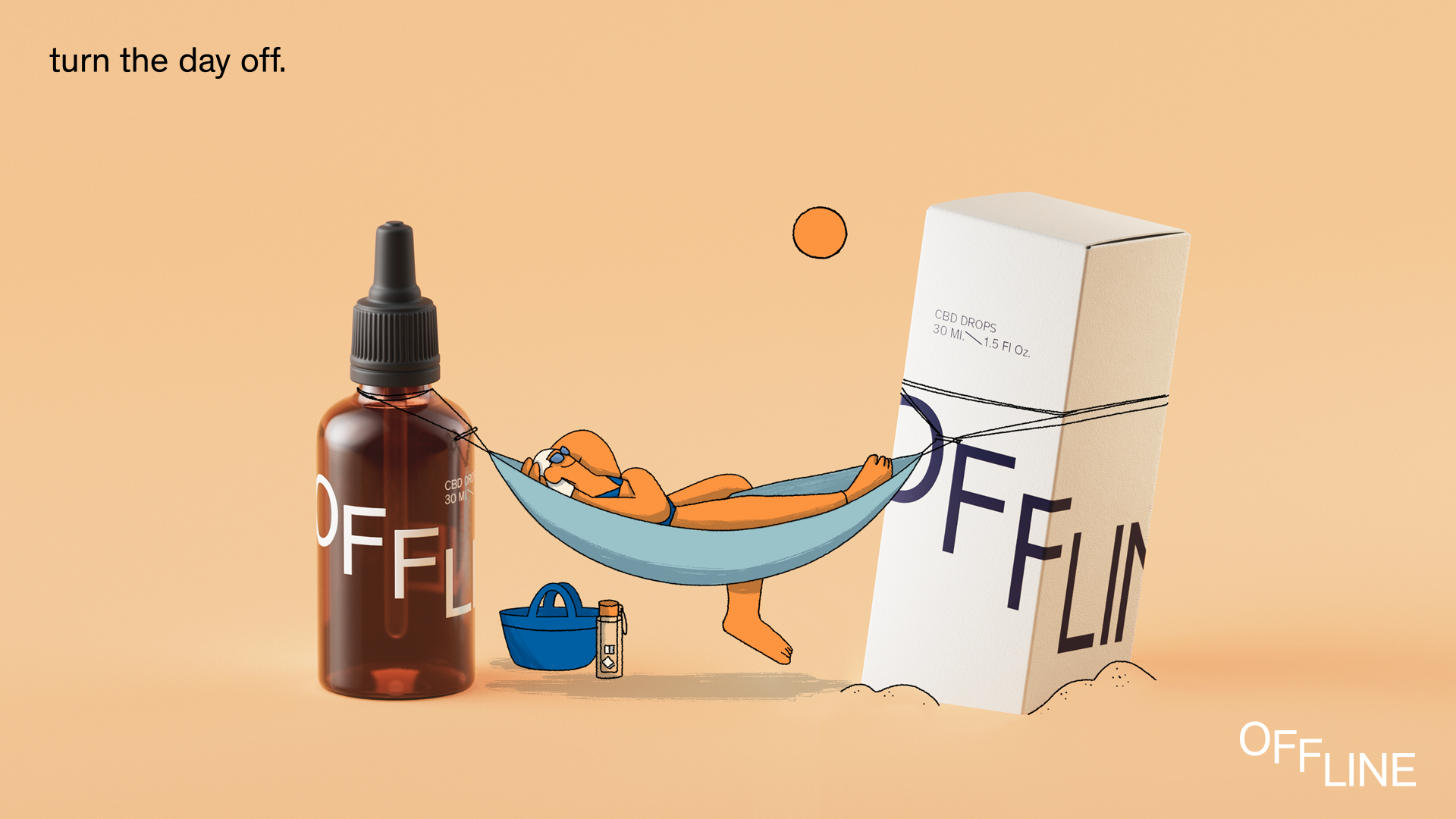
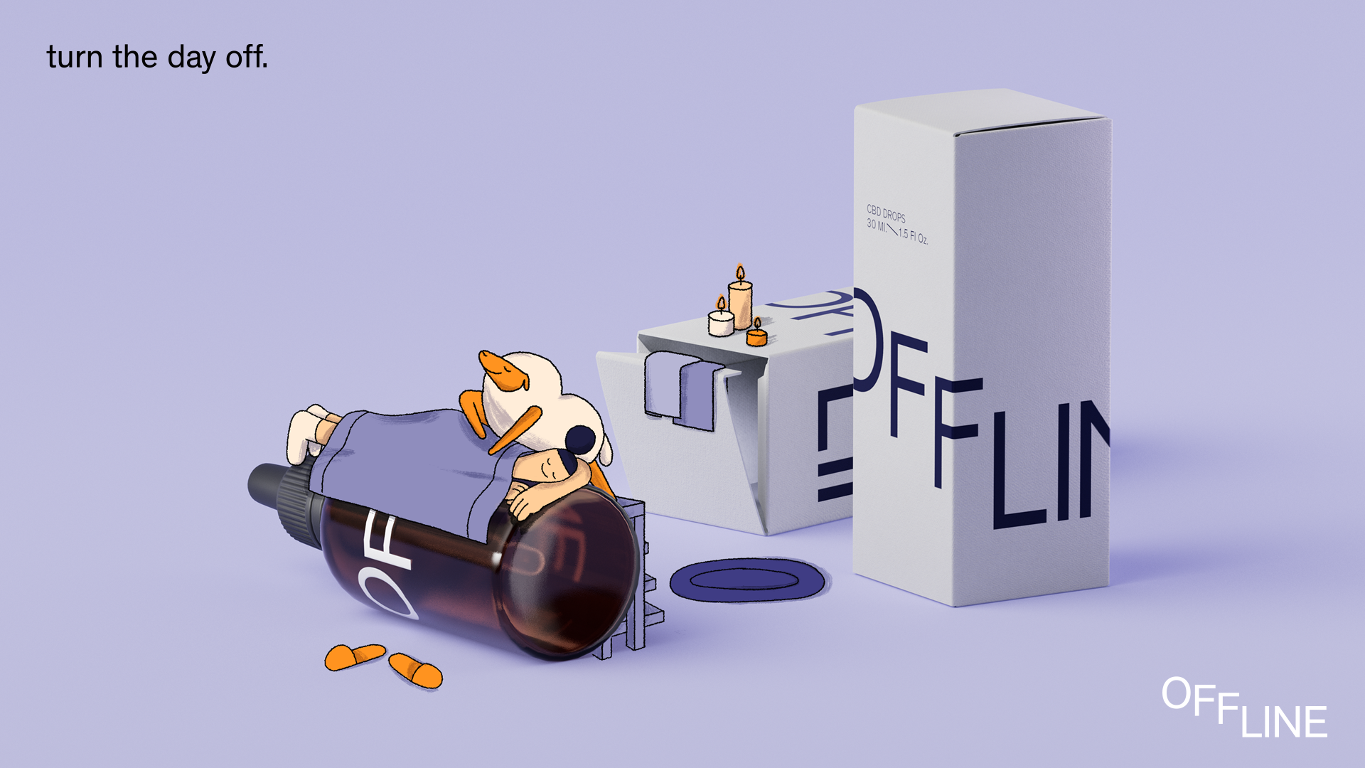
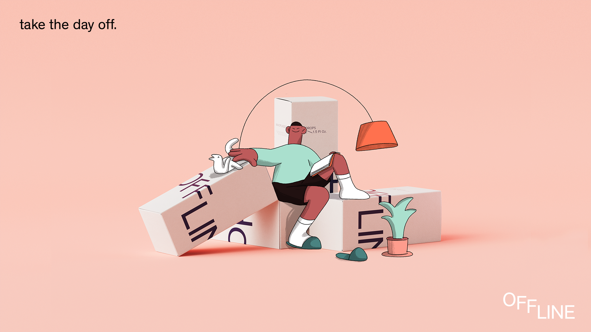
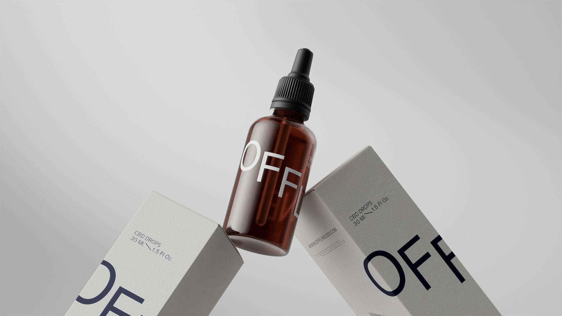
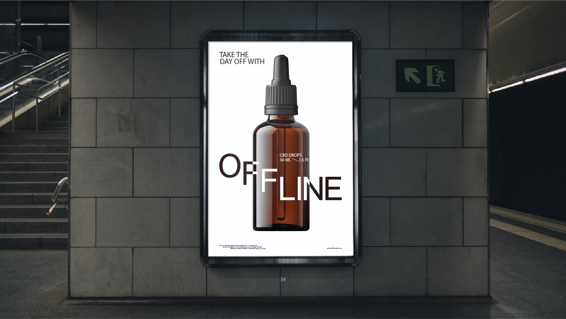
We are passionate about embedding ourselves in with our client partners from an early stage to help explore and ideate around the emotional and functional tenants of a product, and how they can be translated visually so this meant also thinking of the product packaging, materials to be used and CGI photorealistic rendering.
We wanted to combine the playful and relatable illustration with a clean and elegant visual for the actual product. This section of the campaign shows once again how broad and integral our capabilities and the service we provide are.
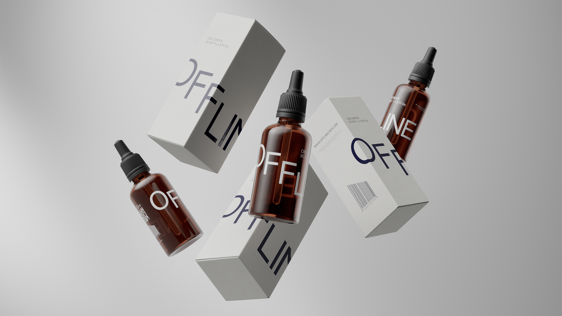
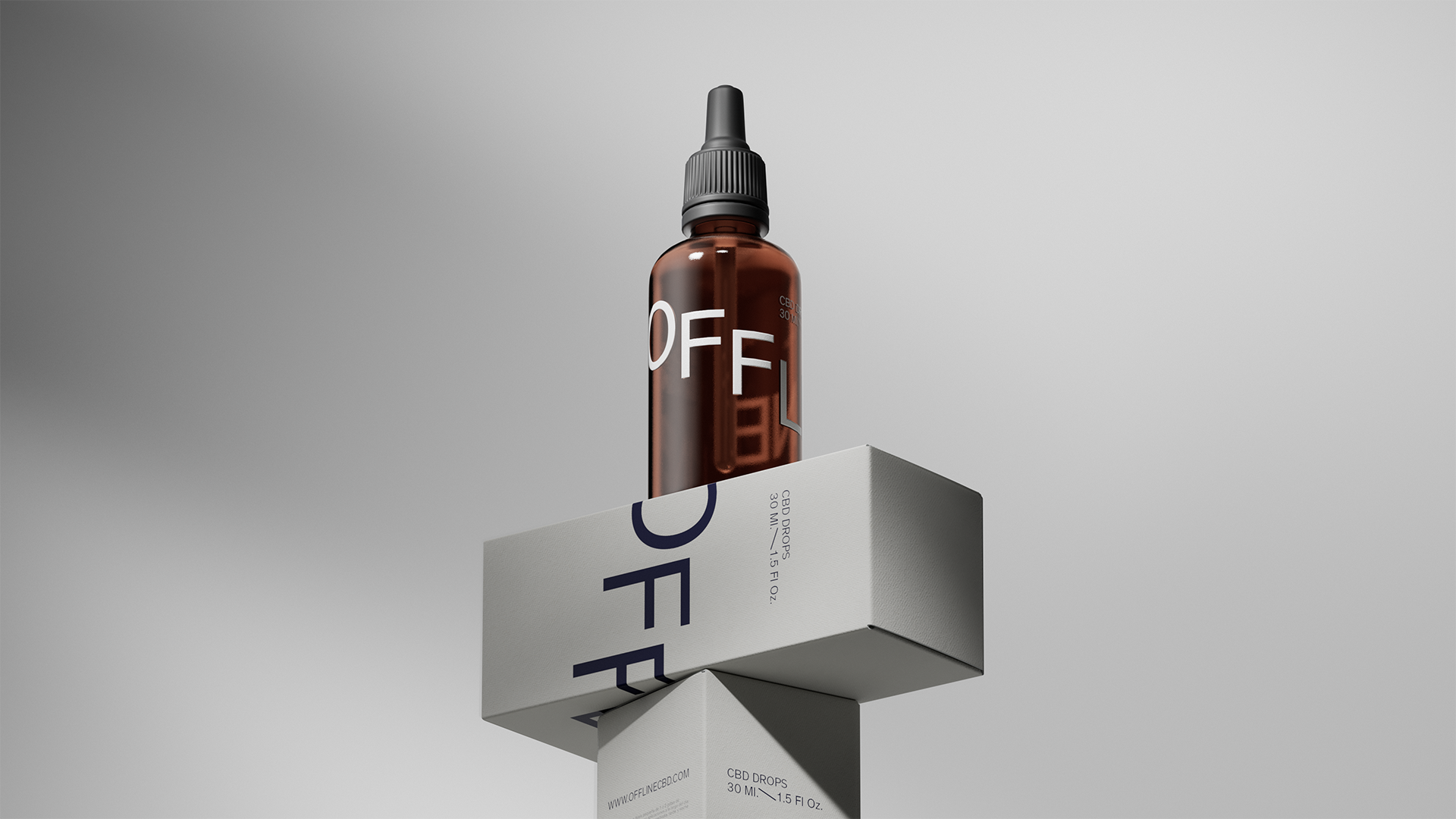
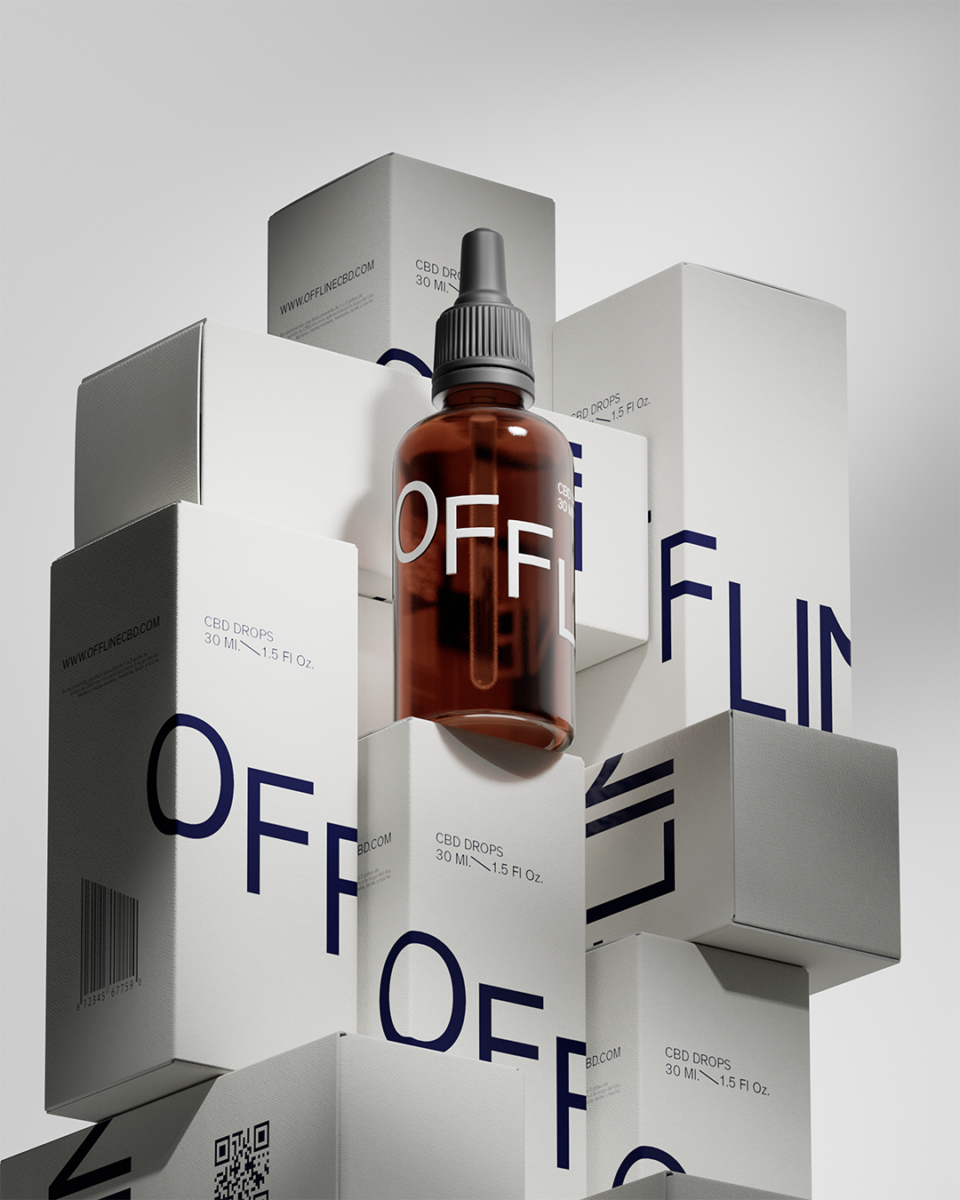
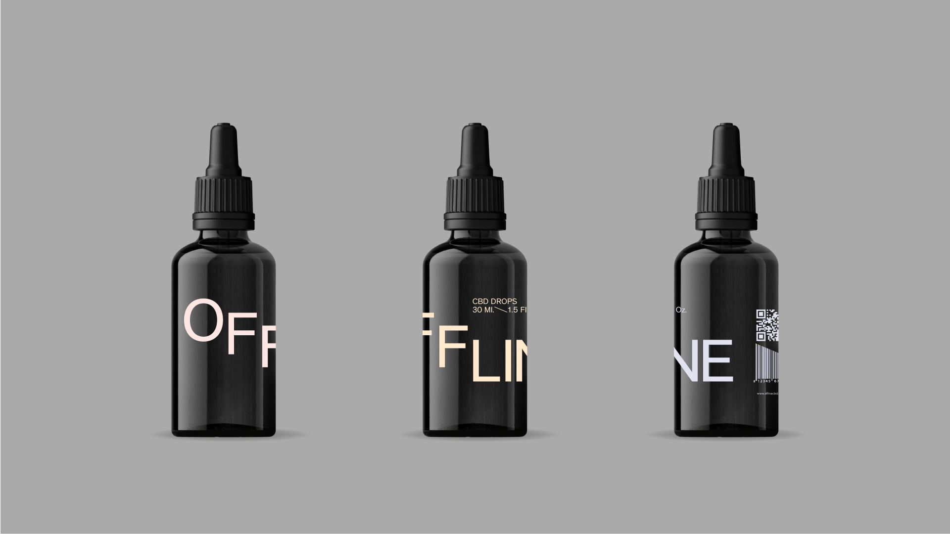
As part of the creative process we researched all sort of materials and also worked on the shape and design of the actual product, both the bottle and box which you’ll find unfolded below.
After studying the CBD market and the main related products out there we wanted to stand out through an elegant and very minimalistic approach: a semi transparent matte glass and silkscreen print of logo and legal. It looks perfect.
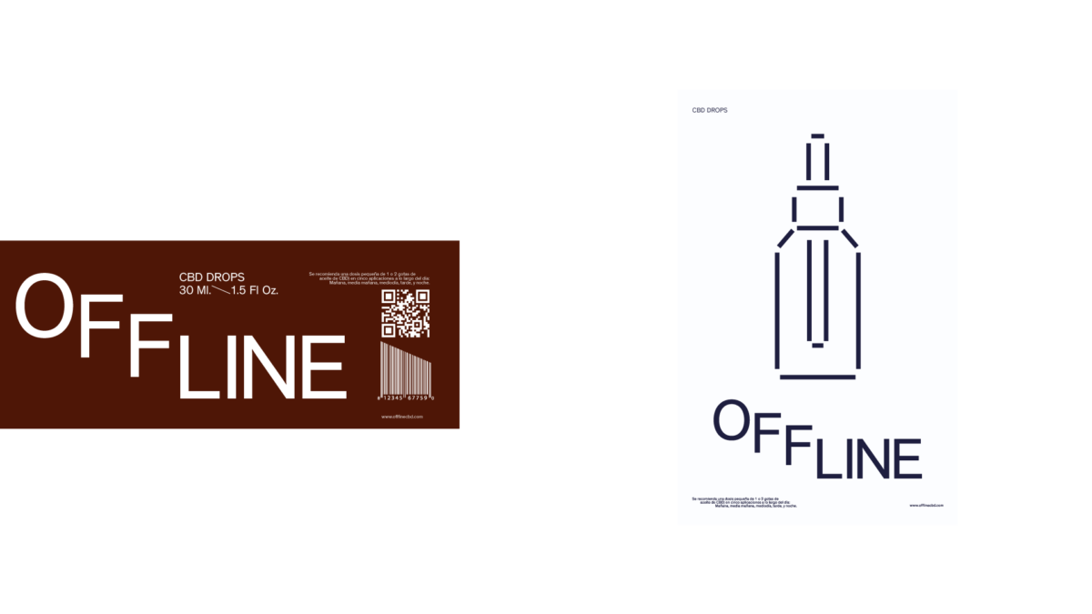
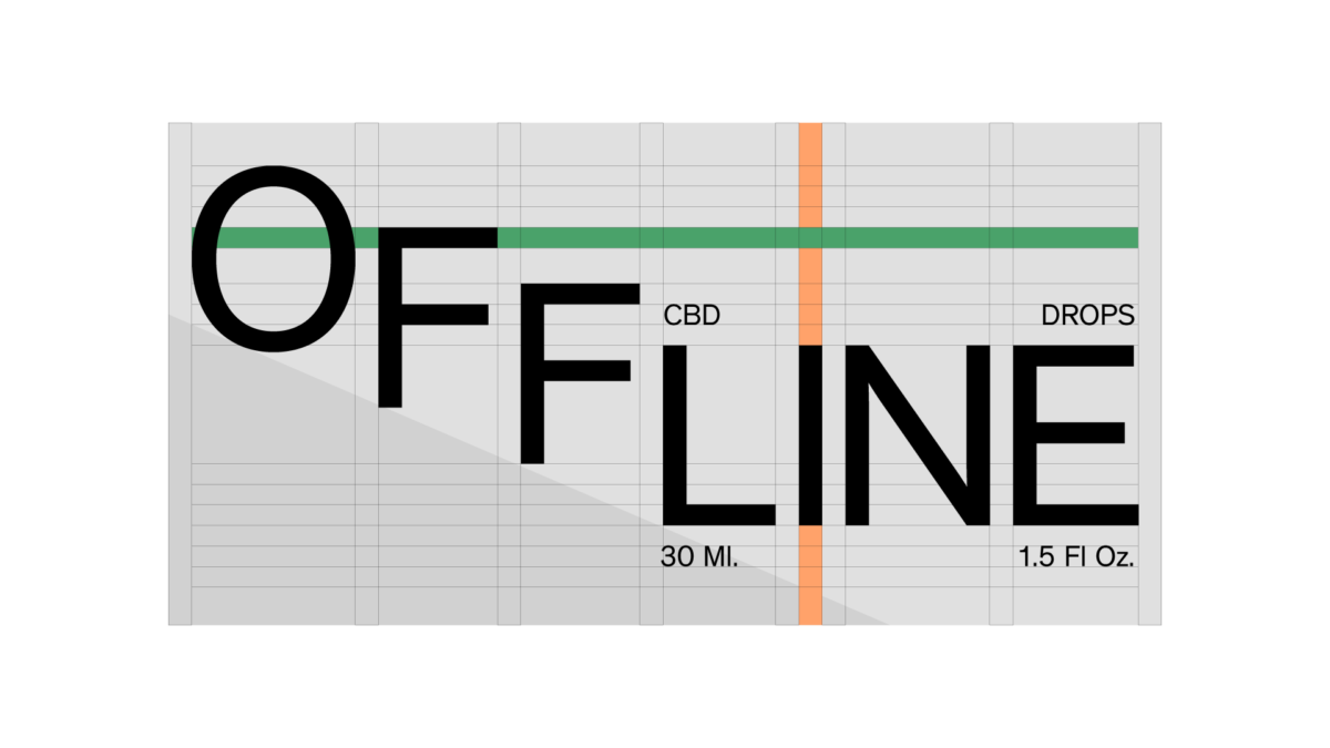
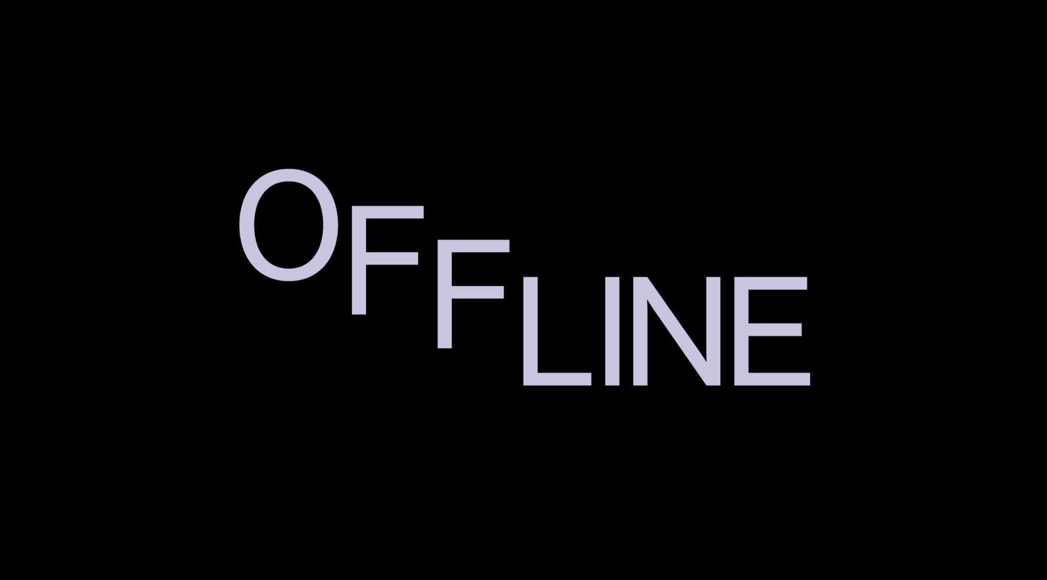
Probably one of the most fun and creative stages of the process, specially coming out with a name for the product – a challenge that we welcome open arms but rarely happens so we savoured it all the way and landed in just the perfect name and with it a beautiful and super simple logo.
Below you’ll find some of the process we went through while developing this brand, lots of good options and very fun and functional visual systems.
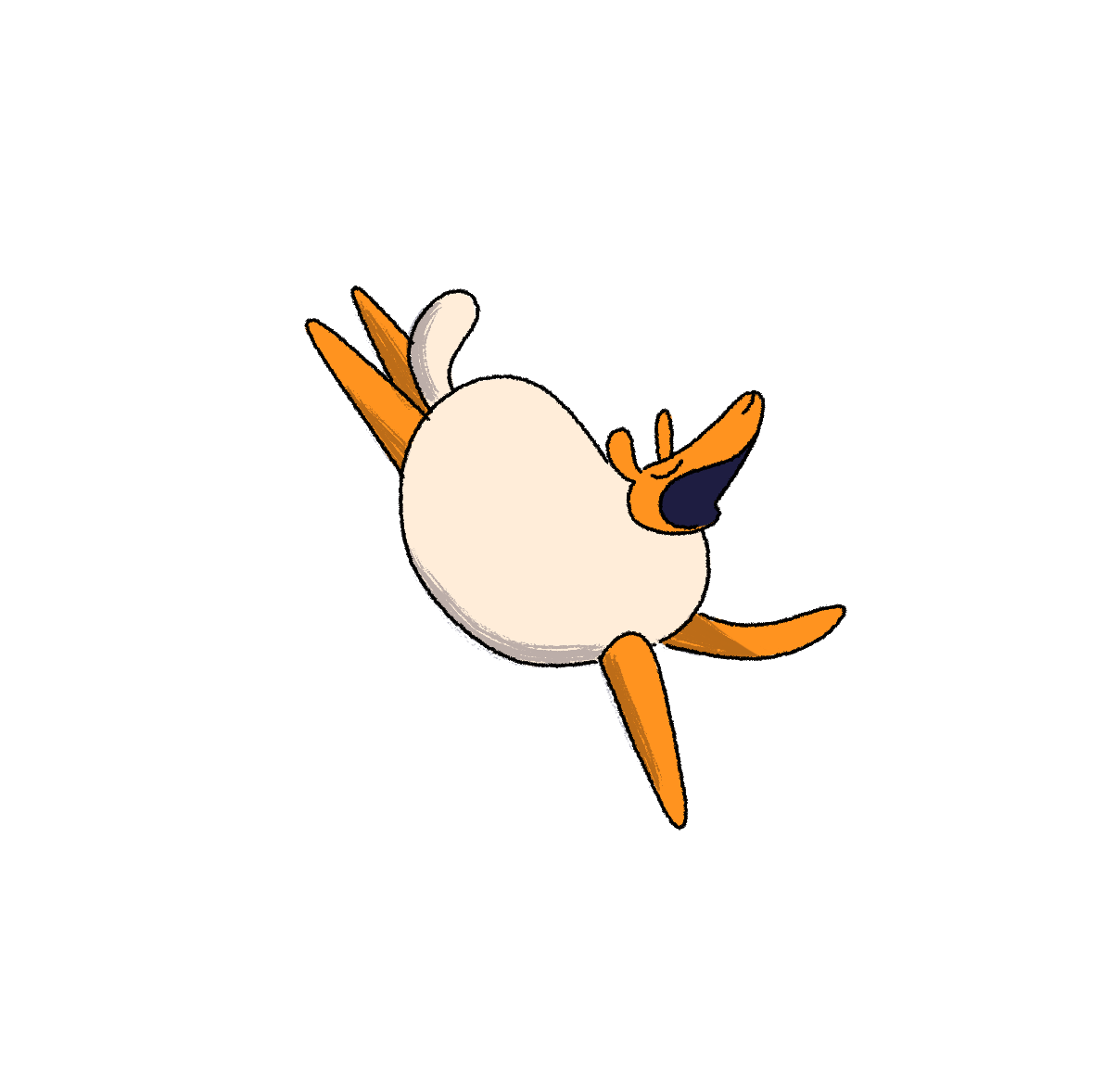
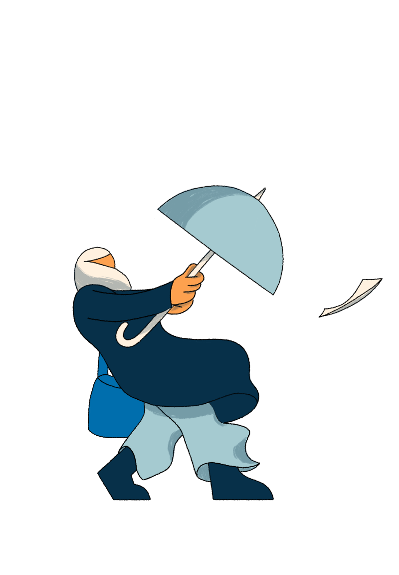
We worked with a small yet very charismatic set of characters through the whole campaign.
We kept them fairly minimal, illustrating facial elements just when needed and relied a lot on body language, key poses and detailed animation to convey each expression.
