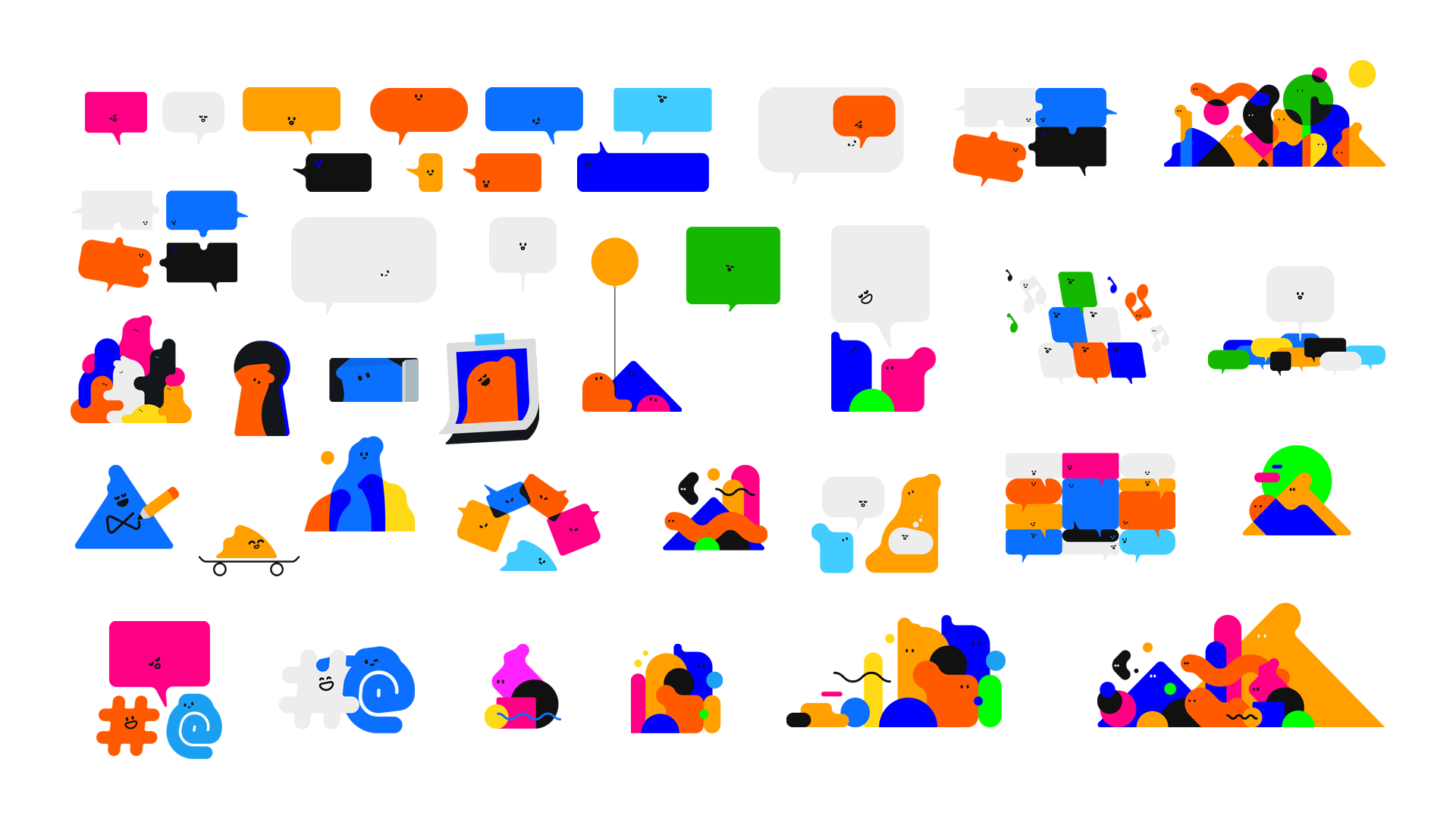
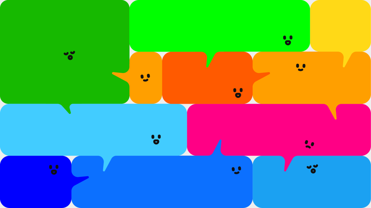
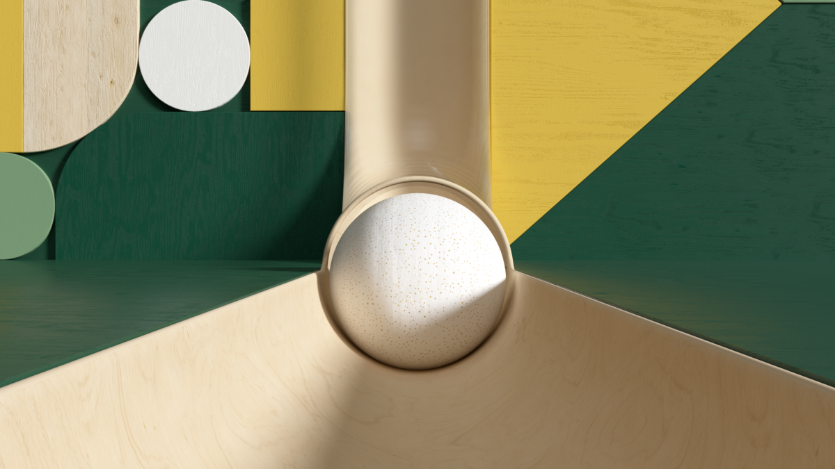
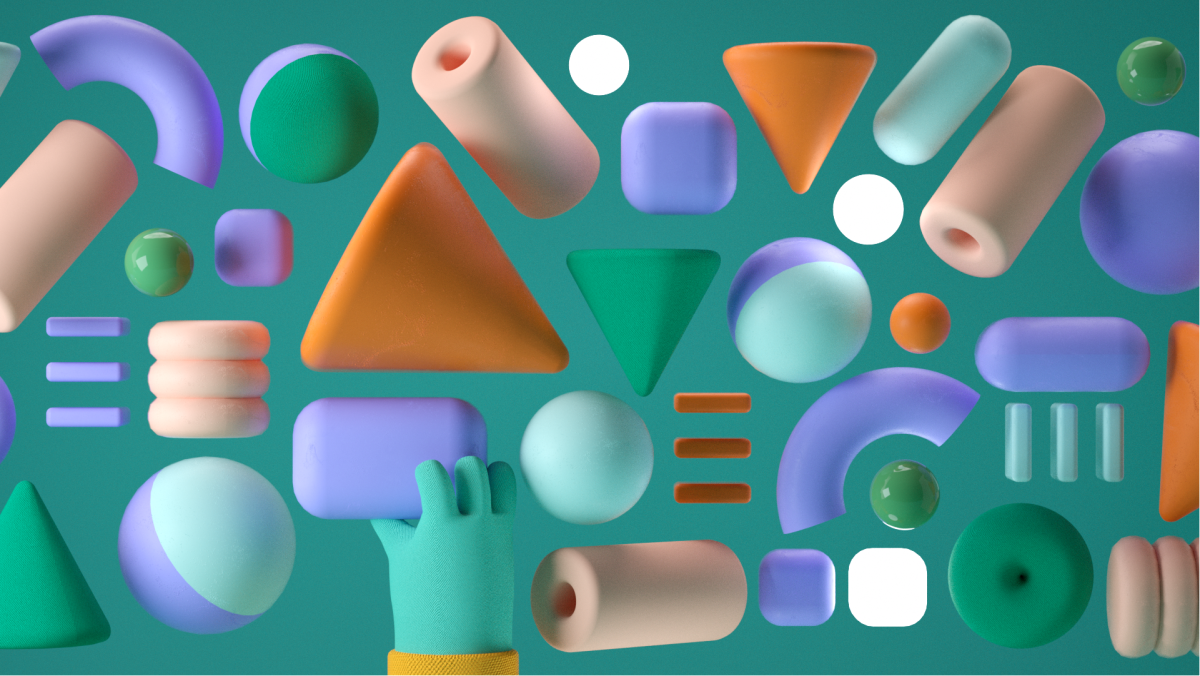
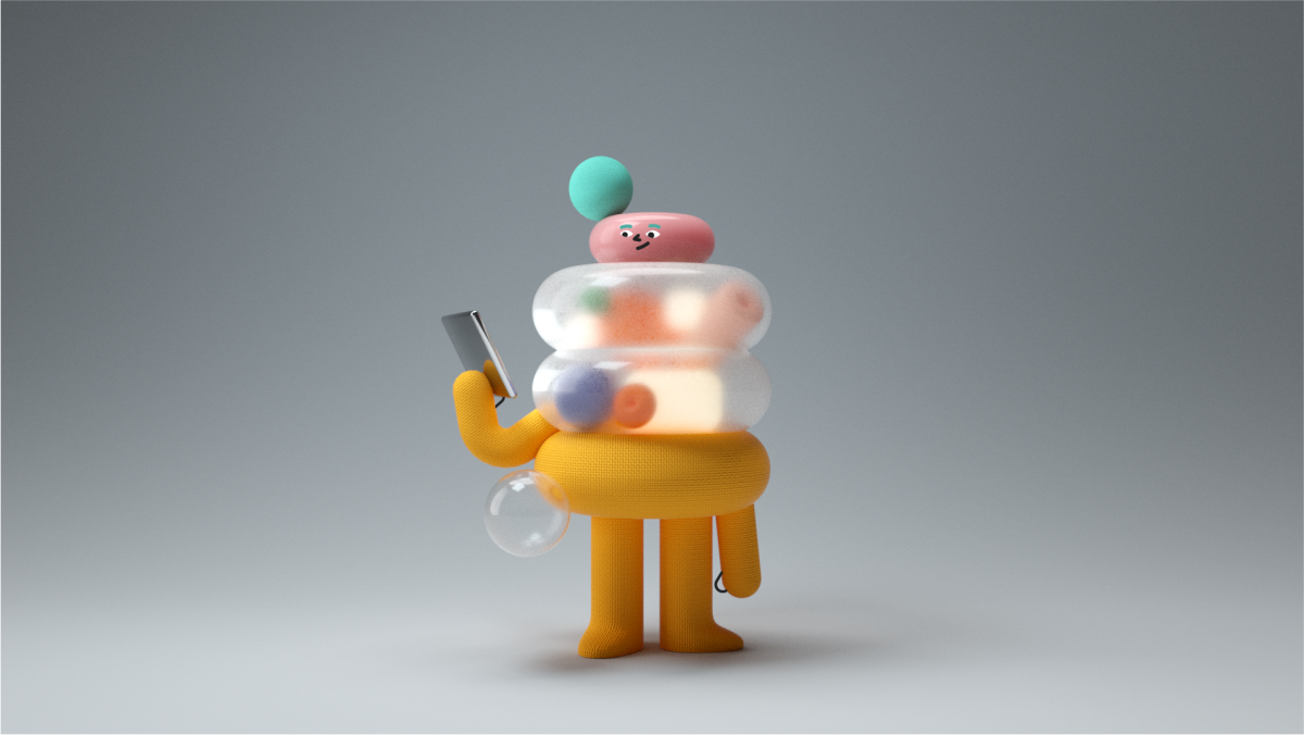
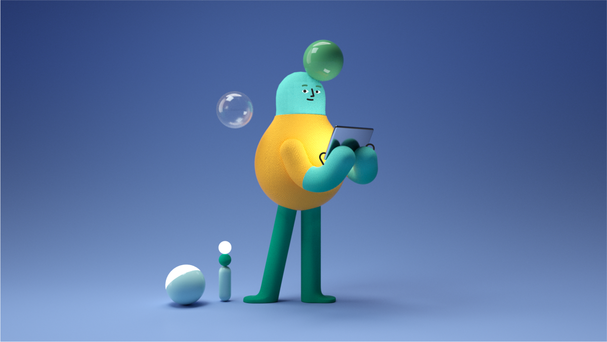
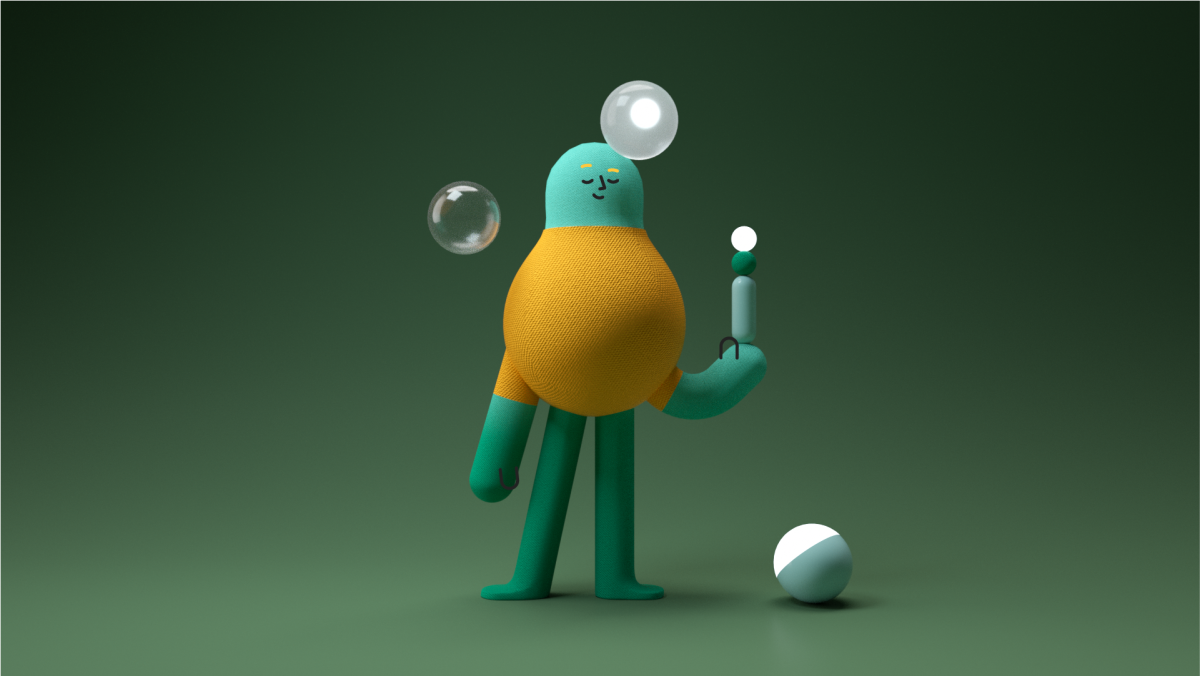
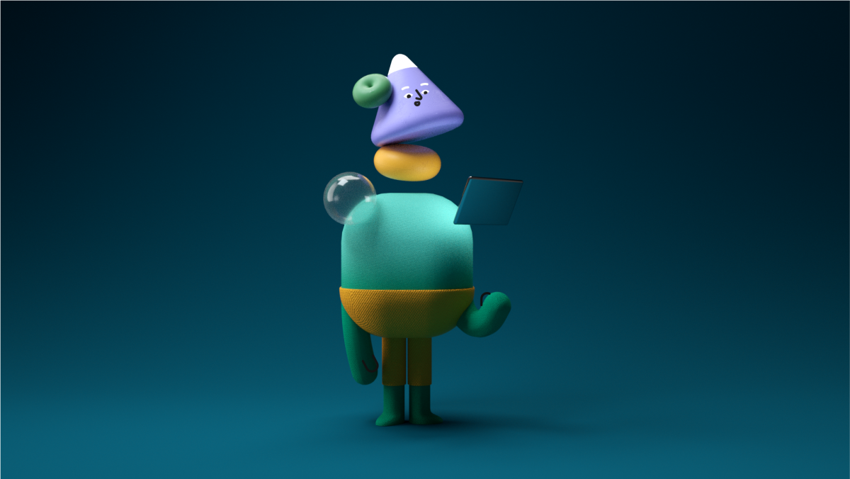
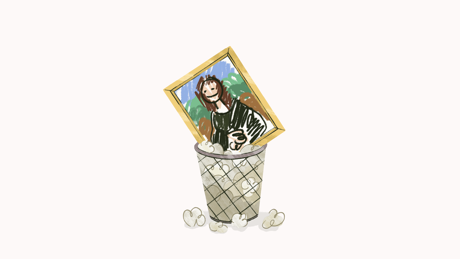
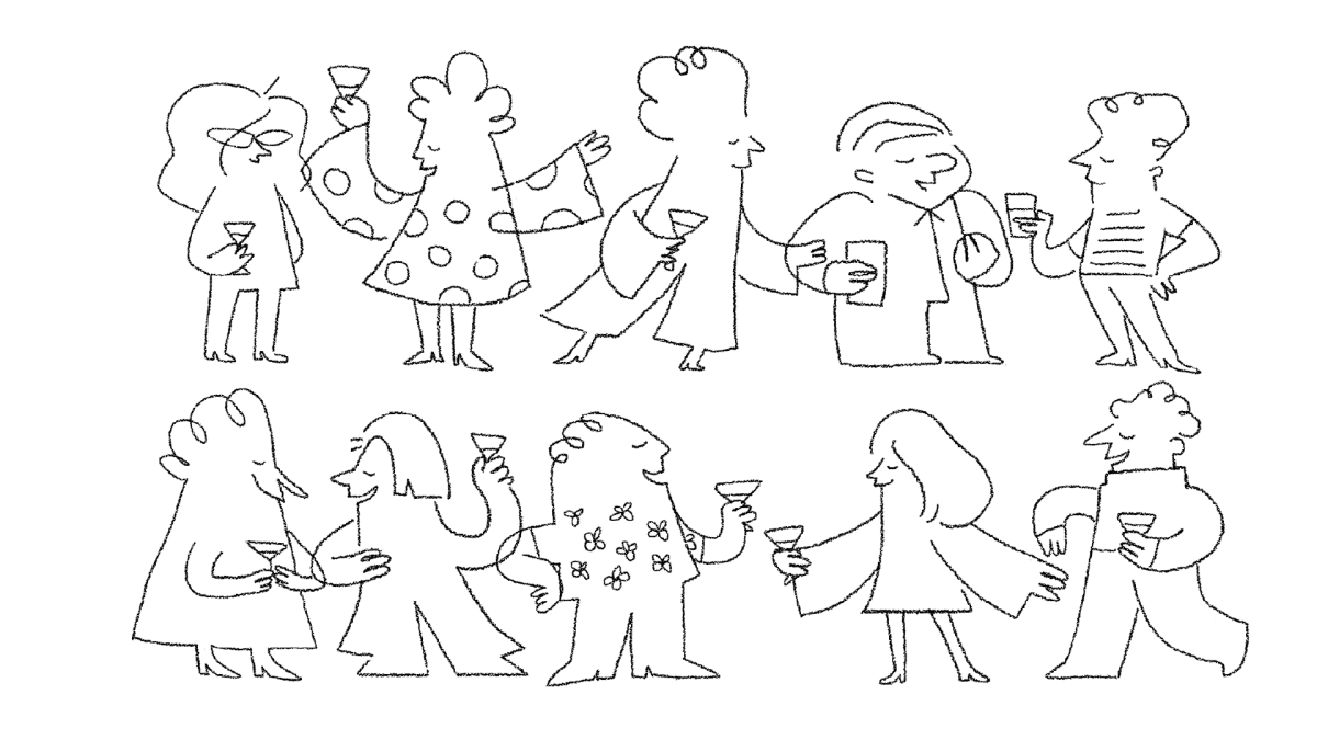
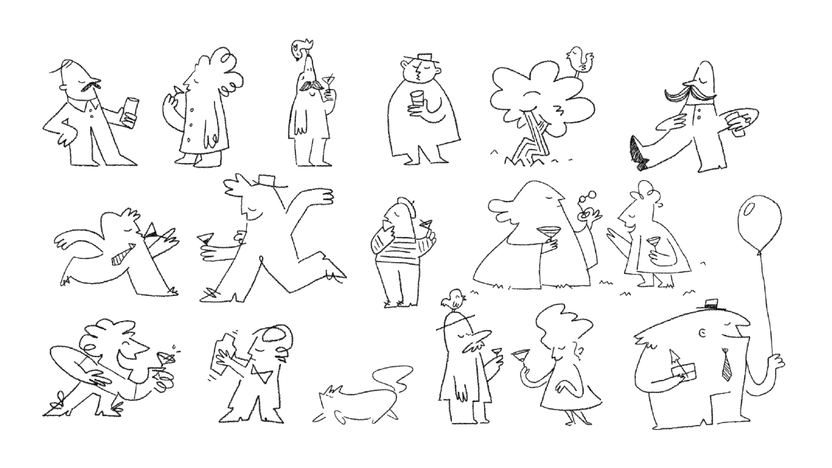
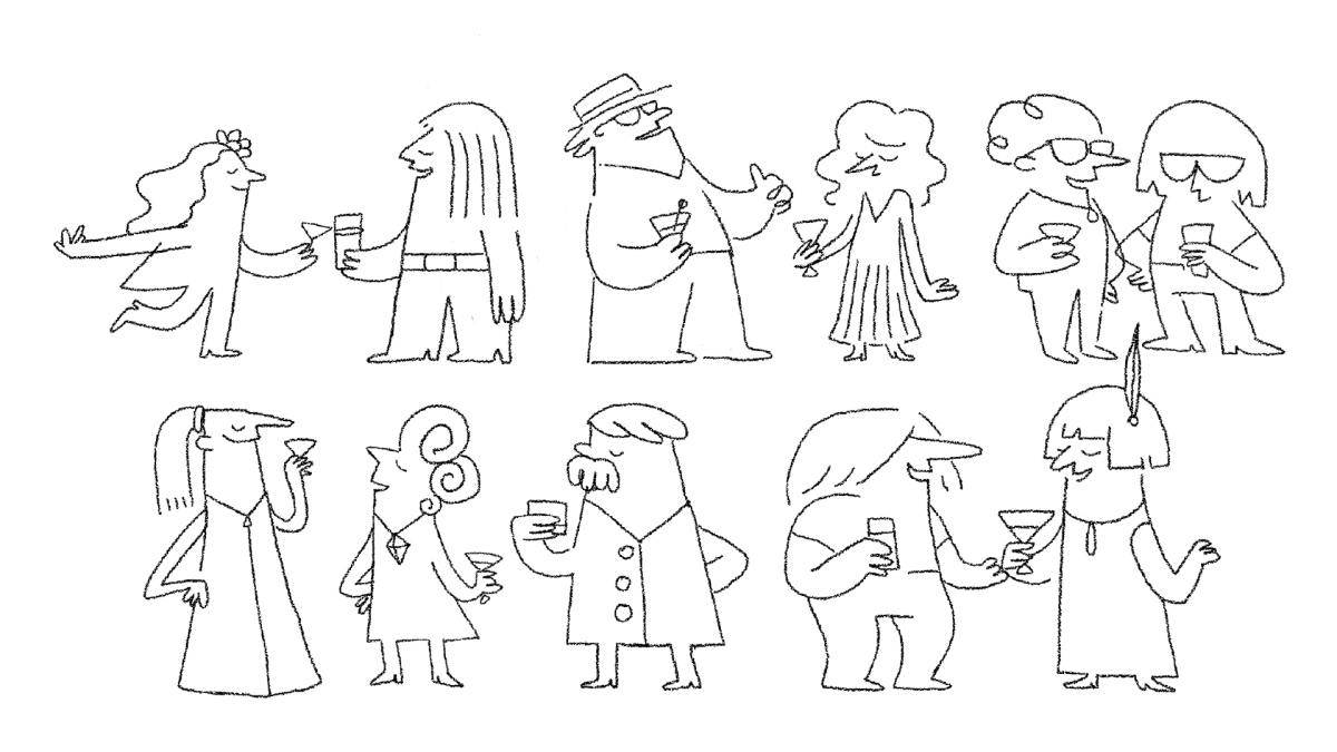
TMDG Conference • An insight to our talk and values
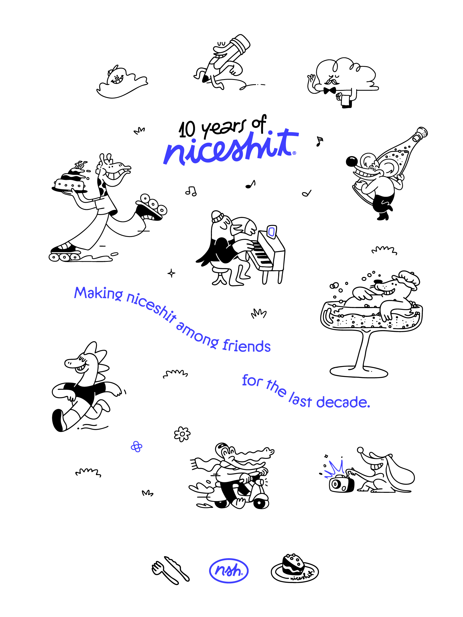
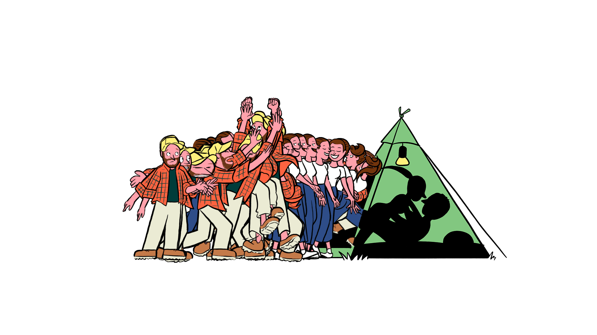
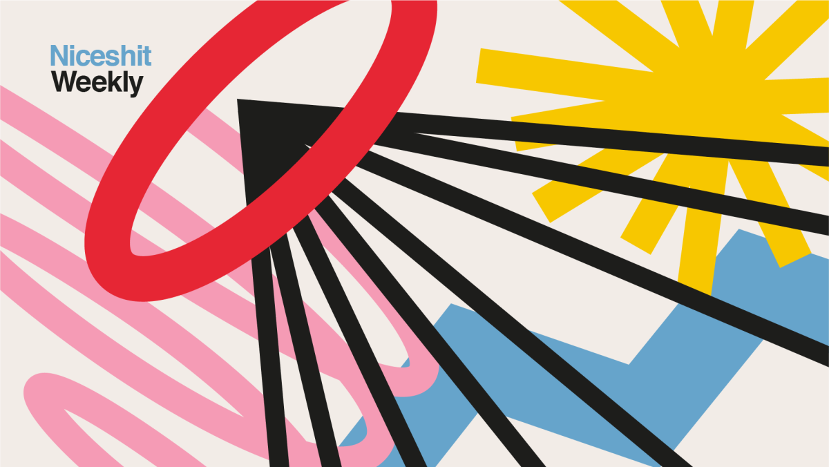
Niceshit turns 10 — and rewrites itself (in its own handwriting).
“ The rebrand that started with a pencil and ended with a typeface.”
by Ufficio
Client
Niceshit
BRANDING
Creative direction, Graphic design & Web design
Ufficio
Project Manager
Luna Nuñez
Font Design
Fer Cozzi
Illustrations & Animated videos
Niceshit
Web development
Juan Pinkus
Niceshit
Creative directors
Carmen Angelillo, Rodier Kidmann & Guido Lambertini
EP
Agusta Timotea
Producer
Larisa Barreda
Illustration
Rodier Kidmann & Tamara Bella
2D
Ana Freitas & Guido Lambertini
3D
Spot Studio
Music & Sound
Facu Capece & Lola Ritcher
BTS & Edit
Ñaño Ramirez
Photographer
Cuca Zabert
Special thanks
Vandals, Lou bones, Tamara Bella & Yang Castillo
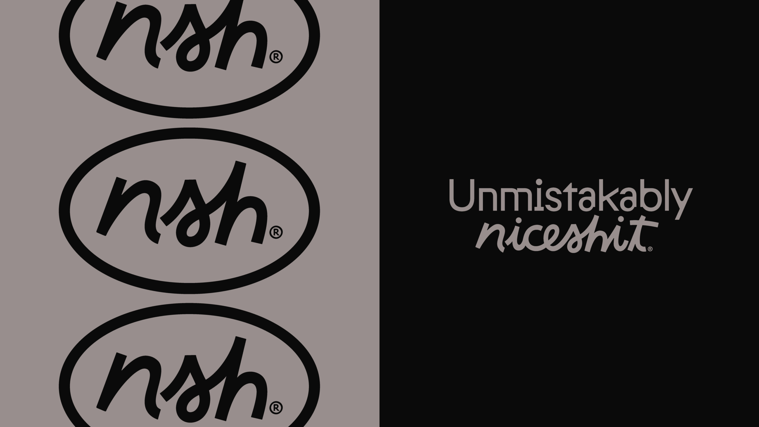
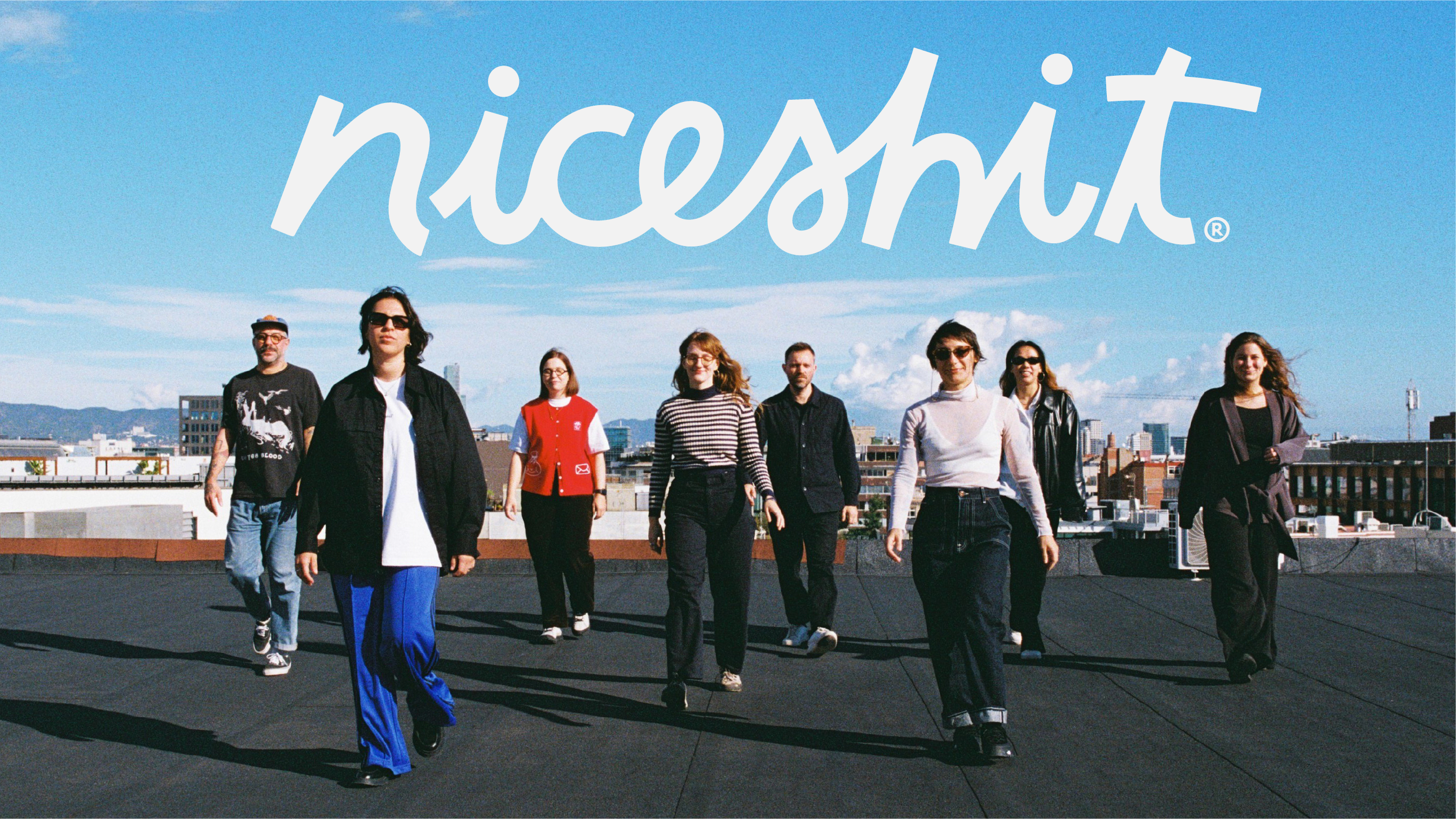
Welcome to the new Niceshit. Our handwriting. Our voice. Our new identity.
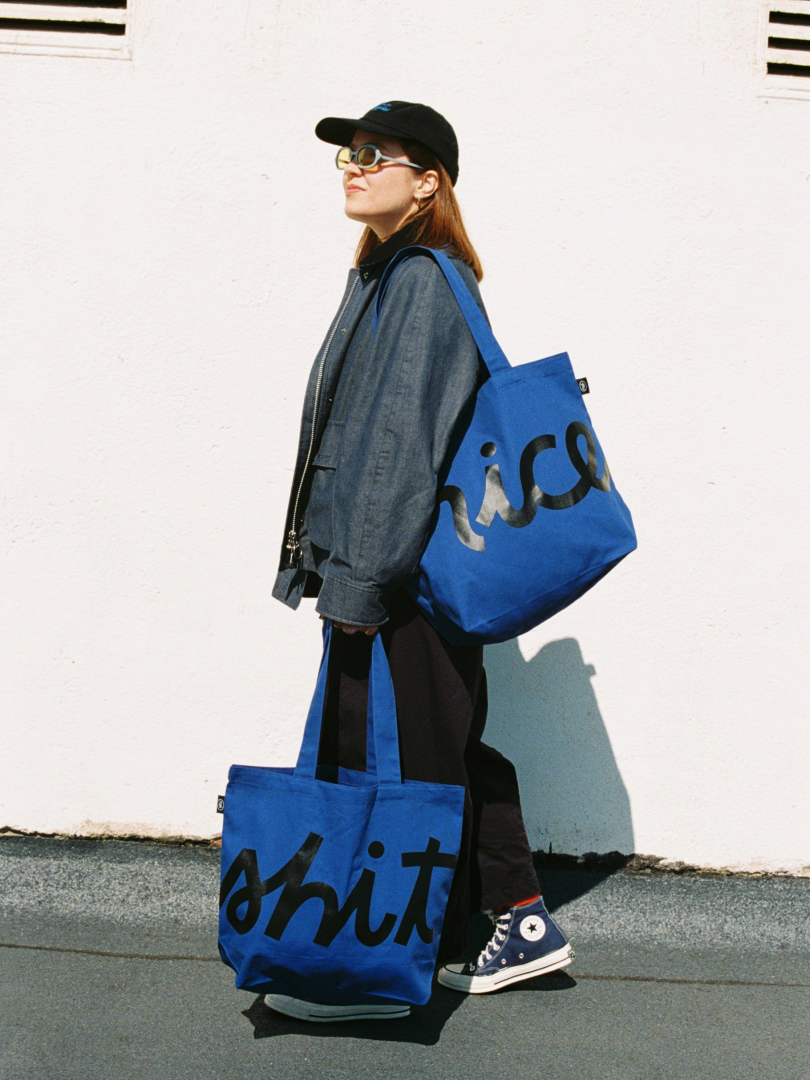
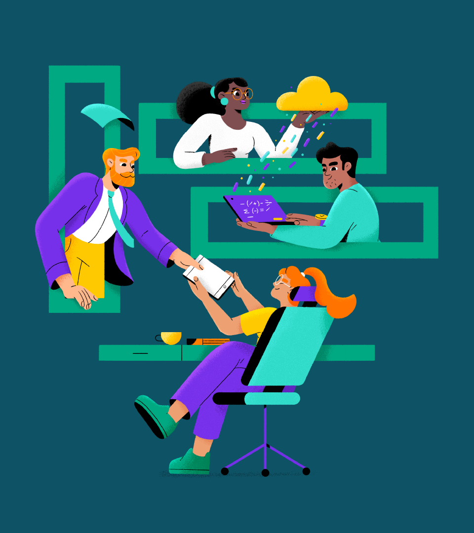
As we reach our 10th anniversary, this rebrand comes as a celebration of who we are and where we are going. We partnered with our friends at Ufficio who were behind this extreme makeover that includes a whole new look, website, merch and our own custom font: the Niceshit Non-Regular.
This new chapter is about embracing the boldness, the humor, even the name itself, but from a more grounded, confident place. One shaped by years of doing the work.
A typeface built from three voices
Ufficio's answer was typography. At the heart of the new identity is a fully bespoke, hand-drawn typeface — the Niceshit Non-Regular — where each letterform is drawn from the handwriting of the studio's three founders and blended into a single, functional system.
The concept starts where every Niceshit project does: off-screen. Ideas take shape on paper, in sketchbooks and on whiteboards, long before they become visual output. The typeface captures that origin point and turns the process into identity.
The choice was deliberate. Type wouldn't compete with the studio's work — defined by constantly shifting styles, distinct visual languages, and worlds built from scratch for every client — but would instead act as something more foundational: a flexible, human layer that holds everything together regardless of what the projects look like. As Ufficio puts it: "the gesture of their letters is unique and cannot be replicated. Even if the idea or process could be applied to another brand, this typeface is and will always be theirs."
The font was paired with a more stable sans serif of equal weight and spirit: one representing process, the other delivery. The logotype and phonogram NSH came later as a synthesis — timeless symbols of the brand. A low-contrast palette with a single blue accent completes the system.
The result balances both sides of what Niceshit is: the spontaneity of the sketch and the precision of the final outcome. Logo, colour system, type, and a rebuilt website — all designed to flex across endlessly varied output while staying unmistakably themselves. As the studio defines it: "Niceshit is an attitude. A way of thinking and solving problems in endless styles and techniques." Three pillars keep it coherent: simplicity, humour, and function.
Why now
Ten years felt like the right moment to ask: who are we now? The answer, as it turns out, is both familiar and evolved.
The work had grown, the trust was there, and the studio had entered a new stage — but the brand hadn't quite caught up. The rebrand is here to close that gap and build a language that feels closer to how Niceshit actually thinks and creates today.
The values — curiosity, warmth, a slightly silly sense of humour, and an obsession with making things that actually mean something — are unchanged. What has grown considerably is the craft, the confidence, and the ambition.
The new identity reflects exactly that: the evolution of a studio that has never stopped treating every brief like a puzzle worth solving, and every client like a collaborator worth listening to.
As the studio puts it: "It's not a reinvention, it's an alignment."
Identity developed by Ufficio. Custom typeface Niceshit Non-Regular by Fer Cozzi. Illustrations, animations and launch production by Niceshit.
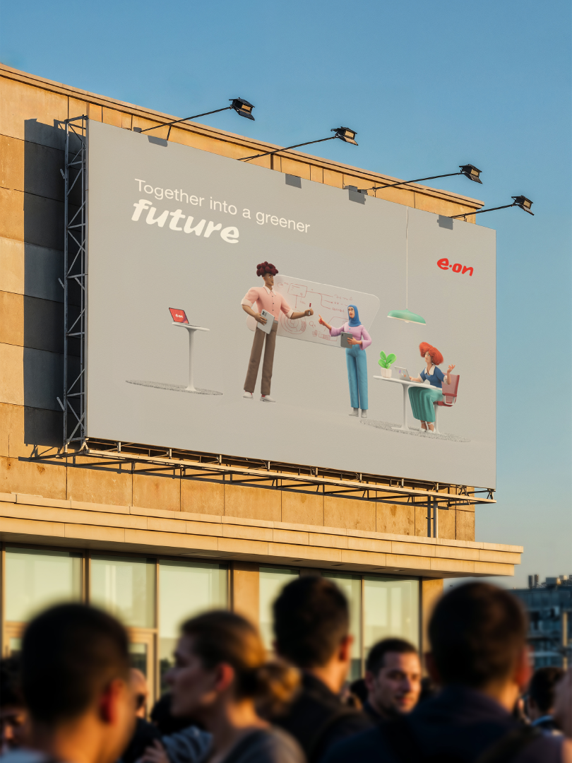
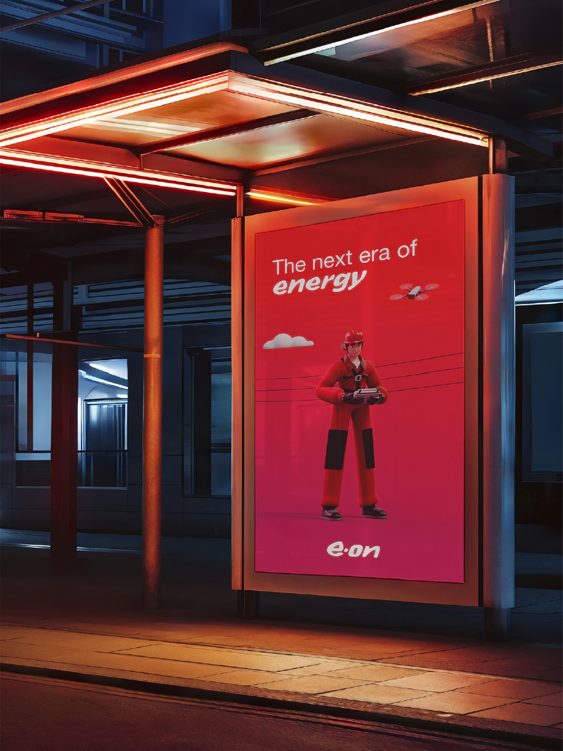
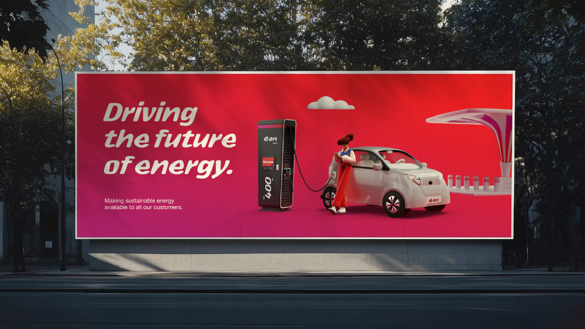
E.on's Flexible and ready to use visual system
Client
E.On
Agency
Peter Schmidt Group
Creative Directors
Carmen Angelillo, Rodier Kidmann & Guido Lambertini
Art Director
Rodier Kidmann
EP
Agusta Timotea
3D Lead
Laura Sirvent
3D Animation
Alan Carabantes Person
3D: Shading & Lighting
Laura Sirvent
3D Modeling
Laura Sirvent, Ruben Stremiz & Matías Fernández
2D Animation & Compositing
Ana Freitas, Magalí García & Guido Lambertini
2D Design
Rodier Kidman & Juan Barabani
Color
Agustín Verrastro
Music & SFX
Facundo Capece & Lola Ritcher
Challenge
Create a visual language both in 2D & 3D.
Whenever we work on a visual system, we do this as a tool that will be used by an external design team, so it needs to be intuitive, flexible and easy to use.
Story
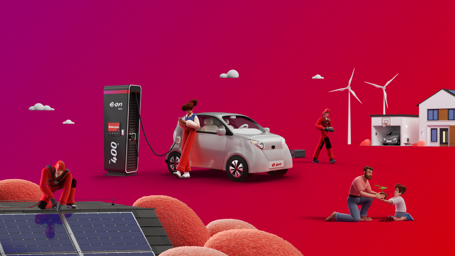
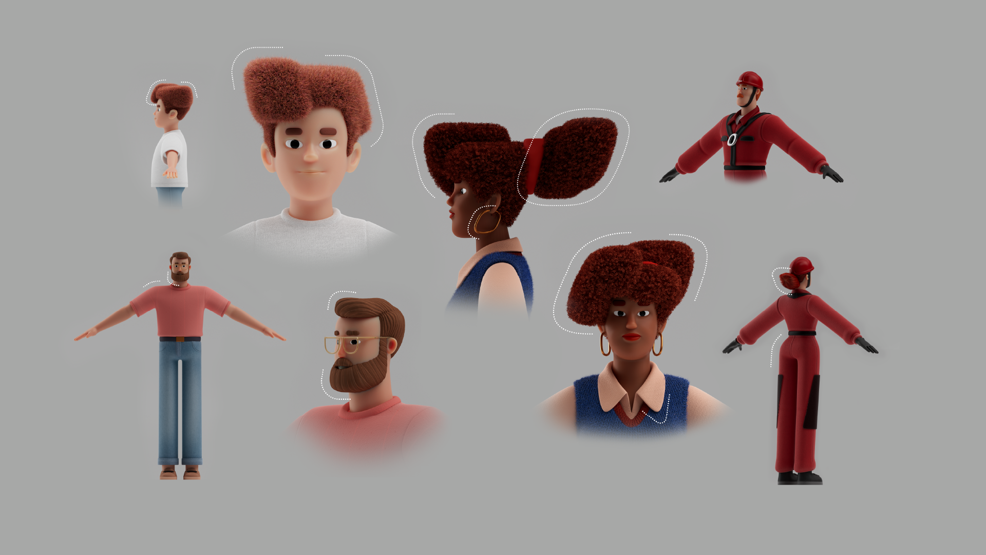
By the time the project landed on our desks, E.ON already had a new logo and bespoke font in place. These became our anchors. After carefully studying the logo and typeface, we took the different movements and curves and transported these graphic elements directly into the character designs to ensure that the core elements from the brand continue to live across the set of illustrated characters and backgrounds.
For E.ON, we created two complete sets of assets, both built on the same family of shapes:
2D illustrations: flat, contour-free, with lines only when needed. Clean, bold, and simple.
3D illustrations: spatially built, with tactile textures, realistic lighting working through the lens of a CGI camera.
Having the full set of assets in a flat vector style and also in CGI gives the E.On’s team a huge range of possibilities to tell complex or abstract stories, from informative to entertaining.
The process of building these sets of characters was really enjoyable as everyone involved shared the same care and love for character design and obsessive attention to detail.
It was especially rewarding to see 2D concepts translated into CGI—suddenly becoming tangible, tactile, and alive.
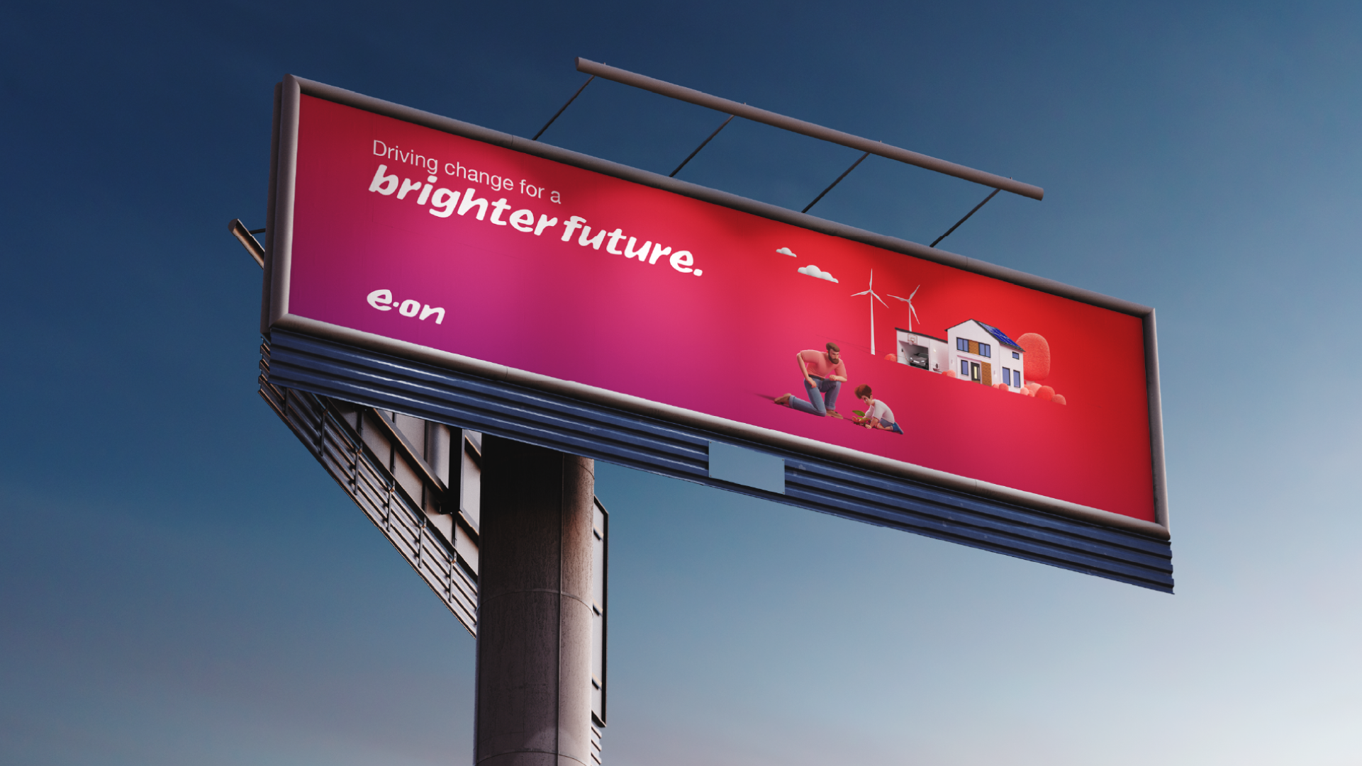
Out in the World
Here’s the funny part: we do rebrands for clients all over the globe, but rarely get to see them “in the wild.” No billboards on the corner, no bus stop posters to send a picture to our mums.
So if you’re in Germany and happen to spot these E.ON characters out there, please send us a pic!
(And hey—if you’re a company in Barcelona looking to cover the streets with a fresh new look, you know where to find us.)
Related Projects
HPE • Hypermodular character toolkit
TrueCar • A new brand identity
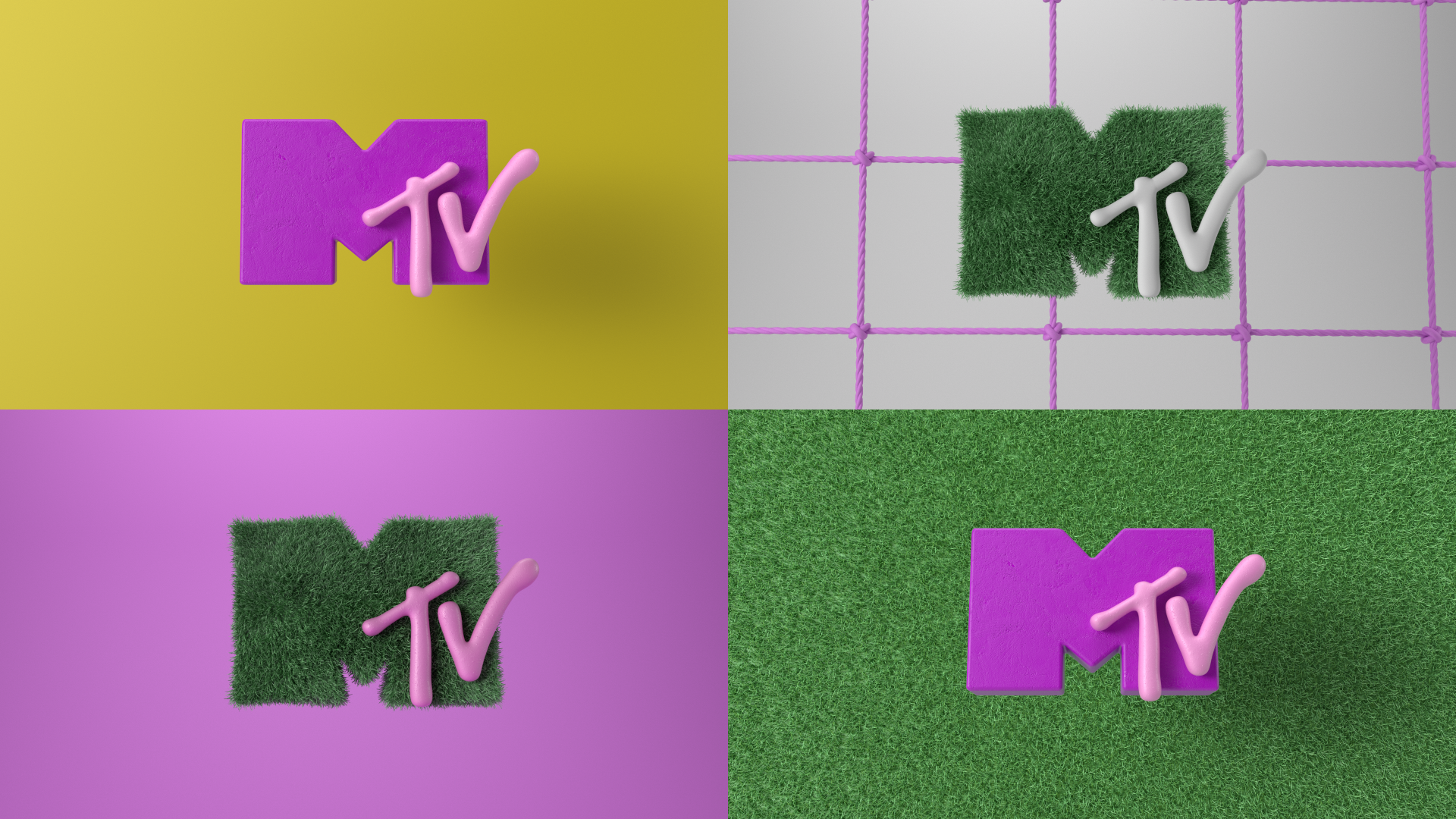
"A heart's heart" for MTV
Client
MTV
Creative Directors
Carmen Angelillo, Rodier Kidman & Guido Lambertini
Art Direction
Nicolas Castro & Rodier Kidmann
Animation Director
Guido Lambertini
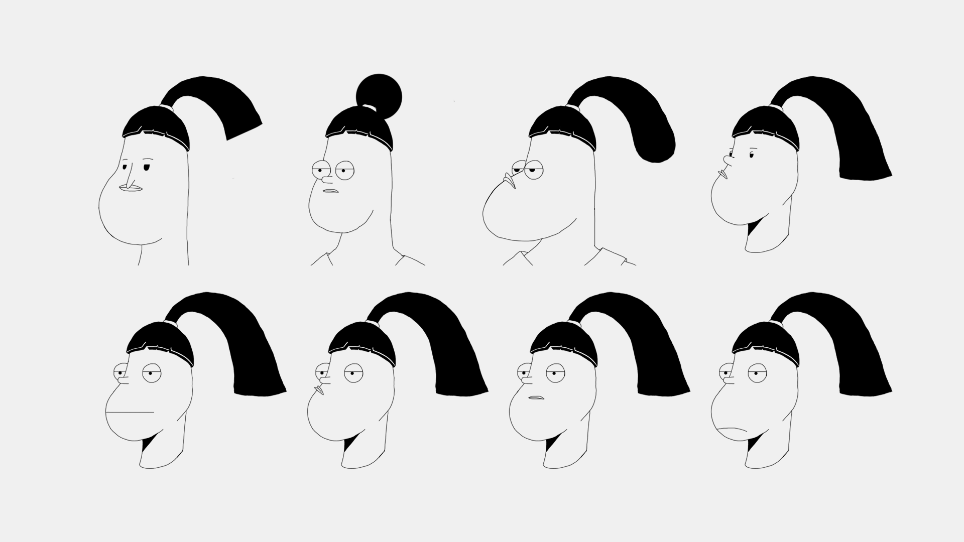
Concepts & Character Design
Rodier Kidmann
3D Modeling
Nicolas Castro, Rodier Kidmann, Guido Lambertini
Shading & Lighting
Nicolas Castro
2D Animation
Leo Campasso, Guido Lambertini
3D Animation
Guido Lambertini
Music & Sound Design
Facundo Capece
MTV Credits
VP Creative
Sean Saylor
Creative Director
Maxi Borrego
Creative Lead
Fran Casas
Art Director
Loz Mendez
Production & Operation Director
Delfina Chiesa
Producer
Francisco Romairone
Story
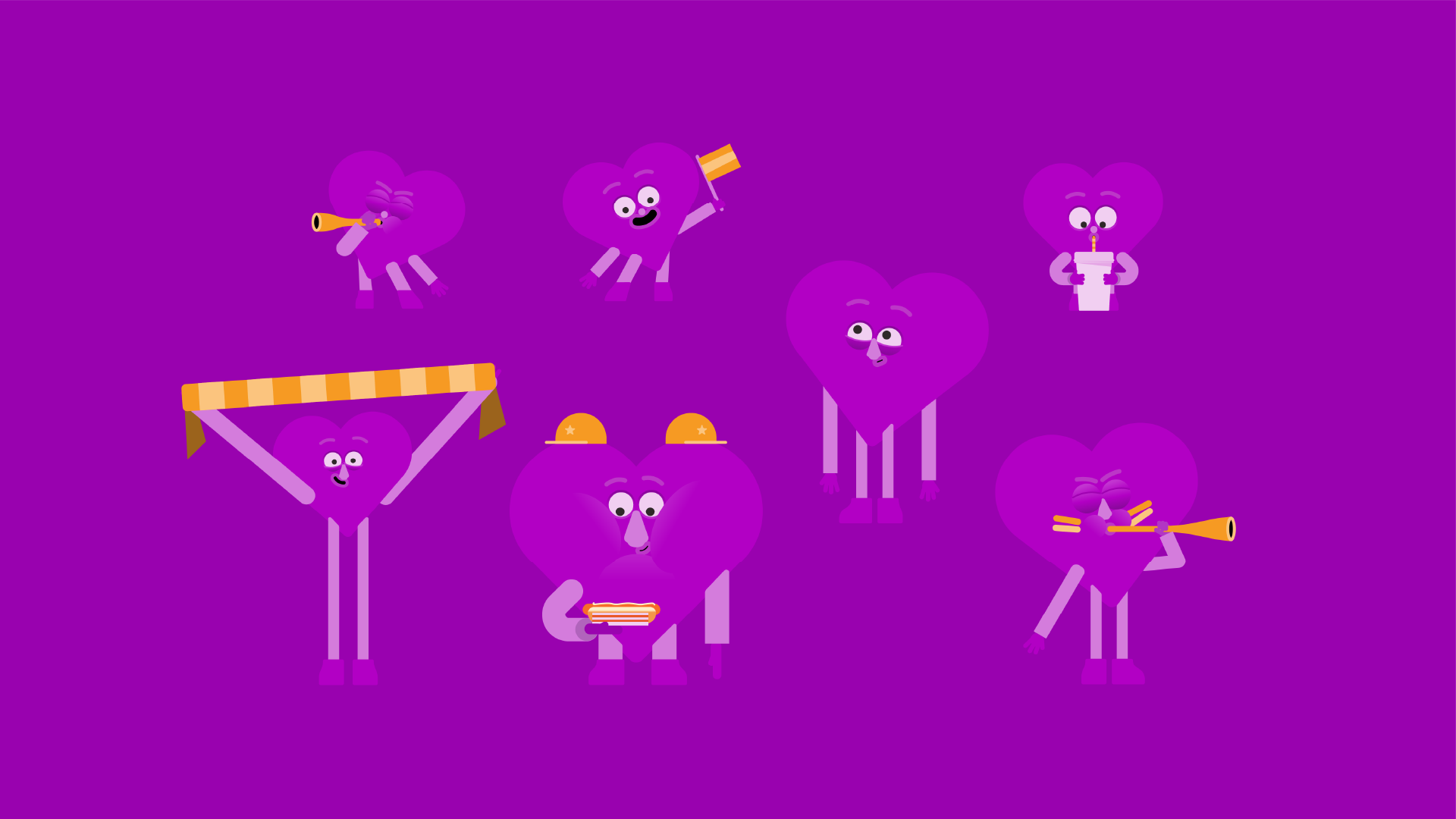
Futbol can be intense, and it definitely was for our little dude.
He just couldn't take it, but hey, he died doing what he loved the most, right?
We were very excited when MTV called us to do another one of these killer Artist Id series.
The keywords they gave us this time were: World Cup, Anxiety & Purple. Check! Check! Check!
With this unusual and always desired level of creative freedom, it is a great opportunity to try something new, and that's when we decided to go full 3D + frame by frame animation.
Related Projects
MTV • Broadcast ID
HPE • Hypermodular character toolkit
Say hi to the Shapemates!
Client
Agency
Anyways
Creative Directors
Carmen Angelillo, Rodier Kidmann & Guido Lambertini
Producers
Ellen Turnill & Rosie Atkinson
Illustration & Animation
Carmen Angelillo & Rodier Kidmann
Music
Rodier Kidmann
Sound Effects
Facundo Capece
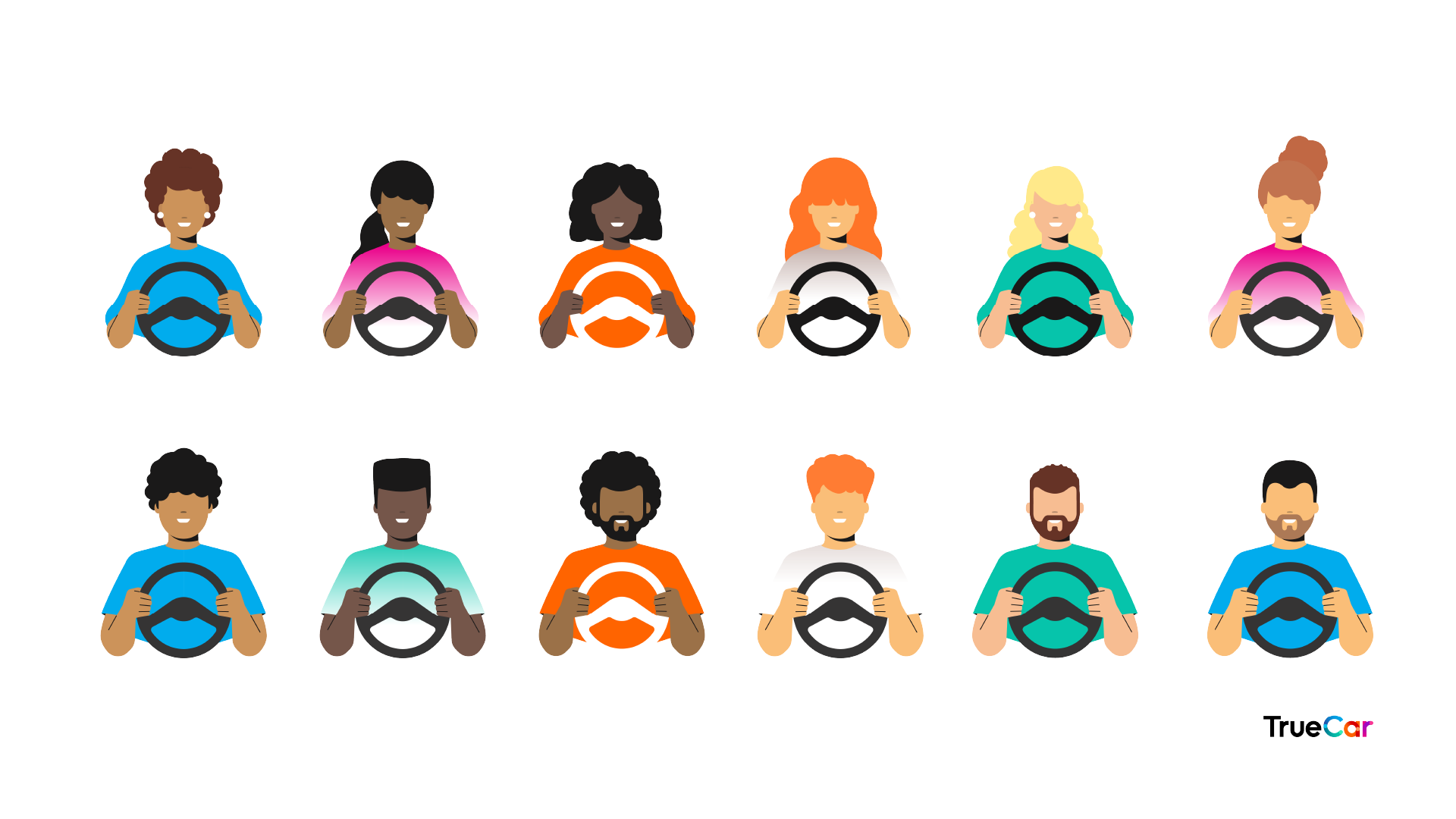
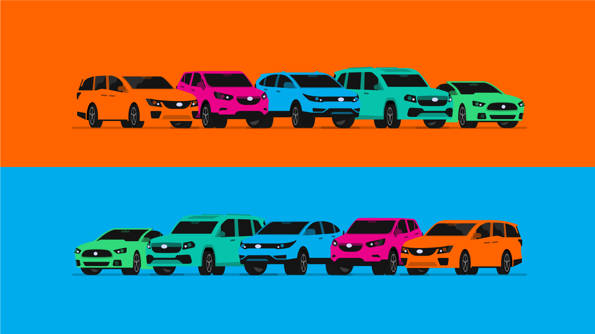
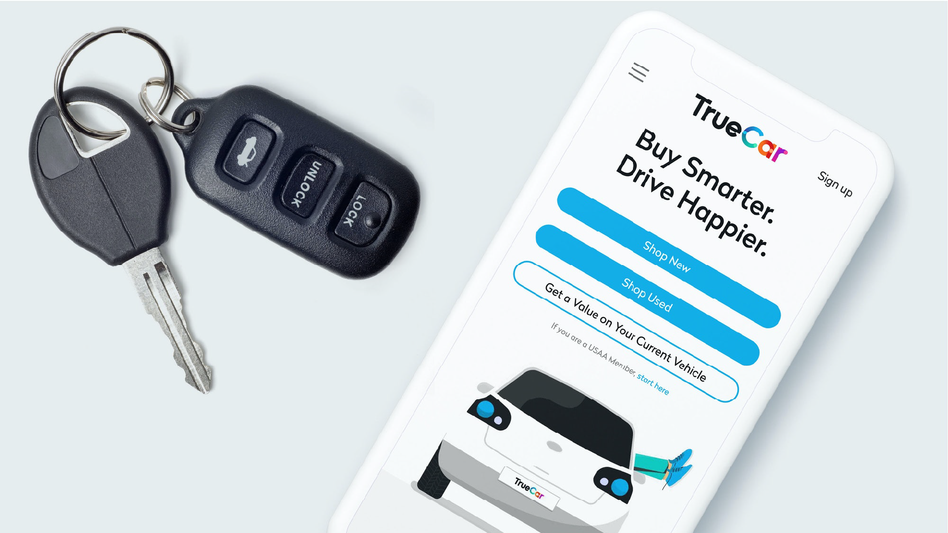
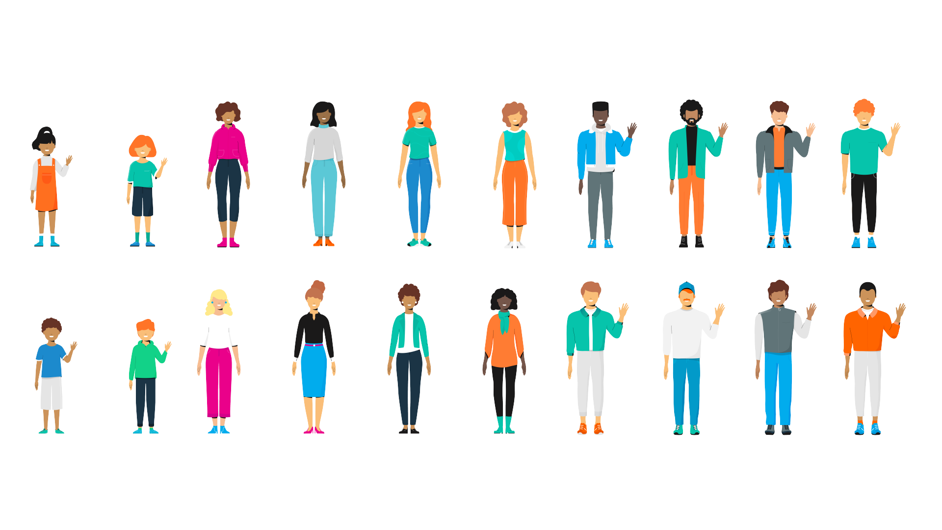
TrueCar new illustration set
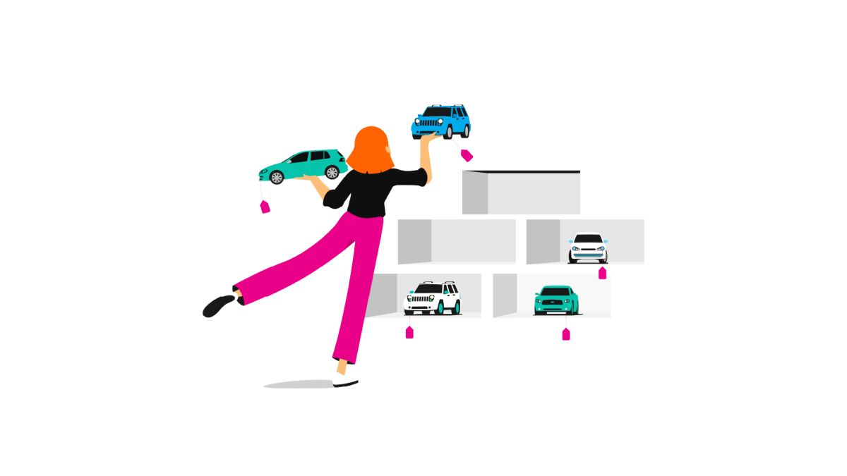
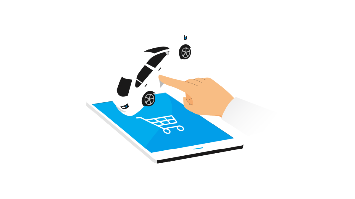
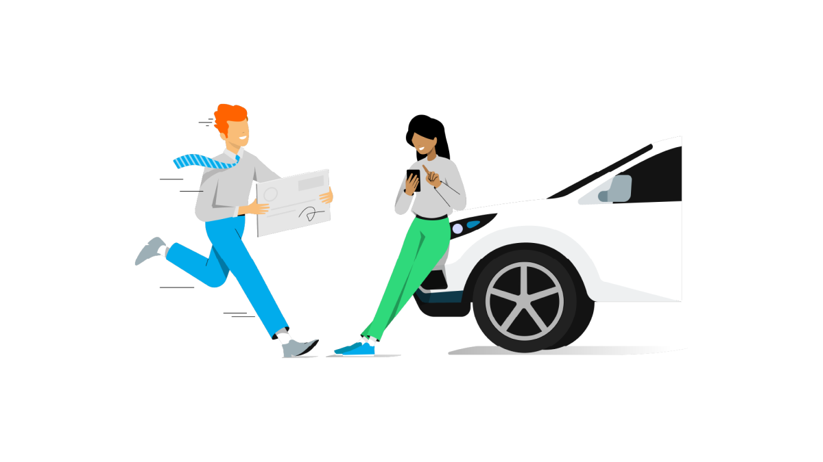
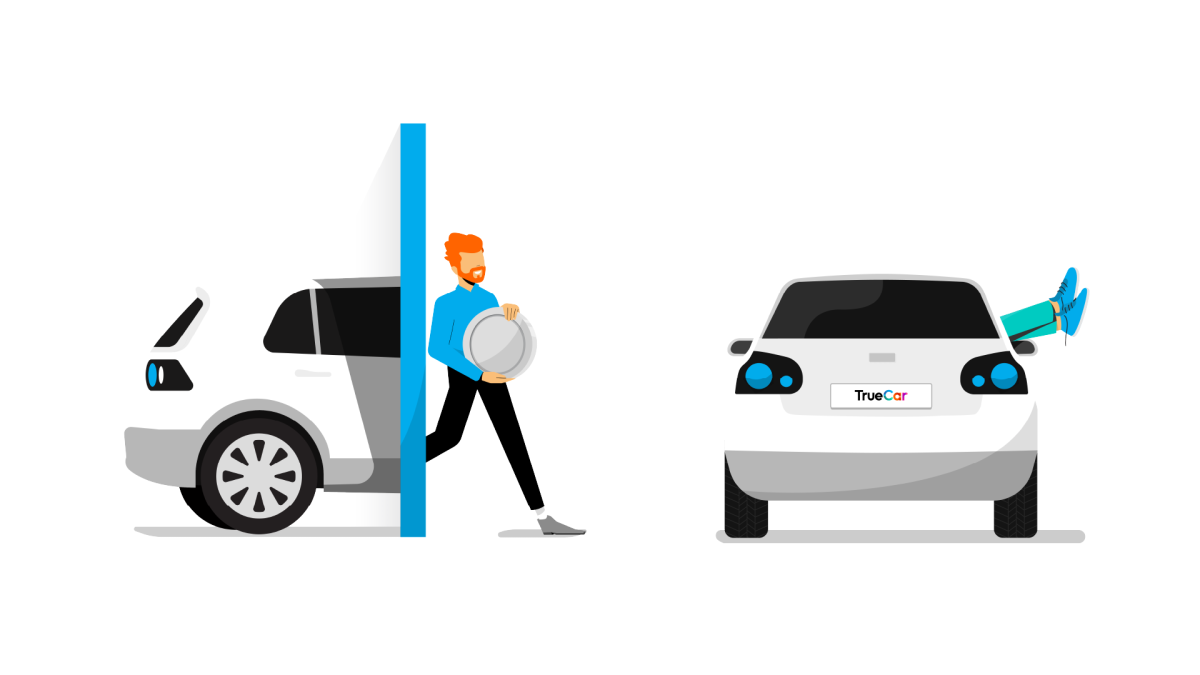
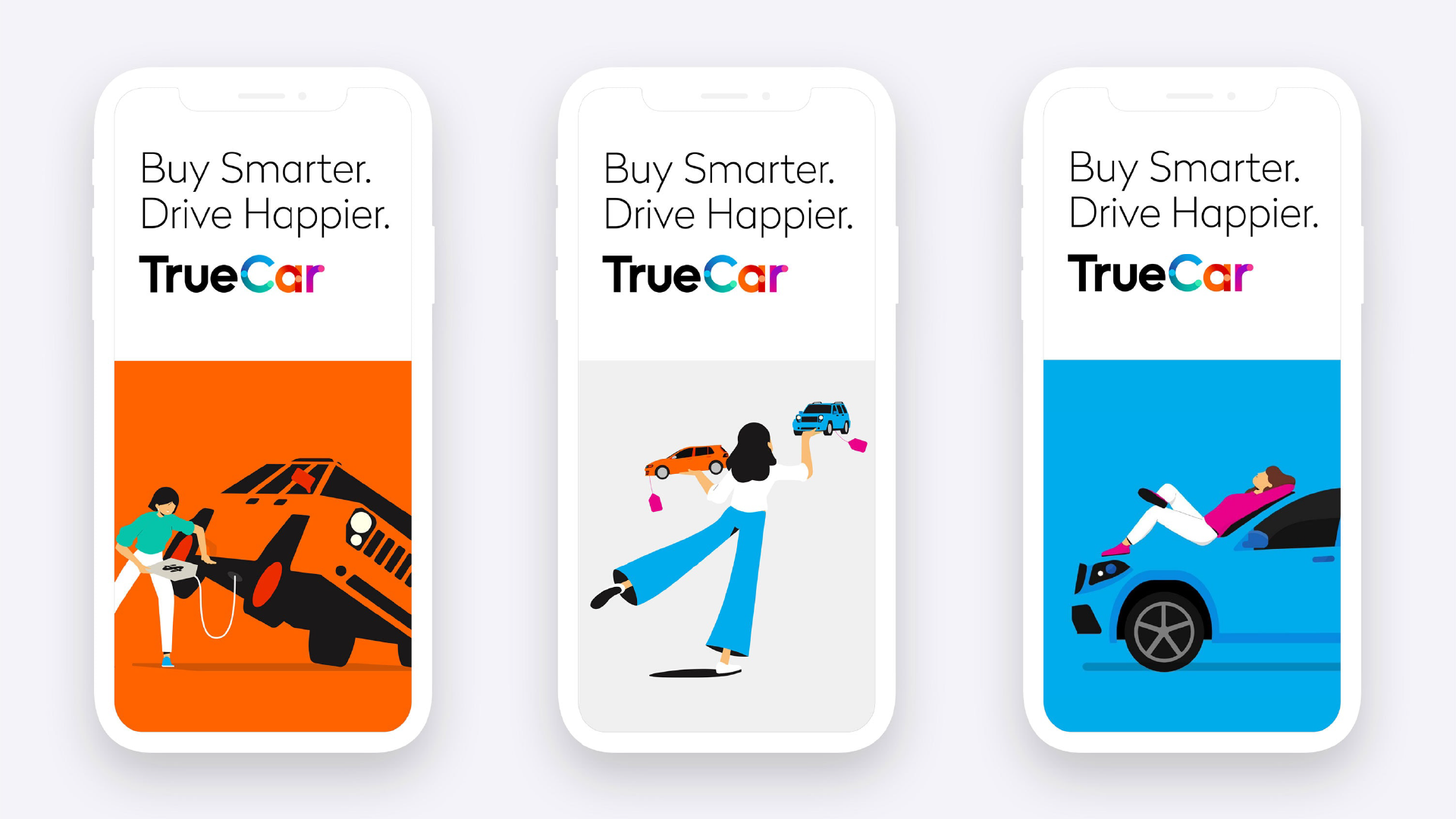
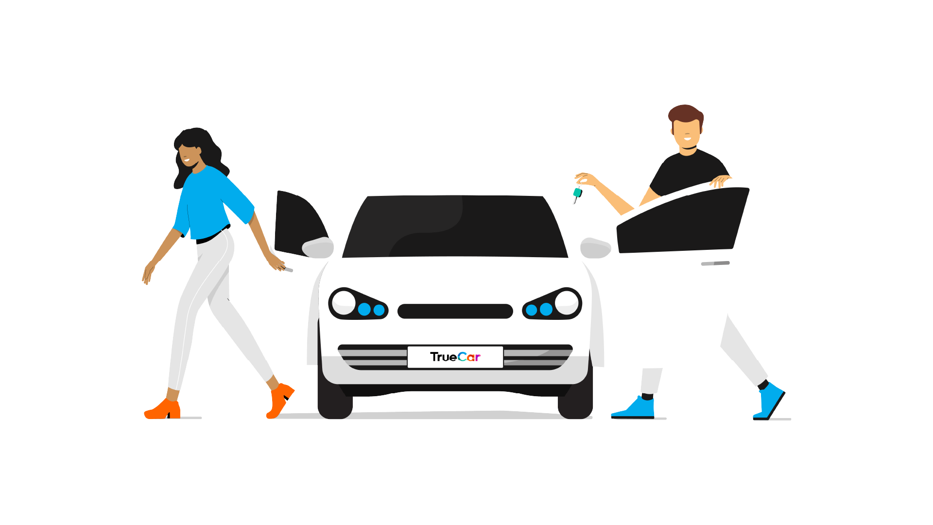
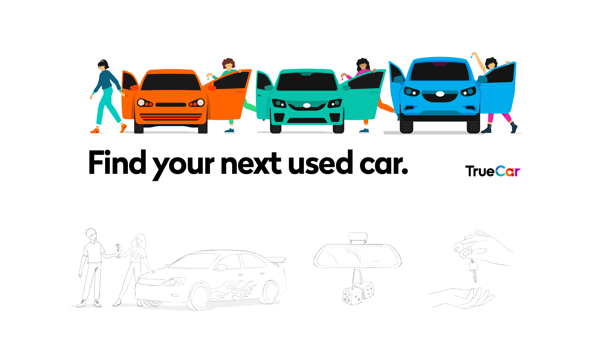
Client
TrueCar
Agency
Pentagram
Agent
Jelly London
Creative Directors
Carmen Angelillo, Guido Lambertini & Rodier Kirdmann
EP
Agusta Timotea
Illustration & Design
Rodier Kidmann, Carmen Angelillo, Ezequiel Cruz, Catarina Alves & Juan Casal
Animation
Guido Lambertini, Erik Riguetti & Juan Huarte
Jelly London
EP
Erica Panasci
LP
Laura Thomas, Ross Frame & Julia Menassa
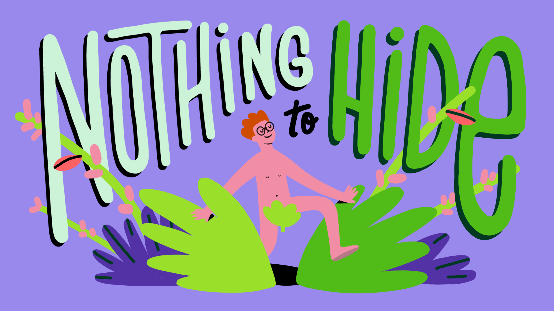
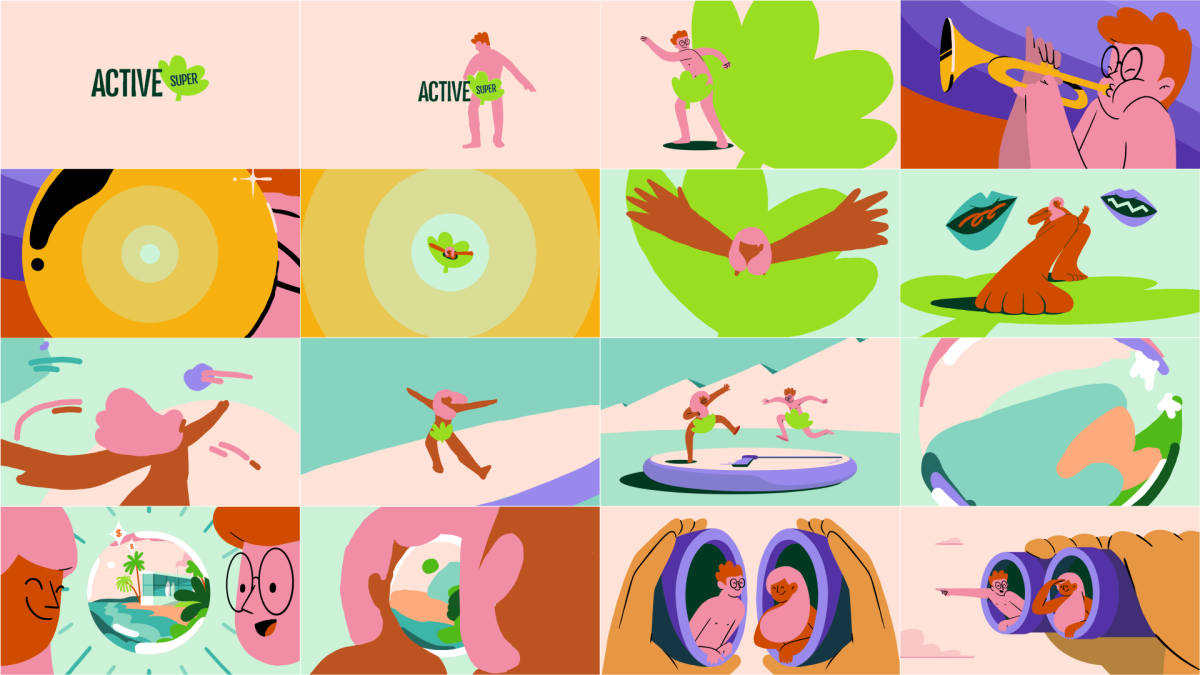
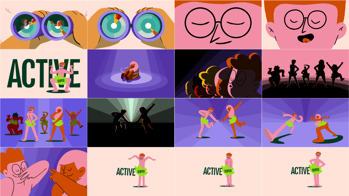
Australia's first naked investment funds
Client
Active Super
Agency
Apparent Sydney
Creative Directors
Carmen Angelillo, Guido Lambertini & Rodier Kirdmann
EP
Agusta Timotea
Animation Director
Guido Lambertini
Art director
Rodier Kidmann
Illustration
Rodier Kidman & Bianca Sangalli-Moretti
Lead animators
Josep Bernaus & David Maliboo
Additional Animation & Cleanup
Gabriel Goga, Julieta Soloaga, Bianca Sangalli-Moretti & Margarita Rojas
Compo
Guido Lambertini
Story
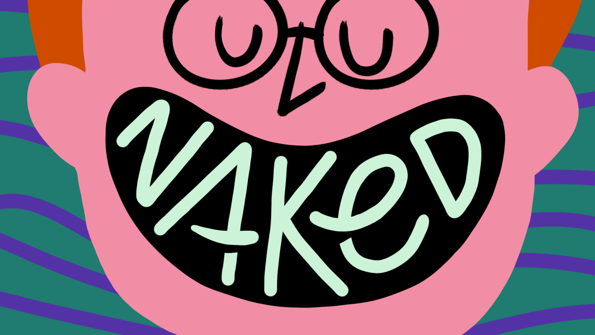
Client: The spot is a catchy song with naked characters dancing.
Niceshit: When do we start?
We can’t lie, we are spoiled enough to often get really fun and creative briefs, but this one took it to the next level where we were asked to use the company logo to cover the private parts of this naked, funky dancers.
The brand manages money and investments and their main selling point is that they are fully transparent, they got nothing to hide - and so they confidently dance and move around the space just fearless.
It was so much fun to develop this, maybe too fun for a superfund investment company? They ended up not using any of this, ha! So let’s consider this a ‘directors cut’.
We needed to put it out…we also have nothing to hide!
Playful and bold character set for the old bird
Client
Production company
Jelly London
EP
Erika Panasci
Creative directors
Carmen Angelillo, Rodier Kidmann & Guido Lambertini
Animation
Guido Lambertini & Ana Freitas
Story
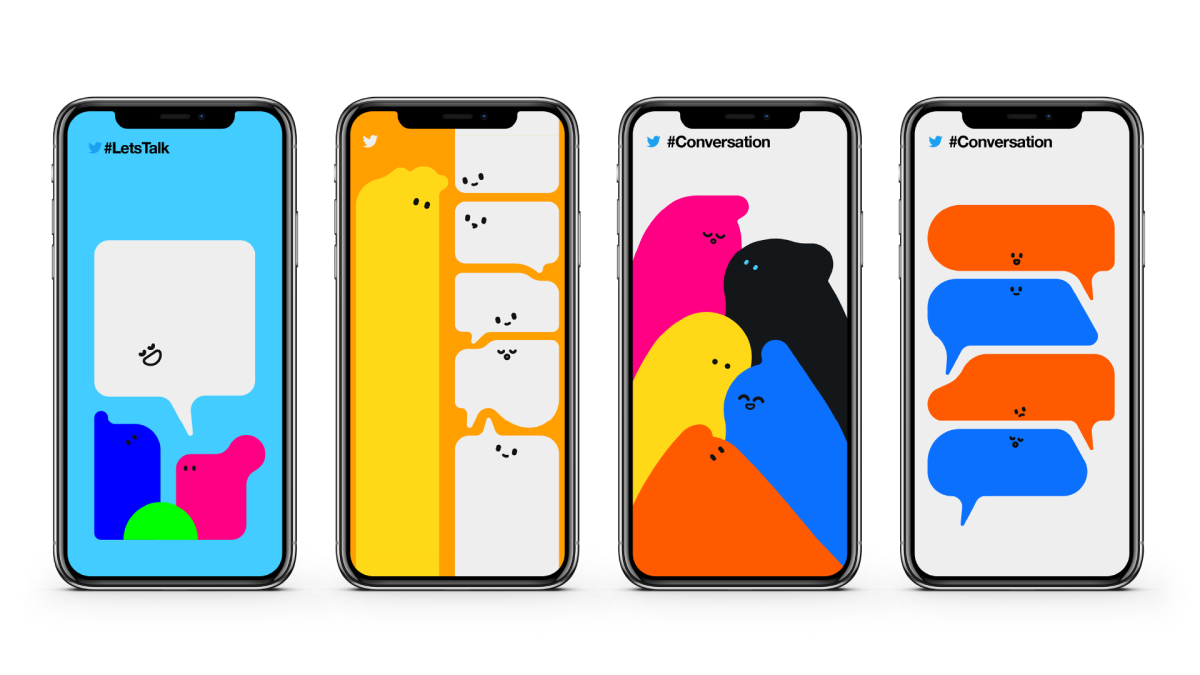
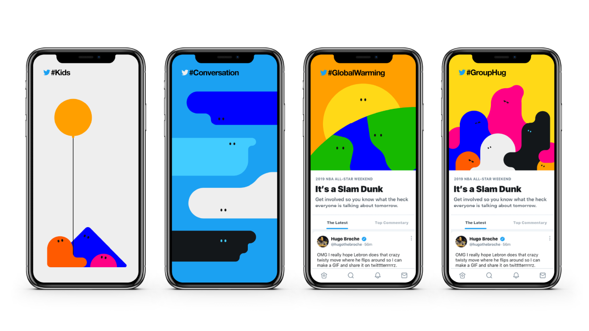
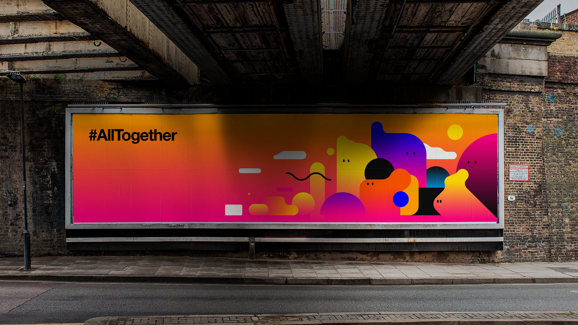
During the first trimester of the year 2018, we had the pleasure of working with the design team at a well-known tech platform (you probably know it as Twitter, now X) on some internal tests. The goal? To develop graphics and movement that could capture their community of users and the spirit of the brand.
At the core of the design thinking was the idea of a constantly shifting space, made by the many conversations and passions coming together. We played with simple shapes and a bright but limited color palette, trying to strike a balance between something emotive and clever. Each scenario was designed to work at first glance, but also reward a second look that makes you go: “aaahh.”
We ended up developing the start of a visual language that could communicate pretty much anything in a simple and graphic way. And while it won’t be used after all, we’re really proud of it and super grateful for the experience.
Through this series of images, we tried to represent all sorts of conversations in a conceptual way.
Even though the project didn’t go live, it was an amazing playground to explore ideas, try new things, and push our visual thinking.
Awareness and truth about algorithms
Client
RSA London
Agency
RSA London
Words
Cathy O’Neil
Design
Carmen Angelillo, Rodier Kidmann, Guido Lambertini
Animation
Guido Lambertini, Carmen Angelillo, Rodier Kidmann, Leo Campasso
Sound design
Lola Richter
Intro & Outro
Cabeza Patata
Sound
Anthony Ing
Story
We were commissioned by RSA London to develop an animation to go along with the words of the always amazing Cathy O’Neil. She is a kickass mathematician, and in this excerpt, she dives into algorithms, how they affect us, and how they’re not always as fair as we’d like them to be.
Our goal was simple: bring Cathy’s words to life with animation. We wanted to make her ideas visual, playful, and a bit surprising.
We had a blast experimenting with lots of different styles and techniques – mixing textures, shapes, and motion to keep the energy dynamic and engaging.
Result
A 2:40-minute video that flies by even though it’s talking about something as geeky as algorithms. Full of different techniques, it keeps things fun and interesting, and before you know it, you’ve learned a thing or two without even noticing it.
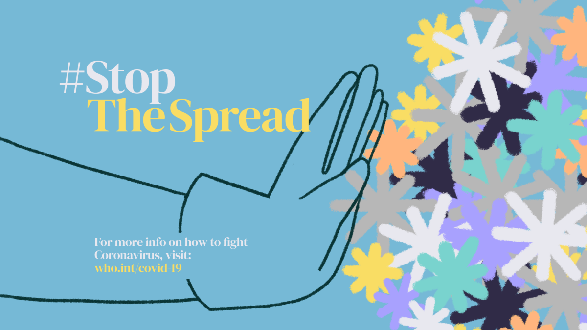
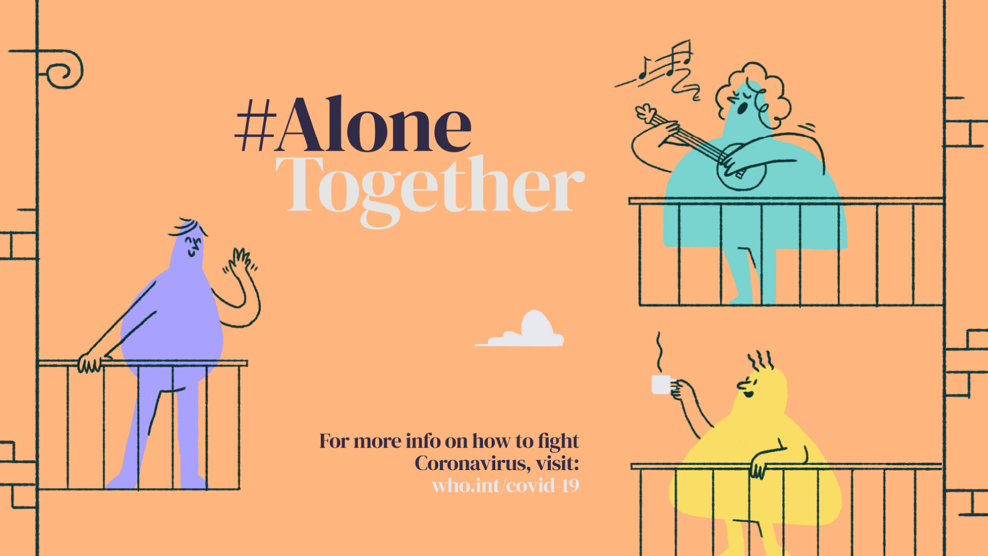
Five ways to greet people in times of Covid
Client
Five Ways
Written by
Guido Lambertini & Sarah-Grace Mankarious
EP
Agusta Timotea
Art Direction & Design
Carmen Angelillo & Rodier Kidmann
Animation & Cleanup
Guido Lambertini, Rodier Kidmann, Carmen Angelillo, Ana Freitas & Juan Huarte
Music & Sound Design
Aimar Molero
Story
In early 2020, as the world began to grasp the seriousness of the pandemic, we found ourselves facing a new reality. Our lives and habits were disrupted, and we were learning to take new measures and adapt day by day. We felt the need to address a simple yet significant change: how we greet each other. This project was born only a few weeks back when Coronavirus started to hit harder in Europe – and especially in our heads – as we began to understand something serious was going on.
So, we created "Five New Ways to Greet People in Times of Covid-19"—a playful animation aimed at spreading positivity and awareness during challenging times.
Idea
With hugs, handshakes, and kisses suddenly off-limits, we tried to offer lighthearted alternatives. Our goal was to provide a moment of lightness and encourage safe interactions through humor and creativity.
Result
"Five Ways" got a few laughs, raised a bit of awareness. It served as a reminder that even in difficult times, creativity and humor can bring us together.
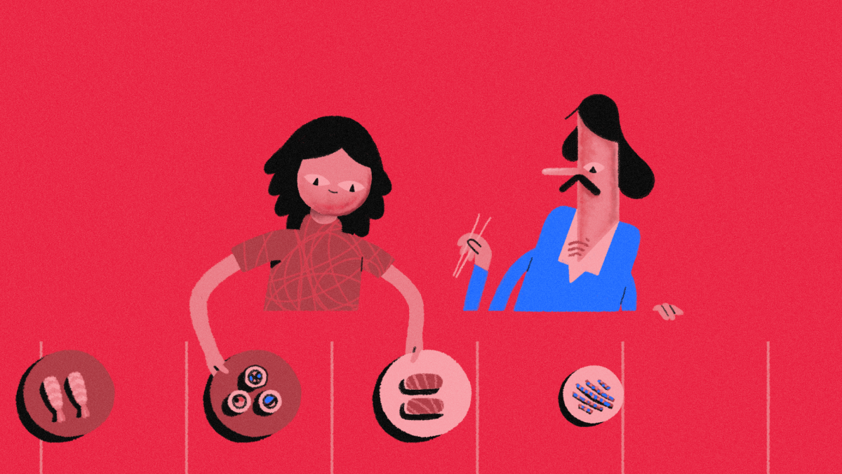
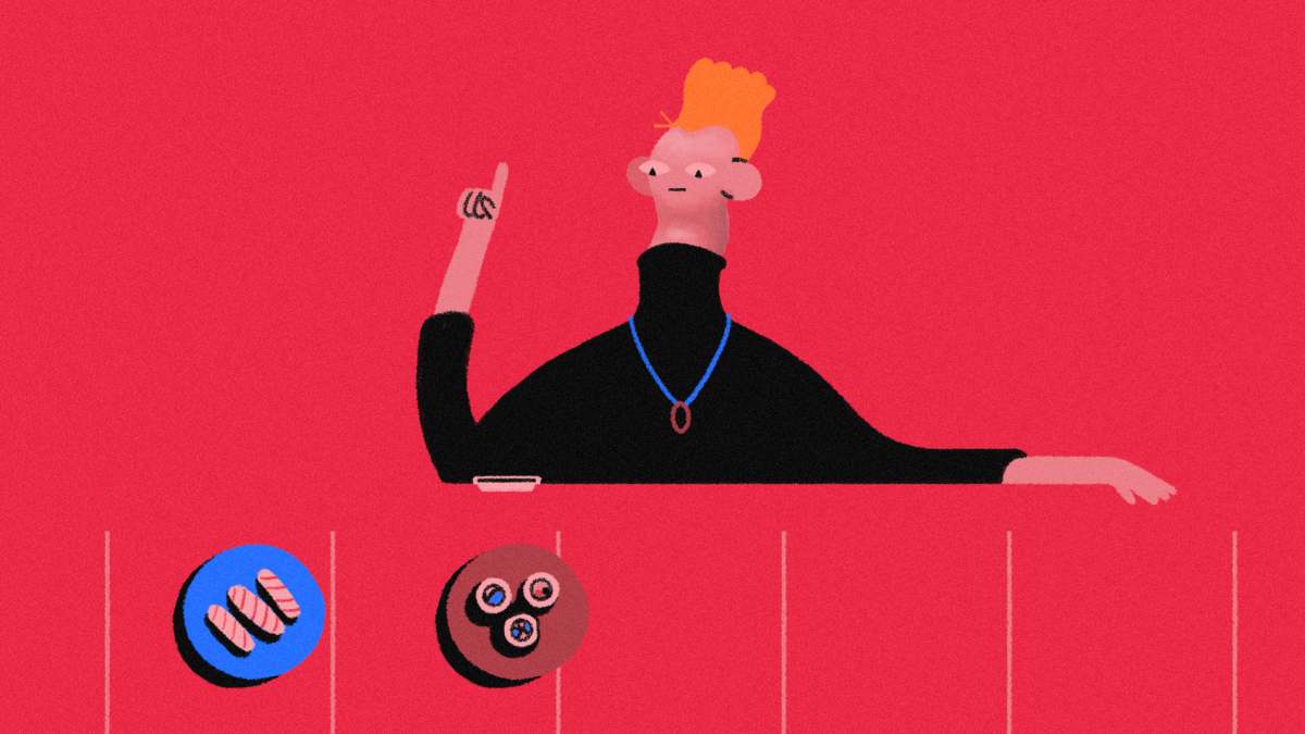
Cool ID for a cool bank
Client
DBS Singapore
Creative Directors
Carmen Angelillo, Guido Lambertini & Rodier Kidmann
Art Direction & Illustration
Rodier Kidmann
Storyboard & Animatic
Guido Lambertini
Lead Animator
Leo Campasso
Story
You wouldn’t expect something this quirky and cool for a bank, but that’s exactly what DBS in Singapore embraced. We got pulled into a bigger series produced by our partners at Final Frontier Asia, and the brief that they handed us was truly open: “conveyor belt.”
Given the freedom, we jumped in and crafted a little micro-story around that idea. Our goal was explore the limits of traditional animation adding volume and subtle 3D feel through hand painted brushes — creating depth without losing that quirky, human touch.
We leaned into surprise and unpredictability. Expressive faces, unexpected scenes — no sushi here, just fun and weird moments.
A graphic journey into London's Soho
Client
Fora Workspaces
Design
Rodier Kidmann & Carmen Angelillo
Animation & Clean Up
Guido Lambertini, Erik Righetti & Carmen Angelillo
Music & Sound Design
Facundo Capece & Lola Ritcher
STORY
We were commissioned by the London creative agency Anyways to make a fun spot for one of the newest Fora Workspaces locations. This time: Soho, London. And wow, did we have a great time!
Using geometric shapes and seamless transitions, we took a little stroll through Soho’s history, discovering all sorts of unexpected facts along the way.
Did you know it was London’s first royal park, named after a hunting cry? SOOHOOO Or that it was the place where John Snow ended the infamous Cholera outbreak?
From Mods to Rockers, from Punks to New Romantics, Soho has been the birthplace of some of the most iconic subcultures. We wanted to capture that energy, that constant mix of creativity, rebellion, and vibrancy. Every frame was designed to feel light, modern, and full of character – just like the neighborhood itself.
RESULT
Soho has always been full of brilliance, so we wanted to bring that to life with geometric shapes, seamless transitions, bold colors, and a playful rhythm that moves you through time. A tiny animated journey that captures the neighborhood’s vibe, creativity, and spirit – just right for the launch of Fora’s newest workspace.
R.I.P MTV, at least we had fun!
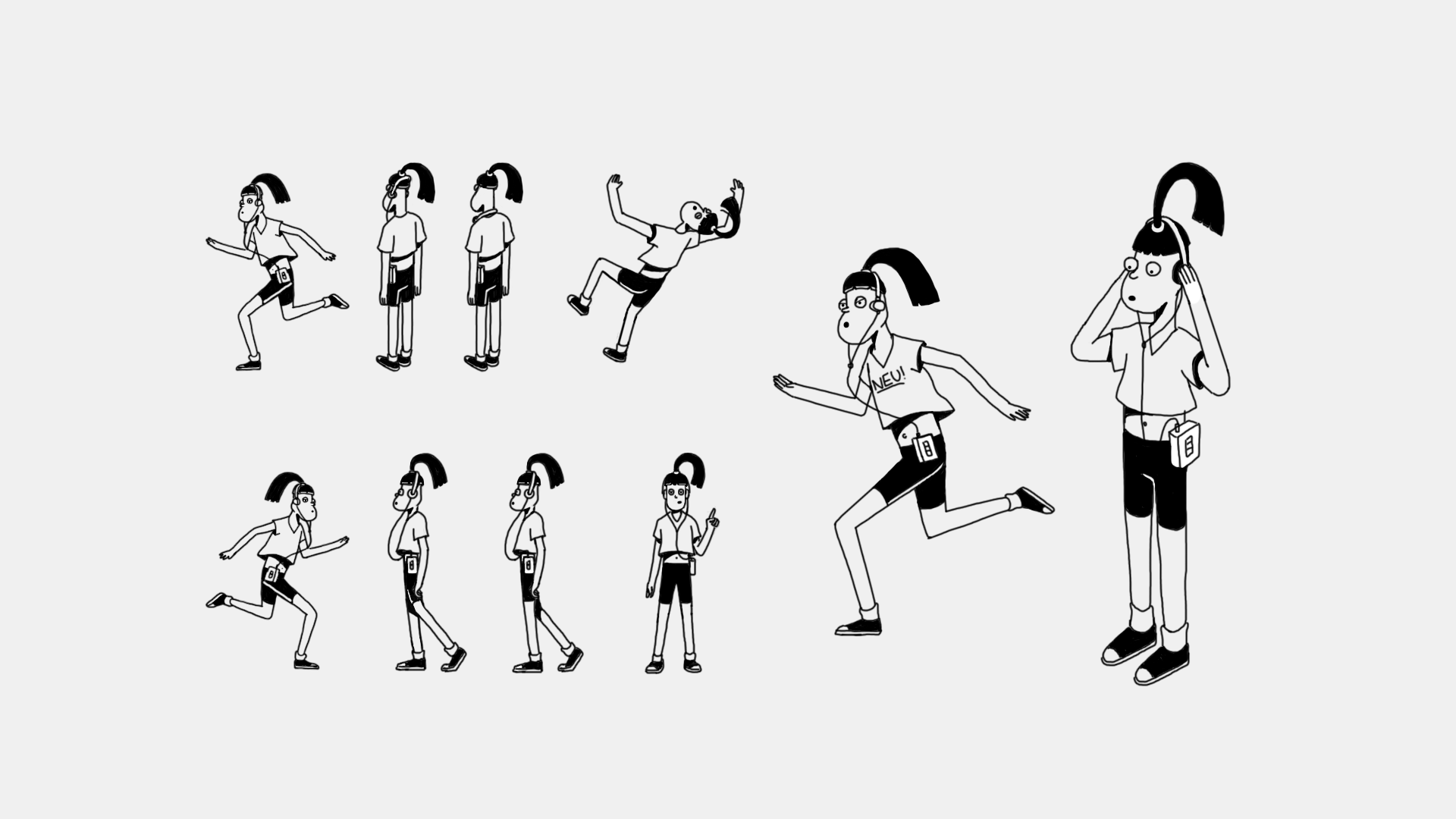
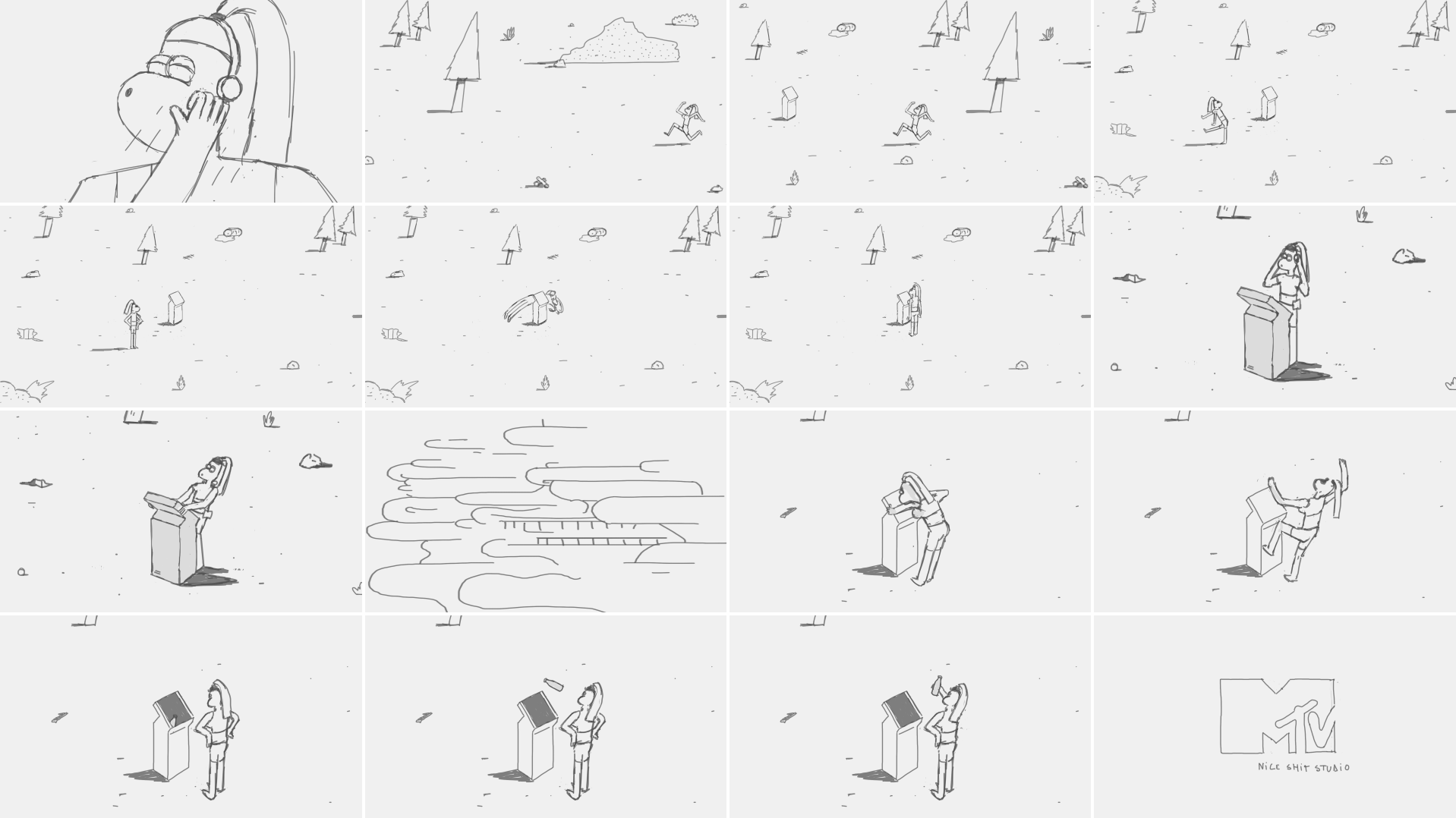
Client
MTV
Concept, Direction, Illustration & Animation
Carmen Angelillo, Rodier Kidmann & Guido Lambertini
Mtv International VP
Creative Director: Sean Saylor
Creative Director
Sean Saylor
Mtv World Design Studio BA
Creative Director
Maxi Borrego
Design Manager
Charlx Alemañy
Director Production & Operations
Josefina Marfil
Production Manage
Delfina Chiesa
Producer
Camila González
Story
MTV International invited us to participate in their 2016 rebrand through the Artist ID Series. We were thrilled by the opportunity — and even more excited when we saw the brief.
The only guideline: it had to involve technology. Beyond that, we had full creative freedom to explore and experiment.
Result
We asked ourselves: What would a sporty cyberpunk human in a post-apocalyptic world have to do just to get a drink?
Our answer: she simply smashes her face into the screen — and that’s it, she’s good to go.
My Favorite Music Memory - Daniel Kessler
Client
Primavera Sound
Creative directors
Carmen Angelillo, Guido Lambertini & Rodier Kidmann
Music & Sound Design
Aimar Molero
Design
Rodier Kidmann, Carmen Angelillo & Guido Lambertini
Animation
Guido Lambertini, Carmen Angelillo, Rodier Kidmann, Olivia Blanc, Gabriel Fermanelli, Leo Campasso
Clean-up Assistance
Macarena Ortega
My Favorite Music Memory Series
Creative Direction
Alex Julia
Original Idea
Joan Pons
Executive Production
Igloo Films
Special Thanks to Daniel Kessler
STORY
We were completely stoked when Primavera Sound invited us to take part in one of their My Favourite Music Memoryepisodes — a series where artists share the stories behind their most treasured music moments.
Our episode featured none other than Daniel Kessler, the mind behind Interpol. Getting to picture his memories and translate his words into animation was an absolute treat.
“… it was in the very late 70s…”
“… I remember seeing The Specials on Top Of The Pops. I don’t remember hearing the music, but I remember seeing this band dressed in suits — they looked great…”
“… I kinda wanted to dress like those guys. I admired them…”
That spark of admiration, that moment of discovery — it’s what this short film is all about. Capturing a fleeting childhood memory that somehow shapes who you become later on.
We wanted the piece to feel intimate and nostalgic. Each scene was carefully animated to the voiceover, letting the story breathe and unfold naturally through seamless transitions, just as you’d recall something dear from your past.
Since this was a story born from music, sound design played a huge role. We worked to keep it subtle and atmospheric — more like a hum of nostalgia than a soundtrack. Every beat and pause was guided by Daniel’s words, making the animation feel like it was moving in rhythm with his memories.
IMPACT
This collaboration with Primavera Sound was a small but special one — a project that reminded us why we love doing what we do: bringing stories, feelings, and memories to life through animation. A heartfelt nod to how music shapes who we are.. And, honestly, as music lovers ourselves, it felt extra special to be part of something that celebrates it so beautifully.
Join the ride to Bose AR
Client
Bose
Production company
Jelly London
Creative Directors
Guido Lambertini, Carmen Angelillo & Rodier Kidmann
Executive Producer
Erika Panasci
Line Producers
Laura Thomas, Kavita Dagger & Filipa Kinomoto
Art Direction
Erika Panasci
Line Producers
Laura Thomas, Kavita Dagger & Filipa Kinomoto
Art Direction
Rodier Kidmann
Animation Direction
Guido Lambertini
Animatic
Guido Lambertini & Leo Campasso
Cel Animation
Leo Campasso, Juan Huarte & Eze Cruz
Clean Up
Eze Cruz & Toni Sala
3D Animation
Guido Lambertini
Edit & Compositing
Guido Lambertini & Ana Freitas
Music & Sound Design
Facu Capece & Lola Ritcher
Special thanks to Juan Molinet for his help at the treatment stage!
Story
We teamed up once again with our fantastic partners at Jelly London to create a clean yet energetic animated film teasing Bose’s AR offering.
It’s always a pleasure to work with brands we genuinely use and admire—and Bose is definitely at the top of that list.
Since 1964, Bose has built a reputation for delivering the sharpest sound through beautifully designed products, so we wanted to carry that same finesse into this animated teaser.
Following the stylishness of their existing photo-led campaigns, we crafted a flowing, clean, and elegant graphic style with seamless transitions that guide the viewer through this one-minute journey.
We’re really happy to share this one—a perfect blend of 3D, motion graphics, and frame-by-frame animation, all tied together with a fantastic soundtrack we created just for it.
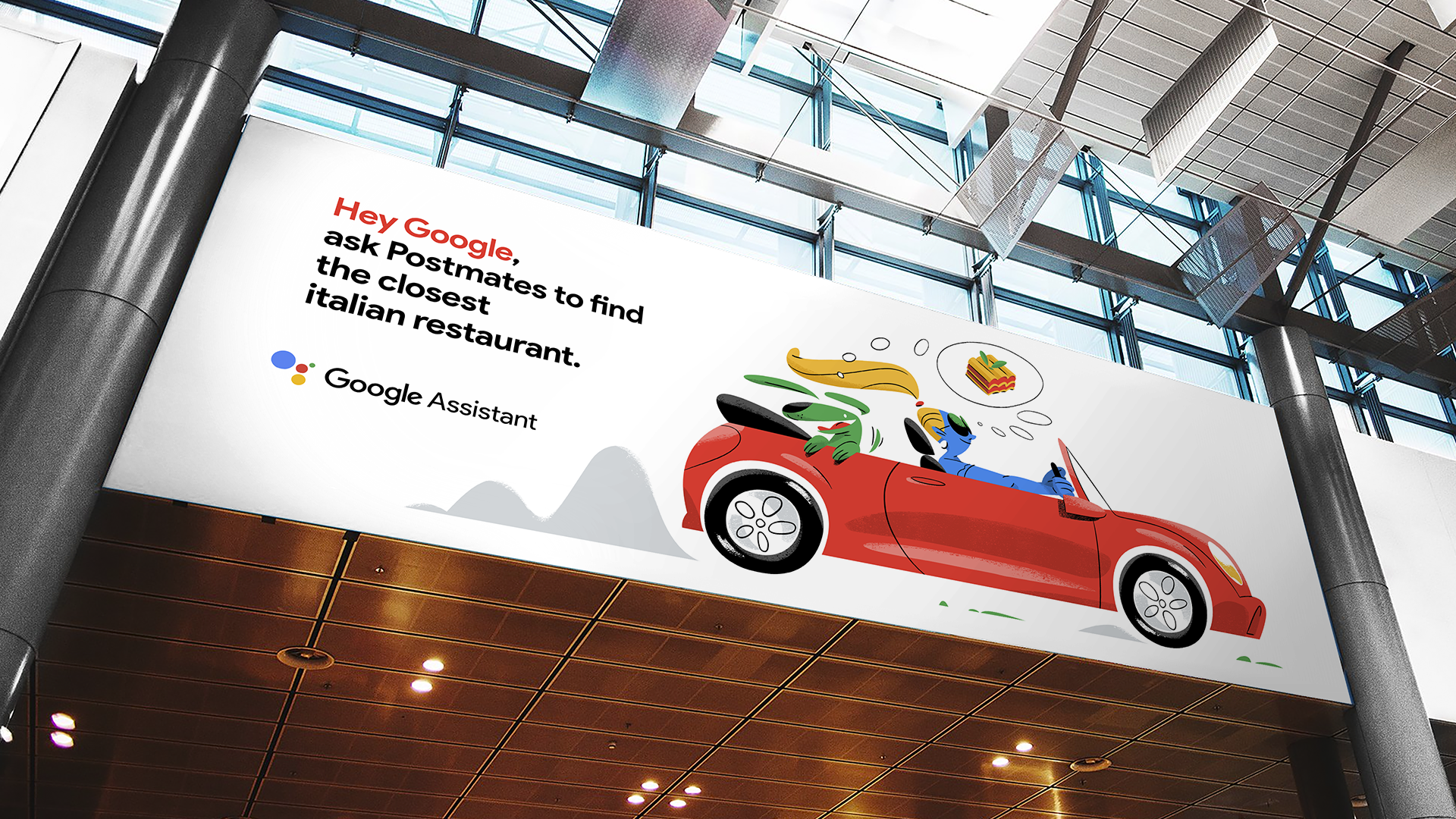
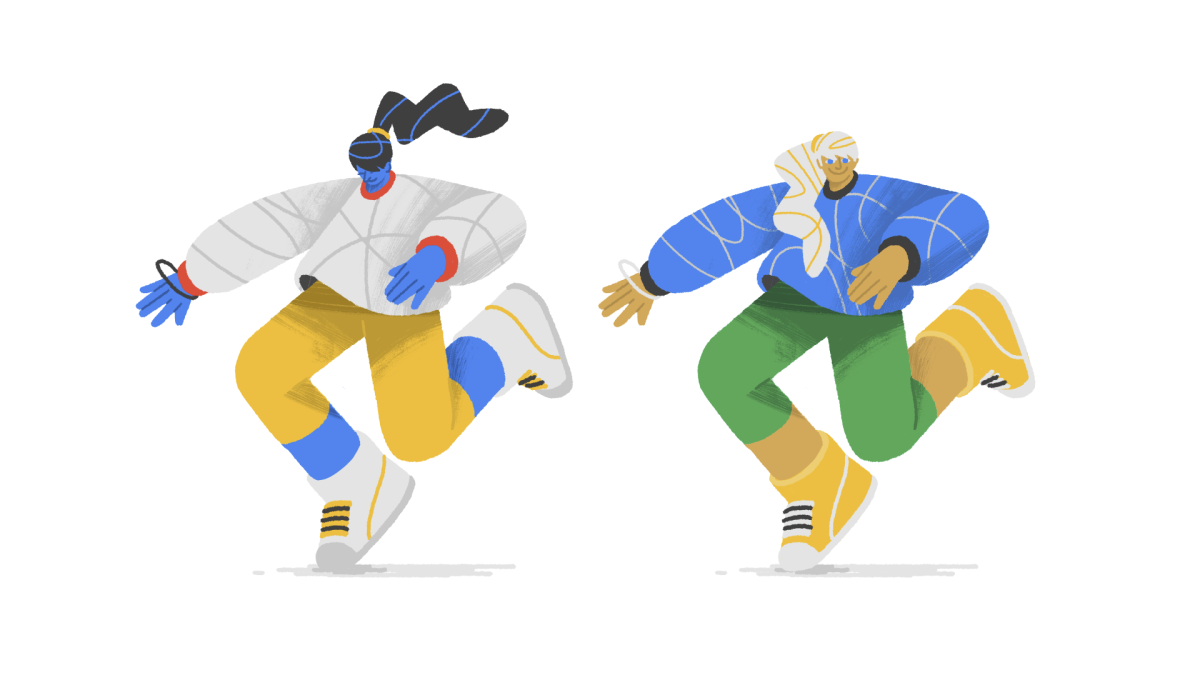
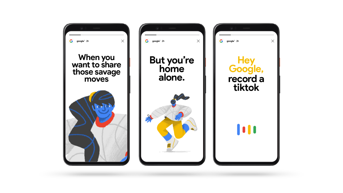
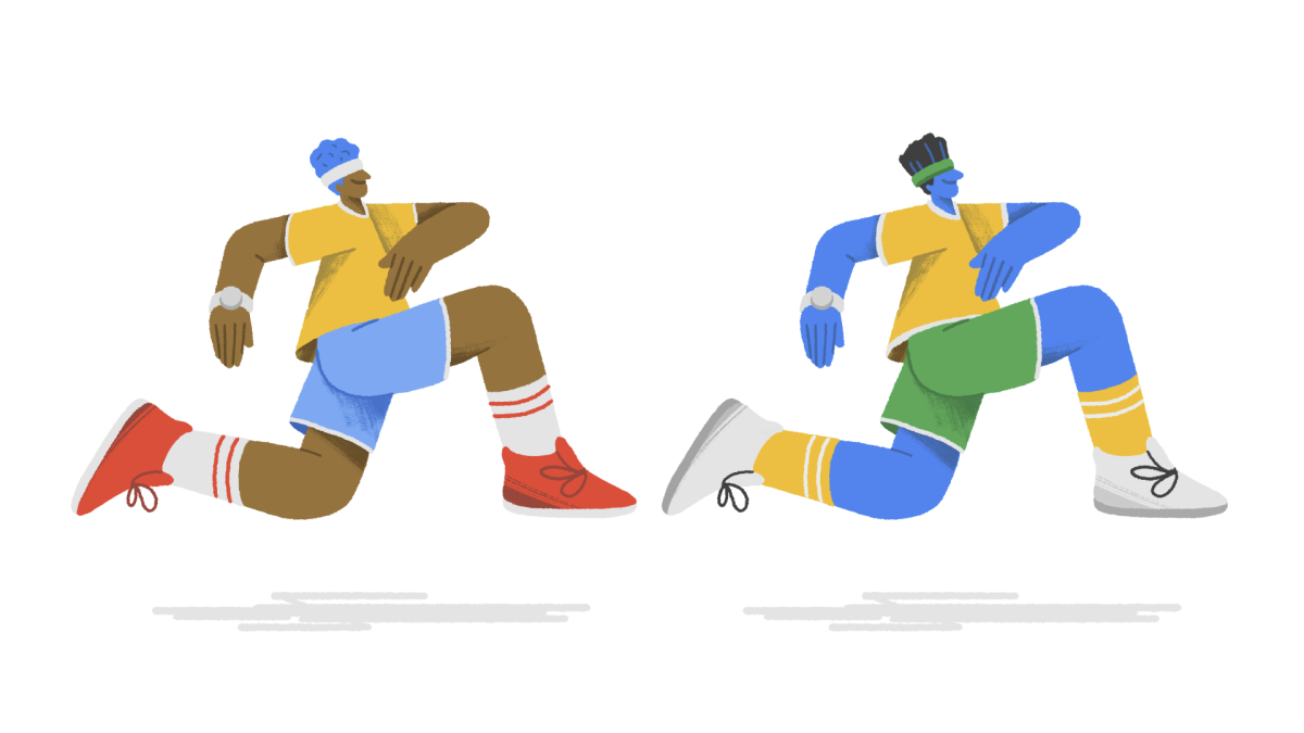
Changing perspectives with Google Assistant’s new app integration
Client
Google Assistant
Agency
Art&Letters
Production
Agressive & Niceshit Studio
Exec. Creative Director
Dan Shapiro
Creative Directors
Carmen Angelillo, Rodier Kidmann & Guido Lambertini
Producers
Agusta Timotea, Dustin Pownall & Won Cha
Art Direction
Rodier Kidmann, Carmen Angelillo
Design & Illustration
Rodier Kidmann, Elda Broglio, Nuria Boj, Franco Vecchi & Miguel Angel Camprubí
Animation Direction
Guido Lambertini
Cel Animation & Clean up
Juan Nadalino, Ezequiel Cruz, David Maliboo, Ana Freitas, Margarita Rojas & Libardo Bohorquez
Animation & Compositing
Ana Freitas & Guido Lambertini
Additional Editing
Dustin Pownall
Music & Sound Design
Wesley Slover
Music & Sound Design Dir. Cut
Facundo Capece
Oportunity
To launch Google Assistant’s new app integration, the goal of the spots was to show how you can easily use the app hands free, through voice control. For this, we created a series of charming Insta-films. The idea was to take Google’s iconic color palette and evolve it — bringing in a new cast of friendly 2D characters, fluid transitions, and dynamic animated environments.
Story
We wanted to keep everything true to “Google”: friendly, flat, instantly recognizable — but with a bit more warmth, dimension, and personality. So we developed a versatile visual system, exploring different body shapes, skin tones, textures, and line styles until we landed on something that felt fresh, modern, and grown-up while staying unmistakably Google.
Each frame was drawn by hand, giving us total freedom to design seamless transitions, expressive character movements, and flowing camera shots.
The campaign included 3 short films, each centered around one of Google’s partner apps: Nike Running, Postmates and Twitter
Result
A clean, fluid, and charming set of insta films that captured Google’s playful spirit while adding a more refined visual layer. A true blend of design precision, character warmth, and that smooth flow we love so much.
Humor is always the best medicine
Client
Mosh
Agency
Royals
Rep
Honey Mill
Creative Directors
Guido Lambertini, Carmen Angelillo & Rodier Kidmann
EP
Agusta Timotea
Art Direction & Illustration
Mark Long
Storyboard
Guido Lambertini, Rodier Kidmann, Bianca Sangalli Moretti & Mark Long
Cel Animation
Maliboo, Juan Nadalino & Ezequiel Cruz
Clean Up
Bianca Sangalli Moretti, Ezequiel Cruz, Rodier Kidmann & Carmen Angelillo
Edit & Compositing
Guido Lambertini & Carmen Angelillo
Music & Sound Design
Smith & Western
STORY
We believe one of the best ways to address sensitive issues is through humor — adding a bit of humor always helps to see things from a different point of view.
So, for this series, we created clever yet very funny spots, using real-life analogies to tackle some of men’s biggest taboos — erectile dysfunction and hair loss.
Inspired by cartoons from back in the day, and through smart and conceptual humor, we developed this hilarious TV campaign: carefully crafted with expressive inky brushes, full of imperfections and human feel.
Cartoons of this era were animated on 6s or 8s (meaning fewer frames per second), where movements felt flatter and snappier — giving the sense that the characters could never live in a real-world setting. To honor this style, we worked with hand-drawn, frame-by-frame animation, adding tons of personality to the characters’ behavior and overall charm of the campaign.
RESULT
In the end, we brought back the warmth and wit of classic animation to tell a very modern story — one that makes men feel seen, understood, and a little less afraid to fix what really matters.
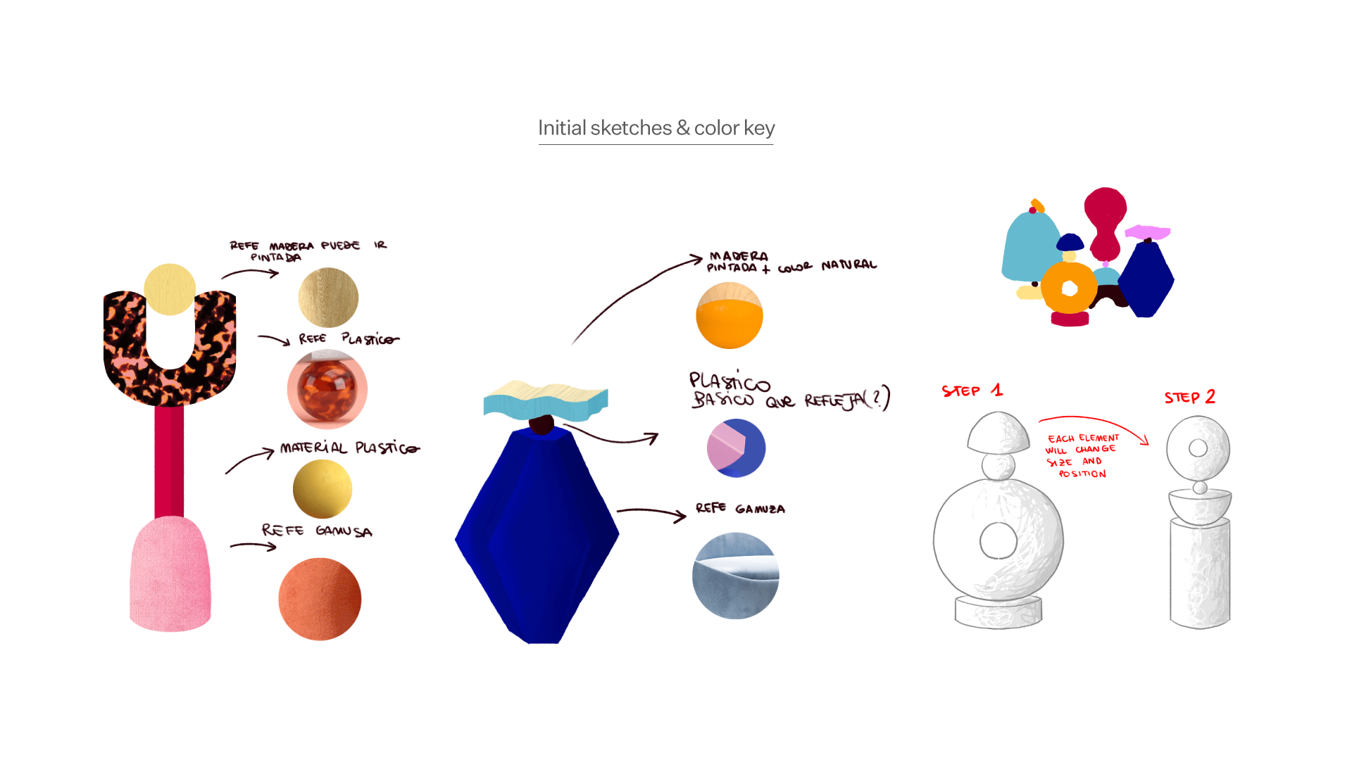
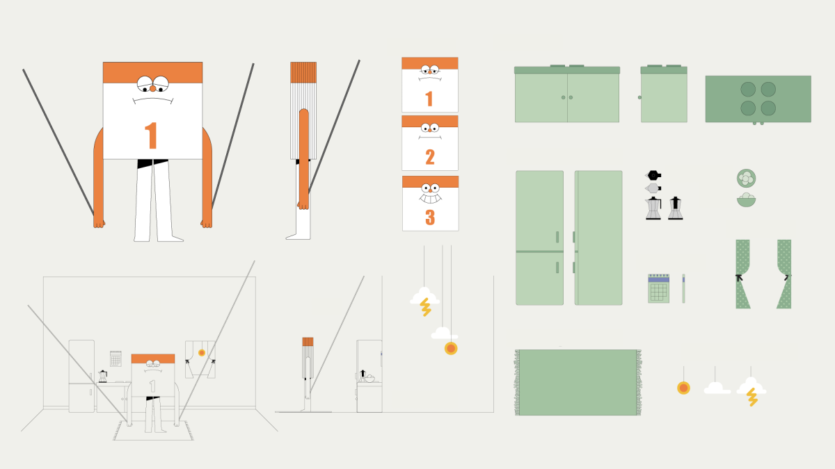
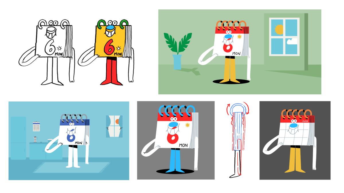
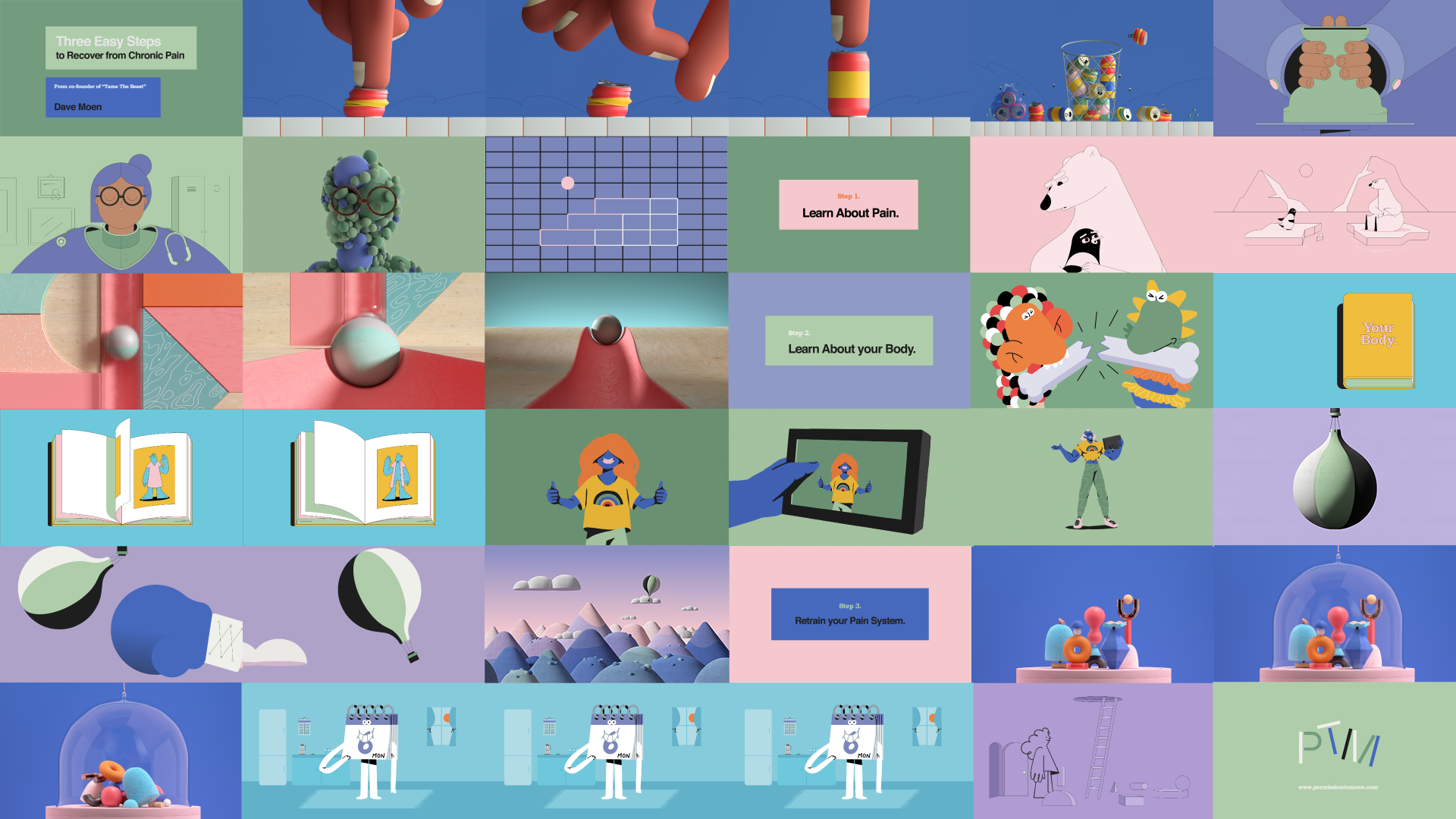
A meditative and humorous look at the world of chronic pain
Client
Permission to move
Production & Direction
Niceshit
Creative Direction
Carmen Angelillo, Guido Lambertini & Rodier Kidmann
Executive Producer
Agusta Timotea
Art Direction
Rodier Kidmann & Carmen Angelillo
Animation Direction
Guido Lambertini
Design & Illustration
Fede Kanno, Cesar Pelizer, Juan Molinet, Martín Salfity, Carmen Angelillo & Rodier Kidmann
Animation & Clean Up
Erik Righetti, Leo Campasso, Sebastian Baptista, Margarita Rojas, Martin Salfity, Cesar Pelizer, Carmen Angelillo, Guido Lambertini & Rodier Kidmann
Puppets & Set Construction
Gacy Sarubbi
DOP & Camera
Agus Verrastro & Pablo Alfieri
Music & Sound Design
Aimar Molero
BTS Photography
Agusta Timotea
Camera Assistant & BTS Edit
Bruno Cosoli
Compositing & Color Correction
Matías Mastrogiano & Agus Verrastro
Special thanks
Ingi Guðjónsson & Hamill Industries
STORY
A meditative yet humorous look at the world of chronic pain — and how to live and recover from it day by day.
Dave Moen, Australian physiotherapist and author, contacted us to collaborate on what instantly felt like a dream project. He had previously written Permission to Move, a book structured around a three-step process that bridges pain science with everyday practice. His goal was simple but powerful: to help people integrate modern pain science into their daily lives.
Dave wanted to turn those ideas into a short film — something human, hopeful, and visually engaging — where he could narrate and explain how to live and recover from chronic pain.
To capture his humanist approach, we embraced a wide mix of techniques and styles: 2D, 3D, and even some live-action puppetry.
Pain is complex — different for everyone — so working with such a variety of techniques and styles felt like the perfect way to tell this story. We loved having the creative freedom to carefully choose how each concept would be expressed visually, finding the best approach for every step along the way.
IMPACT
With this film, we wanted to give people living with chronic pain a quick glimpse of what recovery can look like — a light, hopeful entry point into a topic that’s often heavy and misunderstood.
By combining humor, empathy, and clear visual storytelling, we hope this piece reaches viewers who recognized themselves in it and found a sense of relief and curiosity to learn more.
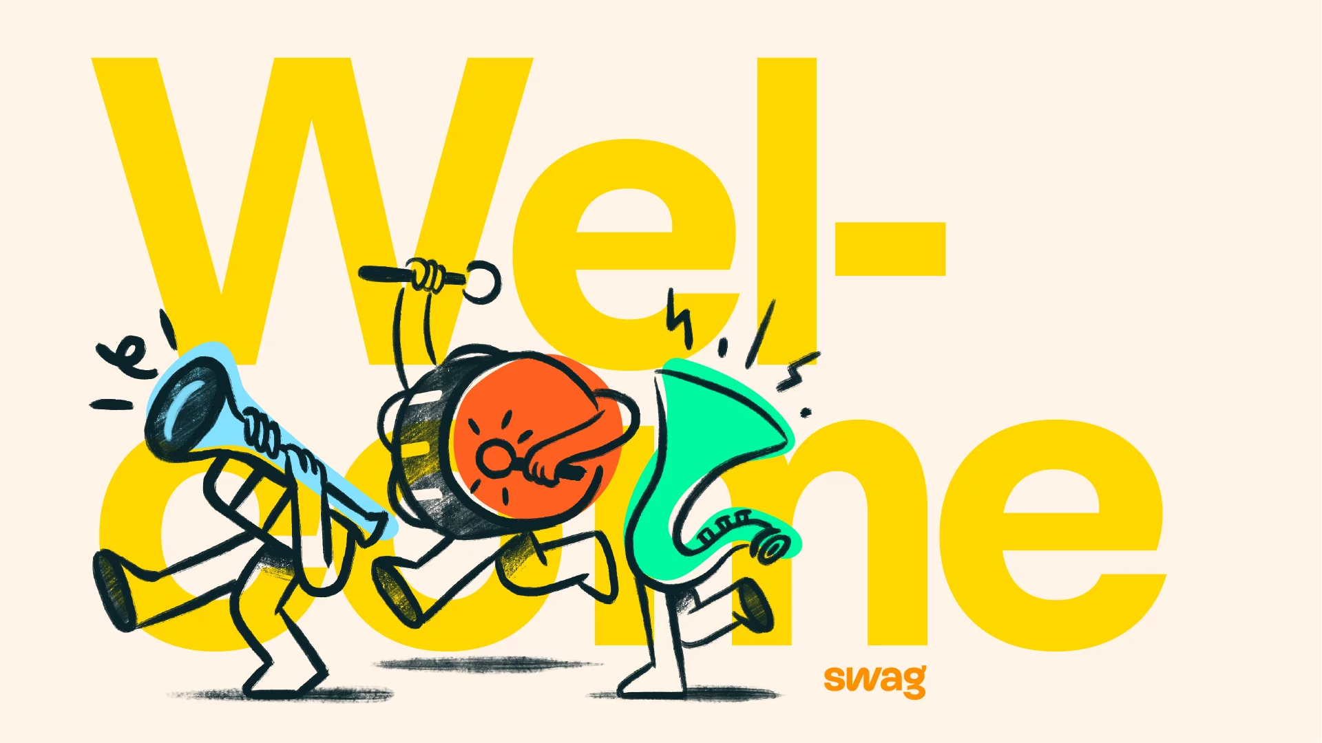
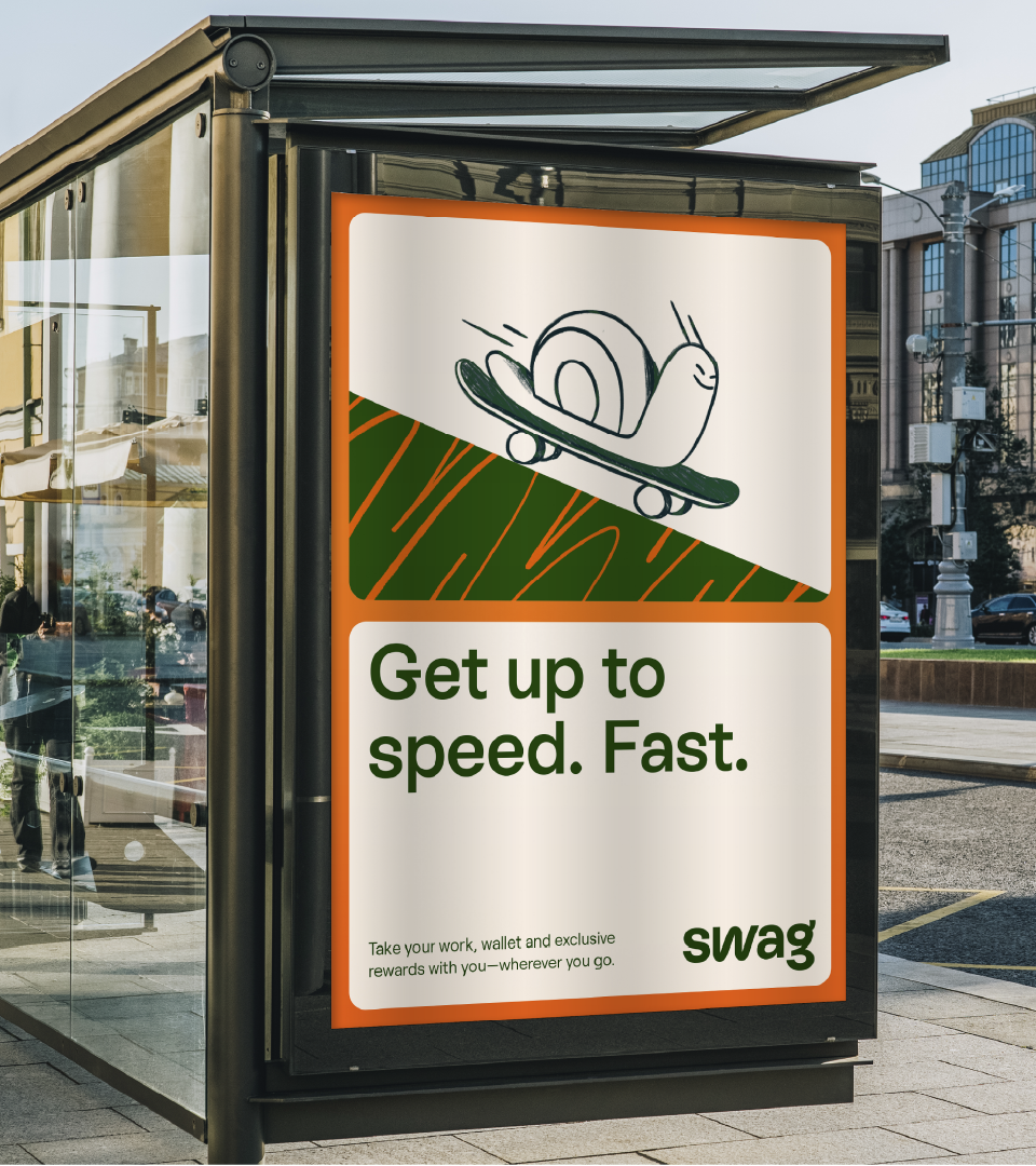
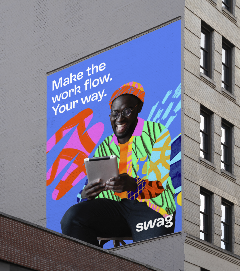
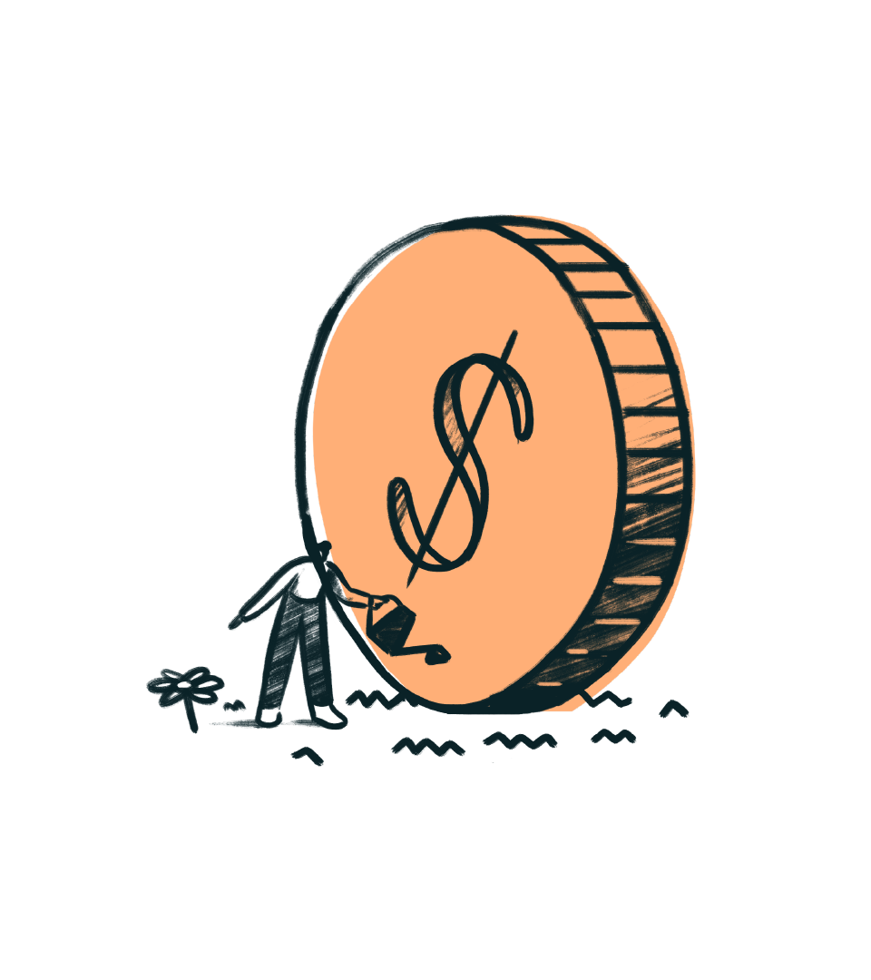
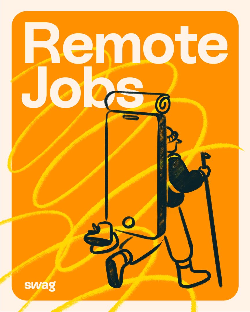
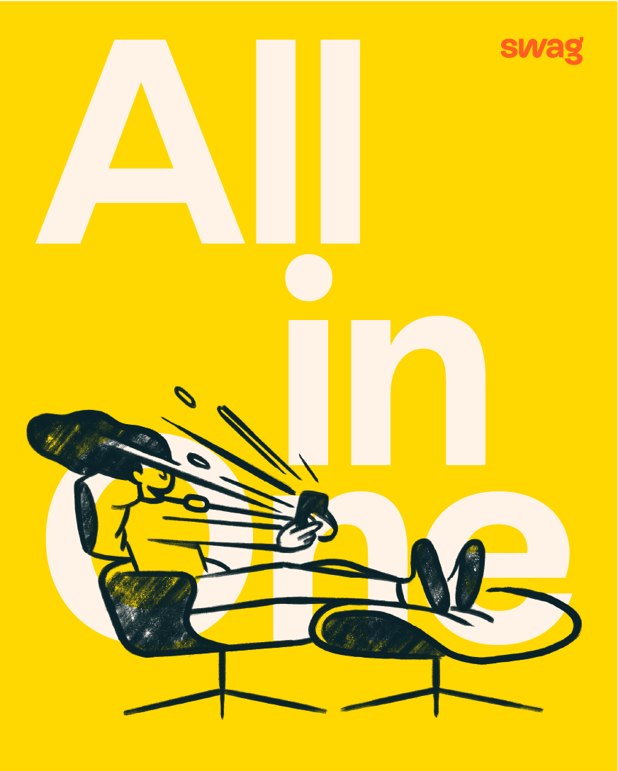
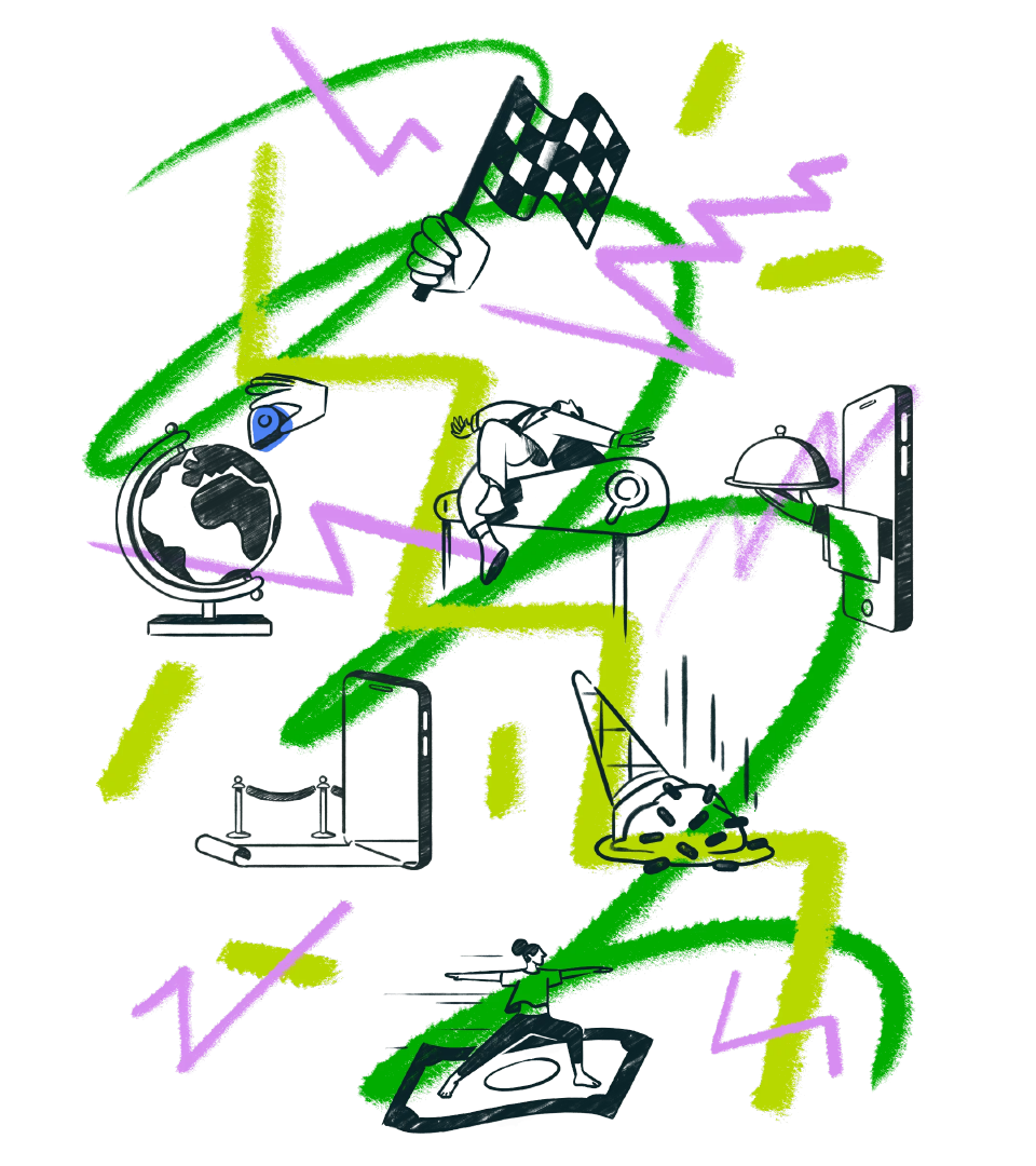
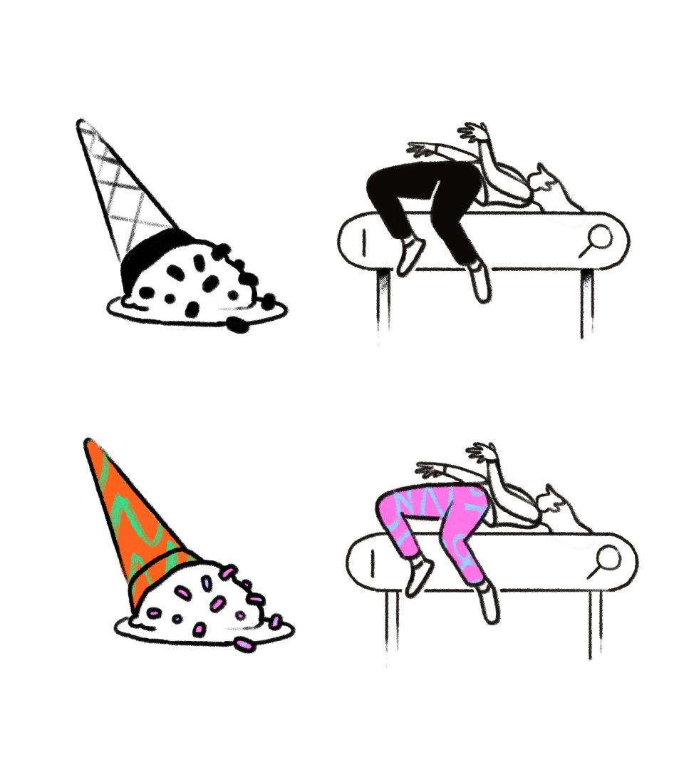
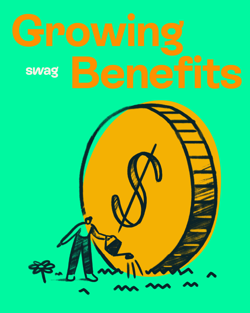
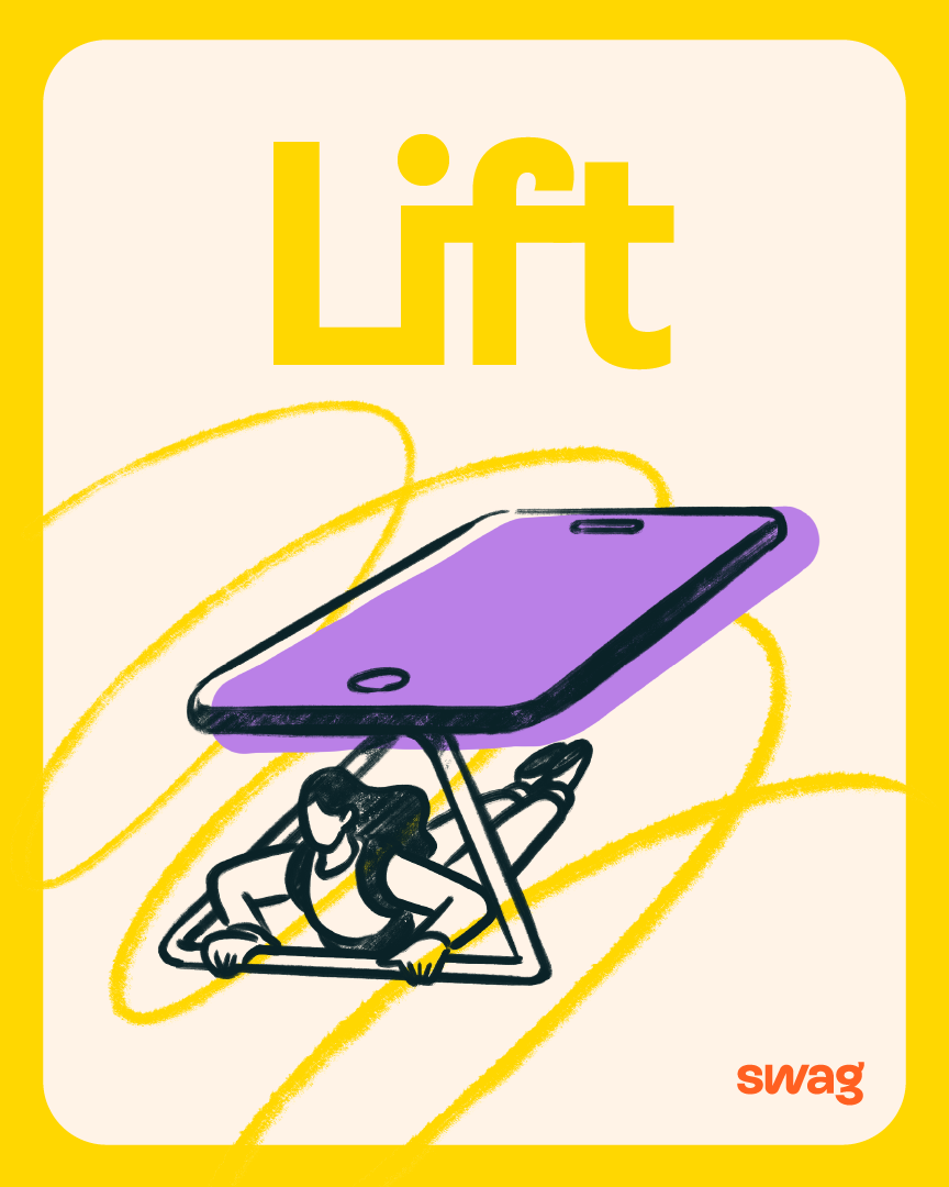
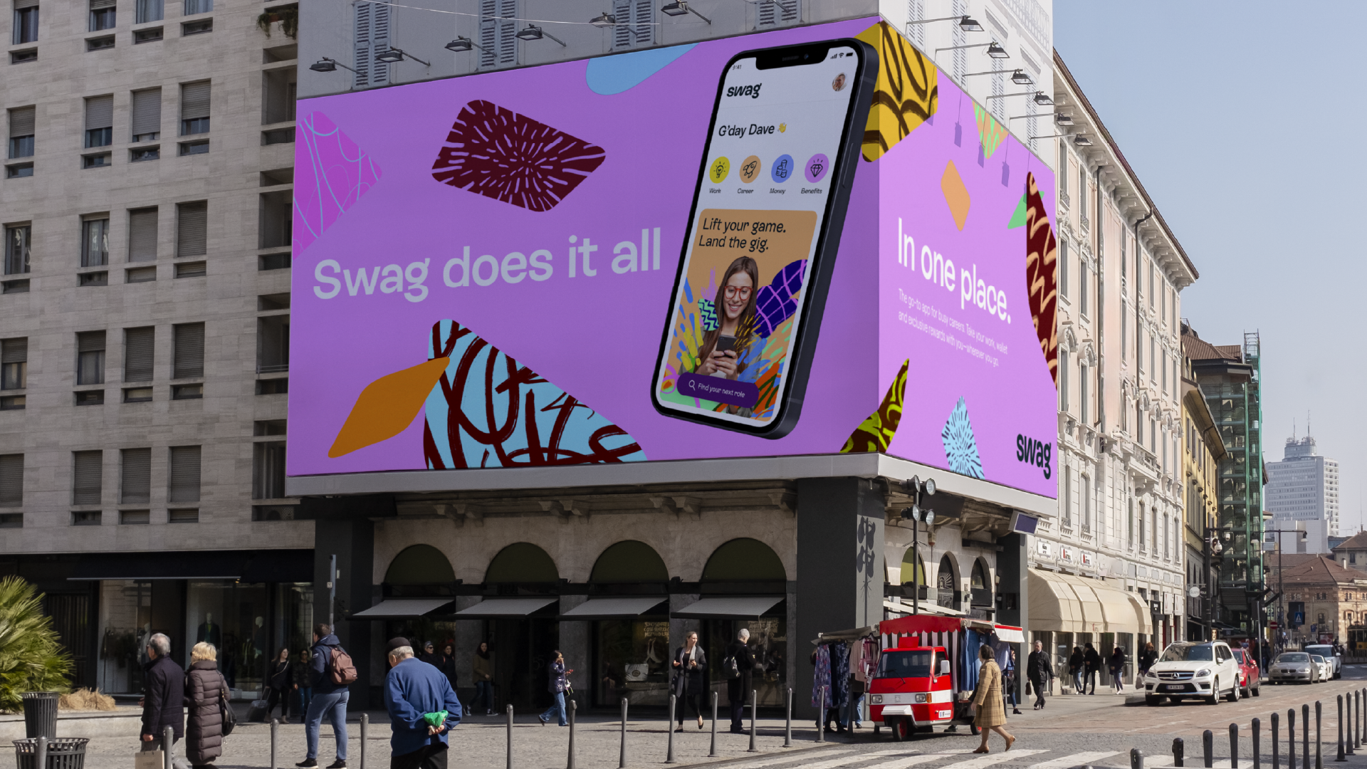
Branding for Swag employment app
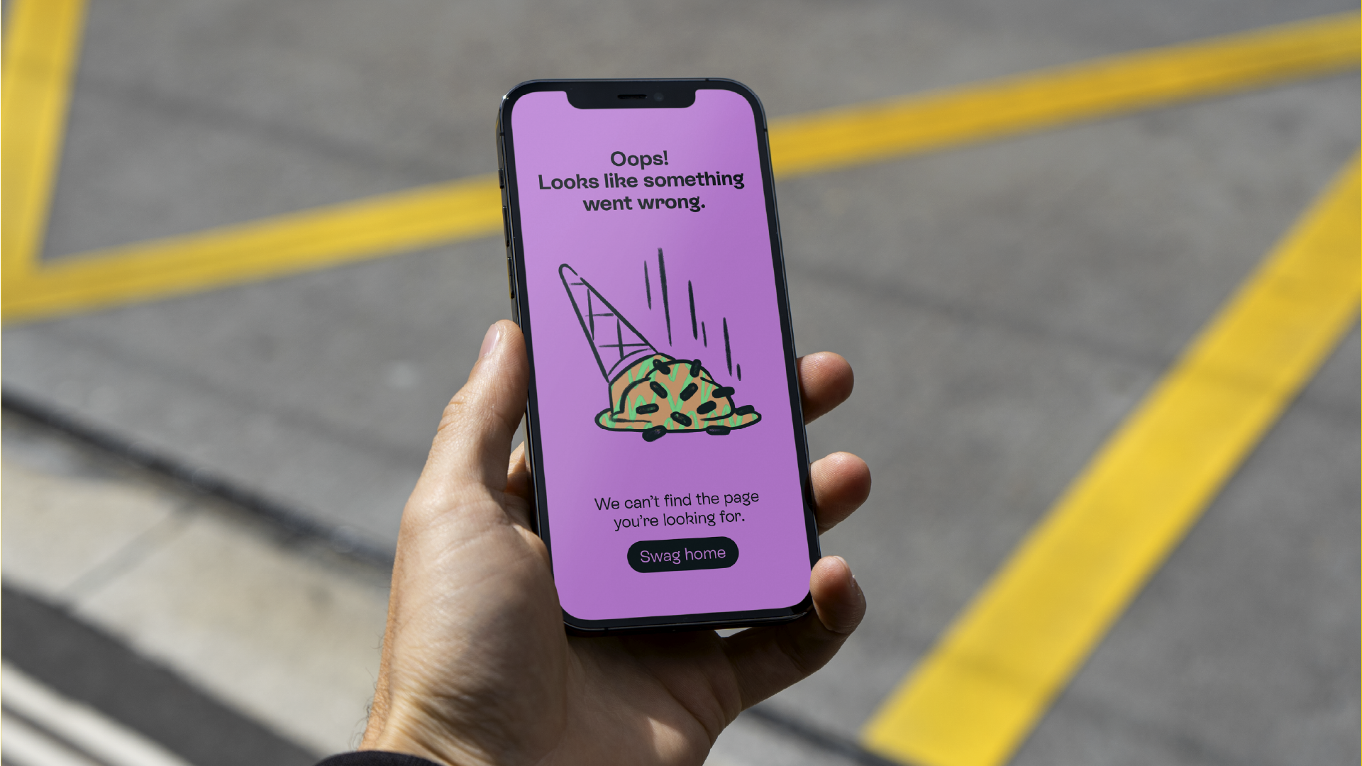
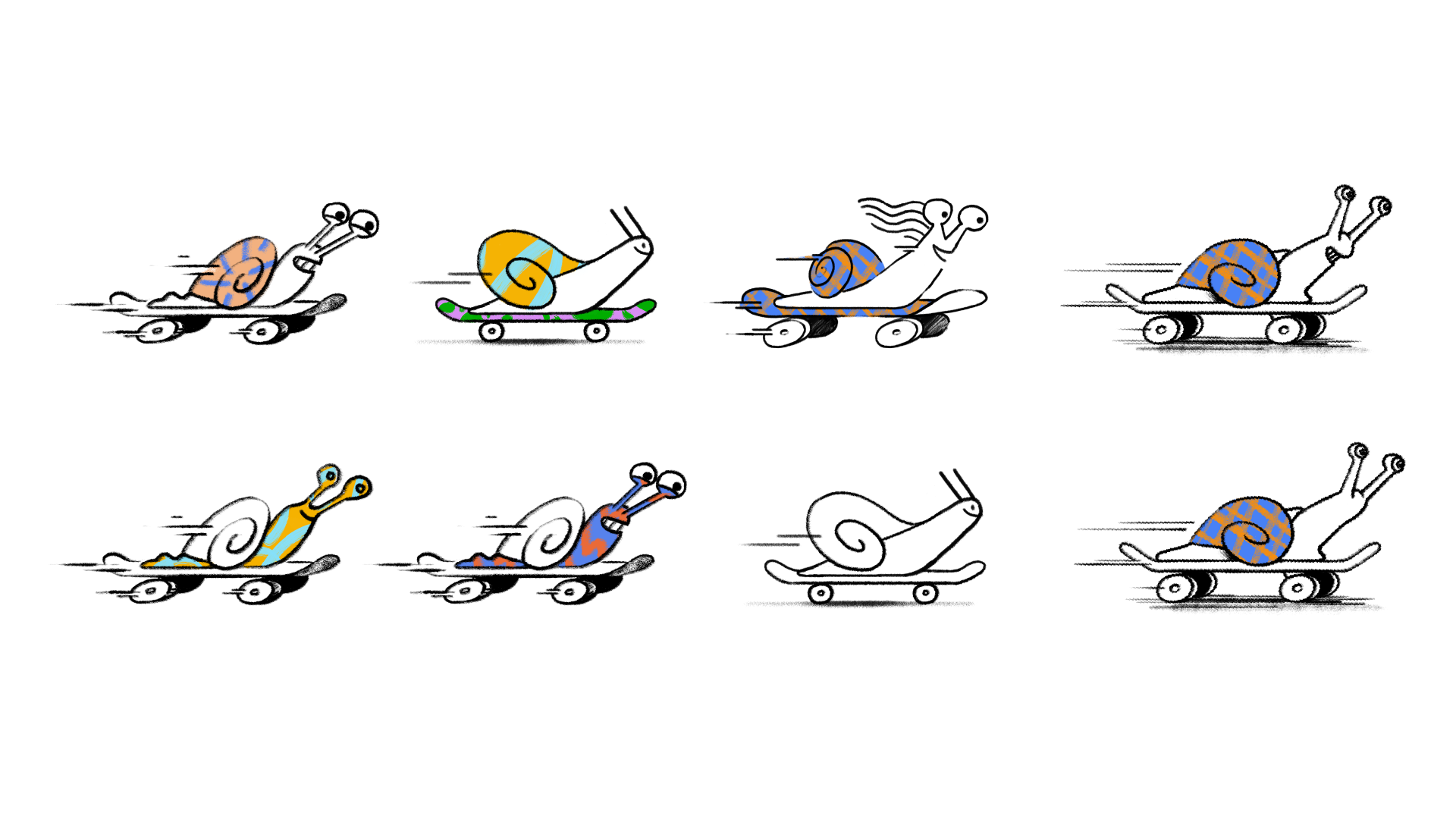
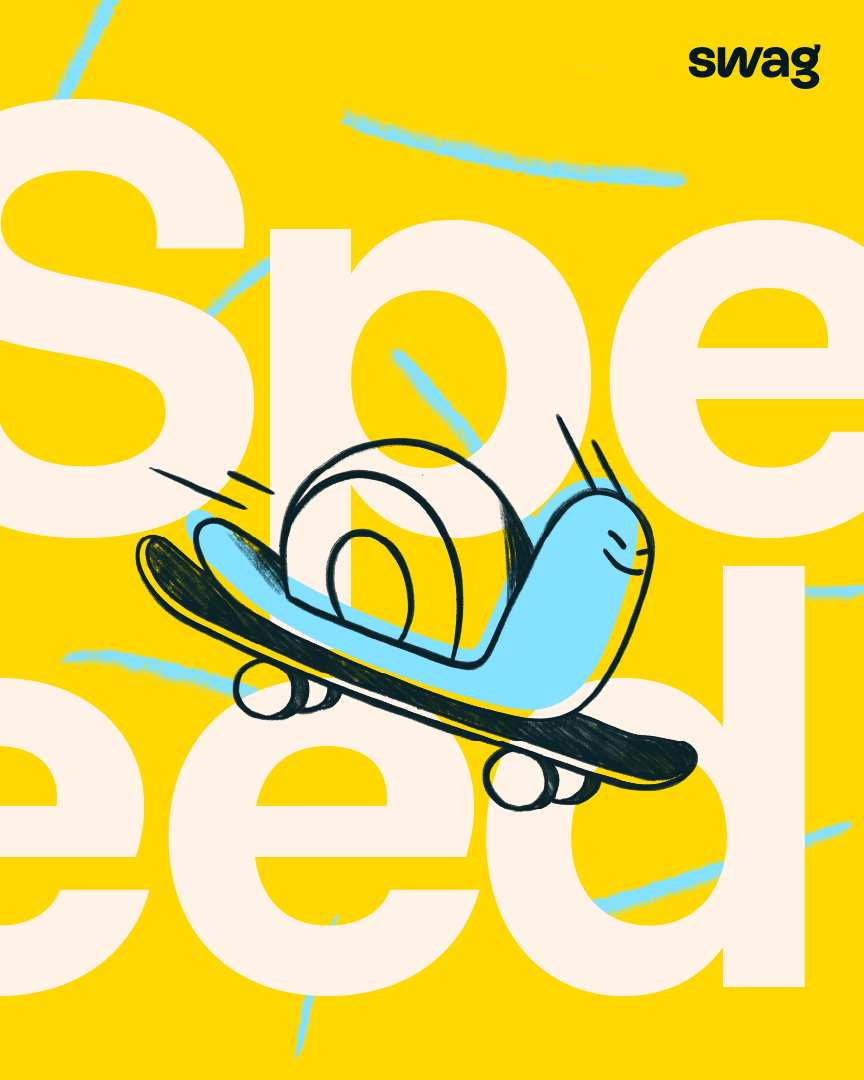
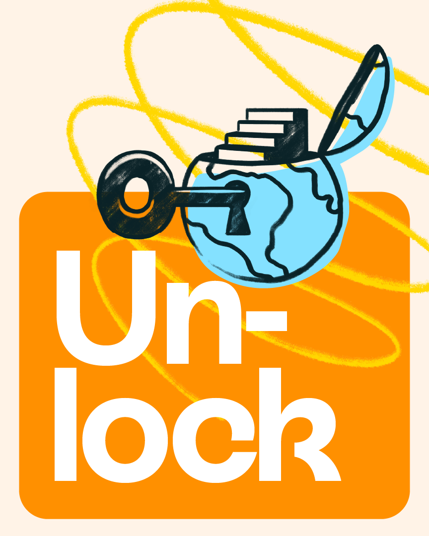
Client
Swag App
Agency
Twist
Direction
Niceshit
Creative Direction
Carmen Angelillo, Guido Lambertini & Rodier Kidmann
EP
Agusta Timotea
Illustration
Rodier Kidmann & Bianca Sangalli Moretti
Animation
Guido Lambertini & Gabriel Gómez
Pattern Designs
Bernardo Henning
Story
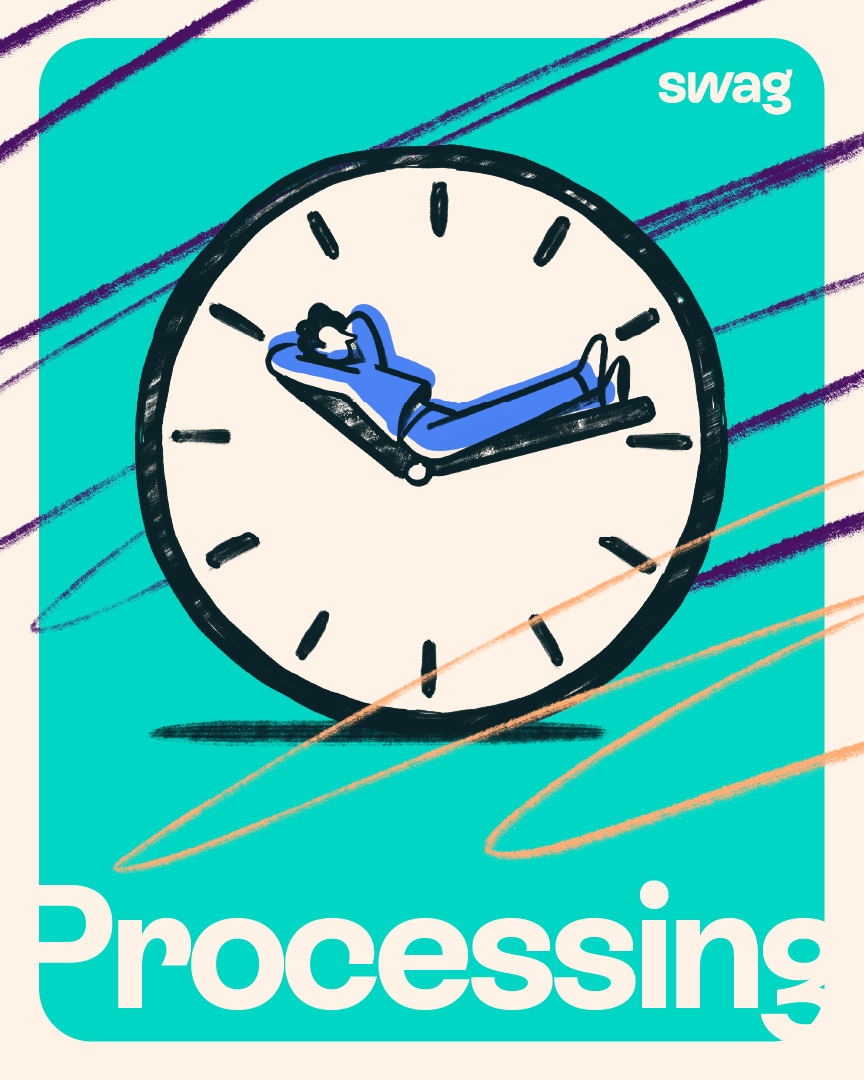
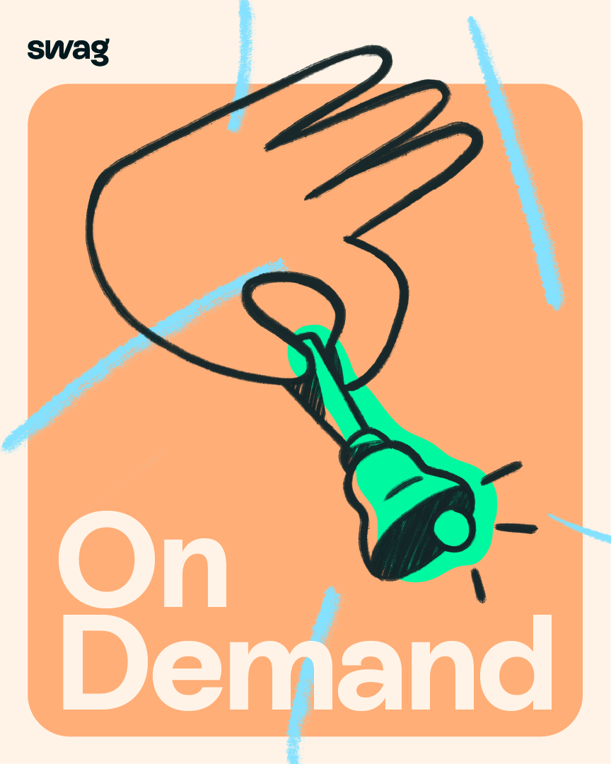
The lovely folks at Design by Twist approached us to develop a set of 20+ illustrations and animated loops to go along with the latest rebranding of Swag. The goal was to build a visual system that not only offered flexibility, but sparkled with warmth and joyful moments throughout the user experience.
Swag is the world’s first “employment super-app,” blending work, money, career opportunities and exclusive benefits into one. So, we wanted to keep the tone light and fresh, clever yet relatable. We combined different typographies (light and bold), played with transparency and added hand-painted textures to give everything a more human and crafted feel.
On the animation side, we kept things modular and fluid. The loops were crafted to stand alone but also to support the message — never distracting, always enhancing.
We absolutely love these kinds of projects where we don’t just get to create a toolkit or visual language, but also come up with fun, engaging concepts for each asset — always aiming for that little ‘second read’ moment that makes you smile.
RESULT
The final set was designed to live across all of Swag’s platforms: modular, adaptable, and built to work alone, next to text, or even layered on top of it. It was an absolute pleasure to bring some visual personality into this exciting rebrand.
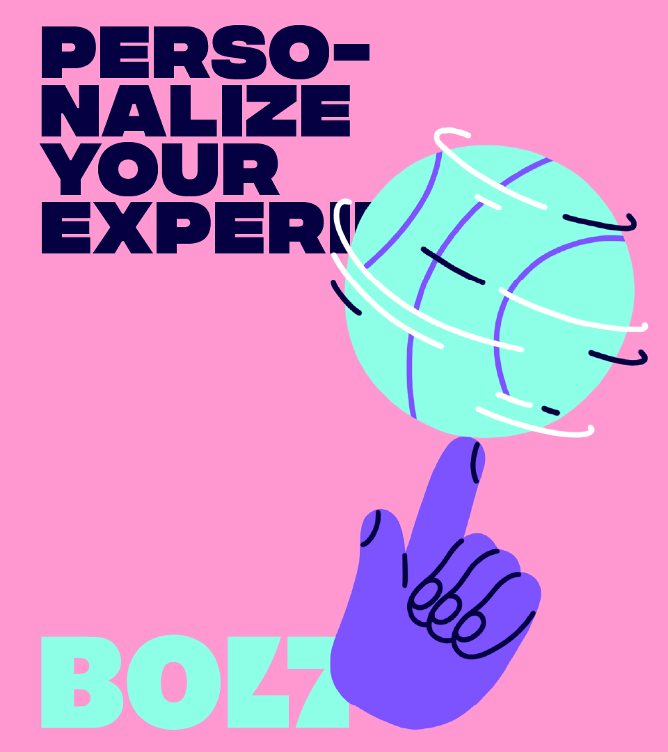
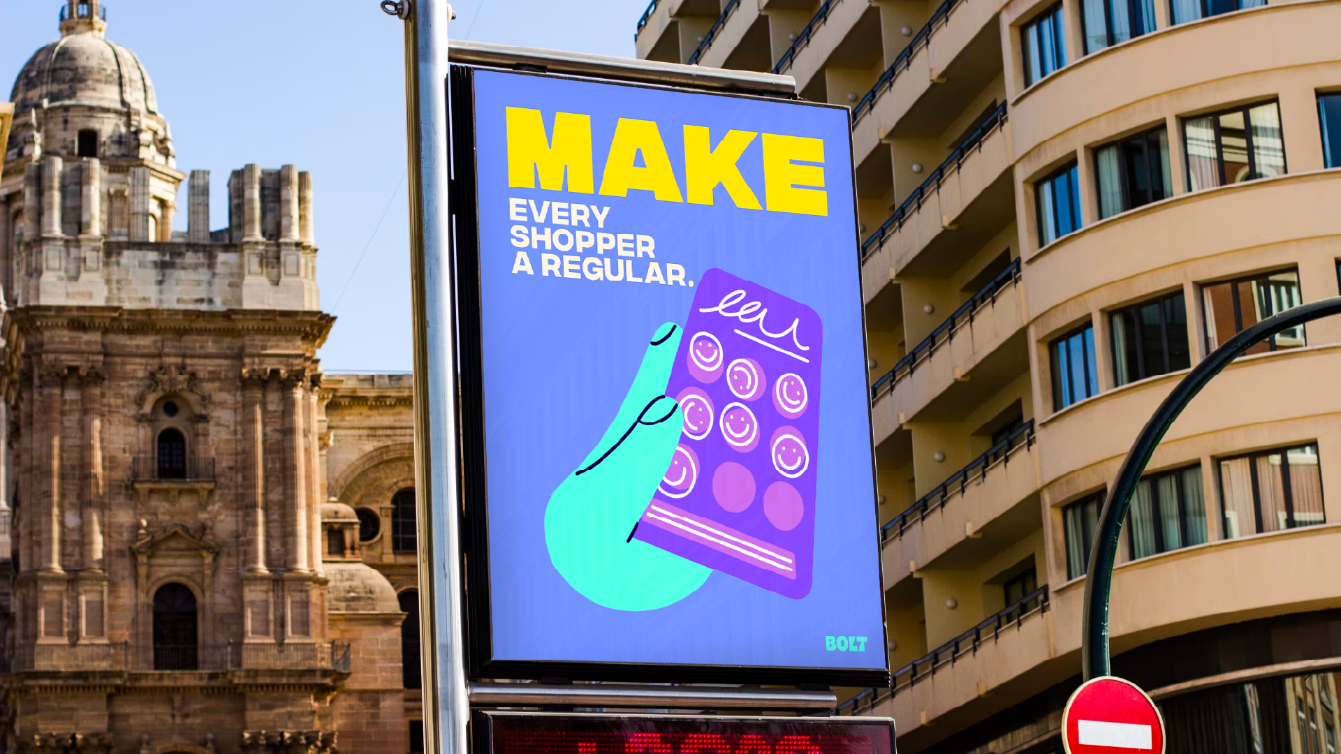
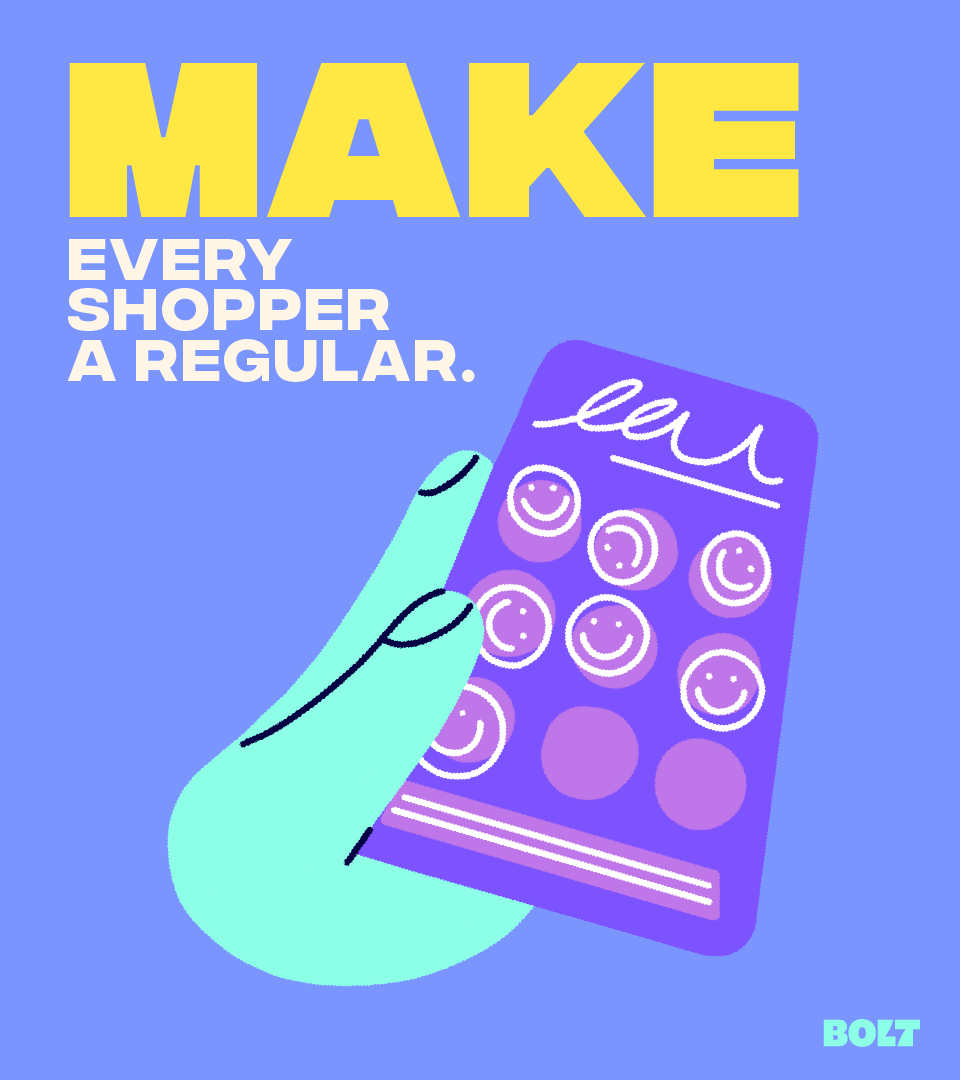
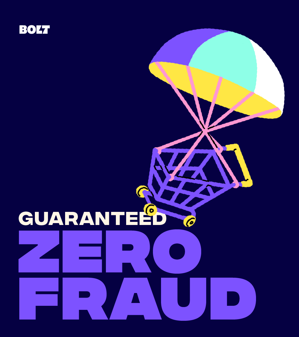
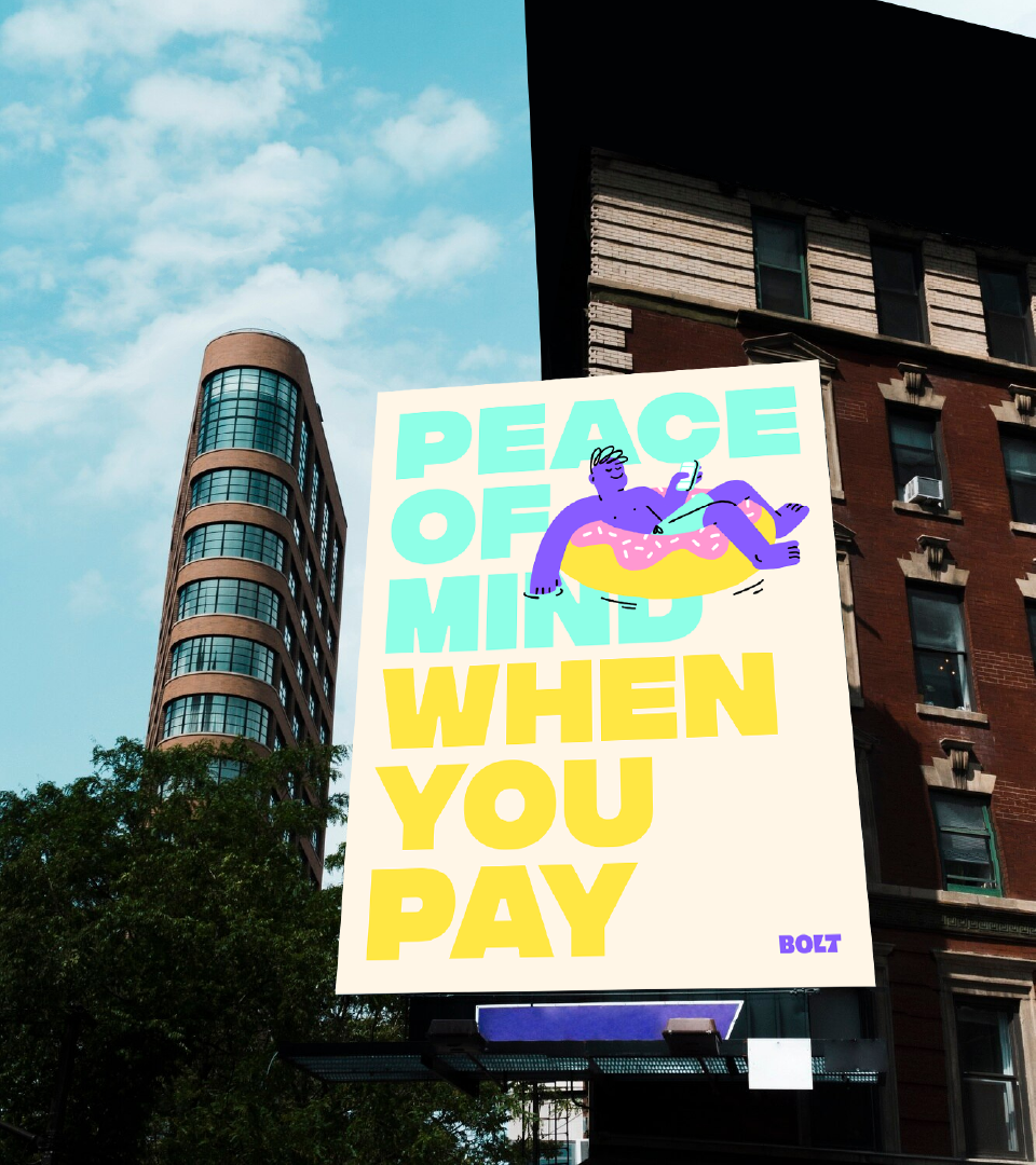
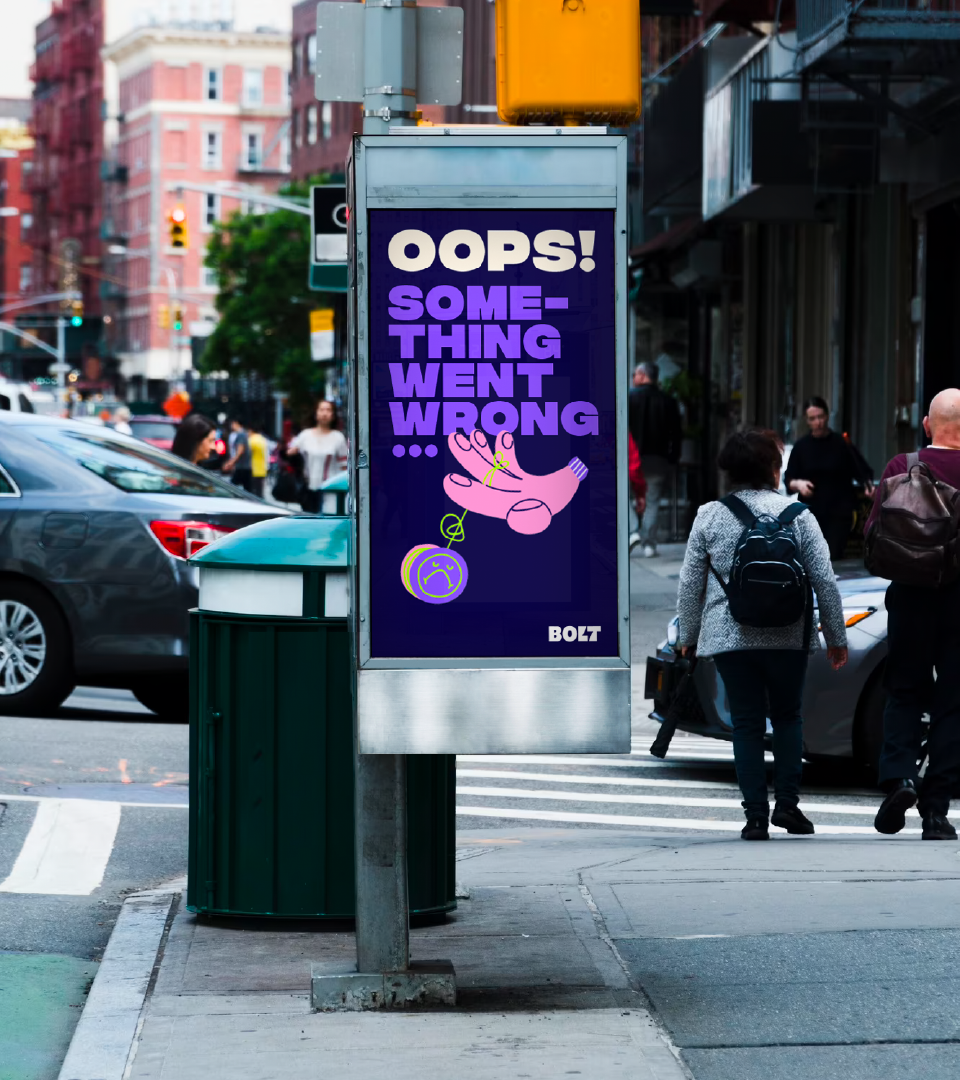
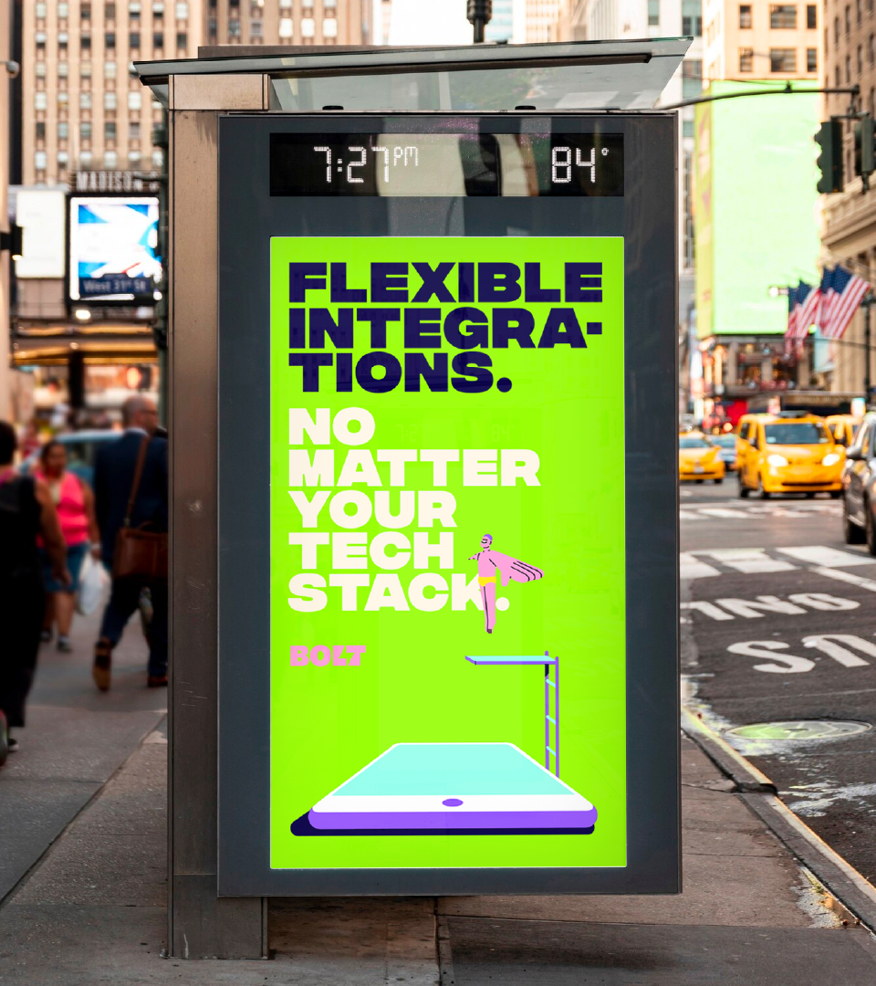
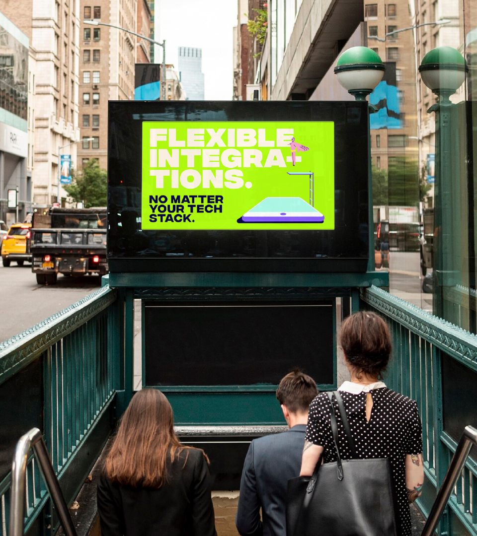
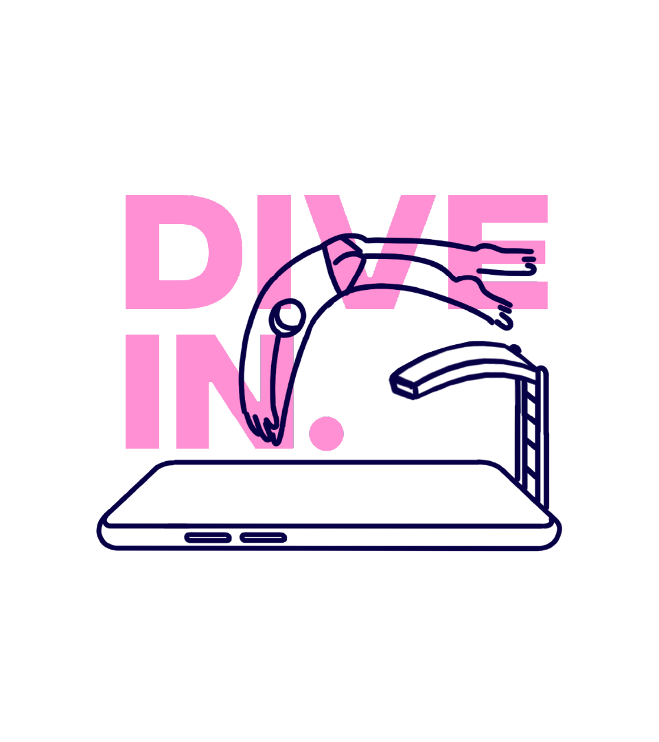
Making the shopping experience pop
Client
Bolt
Creative Direction
Carmen Angelillo & Guido Lambertini
EP
Agusta Timotea
Illustration
Bianca Sangalli Moretti
Design
Rodier Kidmann
Animation
Fabio Valesini
Story
We're always up for exploring different — and not-so-conventional — ways to put a brand out there. That’s exactly what we did for Bolt, even if the project didn’t come through in the end. We had a lot of fun and really liked how it turned out, so we thought... why not share it?
Bolt is a one-click checkout platform. Their whole concept is built around making the shopping experience fast, easy, and secure — no logins, no passwords, just click and done.
They came to us looking for a visual and motion approach to bring their key messaging to life across their website and app.
The brief was clear: make it pop, make it loud, and make it fun.
We went all in with a bright, punchy, visual language that felt poppy, energetic and a bit irreverent — the kind of work that travels straight into the viewer’s eyes (in the best way).
We leaned into strong color palettes, playful compositions, and motion that didn’t feel like your usual UI animation. It had rhythm, surprise, and a touch of weird — because that’s where the fun is.
One of the outputs we were most excited about was a series of Animated Posters: simple layouts with still background typography and unexpected, almost sneaky, illustration movement.
A small idea, but one that really worked.
RESULT
Did the project launch? No.
Would we do it again? 100%.
We had a blast pushing the brand into a more playful, visual space — and even if it never went live, we walked away with work we’re proud of (and that we still revisit from time to time).
Sometimes the value isn’t just in the final delivery — it’s in the process and what you learn along the way.
A visual system for the huge HPE's team
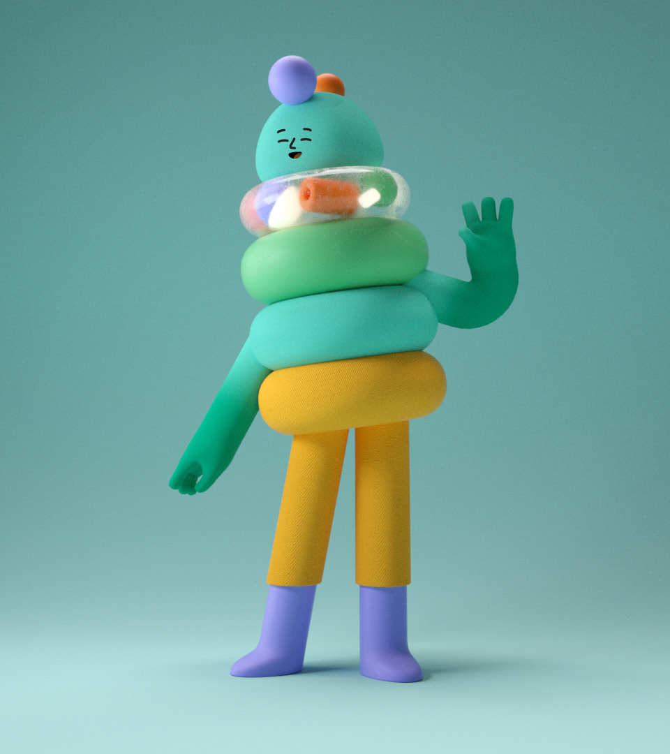
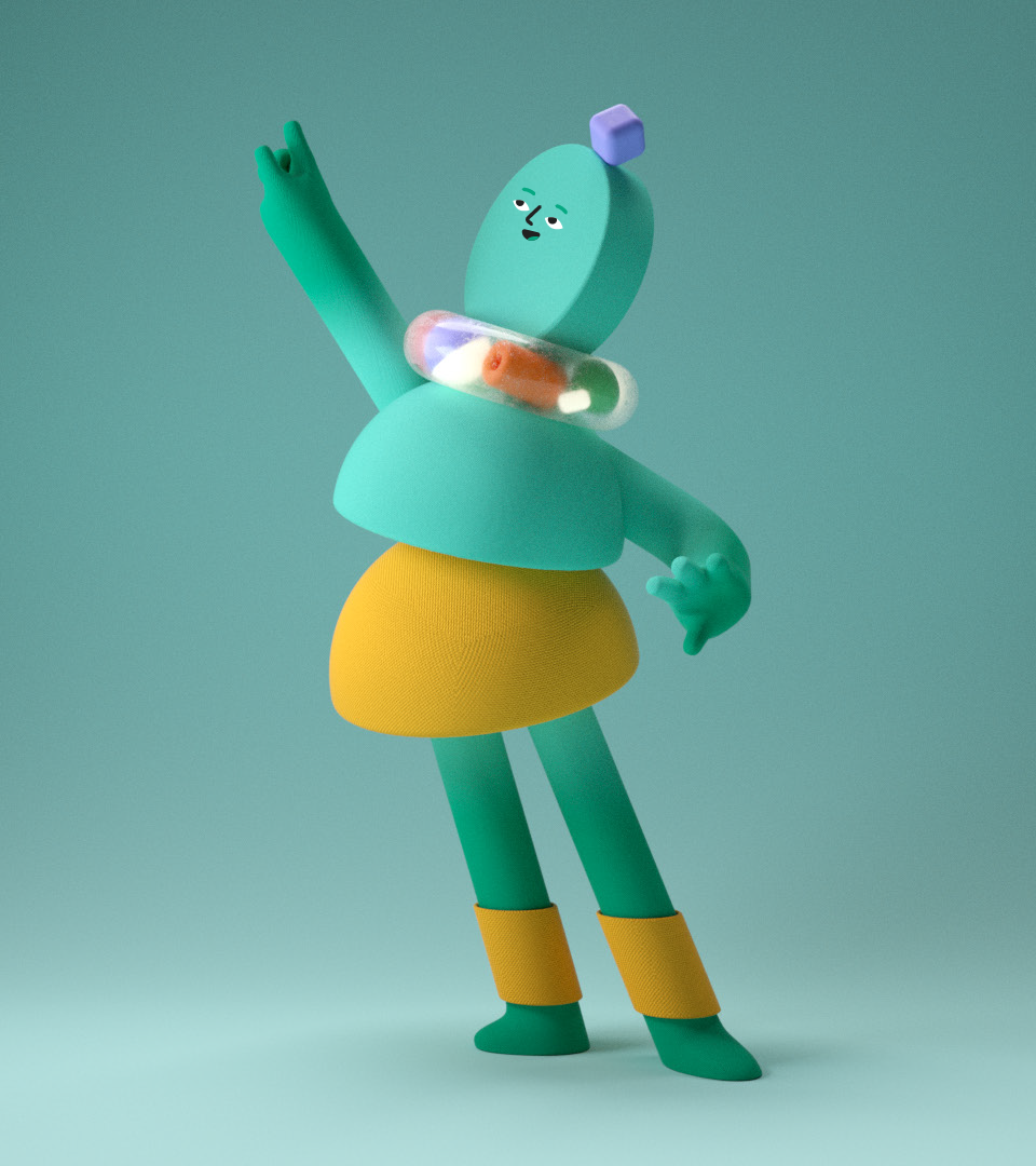
Client
HPE
Direction
Niceshit
Creative Directors
Carmen Angelillo, Rodier Kidmann & Guido Lambertini
EP
Agusta Timotea
Design & Illustration
Rodier Kidmann, Santi Zoraidez & Catarina Alves
Opportunity
Working with big companies has its ups and downs!
It’s always challenging and exciting to be trusted with the task of developing a full visual language for a company with thousands of employees, global offices, and a massive client base. But at the same time, the whole process can feel a bit like building a house of cards — months of creative work that might never see the light of day.
We were hired by a massive tech company to design their new visual system from scratch: characters, illustrations, and a flexible language to be used across all their internal and external comms, made for 60,000+ employees.
Did it go live? Not really.
Was it worth it? 100%.
Story
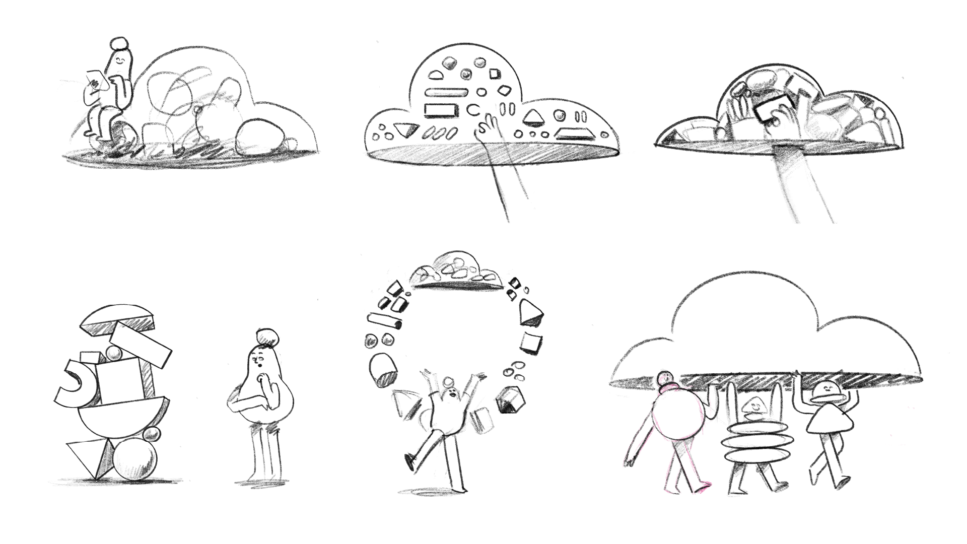
We explored different visual directions, tested techniques, and developed a series of flexible systems that could adapt to any platform, format, or audience. Here's a glimpse into the process (and the fun we had building it.
Result
Even if this one never made it out into the world :( we’re still proud of it.
Exploring these different directions, testing styles, teaming up with friends, and building systems that feel like they could live and breathe anywhere — that’s what keeps us going.
And hey, we might still animate those little guys one day… just for fun.
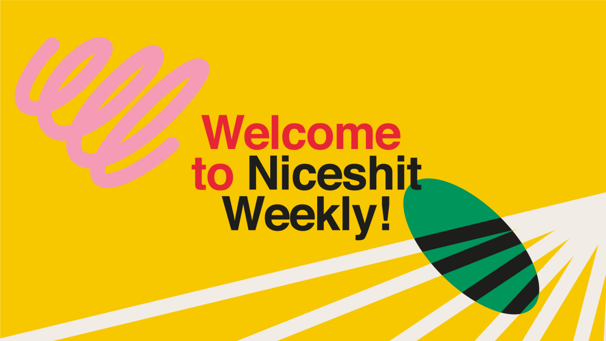
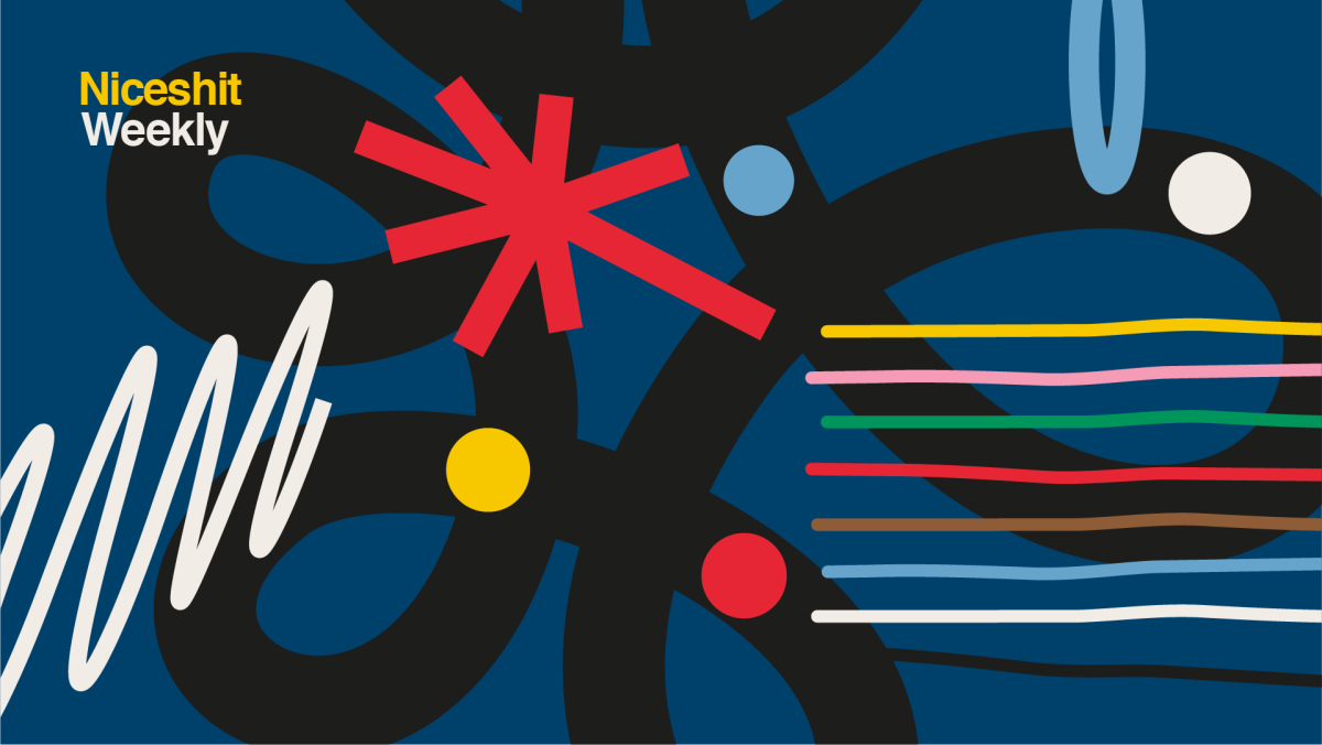
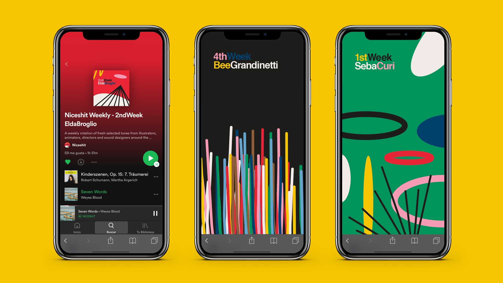
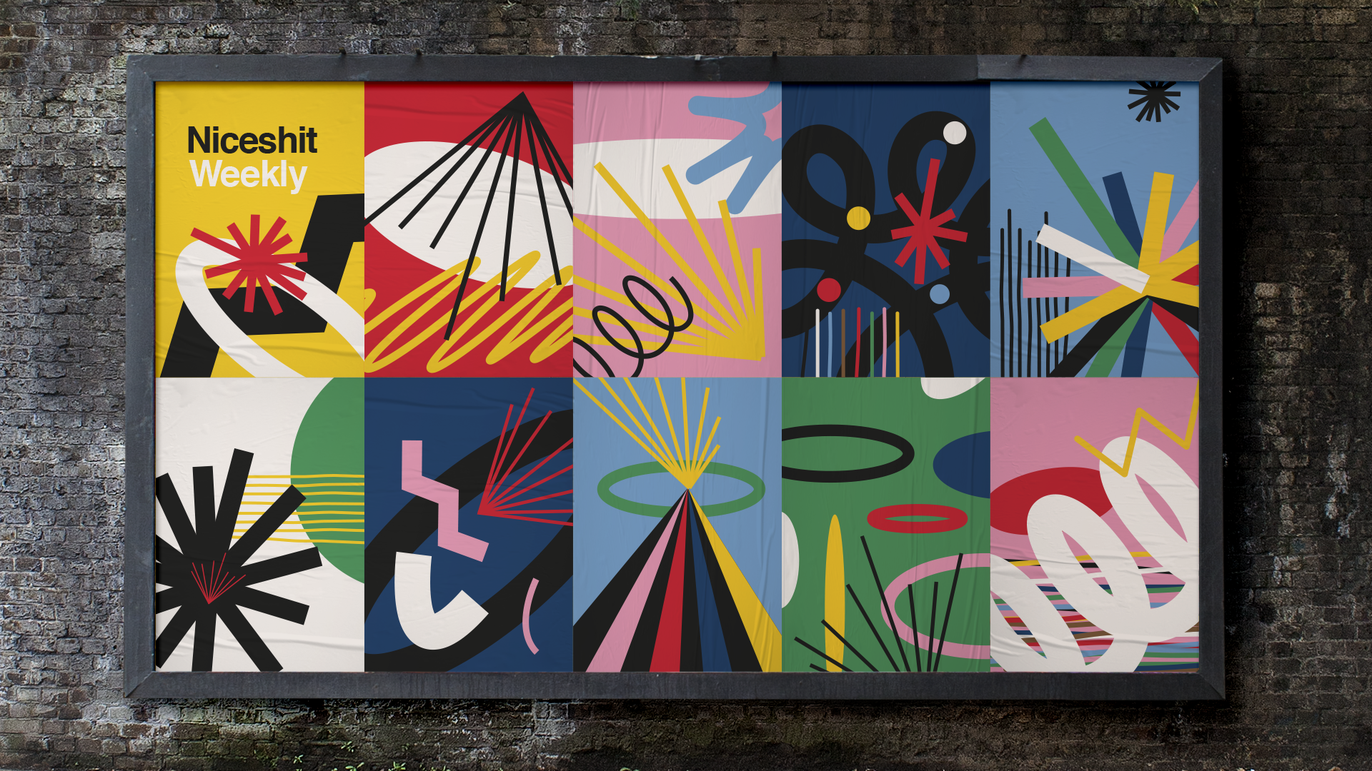
Niceshit Weekly: a generative visual tool
Client
Niceshit weekly
Creative Directors
Guido Lambertini, Rodier Kidmann & Carmen Angelillo
EP
Agusta Timotea
Design
Rodier Kidmann & Carmen Angelillo
Animation
Ana Freitas & Guido Lambertini
Magical sounds
Facu Capece & Lola Ritcher
STORY
We’re super happy to introduce you to Niceshit Weekly — a weekly Spotify playlist designed to refresh your soul and ears.
The idea came from our deep love for music and the curiosity to share what the people who inspire us are listening to.
Each week, we invite an artist, collaborator, or creative friend to share a playlist of 20+ songs — a peek into their current soundtrack. It’s a simple way to discover new music and get to know the taste behind some of the talented people we admire. The playlist updates every Monday, so make sure to follow and save your favorites.
CHALLENGE
We wanted to create a system to quickly generate animated layouts with sound — instantly ready for online communication.
SOLUTION
With that in mind, we developed a set of illustrated elements that we animated in seamless loops, each with its own sound. As we combined these elements into compositions, music and sound design built themselves automatically.
Using editable text layers and being able to scale, rotate, and recolor both elements and backgrounds, this graphic toolkit allows us to create endless layouts within the same branded style — always fun, dynamic, and engaging.
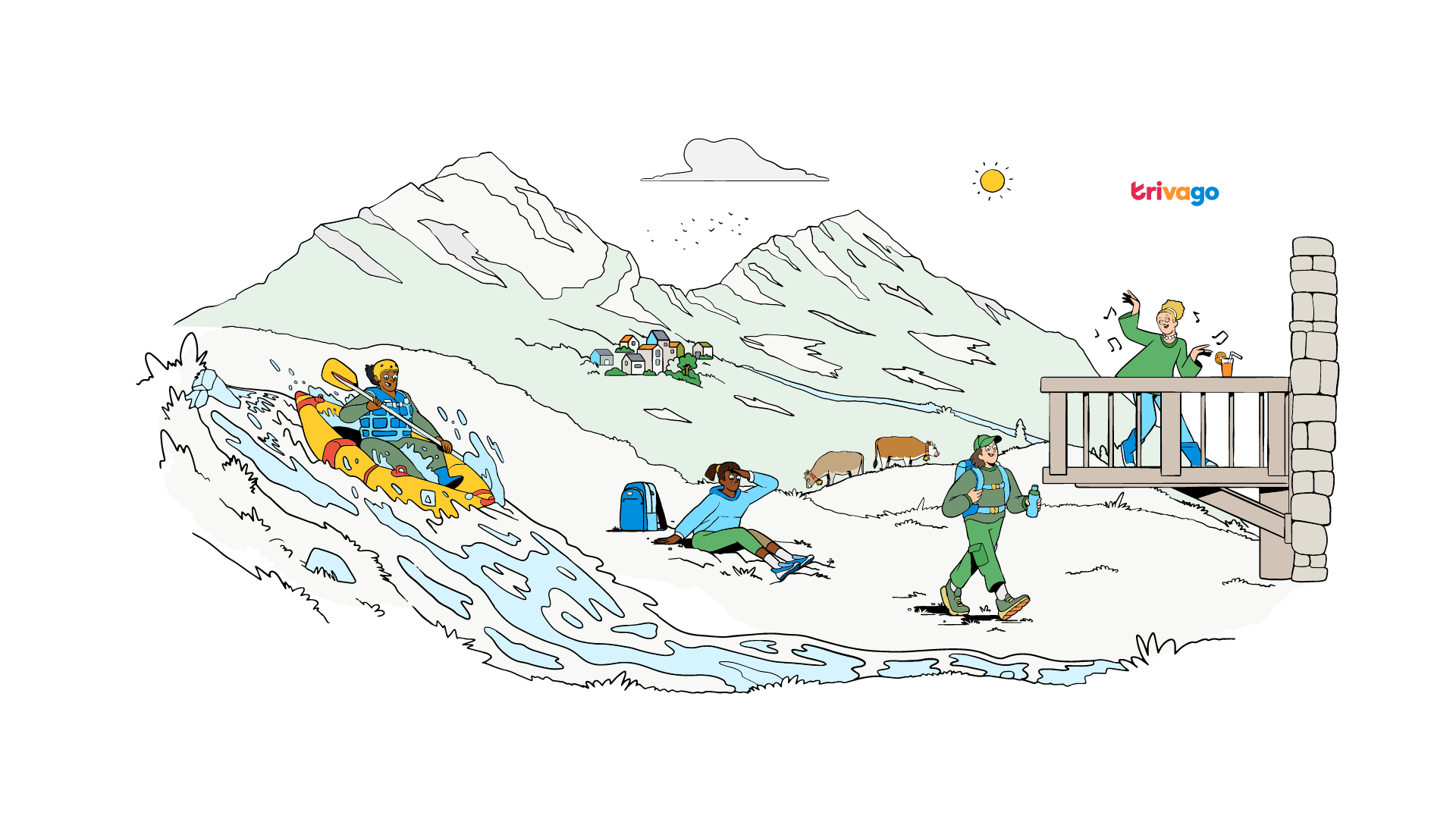
Trivago: refreshing a global travel brand
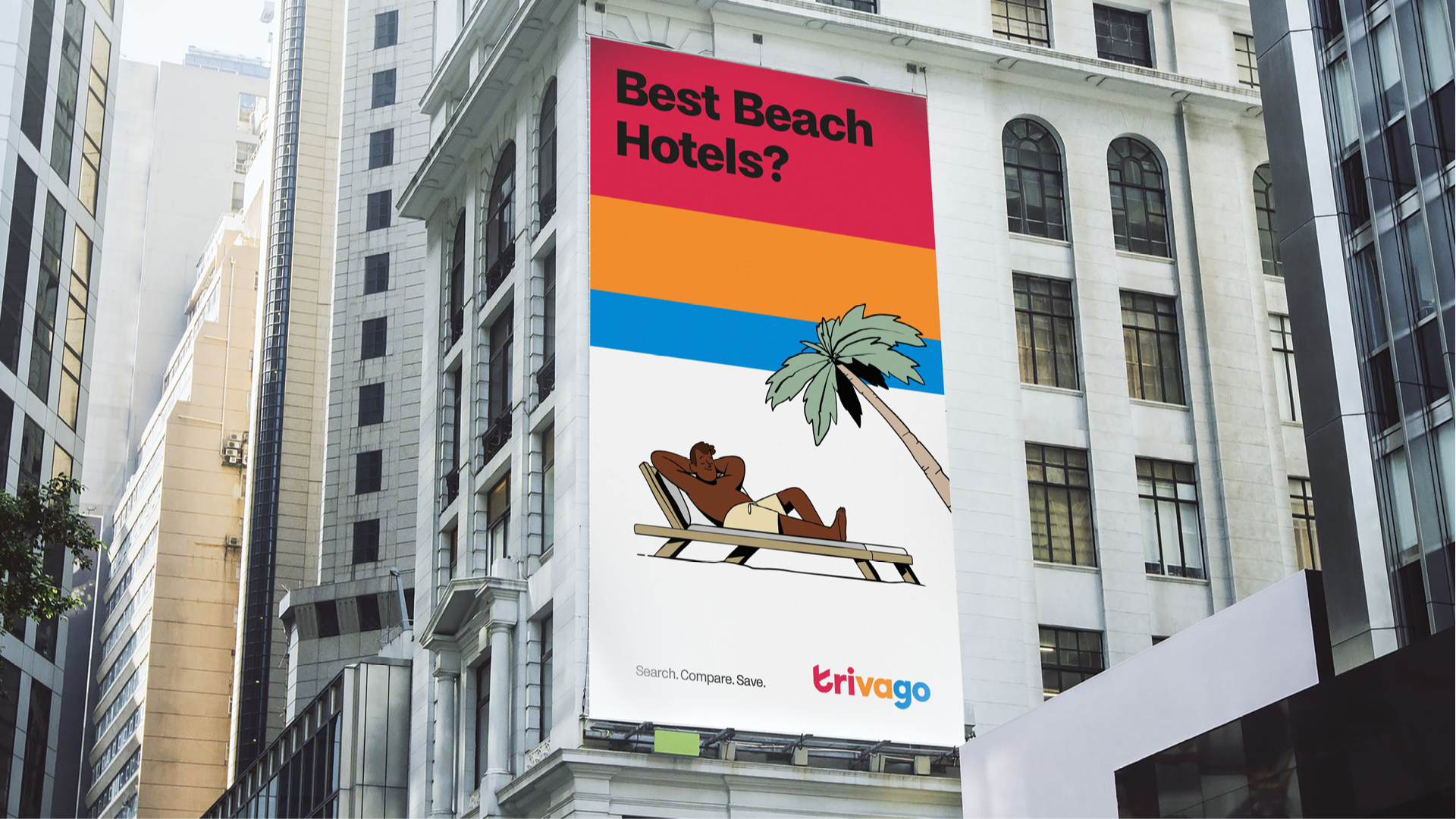
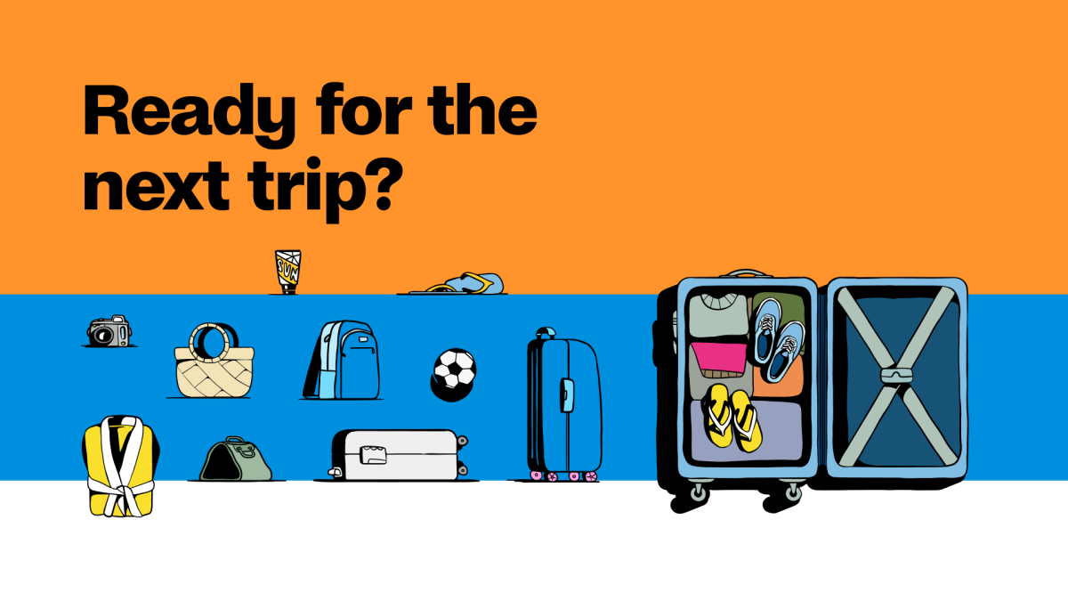
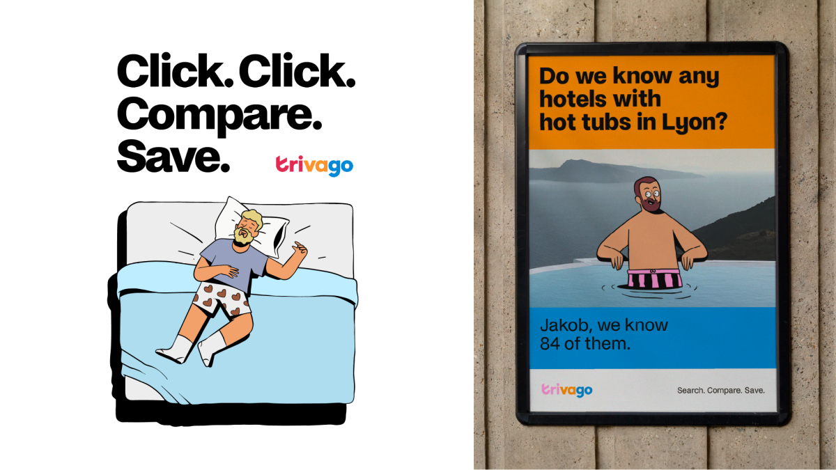
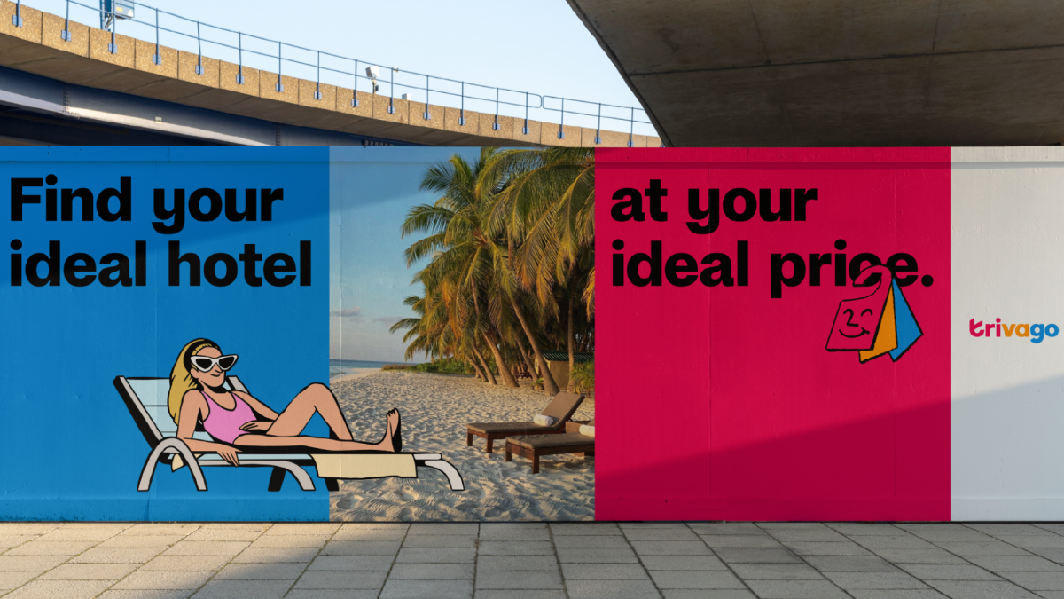
Client
Trivago
Client
Trivago
Agency
Further (Ex Design Studio)
Creative Direction
Carmen Angelillo, Guido Lambertini & Rodier Kidmann
EP
Agusta Timotea
Art Direction & Illustration
Rodier Kidmann
2d Promo Animation
Jaume Mestre
Challenge
Create a modular, scalable and flexible illustration style that could be scalable and customisable for different needs at different moments.
STORY
We developed a style that balances a digital and physical feeling, combining hand-drawn stroke textures with slightly geometric forms.
Every illustration tells a little story: each character and scenario has its own personality, and when mixed together, they create new adventures—always keeping that vacation mode vibe that defines Trivago.
This flexibility allows our partner to generate new assets for any communication need, from digital campaigns to large-scale urban placements and office graphics.
The goal was to build on Trivago’s global brand strength while moving it towards a more distinctive and contemporary visual language. This wasn’t just an aesthetic update, but a way to help the brand stand out in a competitive travel market, staying true to its mantra: Search, Compare & Save.
RESULT
The result is a flexible, modular, ready-to-use illustration system that allows the brand to tell consistent and engaging stories to travellers worldwide.
Related Projects
Findigs • Hand painted illustration rebrand
Realtor • Modular visual system
A fully flexible and textured visual system

Client
Findigs
Findigs Team
Stephen Wake, Silvia Herrera, Jamie Martinez
Direction
Carmen Angelillo, Guido Lambertini, Rodier Kidmann
EP
Agusta Timotea
Art Direction
Rodier Kidmann
Illustrations
Rodier Kidmann, Tamara Bella
Edit
Guido Lambertini
Music & SFX
Facundo Capece & Lola Ritcher
STORY
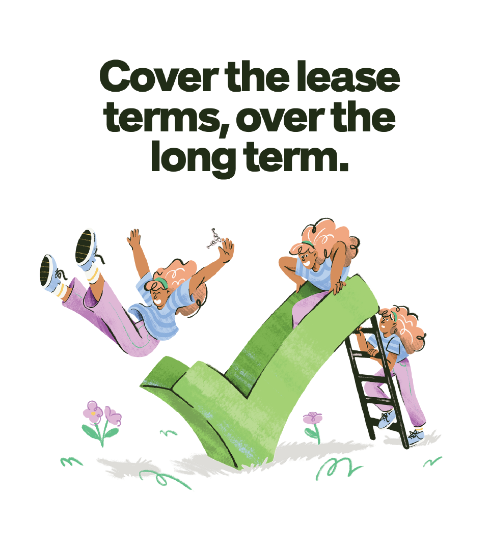
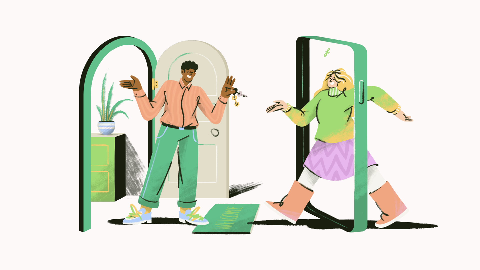
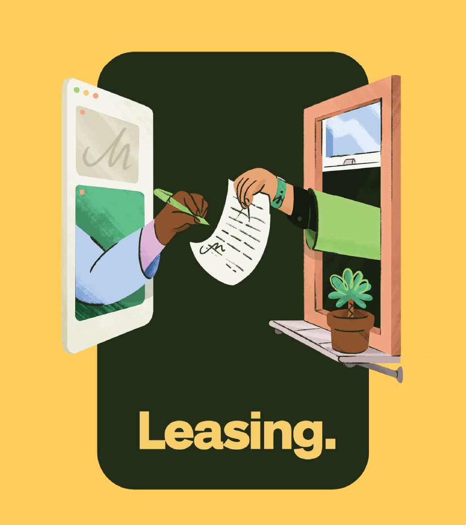
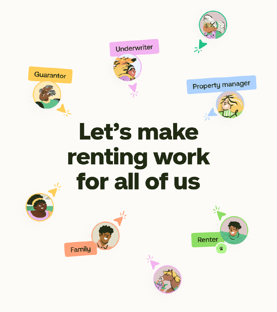
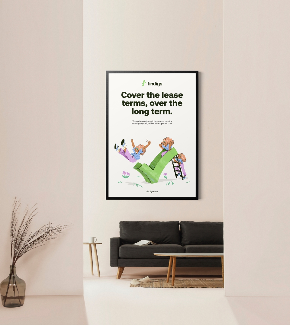
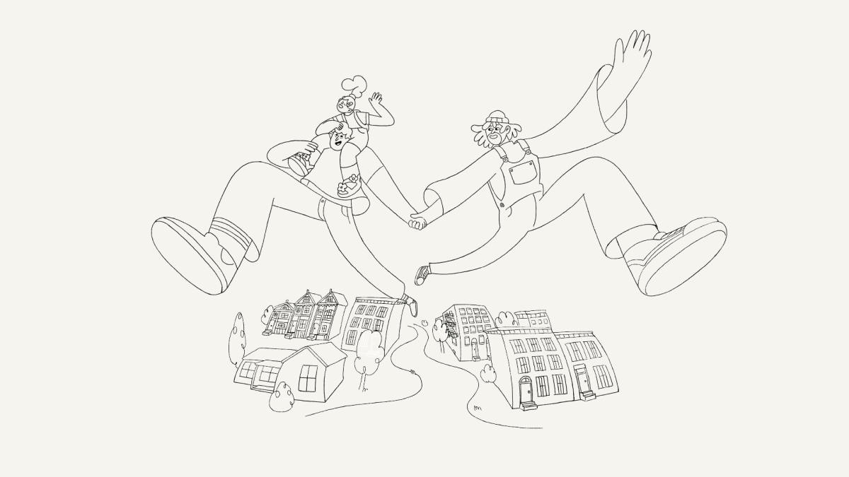
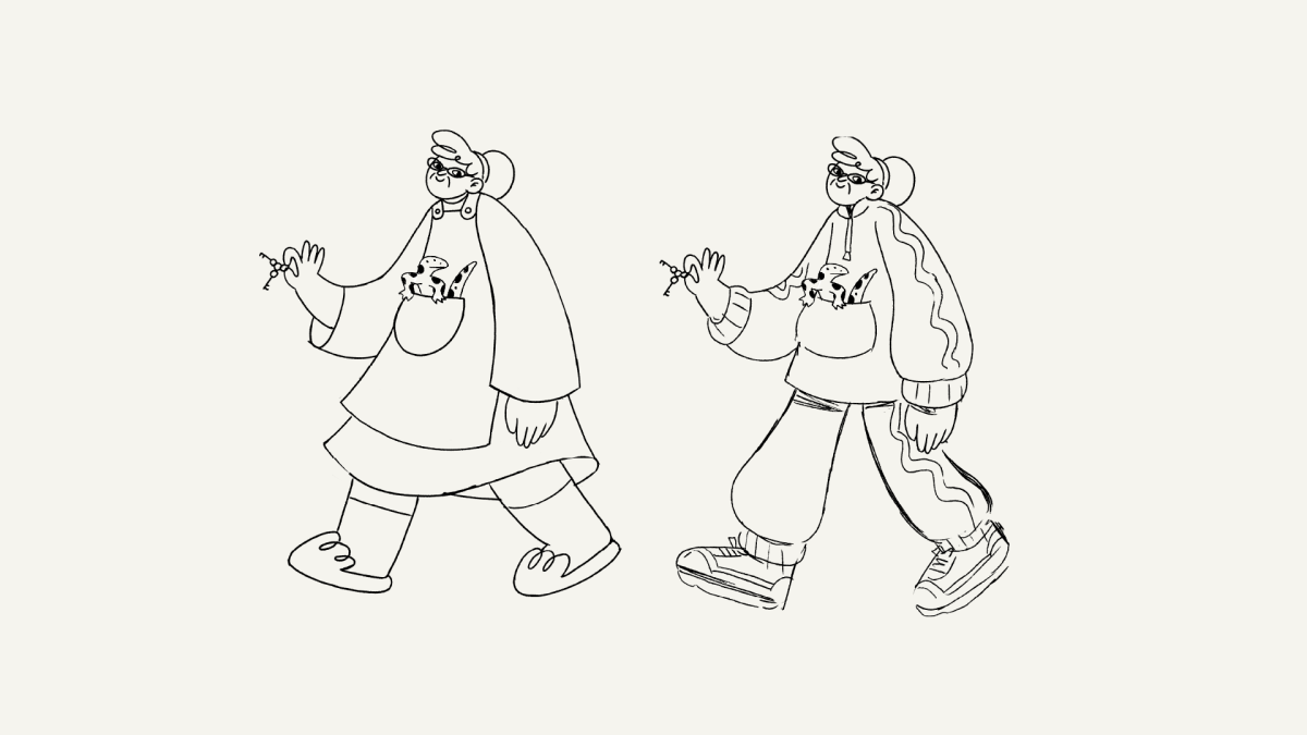
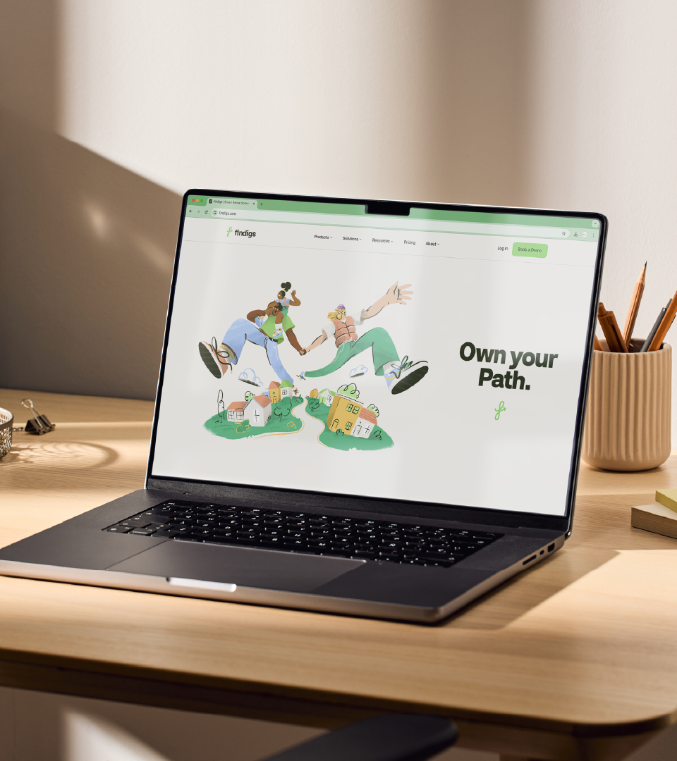
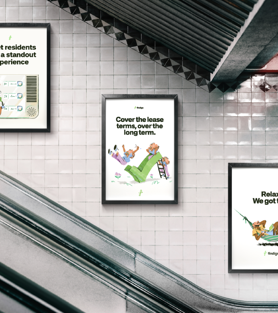
We teamed up with Findigs, the NYC-based rental platform, to create their illustration system — a warm, playful, and flexible visual language.
Findigs is one of those rare rental platforms that’s actually on the renter’s side (finally!). Their whole vibe is human, approachable, and kind, so we leaned on that to build a textured style full of little imprecisions and organic shapes that carries that same warmth they stand for.
When working on a rebrand, one of the key things is really capturing the tone and personality of the brand. For Findigs, we wanted everything to feel easygoing to show that this -usually painful- process can actually be enjoyable so every concept and illustration has that “resolved” feeling, the aftermath: if you’re thinking about applying for a new place, you’re already holding the keys and moving in.
We built the visual system to be modular and ready to use, adaptable to both light and dark backgrounds and any format the Findigs team might need. When designing illustration systems for rebrands, it’s crucial to think about where and how they’ll live and who will be using this tool. As usual, the system needed to flow seamlessly across all platforms: digital, print, large, small, light, or dark. Once delivered their design and marketing team could use, reuse, and tweak so they can apply it to any communication need, now or later.
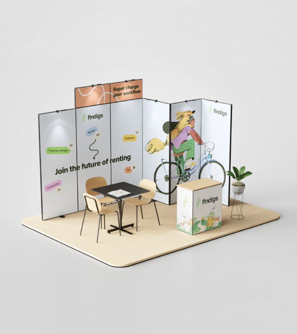
Experience
Since then, Findigs has become a reference for what it means to be really nice people to work with, and they keep raising the bar. From there, we built a partnership based not just on design but on shared values: openness, curiosity, and joy. So when they moved into their new headquarters in New York, they asked us to bring a bit of Niceshit’s magic into their physical space. Together, we explored how murals could extend the brand into their team’s everyday life. This led to two large-scale murals.
Impact
Made a new office feel unmistakably Findigs.
Brought “a smile on the mind” into the everyday life of the Findigs team.
Deepened a client relationship built on trust, collaboration, and fun.
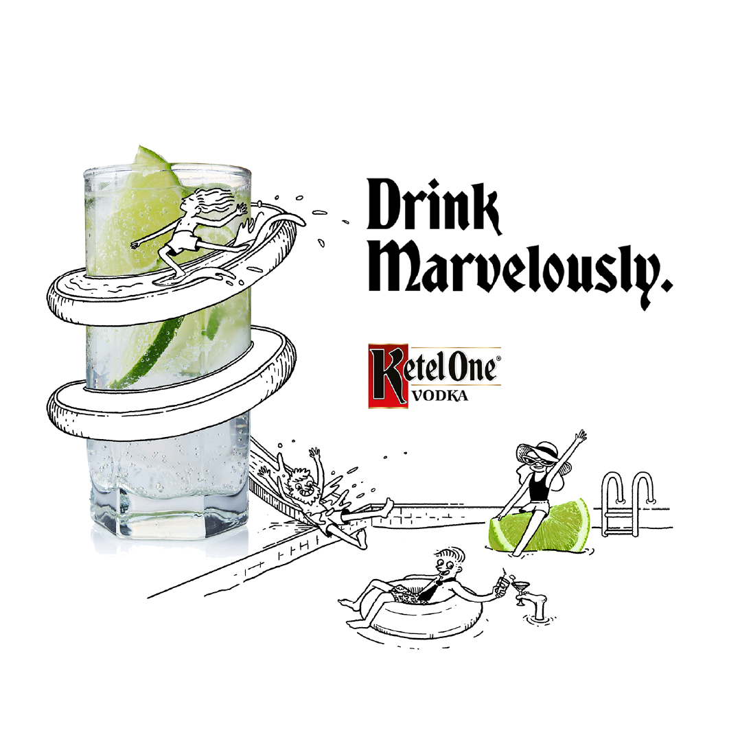
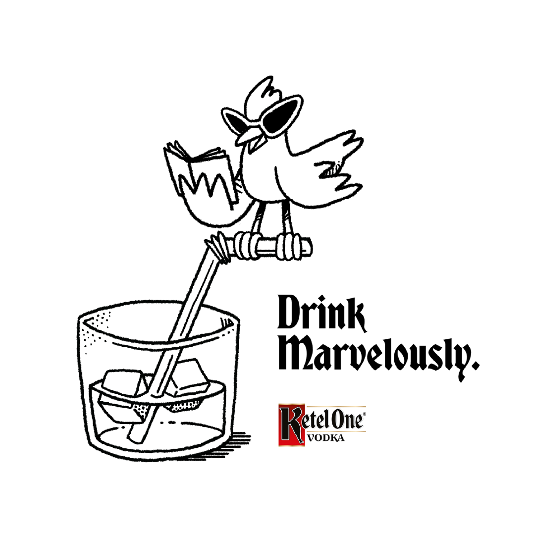
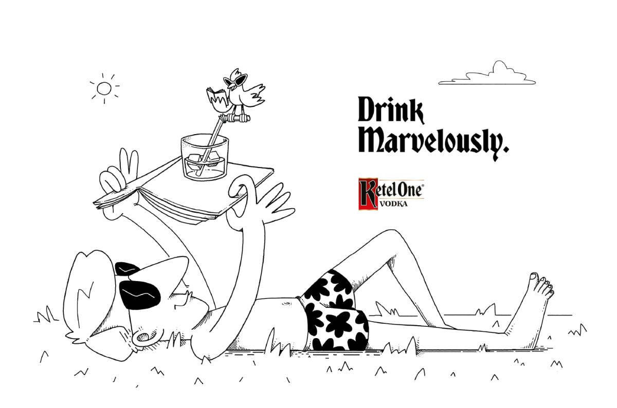
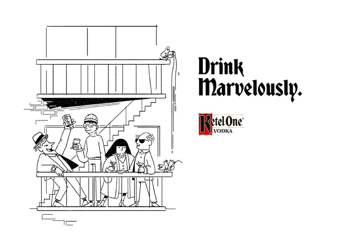
Ketel One. Standing out pays off
Client
Ketel-One
Client
Ketel-One US
Agency
FIG NY
Production Company
Jelly London
EP
Erika Panasci, Chris Page
LP
Kavita Dagger, Laura Thomas
Directed by
Niceshit
Creative Directors
Guido Lambertini, Carmen Angelillo & Rodier Kidmann
Art Director
Rodier Kidmann
Animation Director
Guido Lambertini
EP
Filipa Kinomoto
Animation
Claudio Salas, Maliboo, Olivia Blanc, Ezequiel Cruz, Melisa Farina, Henrique Barone, Juan Huarte, Juan Nadalino, Ana Freitas, Nuria Just, Leo Campasso & Erik Righetti
Edit & Compositing
Guido Lambertini
Opportunity
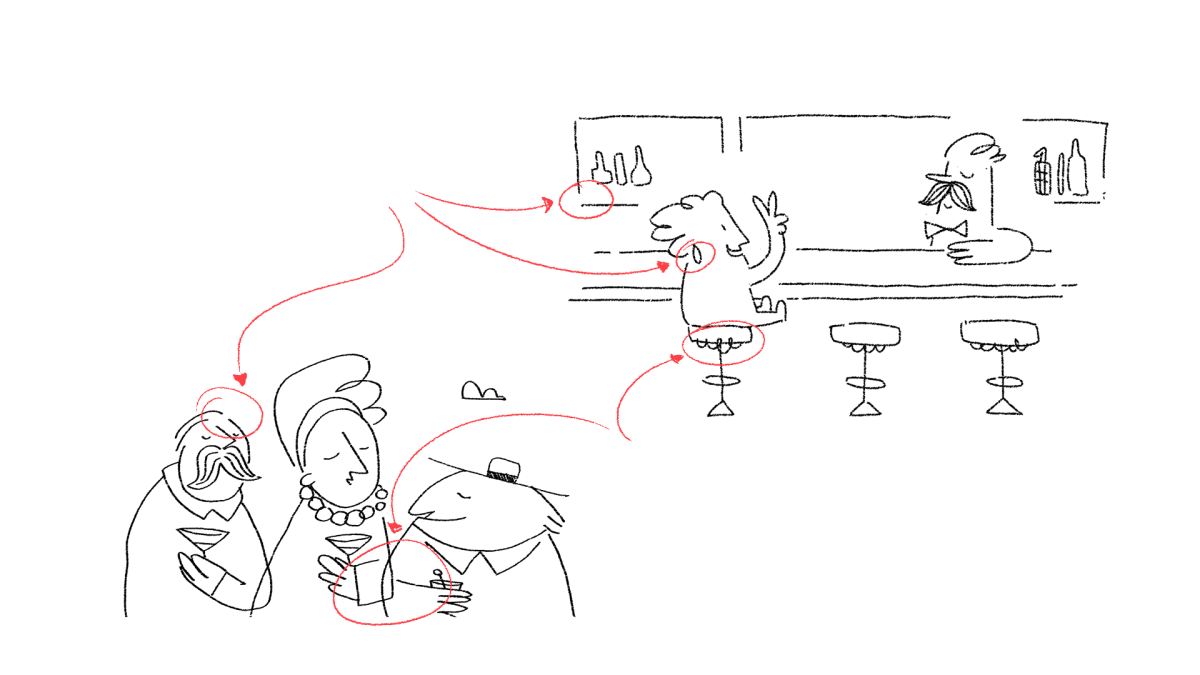
Create a big and cohesive campaign — one where we could build an entire universe, a language, and explore it thoroughly. For this project, we developed 12 animated films — a combination of TVCs, social content, and PR pieces for Ketel One’s worldwide campaign, “Drink Marvellously.”
We absolutely love these kinds of scripts, where details and clever humor take the spotlight — those small pauses, perfect timings, and subtle expressions. This one is, by far, one of the coolest and most humor-driven campaigns we’ve developed so far.
Story
For the overall campaign, we developed hundreds of bespoke characters to narrate these magical stories — all conceived as if they were part of a collection of bar napkin doodles. Ridiculously fun!
With such an imperfect and hand-drawn style, the main focus was on acting and timing — perfectly landing each joke and funny moment, communicating as much as possible through minimal but detailed movement. The result: a bespoke and functional animated universe that we hope will become an iconic, long-running look for the brand.
The series consists of 12 animated films. The longer one, The Journey, even premiered at the Emmys!! Five of them were TVCs, running across the US and Europe, and to complete the campaign we created some shorties but goldies — three 15” and three 6” pieces for social media. Very funny stuff!
IMPACT
What a ride! The campaign turned into a massive, global rollout — seen everywhere from buses to billboards, airports, and even hot air balloons. It became a full 360° experience. Seeing this world come to life on such a huge scale was wild — definitely one of the biggest, most ambitious, and marvellously fun campaigns we’ve ever been part of.
No need to say this style was a pleasure to develop! It was a lot of work, but we had the most amazing team. Huge thanks to everyone who was involved in this crazy adventure.
Blending live action and animation for Barcelona
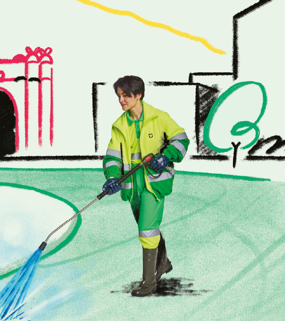
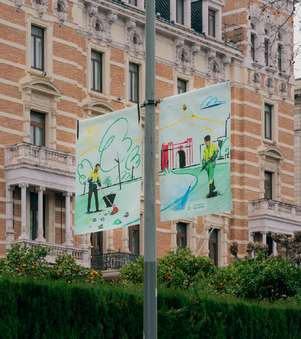
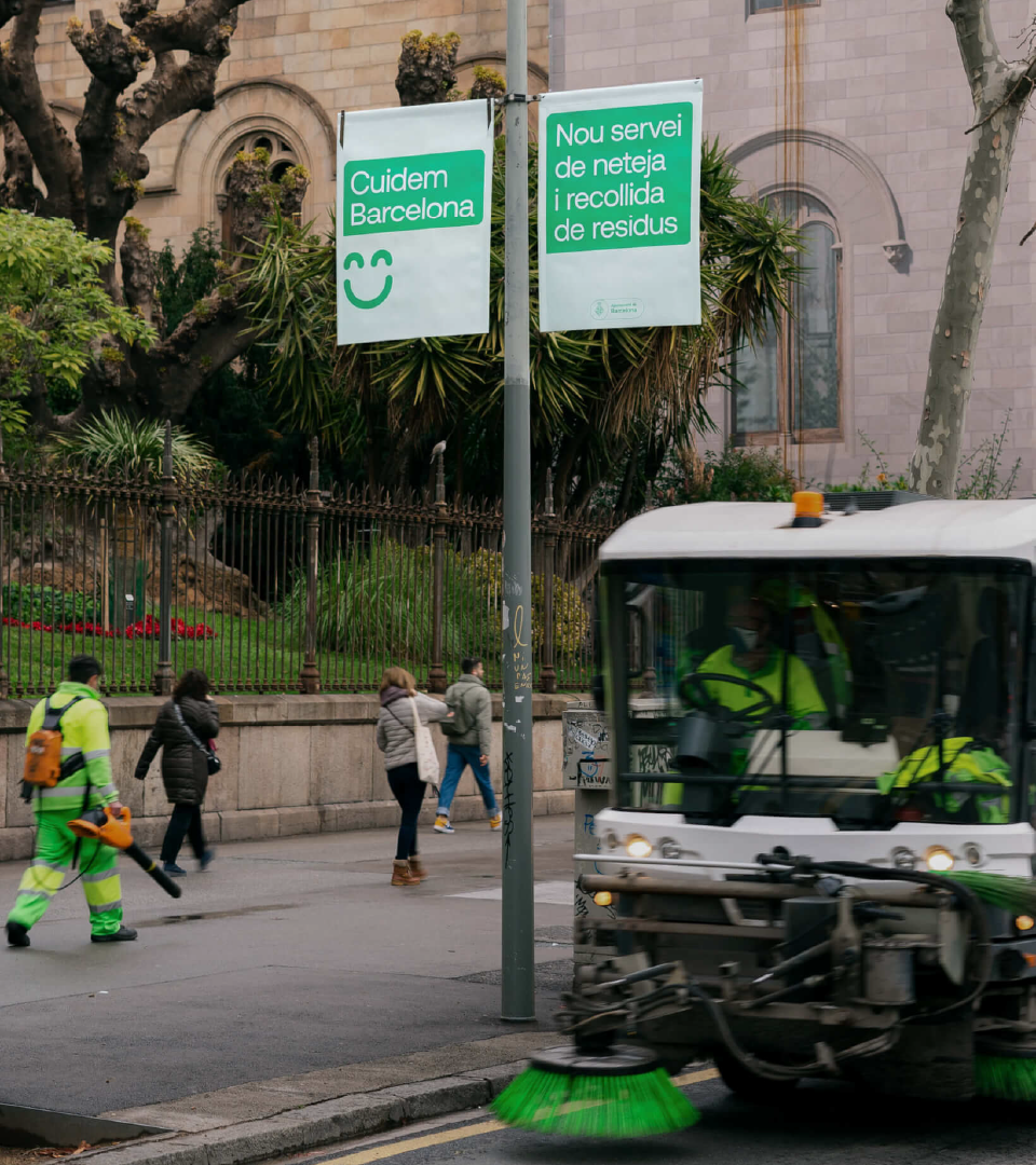
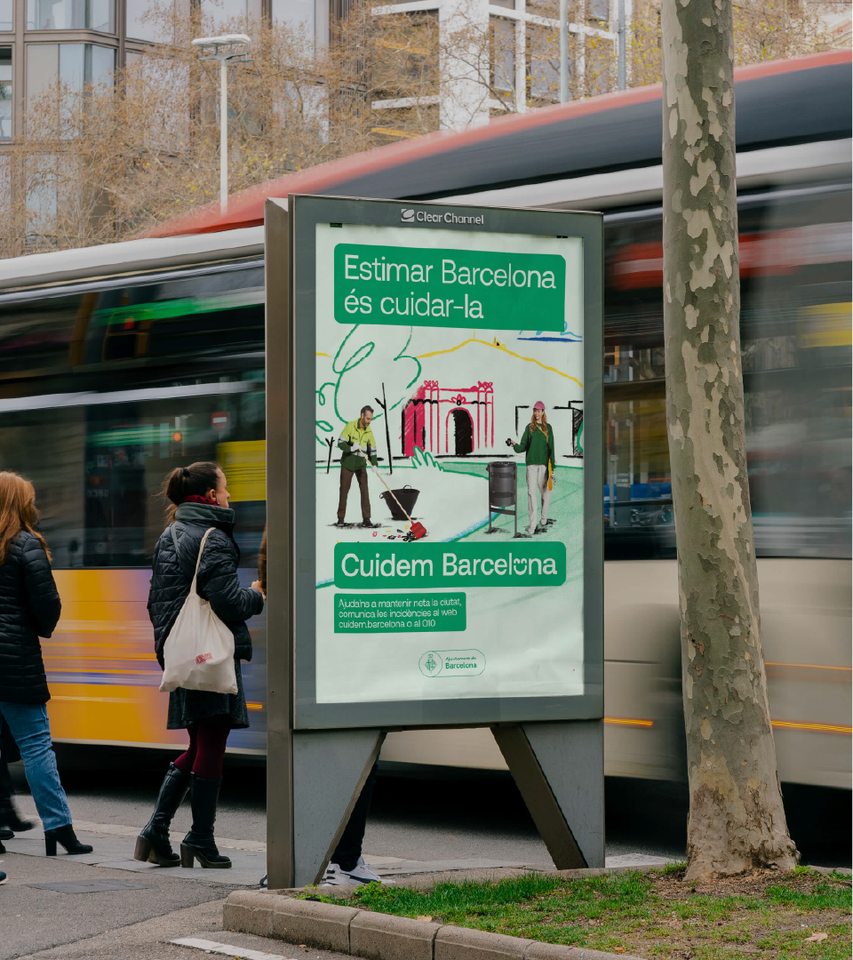
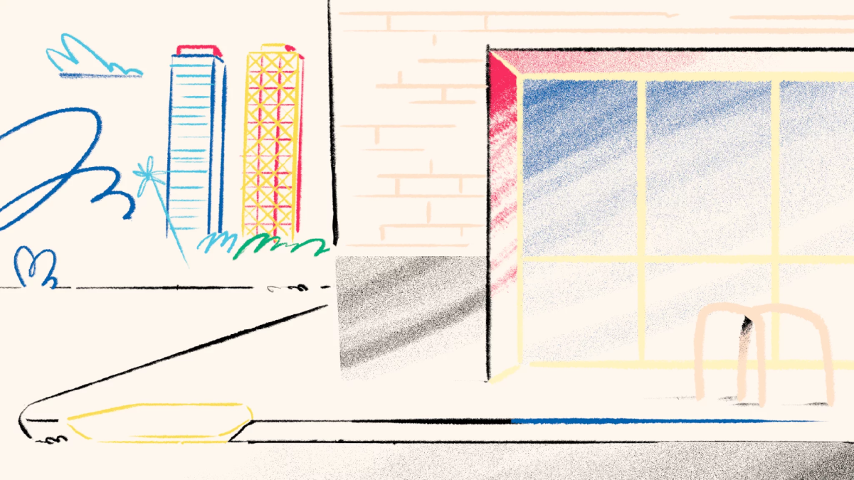
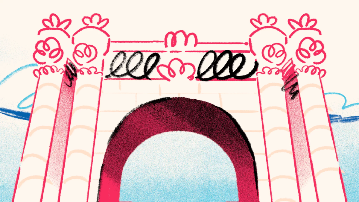
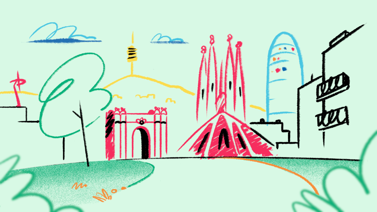
Client
Barcelona
Directed by
Niceshit
Campaign and concept by
Folch Studio & Barcelona Cat
Live production
Playground
Shooting direction by
Agustin Verrastro
Creative direction
Carmen Angelillo, Guido Lambertini & Rodier Kidmann
Executive Producer
Agusta Timotea
Illustration
Rodier Kidmann & Bianca Sangalli Moretti
Animation Director
Guido Lambertini
2d Animation
Fabio Valesini, Josep Bernaus, Eze Cruz & Libardo Bohorquez
VFX, 3d & Compositing
Hugo Morais
Clean-up
Margarita Rojas, Julieta Soloaga & Ana Freitas
BTS
Manso Studio
Color grading
Glassworks
Music & SFX
Facu Capece & Lola Ritcher
Campaign shooting
Lander Larrañaga
Documentary photography
Aramis León
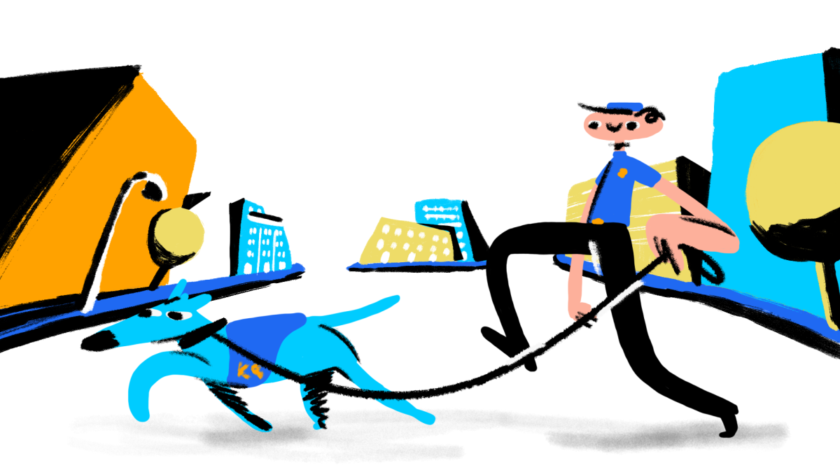
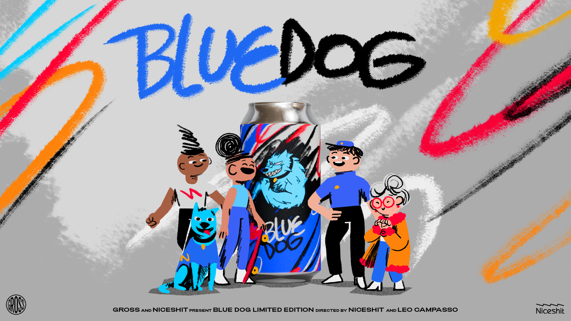
Handcrafted film for a handcrafted beer
Client
Gross Brewing
Directed by
Niceshit & Leo Campasso
Creative Directors
Carmen Angelillo, Guido Lambertini, Rodier Kidmann & Leo Campasso
Executive Producer
Agusta Timotea
Written by
Leo Campasso
Art Direction
Rodier Kidmann, Carmen Angelillo & Bianca Sangalli Moretti
Animation directors
Guido Lambertini & Leo Campasso
Design & Illustration
Rodier Kidmann & Bianca Sangalli Moretti
Cel Animation & Clean Up
Leo Campasso, Ezequiel Cruz, Bianca Sangalli Moretti & Ana Freitas
Edit & Compositing
Guido Lambertini, Ana Freitas & Carmen Angelillo
3d Animation
Guido Lambertini & Leo Campasso
3d Render
Carolina Carballo
Music & Sound Design
Facundo Capece & Lola Ritcher
Story
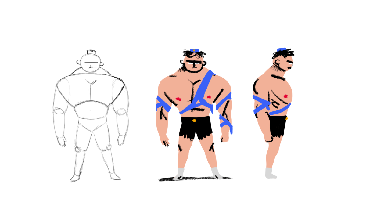
Inspired by Gross independent, punky-rebel essence we wrote this rollercoaster ride of a story, a non stop persecution of this police dog in the endless chase for at least one last drop of this refreshing hazy IPA.
Produced by Niceshit and co-directed with our great friend Leo Campasso we put together a concise yet stellar team that made this possible.
We always try to share some of the behind the scenes, how these shots were made from rough pencil tests to clean up and final look.
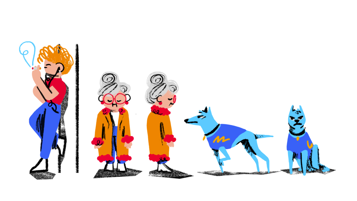
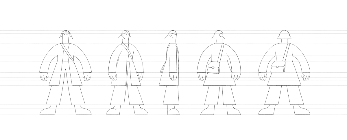
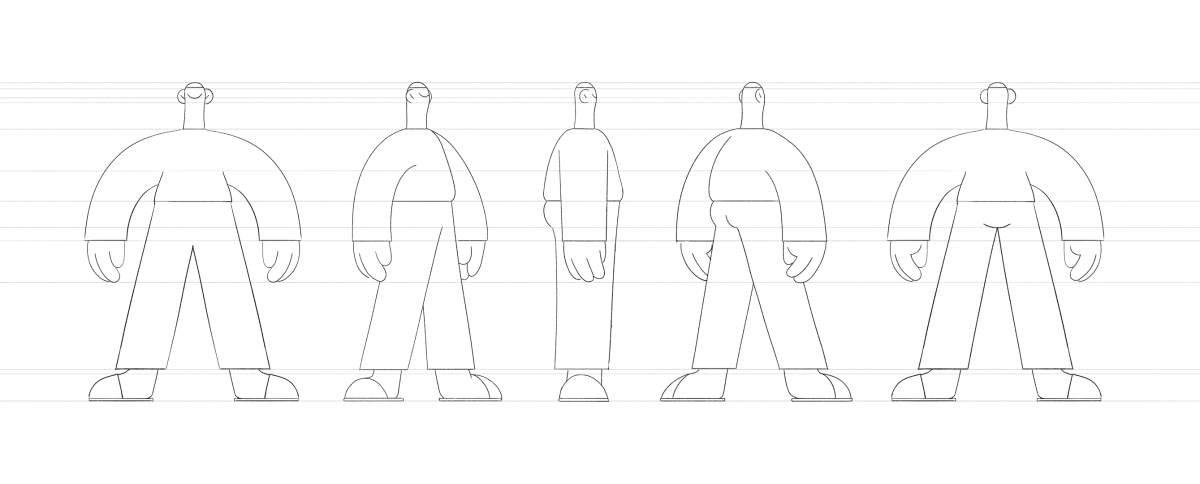
Character studies & character sheets are key to any animated production and specially for a frame by frame short film. That's why we did many sketches, key poses and turnarounds of the Blue Dog main cast.
After laying down the ideas on a storyboard, we sketched every layout and camera angle for all the scenes, this gave us a complete and integral understanding of the film structure. So we could steadily work from there.
There is only one shot that we approached differently. We roughly sketched the camera movement and overall action in 3D first, aiming to get the timings right to then move into the initial, rough pencil animation.
Our first animatic is pure gold, it surprises us how similar our first animatic is to the actual final film and it also makes us laugh every time we watch it.
The clean up stage was a complete work of art: each and every frame with the love and detail of editorial illustrations - mixing hard, sharpie-like strokes with a bunch of different textured brushes and noise textures. The dog sniffing the lens and making them foggy was definitely a challenge but it came out amazing! All made frame by frame in Photoshop.
WINKS
Akira homage.
We just couldn’t resist adding our little contribution to the endless Akira bike-slides homages, from The Simpsons, Adventure Time, Batman and Ninja Turtles…now also Blue Dog.
A film with rhymes for these hectic times
Client
Krave Beauty
Client
Krave Beauty
Agency
Universal Favourite
Rep
Honey Mill
Produced & directed by
Niceshit
Creative Directors
Carmen Angelillo, Rodier Kidmann & Guido Lambertini
EP
Agusta Timotea
Art Director
Bianca Sangalli Moretti
Animation Director
Guido Lambertini
Design & Illustration
Bianca Sangalli Moretti & Rodier Kidmann
Animatic
Fabio Valesini
Cel Animation
Fabio Valesini, Maliboo, Kiosko & Leo Campasso
Clean Up
Margarita Rojas, Julieta Soloaga, Macarena Ortega Oyanedel, Eze Cruz & Carmen Angelillo
Edit & Compositing
Guido Lambertini & Carmen Angelillo
Music & Sound Design
Facu Capece & Lola Ritcher
STORY
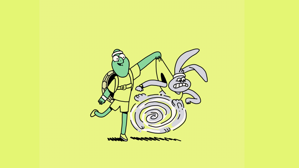
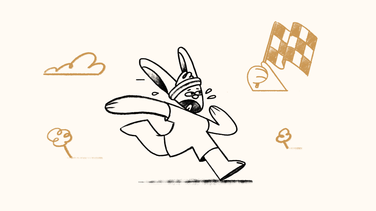
For this, we revisited the all-time classic fable “The Turtle & the Hare” story we’ve all heard countless times, but this time, with a twist.
In our version we follow our fast-paced buddy through a journey of learning and growth, something we could all learn from. The hare is not the bad guy, it's just a victim of the fast-fashion world we’re living in.
And the Turtle? The voice of reason.
“Slow down little bunny and ask yourself why?
Our industry’s grown unsustainably high.”
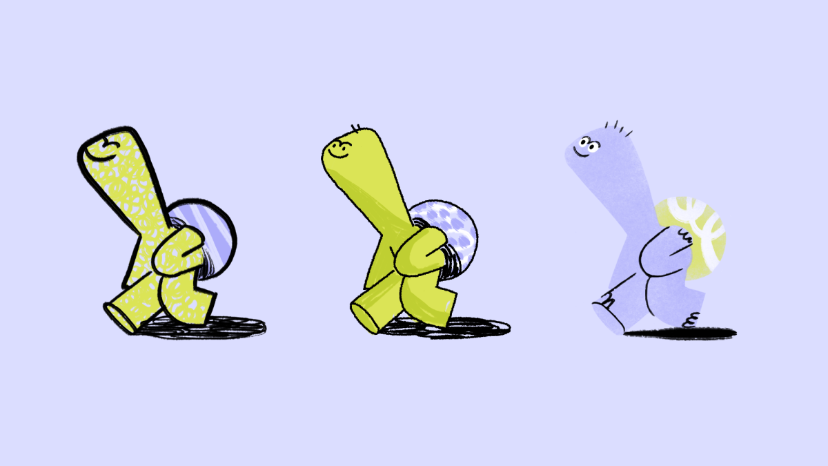
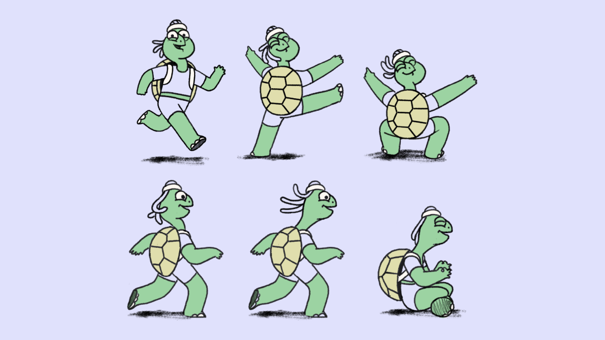
We wanted a sensitive, human and relatable approach and at the same time we wanted to stand out from the classic cold cosmetics adverts. Inspired by classic animated cartoons from the 60s to the 90s hand-made illustrations, brushes, and textures were a perfect fit. We used traditional frame-by-frame animation, focusing on key poses and moments, and having fun with smears and graphic motion blurs — making every single frame one of a kind.
The script?
Written as a poem.
That was the cherry on top
We love using our creativity to reflect the goals and philosophies we believe in. And this project was exactly that.
The solution is sometimes in front of our eyes, we just have to be ready to step out of the business machine and find our healthy and thoughtful pace.
“We’re in it together, we’ll do what is right,
for skincare, the planet, and a future that’s bright.”
Problem
We realized there’s an insane amount of beauty products we’re made to believe we need.
SOLUTION
With the goal of fighting the overwhelming fast fashion in cosmetics, We partnered up with Krave and Universal Favourite, to contribute to show a possible solution, to offer a different way, a slower one. One that feels more human.
It was all about pressing reset on how the beauty industry defines success And finding a way to communicate something sensitive, close, warm and relatable.
so, we created this animated anthem for their “Slow Down Skincare” campaign — a call to reduce the number of products we use, and help our planet while we’re at it.
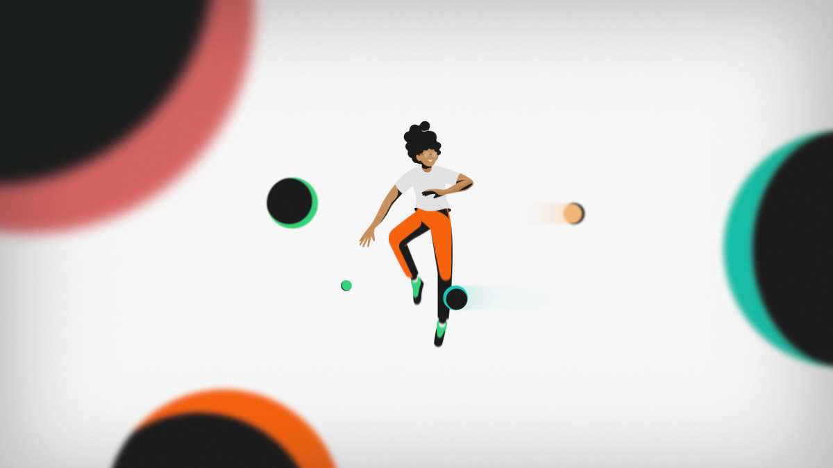
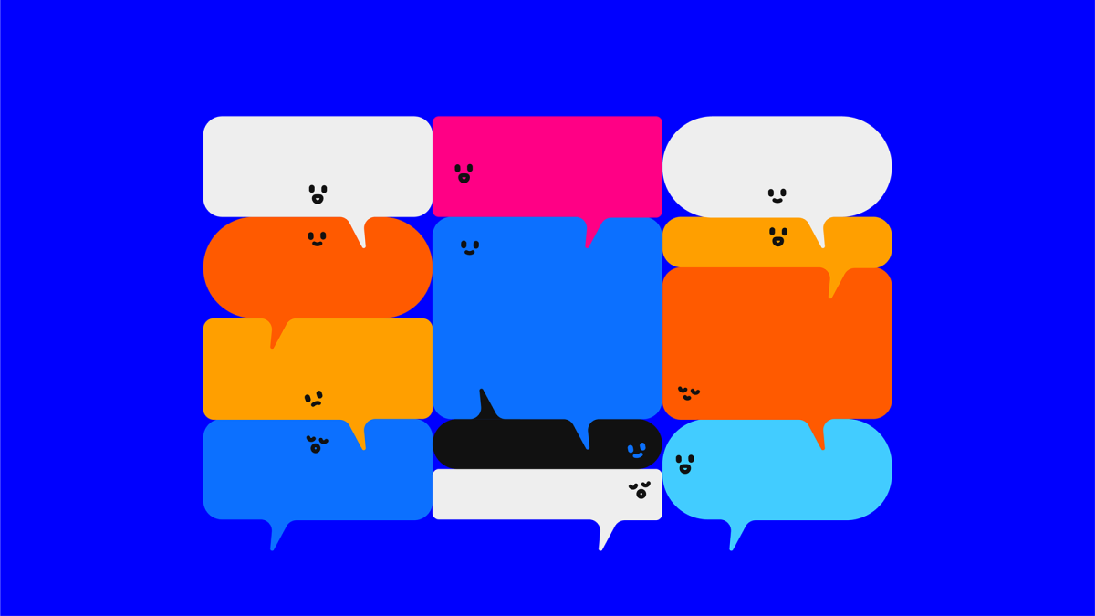
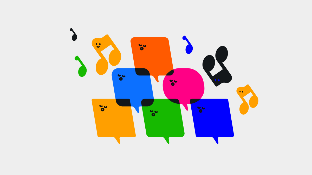
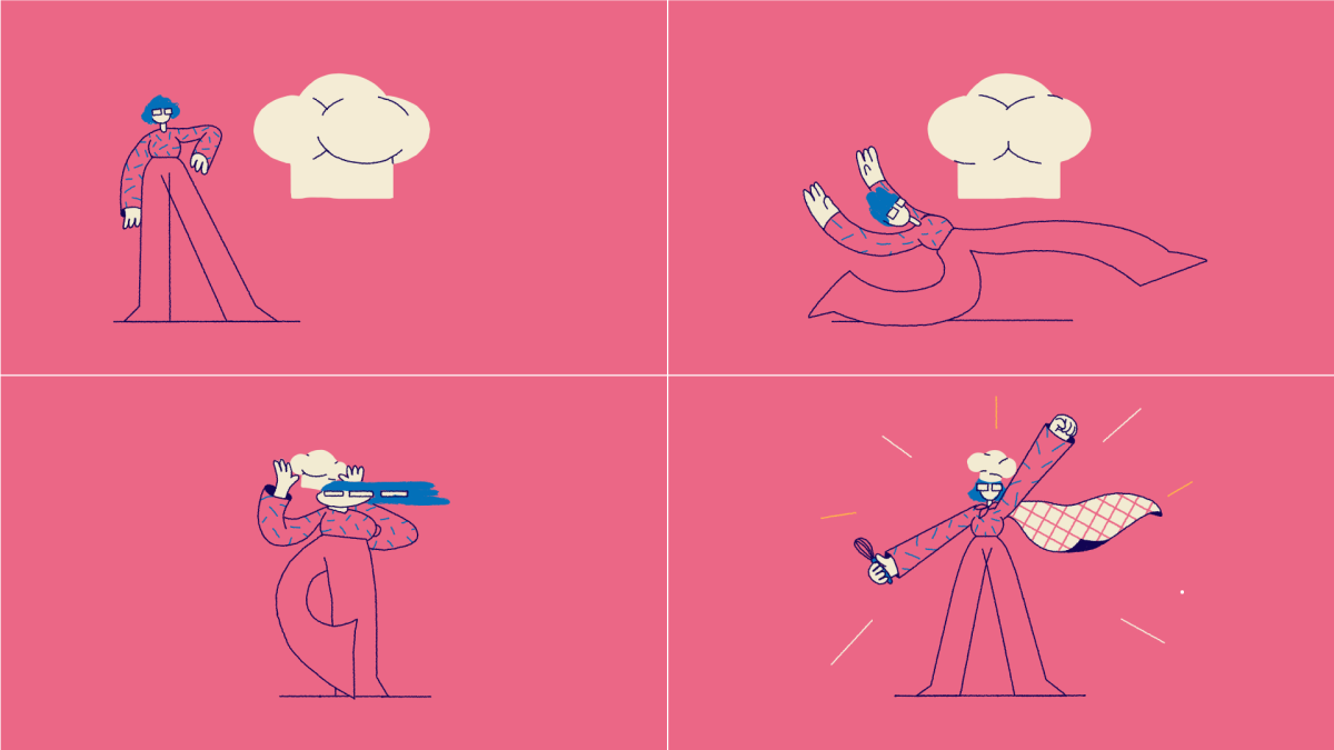
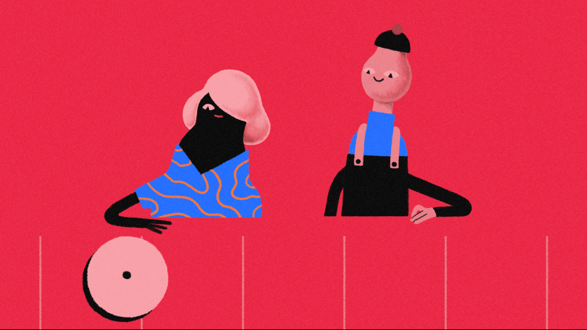
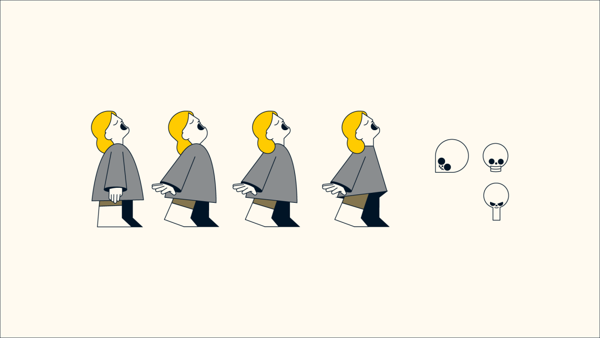
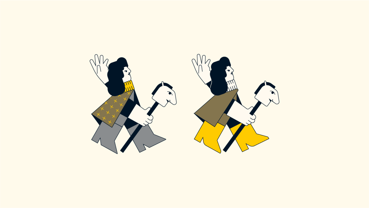
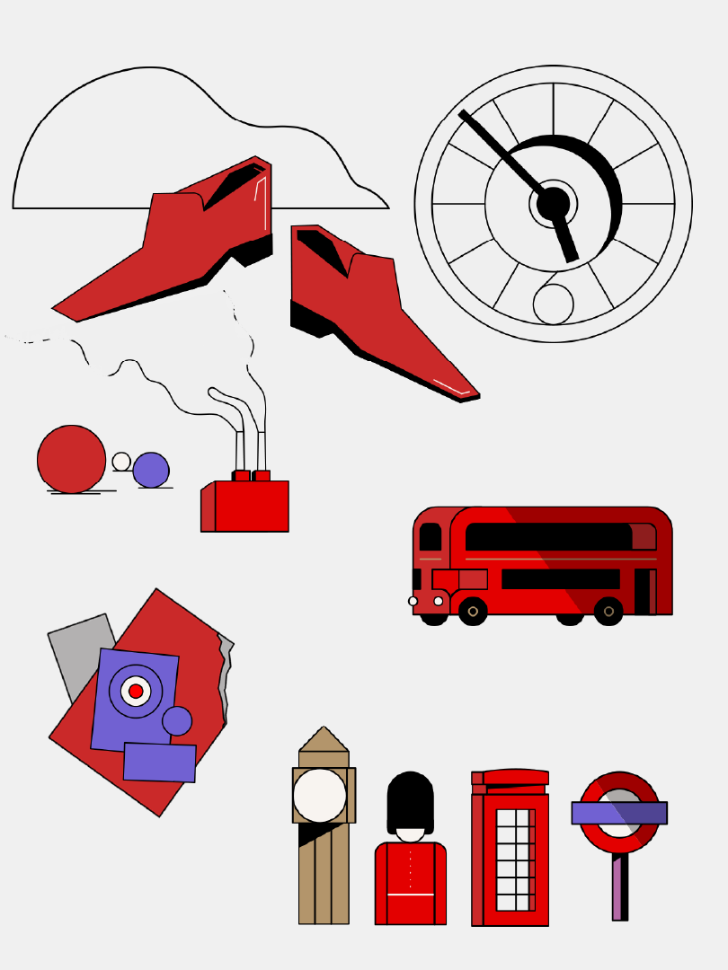
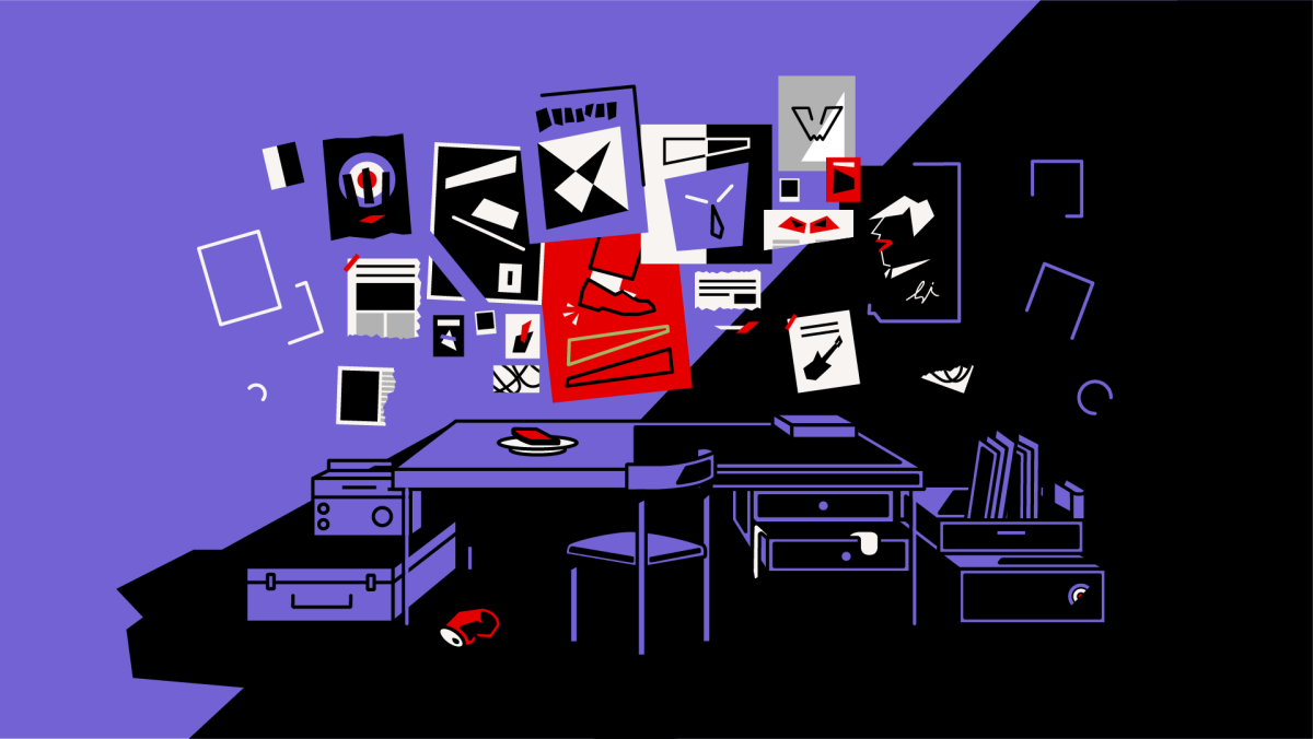
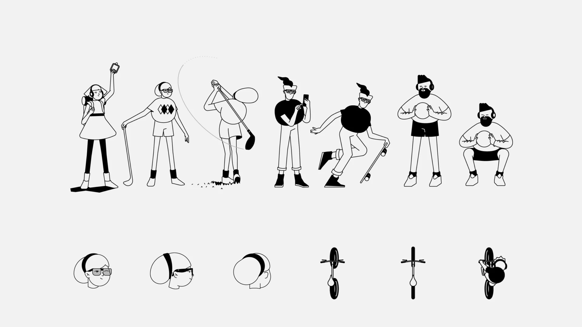
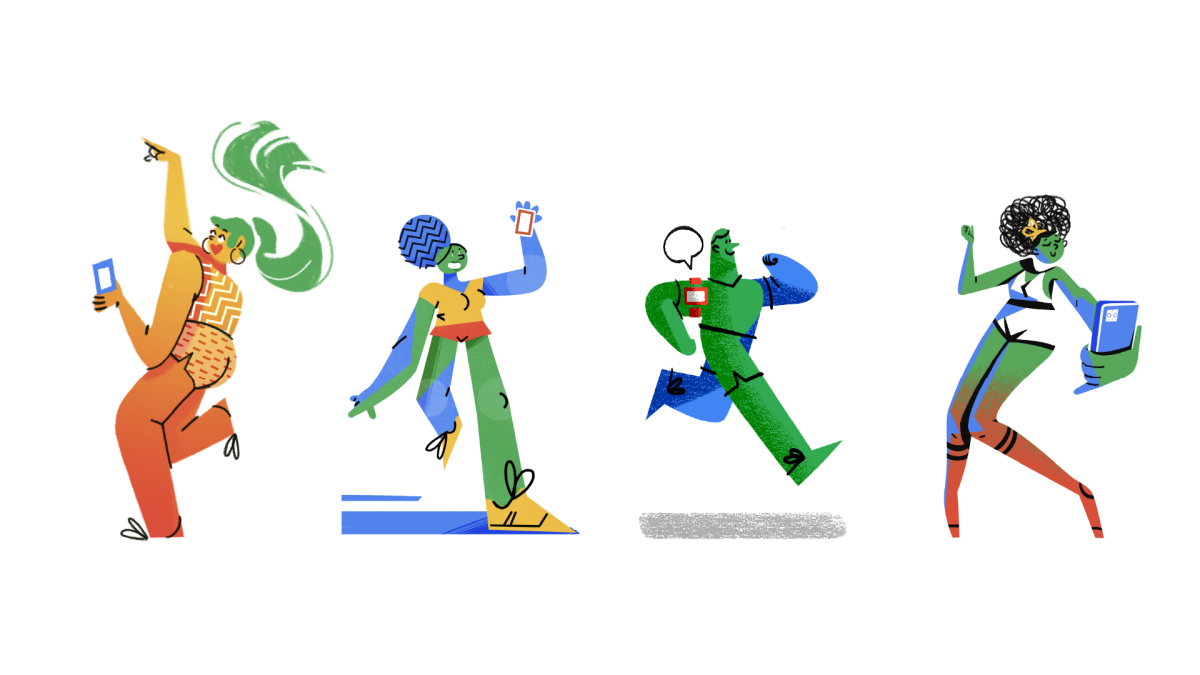
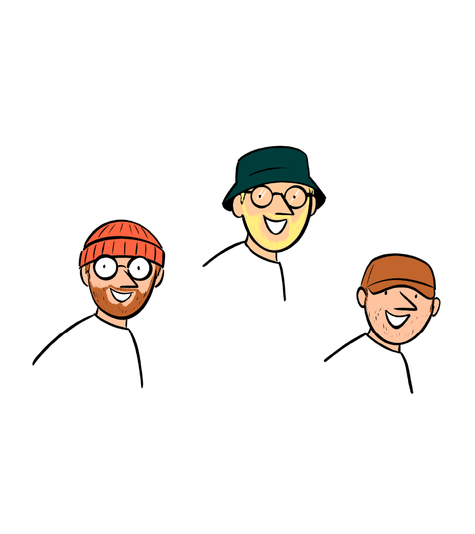
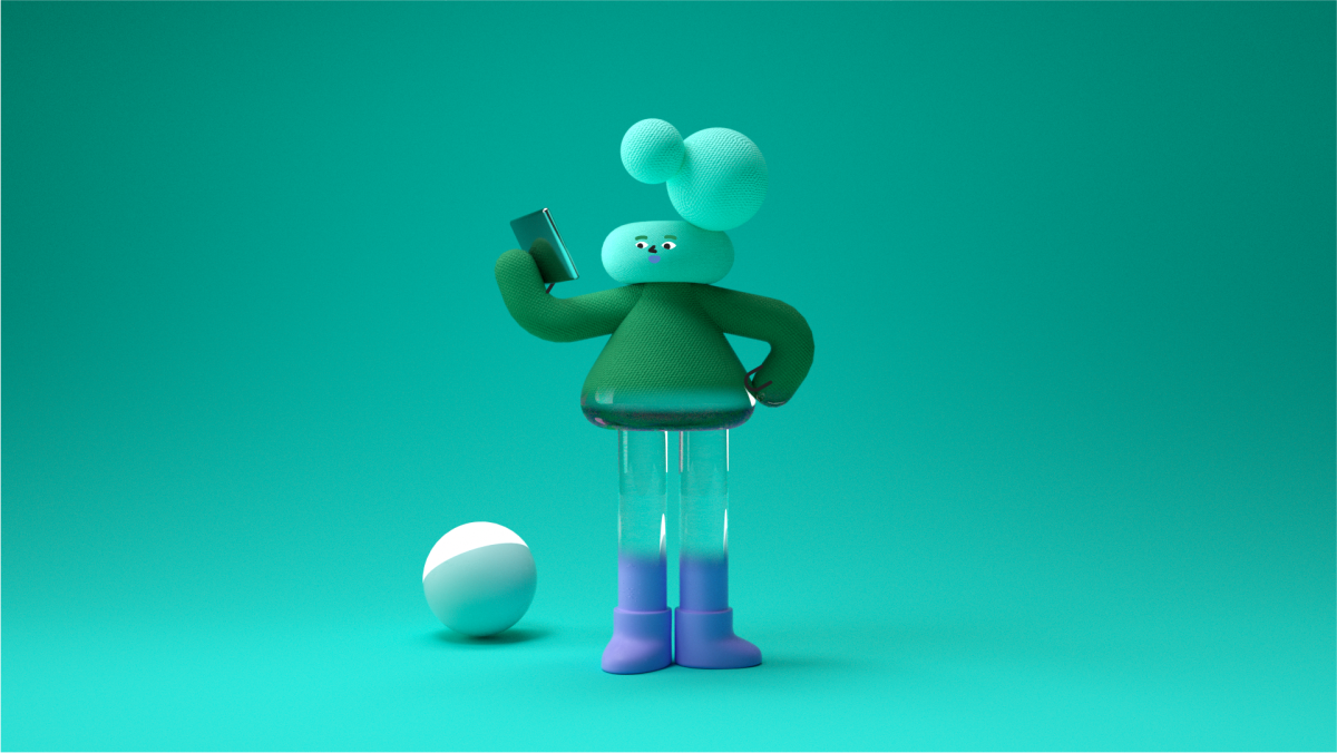
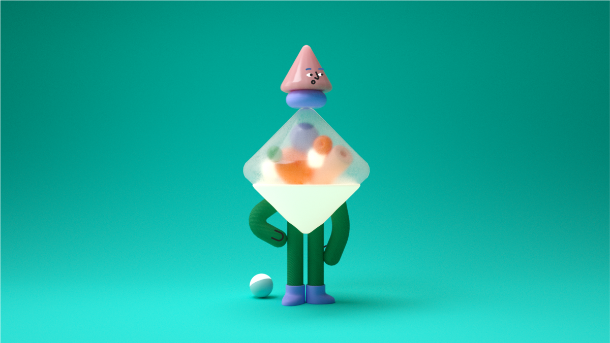
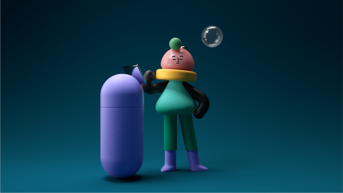
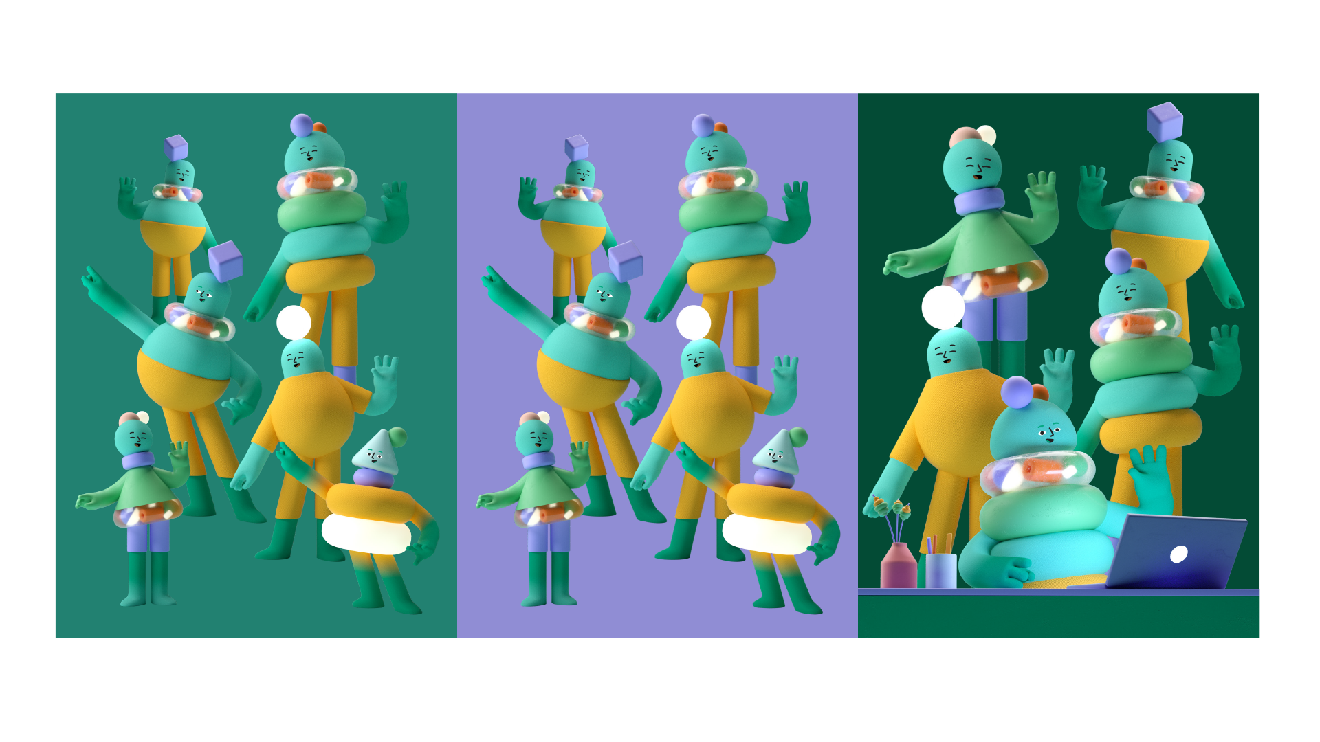
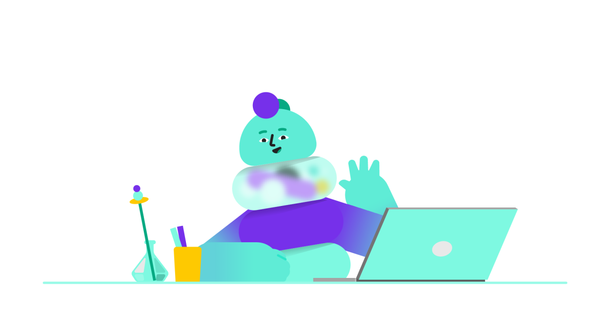
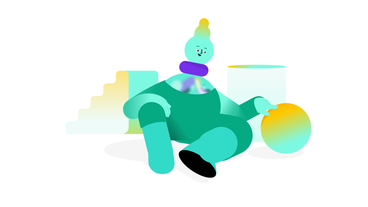
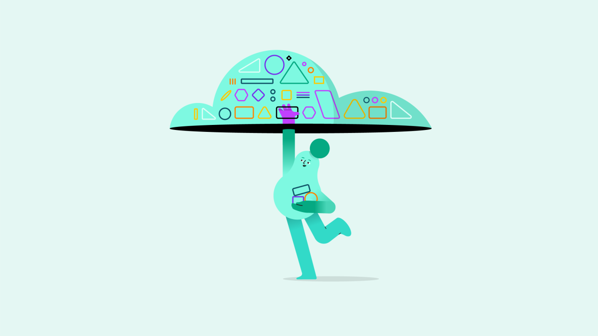
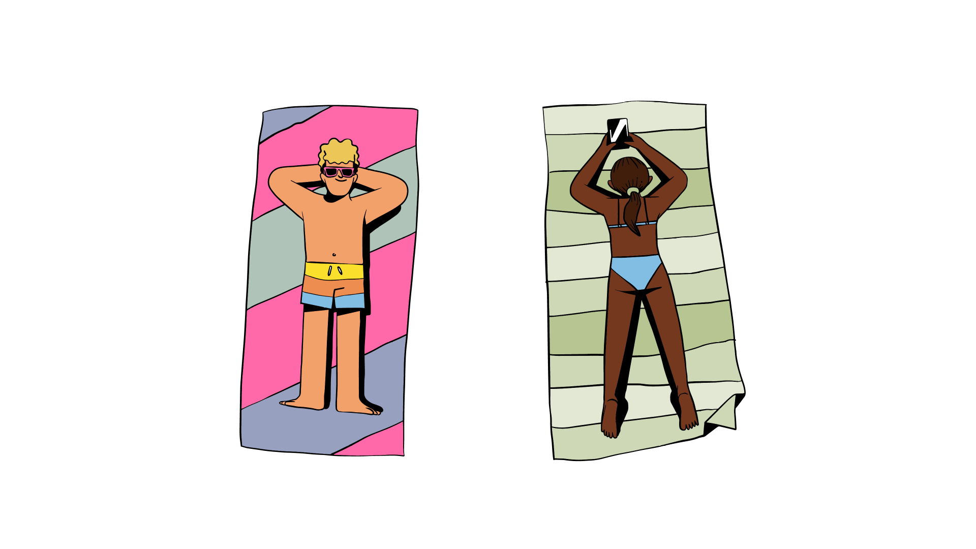
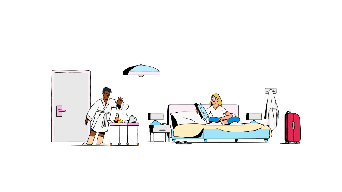
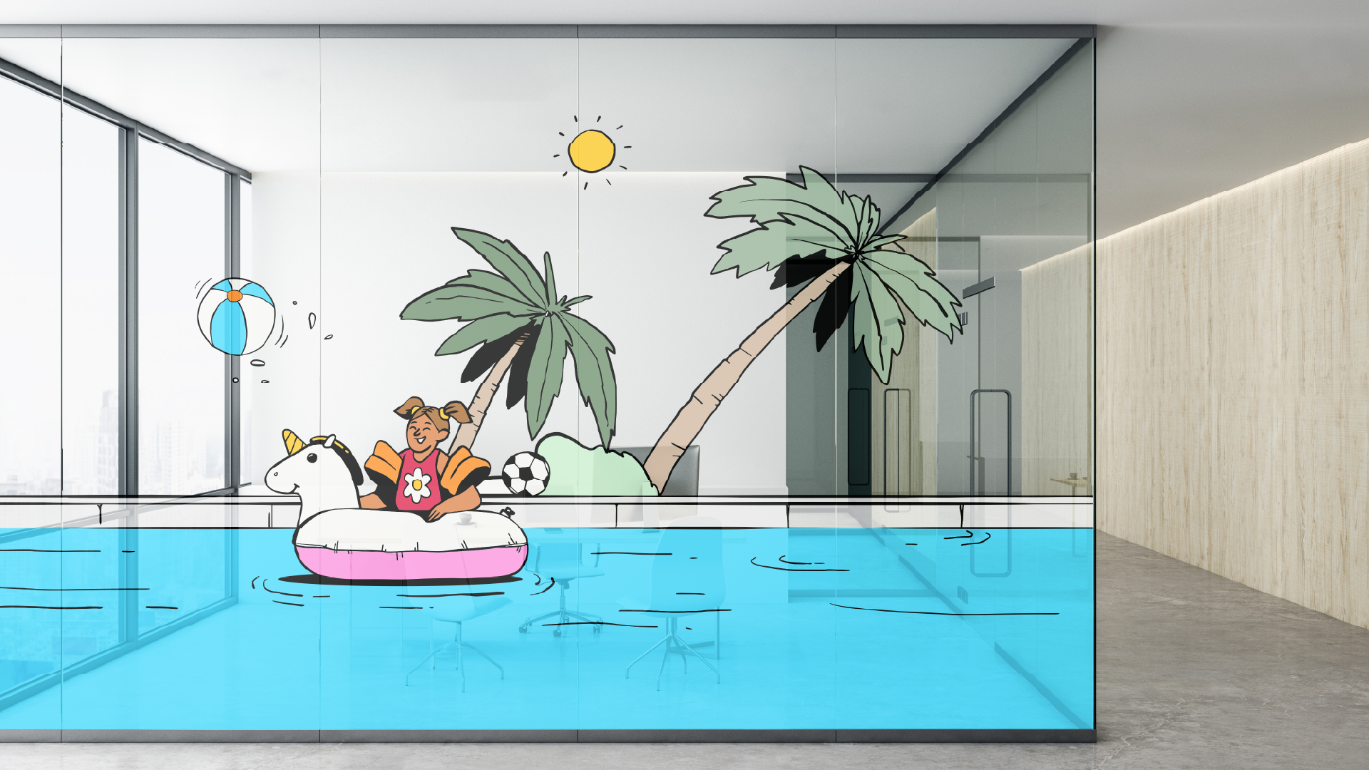
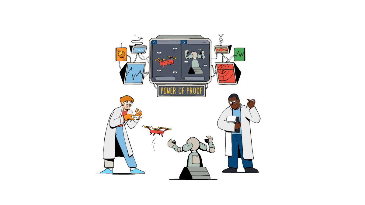
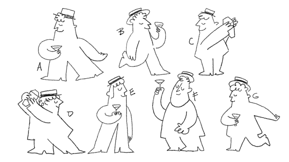
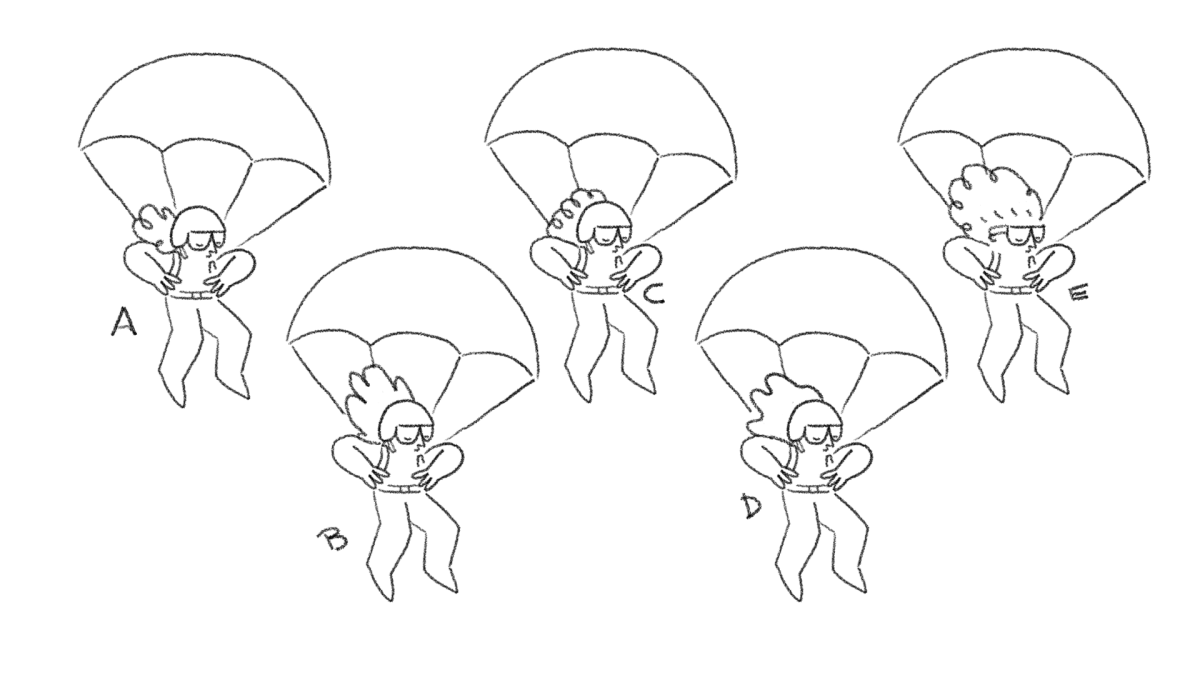
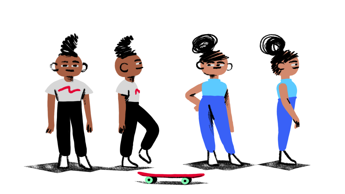
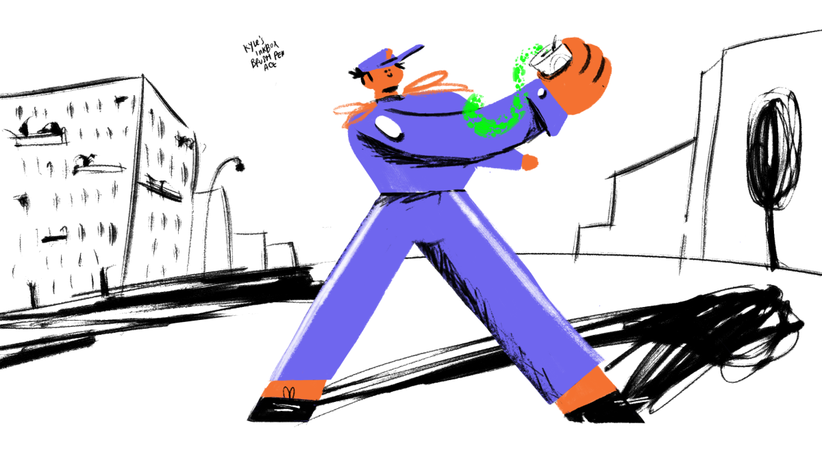
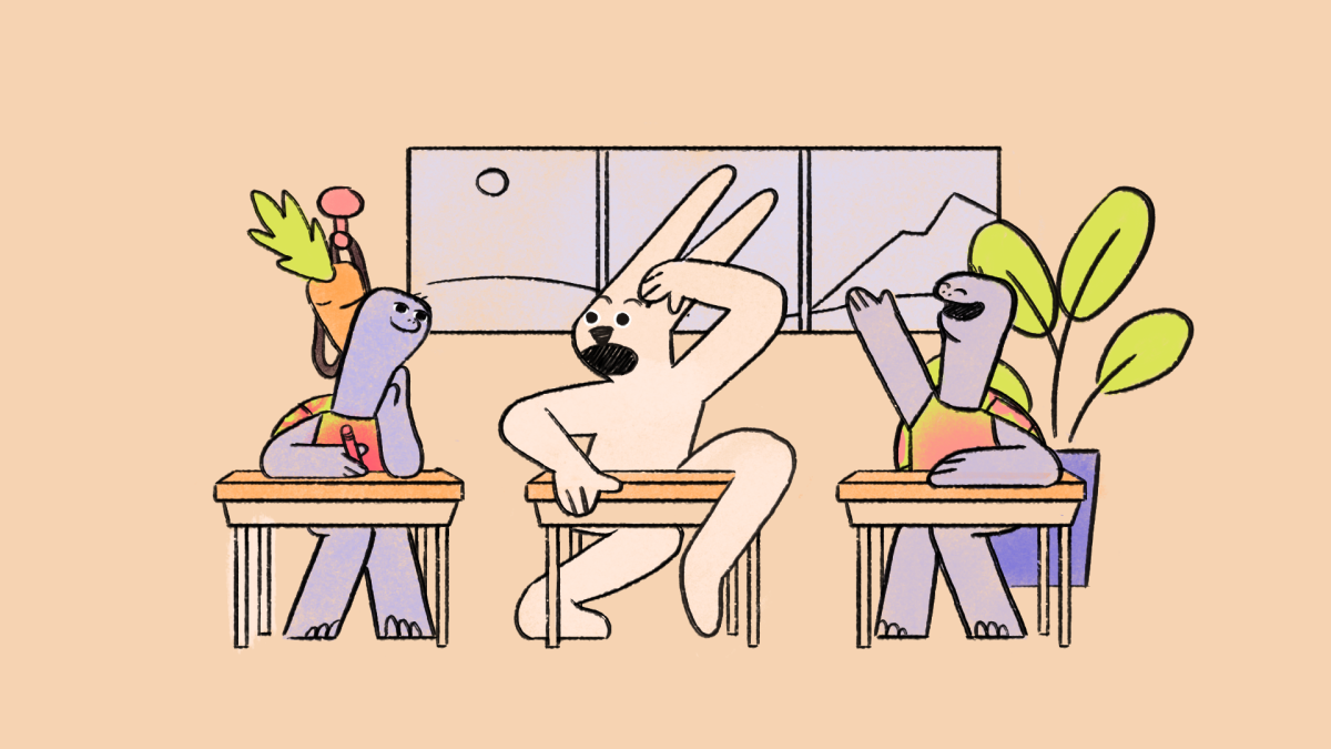
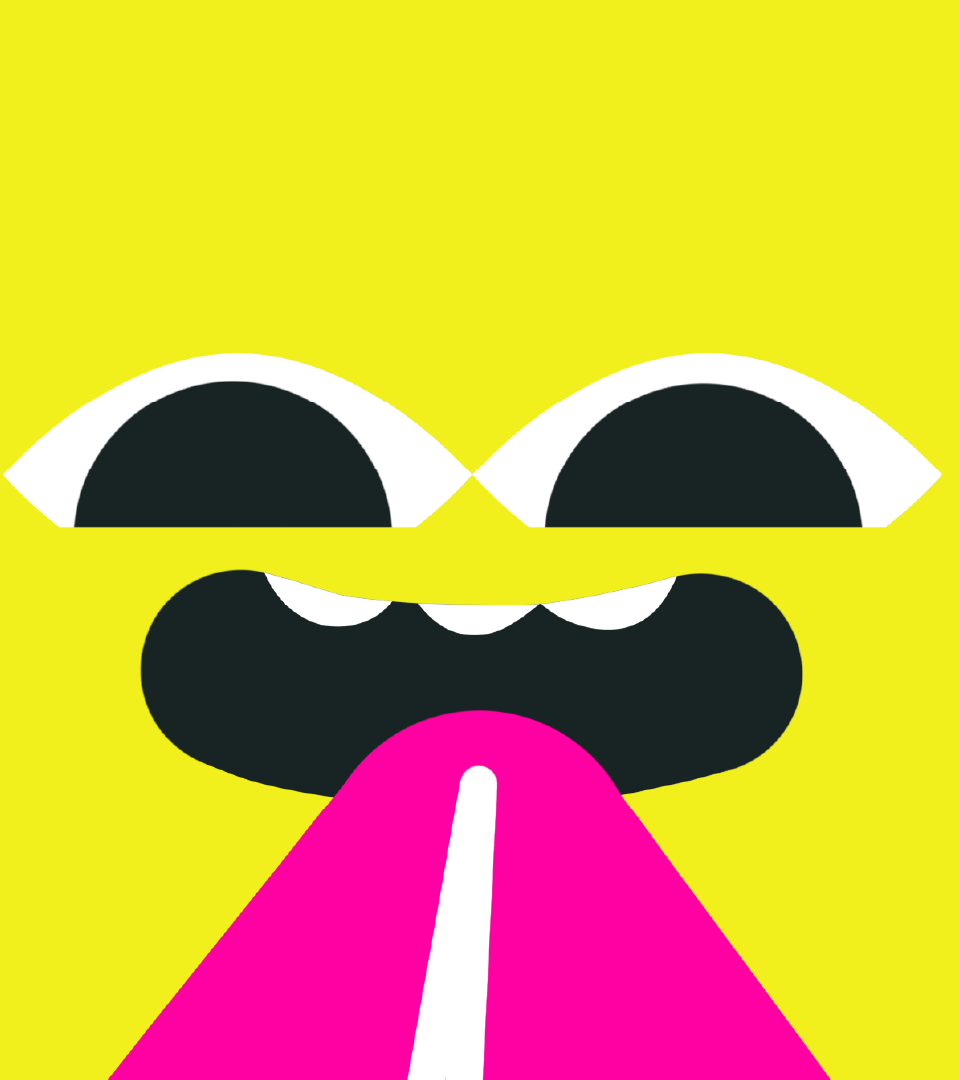
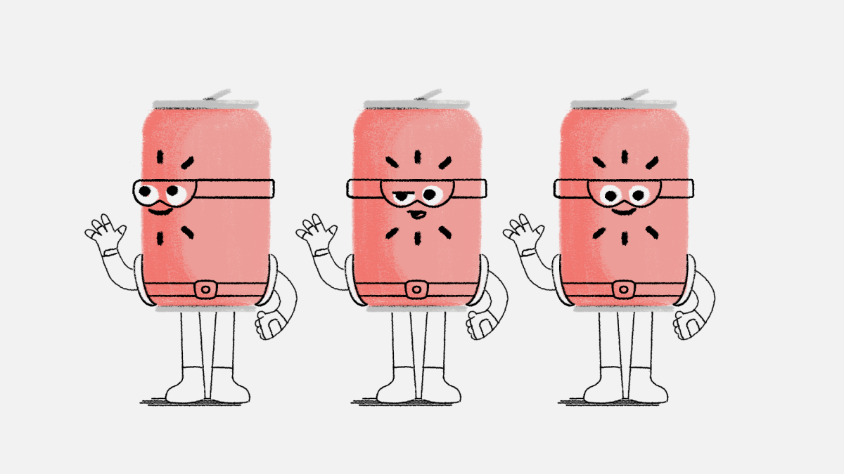
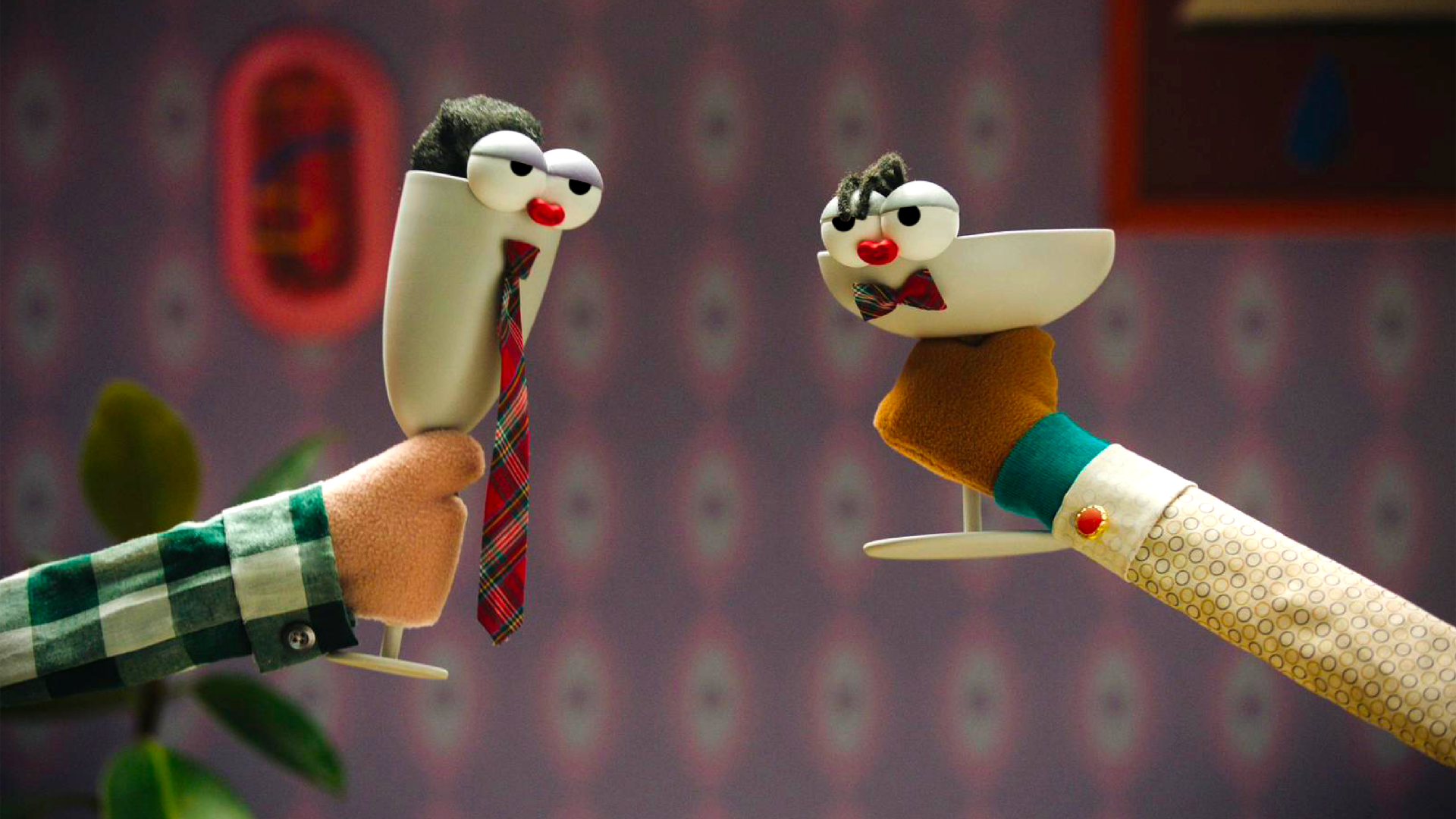
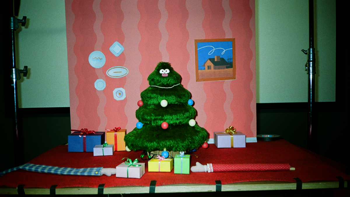
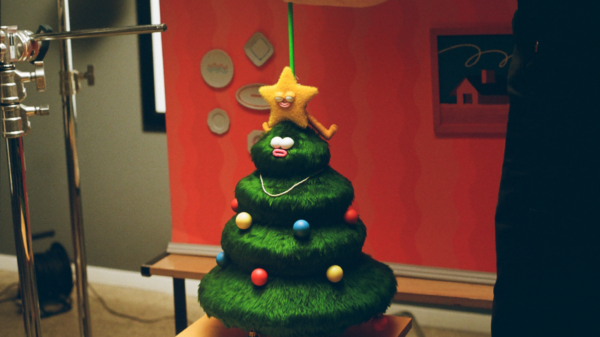
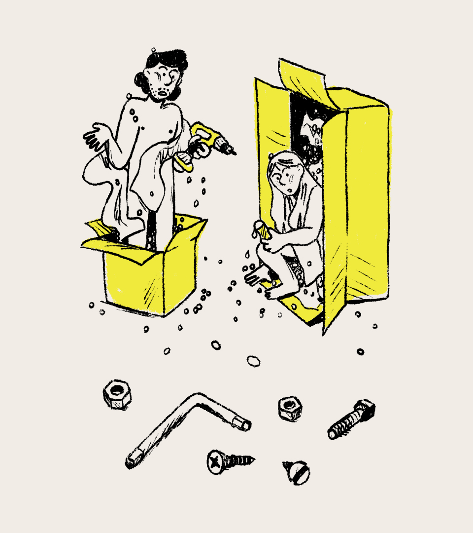
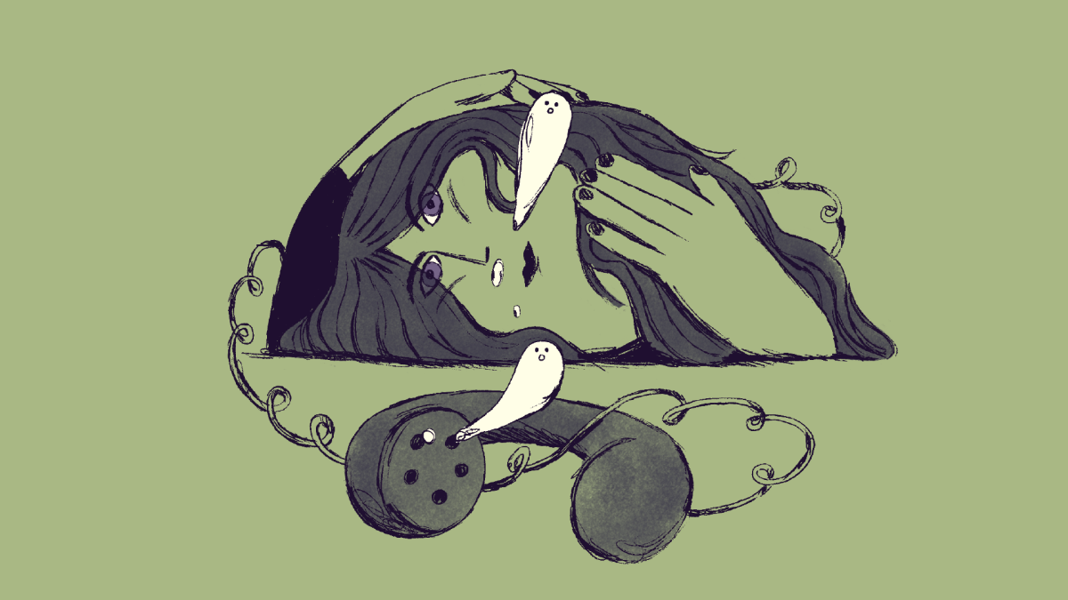
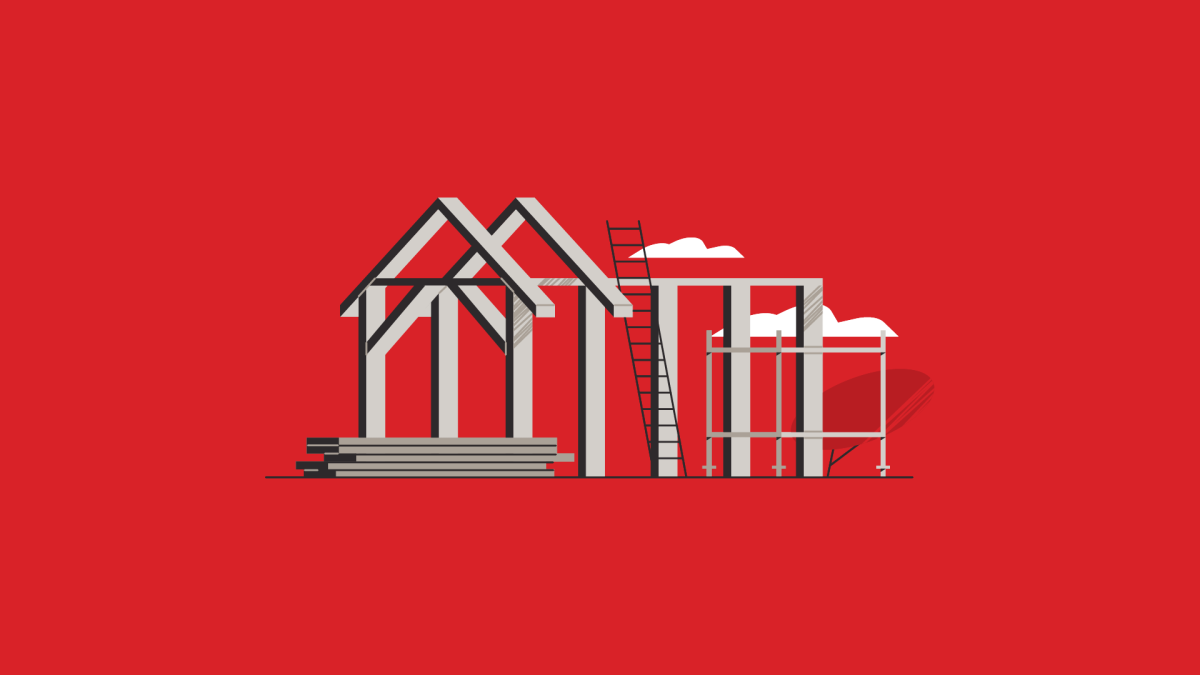
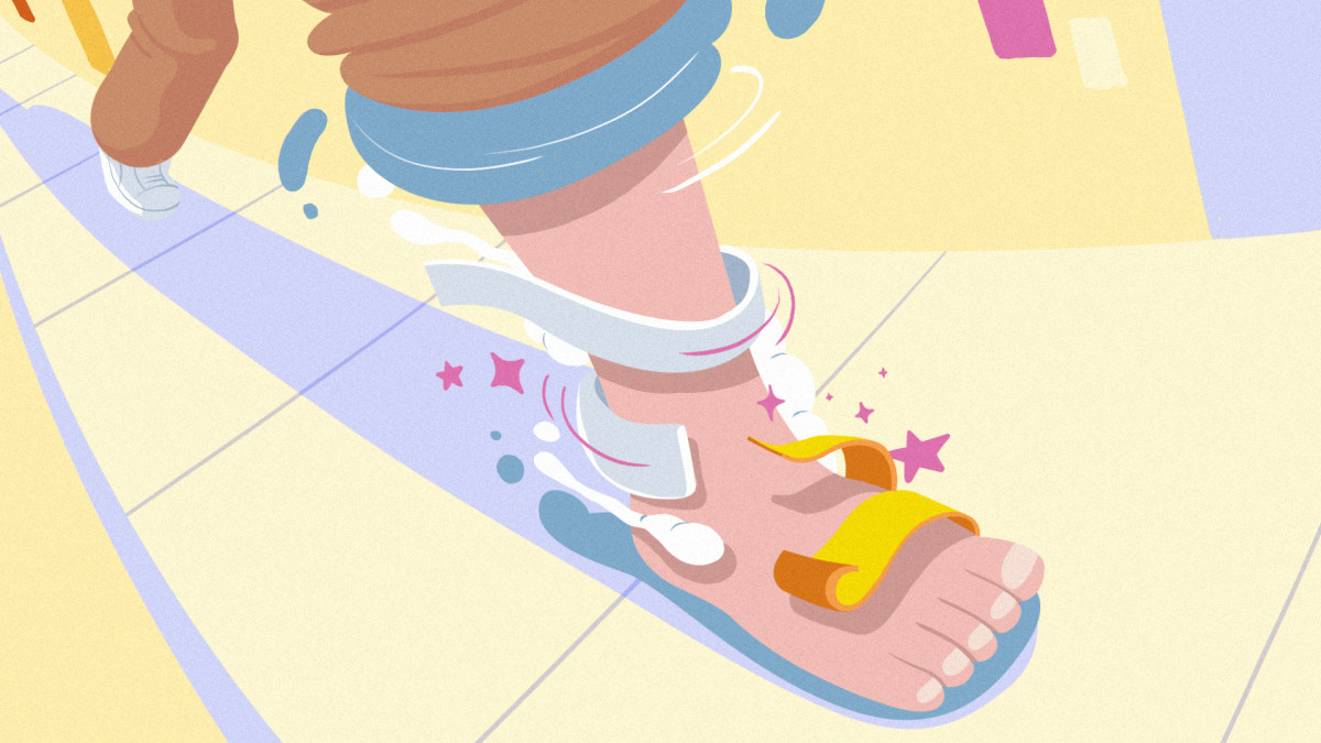
An insight to our talk and values
Client
TMDG Conference
Produced & Directed by
Niceshit
Creative Directors
Carmen Angelillo, Guido Lambertini, Rodier Kidmann
EP
Agusta Timotea
Design & Illustration
Rodier Kidmann
Animation Director
Guido Lambertini
2d Animation
Josep Bernaus, Maliboo, Eze Cruz, Fabio Valesini & Kiosko
Clean Up
Bianca Sangalli Moretti, Ana Freitas, Yaiza Ortiz & Eze Cruz
Edit & Compositing
Guido Lambertini, Ana Freitas, Fabio Valesini
Music & Sound Design
Facu Capece & Lola Ritcher
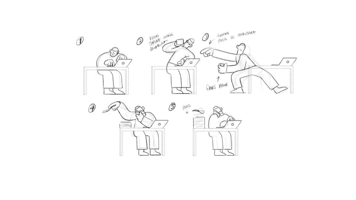
STORY
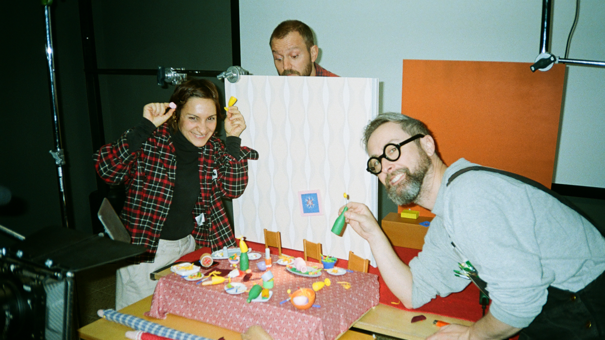
In August 2022, we got the invite to speak at Trimarchi – a huge event in Mar del Plata, Argentina, with 7,000 people in the audience. Excited? Absolutely. Terrified? Even more.
It was our first time doing something like this, so we started preparing a talk about our projects, our studio, and the humans behind it. It turned out to be a really introspective process – beautiful and necessary.
It was just in the middle of the process when we realized that we were not speakers (at least until that time!) But instead we are storytellers, so we decided to divide our talk into chapters.
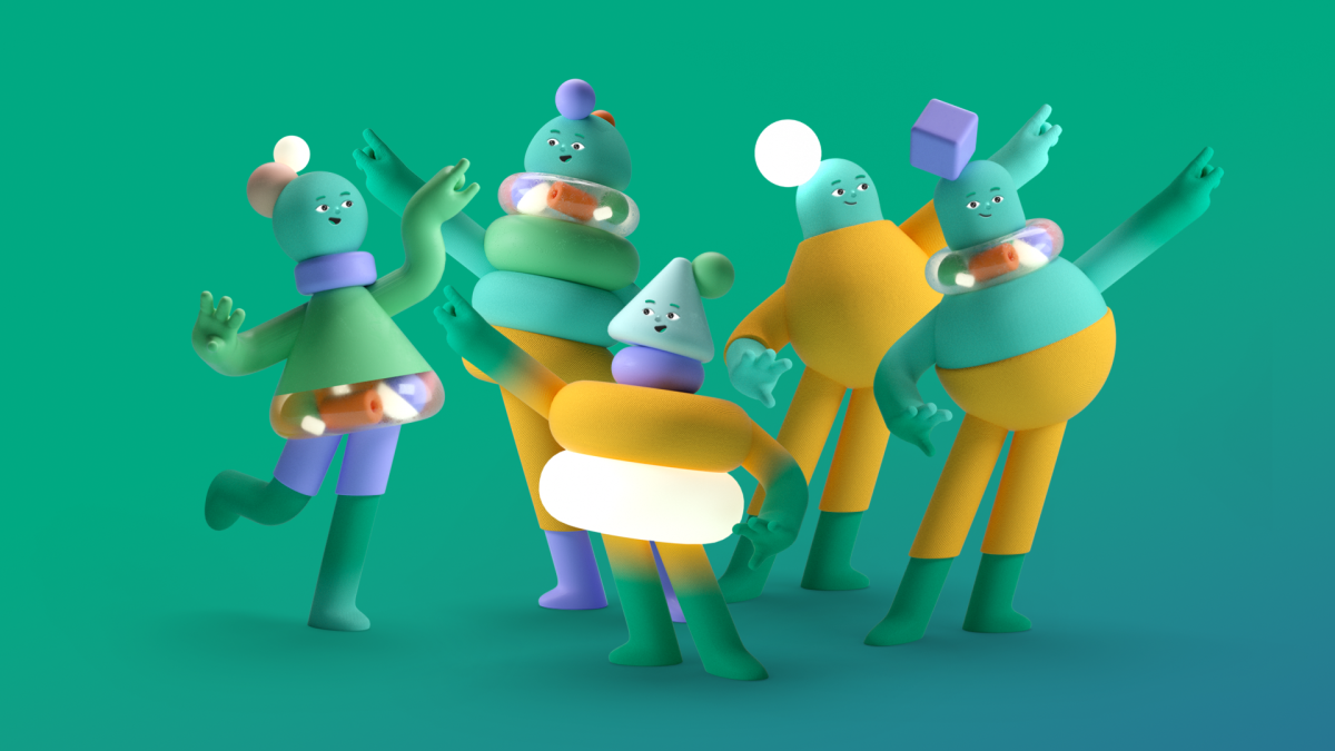
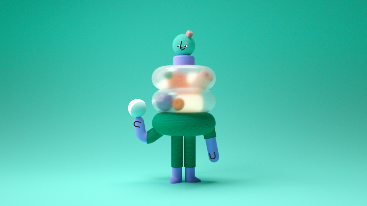
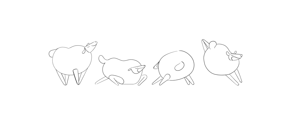
We ended up writing and animating 5 little chapters to take the audience through some of the feelings and thoughts that in some way rule our little bubble at Niceshit.
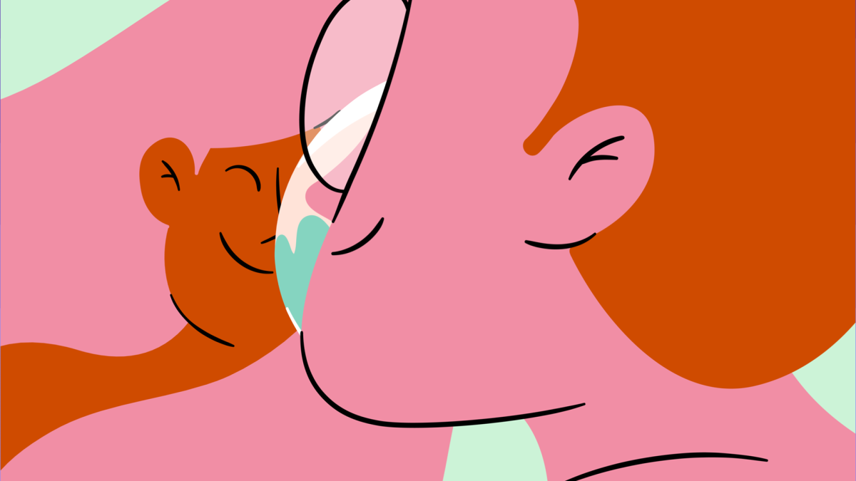
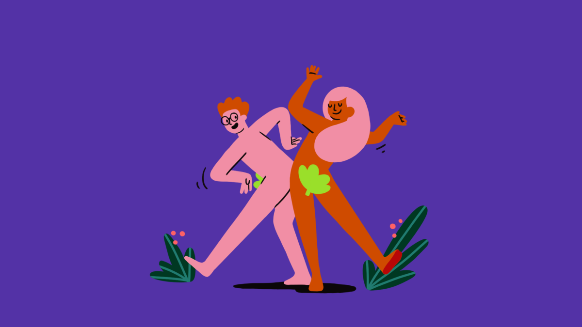
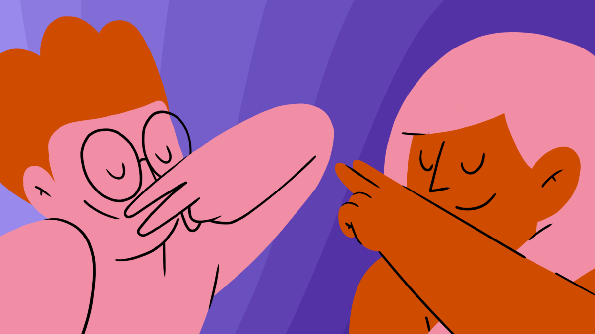
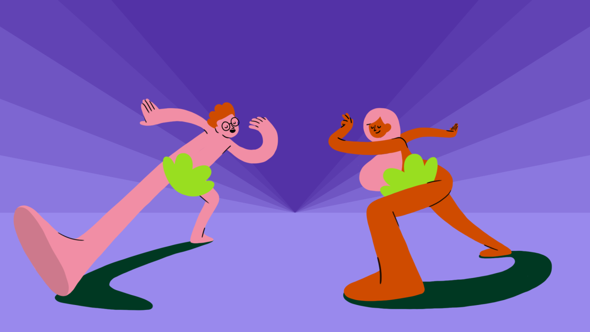
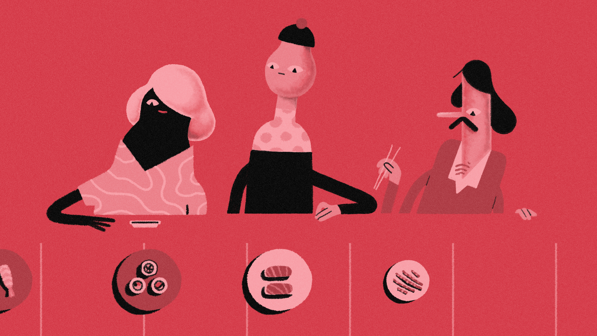
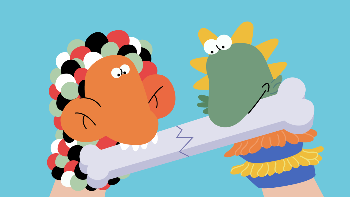
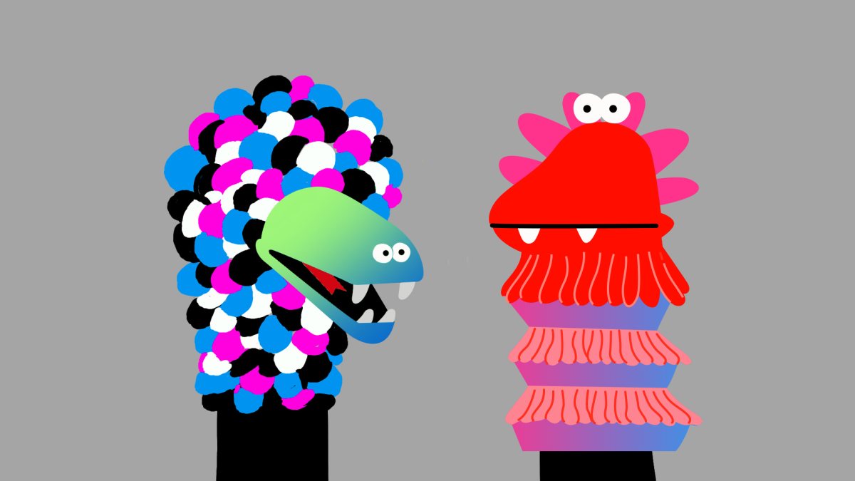
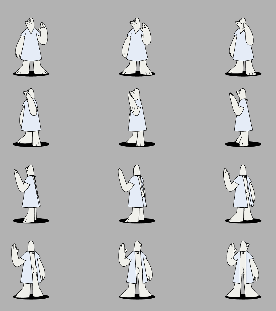
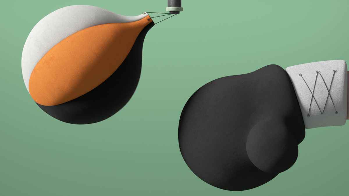
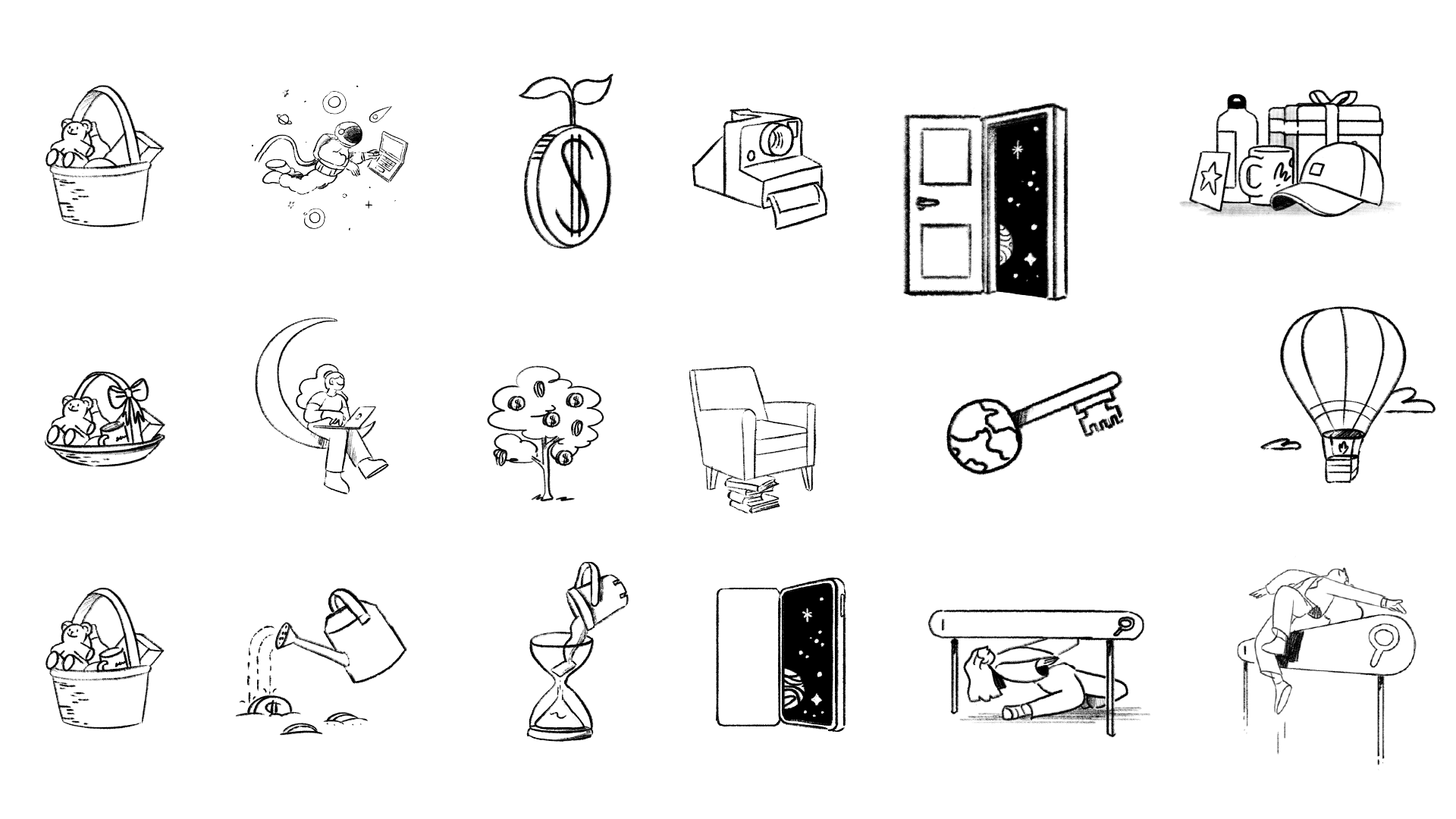
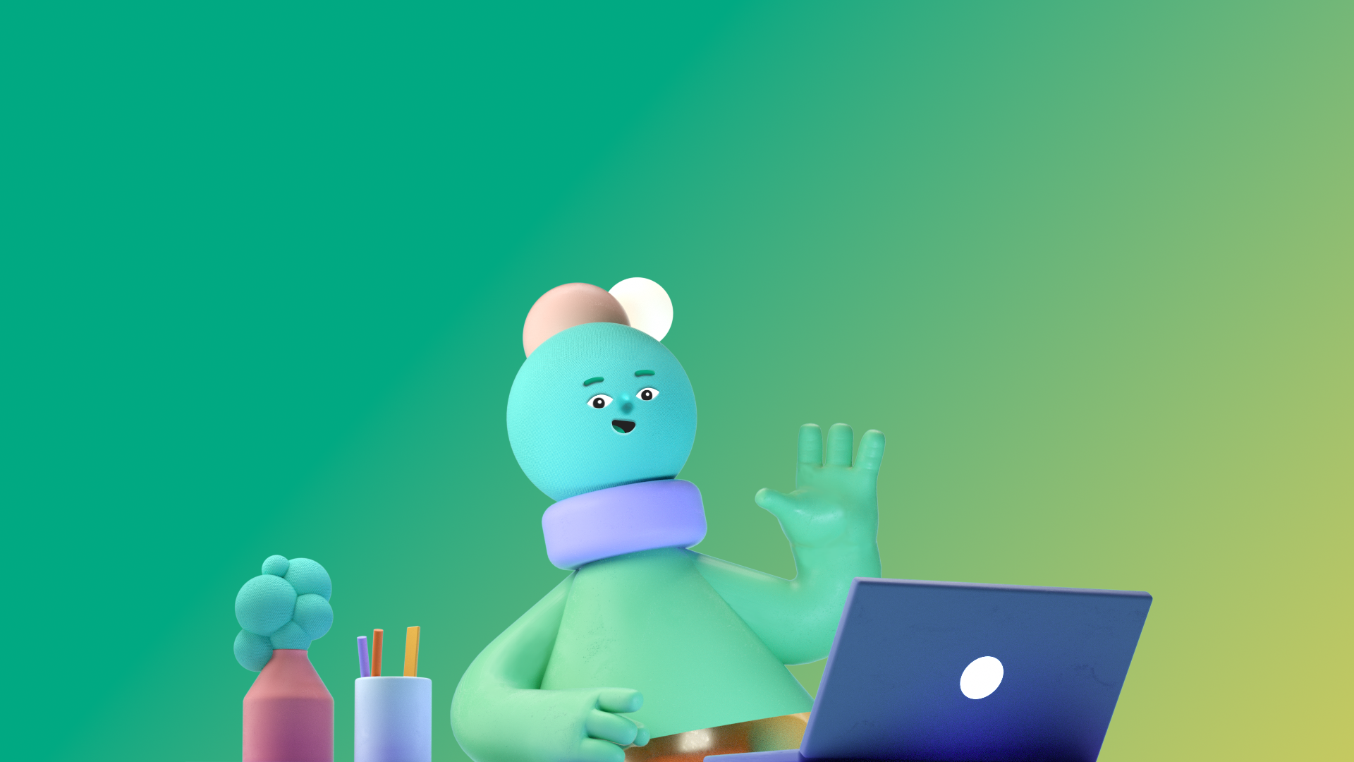
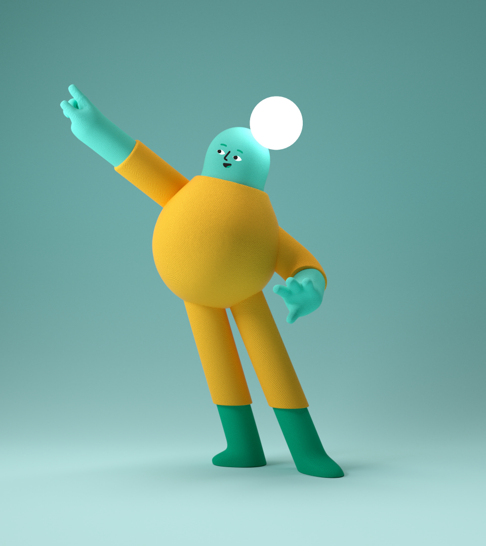
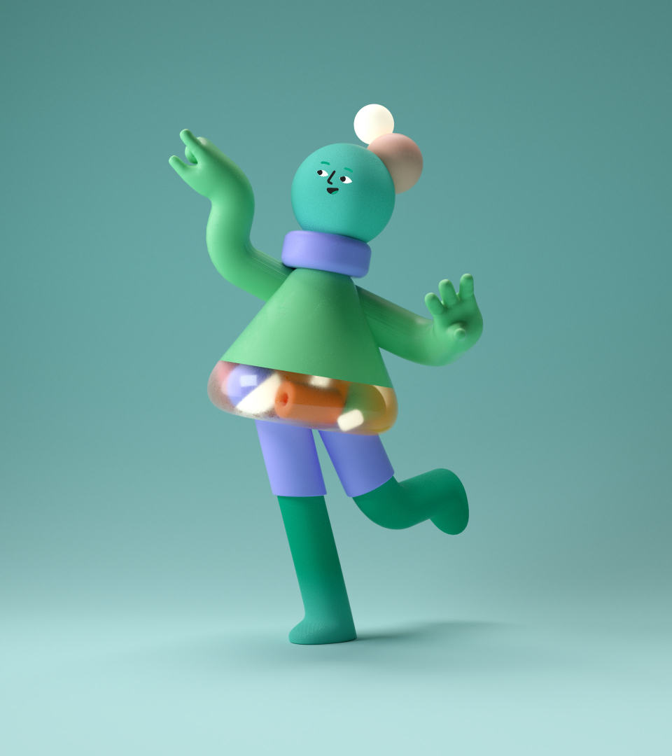
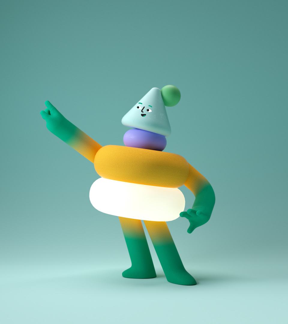
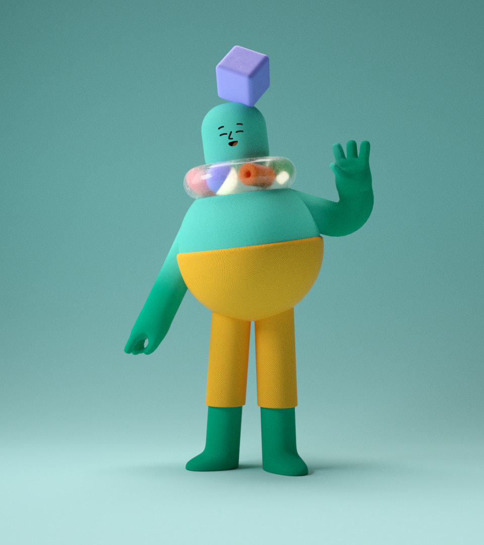
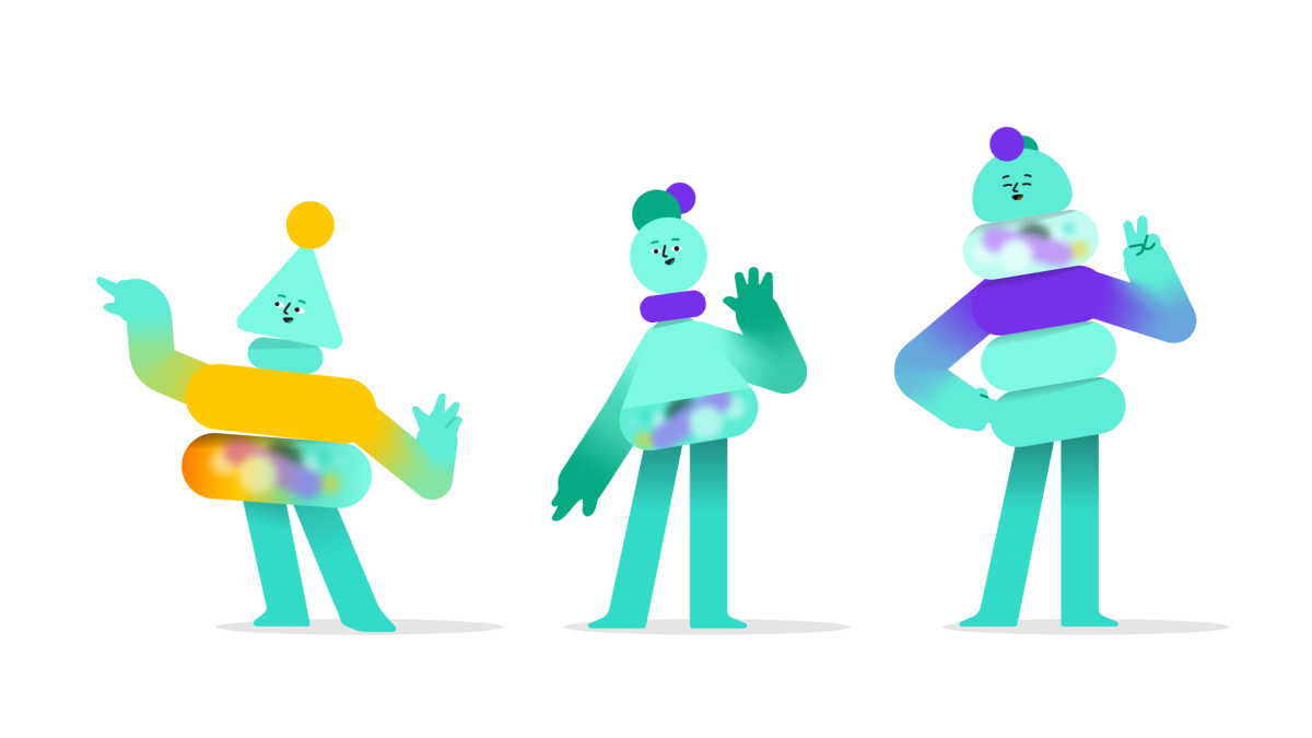
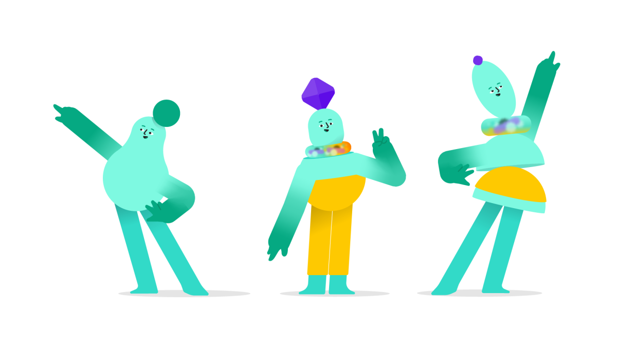
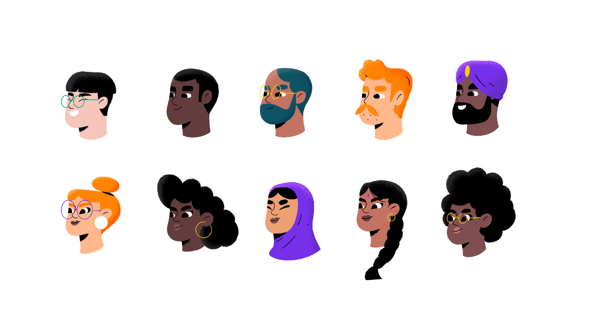
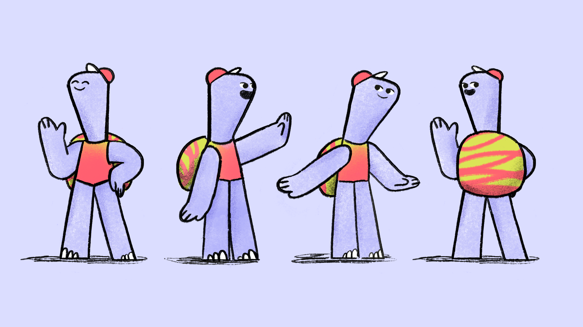
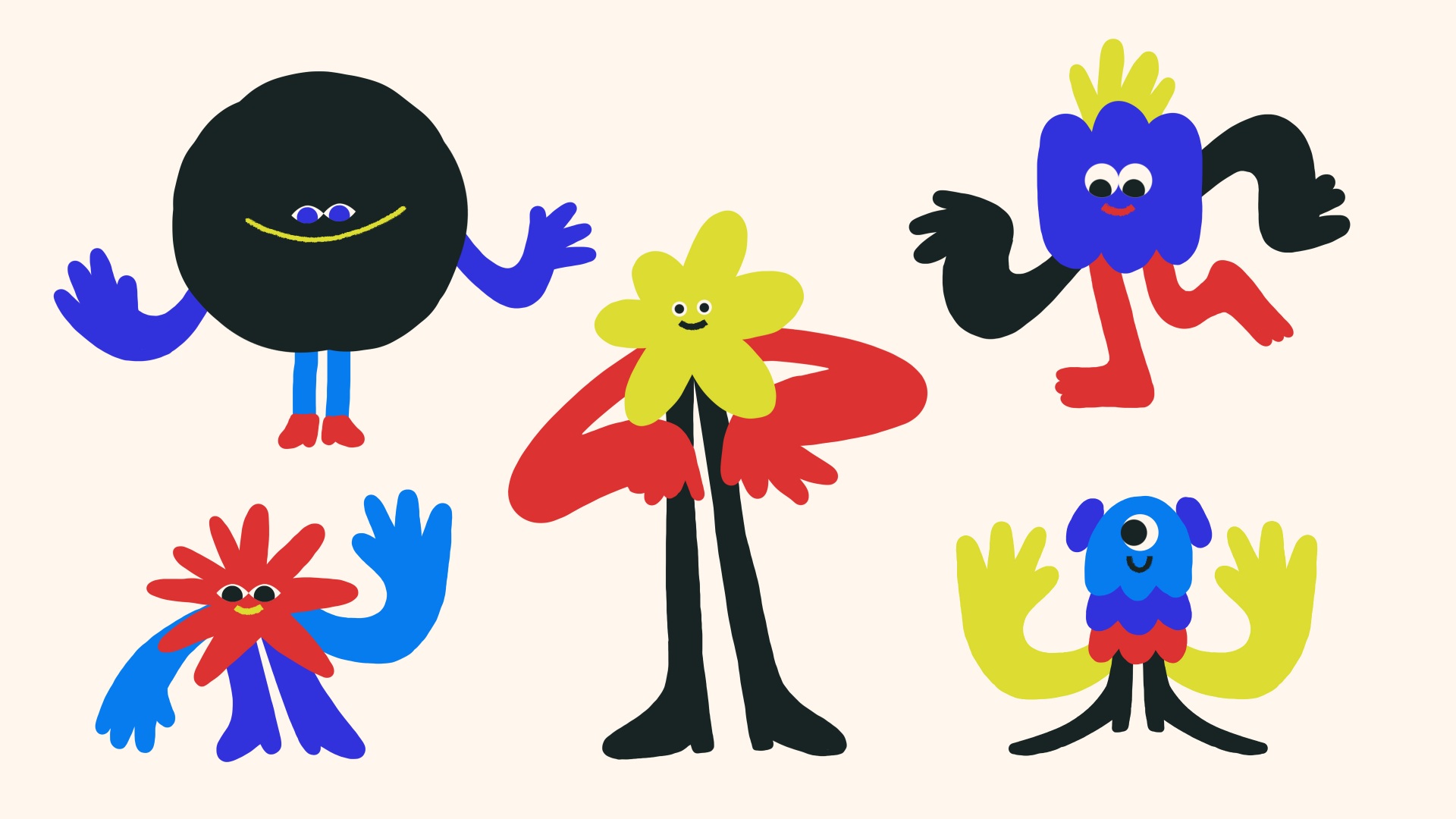
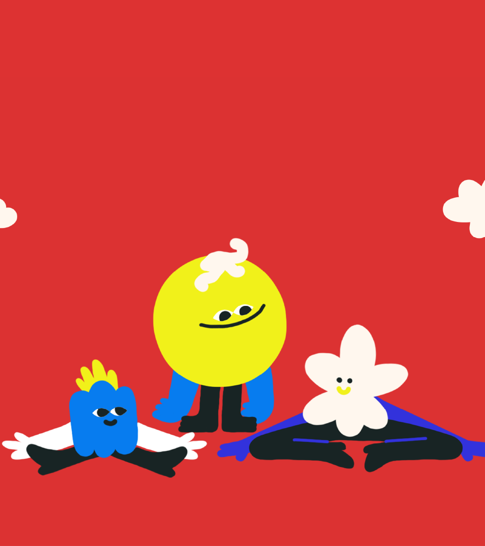
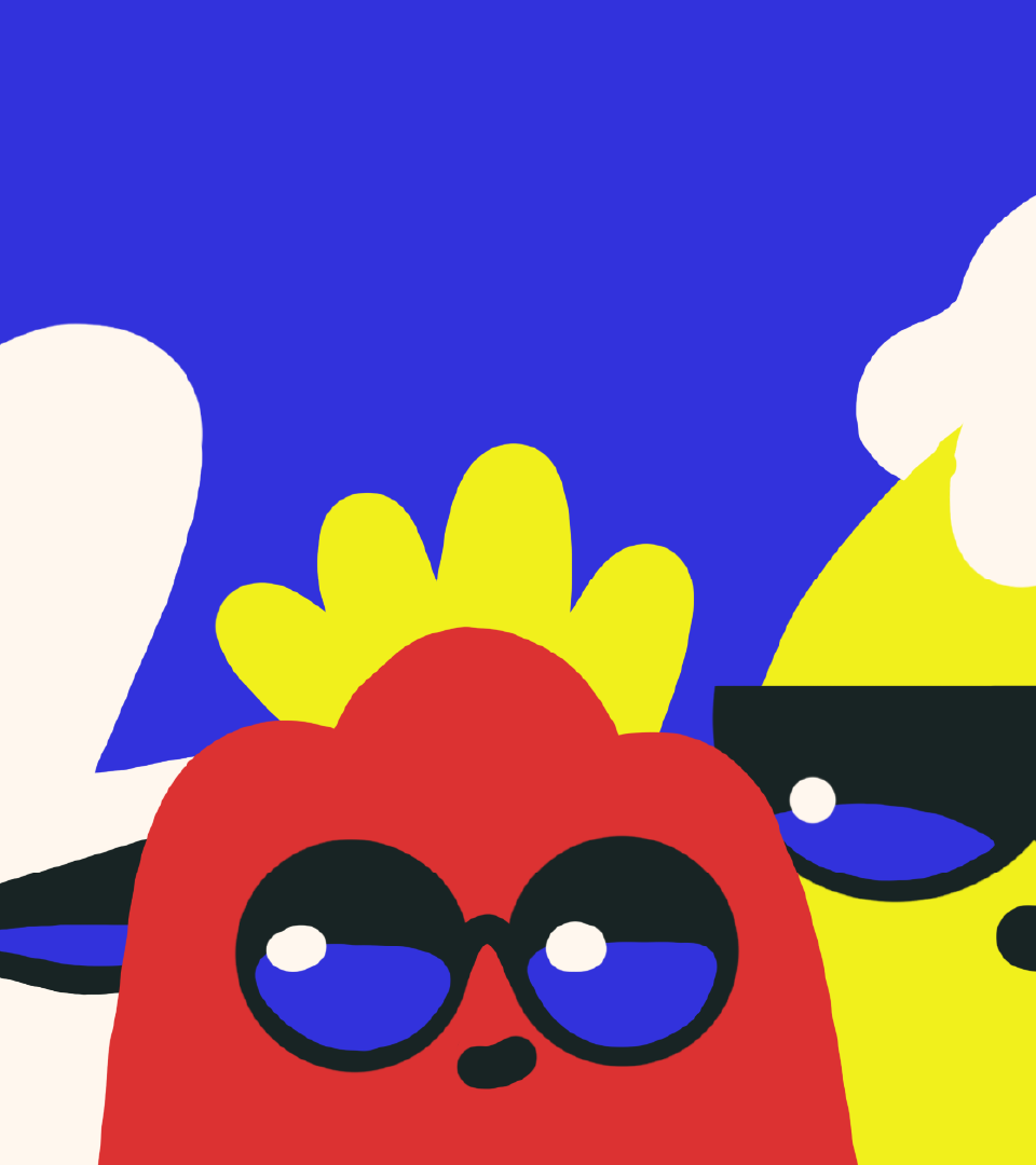
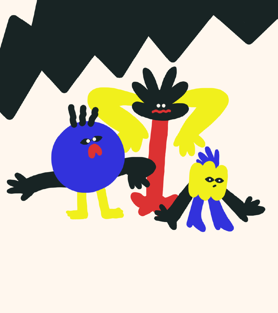
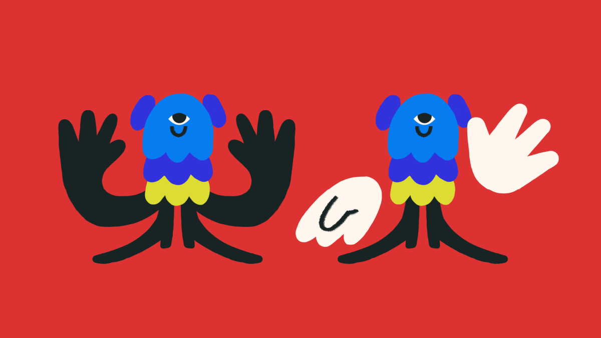
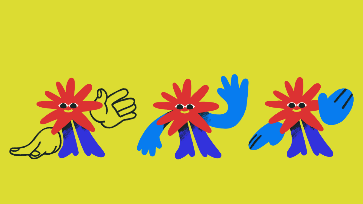
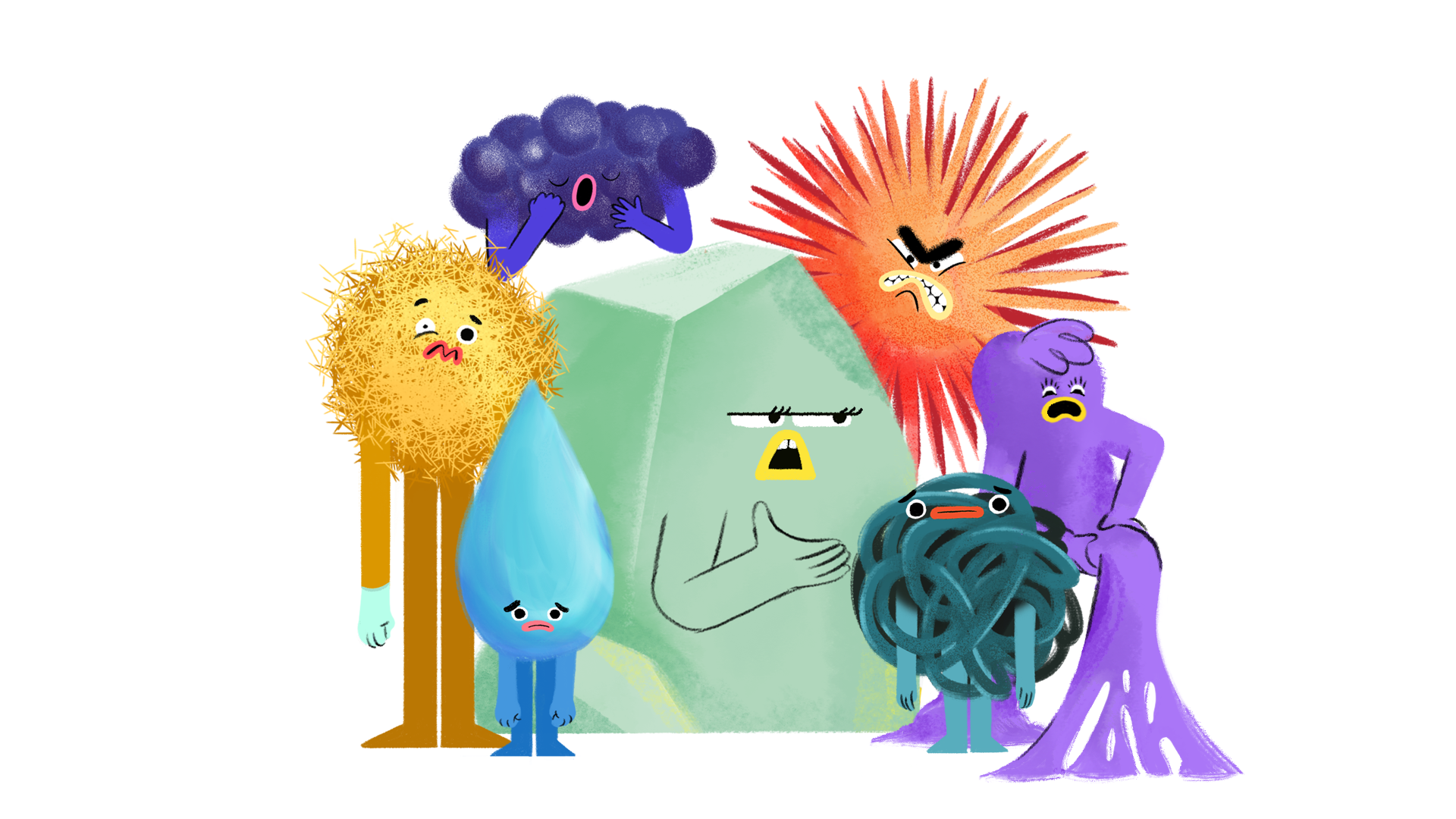
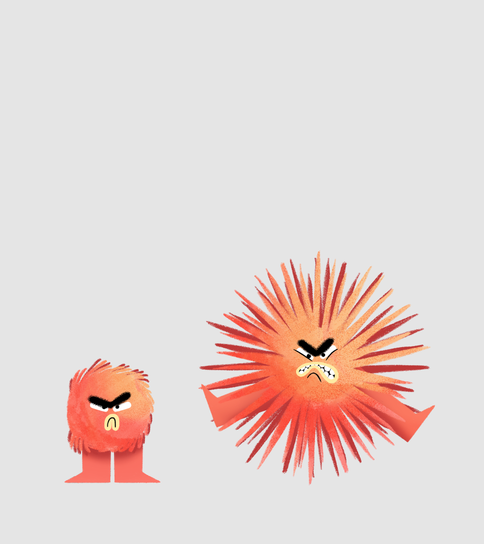
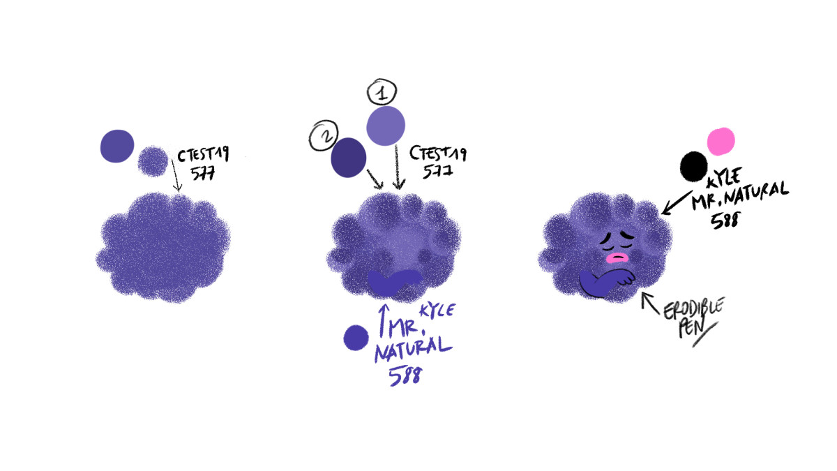
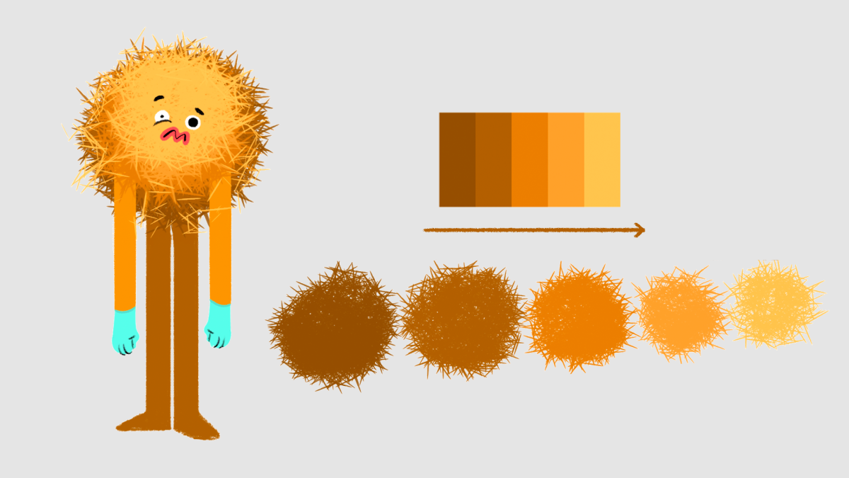
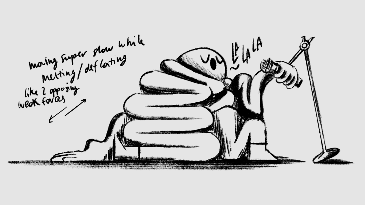
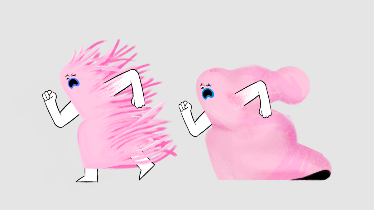
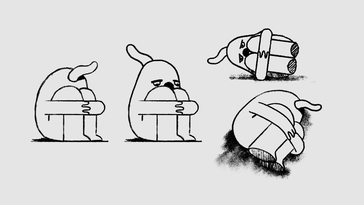
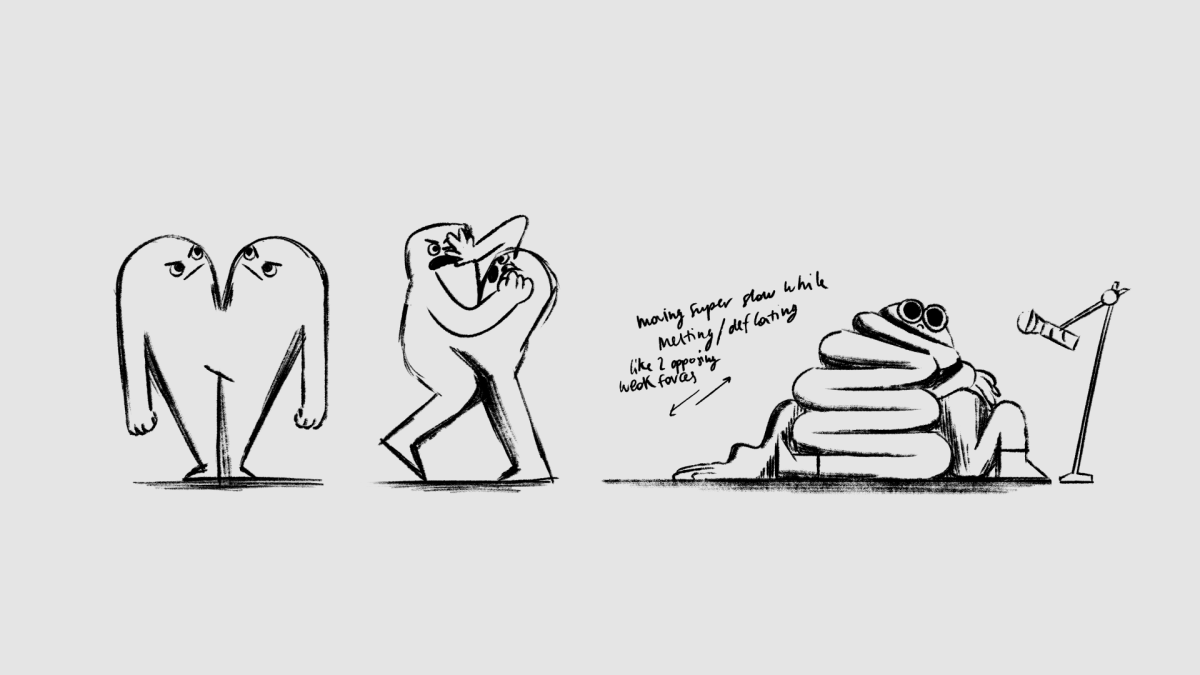
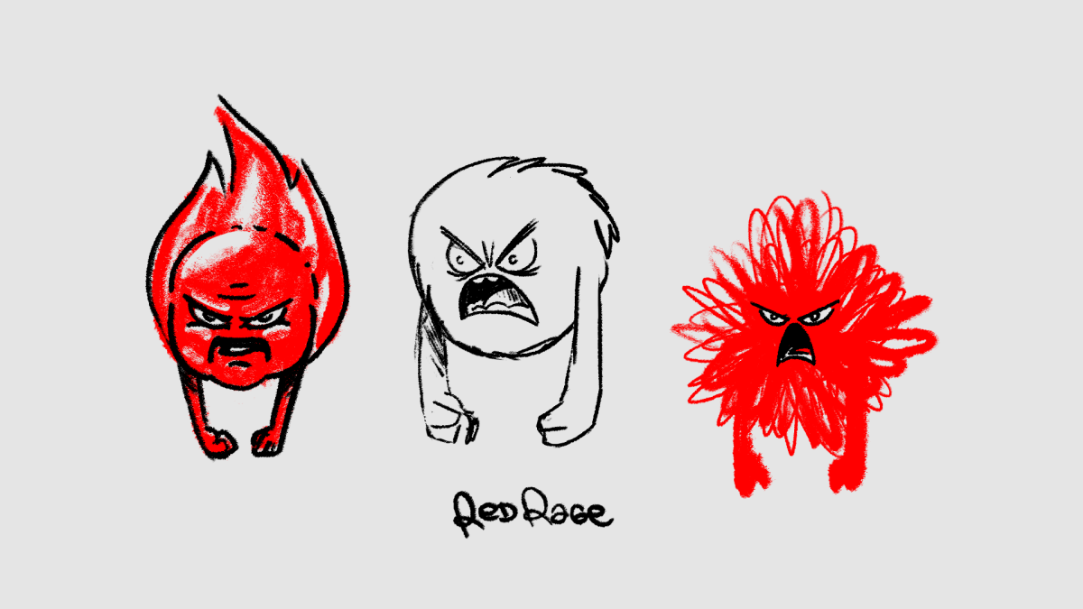
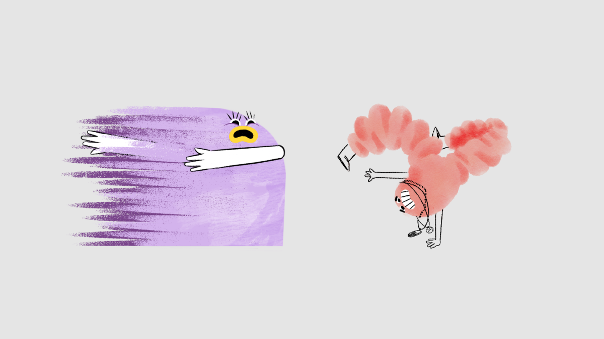
For this talk, we created a little family of creatures – playful, genderless, and full of personality. Three main characters appear in each chapter, giving each story a fun, whimsical touch.
01. The Power of Animation
Animation is a fantastic and completely magical tool where – as cliché as it sounds – everything is possible. We like to think of ourselves as a creative studio with many different styles and ways to approach ideas but animation is clearly our main tool.
We welcome and enjoy the feeling of thinking of ideas and being able to manifest them, and actually make them happen. It could be through any medium, as long as the idea, and the concept go through.
02. Nurture Creativity.
Over the years we have discovered how to stay creative, inspired, and excited about what we do. We needed to balance commercial work with self-initiated projects.
We are lucky to have lots of fun and tackle super interesting challenges with client work but making personal projects is where we have the chance to go above and beyond exploring ideas, techniques, and try new narratives.
Mixing personal and commissioned work helps us to keep the spark alive and we have even found out that lots of client work gets to us because of these studio projects, so that’s a win-win for us!
03. Teamwork
Everything is better as a team.
Animation and all these sorts of adventures we dive into are hard work. We love seeing many hands come together to build something bigger. Every project brings a new combo of amazing artists, and watching what everyone brings to the table is endlessly inspiring. Constantly learning from each other is the best part.
04. Think
If someone asks us: “What defines Niceshit?”
The answer will be: to think, tackle, and challenge problems through ideas.
Although our work is very visual, there are a lot of brainstorming - and (good) headaches - behind all the illustrations and animations.. We spend a huge part of each project in pre-production, polishing ideas, making decisions, and letting the best idea win.
This is a side of the work we enjoy a lot and we’re happy to see that clients
and collaborators trusting us more and more with the creativity behind the campaigns.
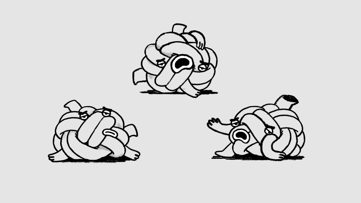
05. Safe Space
Probably the most important chapter as it has to do with the human factor, the day-to-day not everything is about work.
Although we started Niceshit in late 2014, we’ve been in the game for longer and through this time, we’ve learned the world of Advertising and its values, ways of communicating and so-call emergencies don’t always align with the way we would like it to be.
Developing an environment in which we, and the people we work with, feel comfortable, has been a key to our projects and probably one of the main reasons that pushed us to start the studio - to create this little bubble. This ecosystem in which, of course, hasn’t always been perfect, but where we are independent and respect our values, times, and ways to think and work. Over time we’ve discovered that one of the main ways to find, and generate this ‘Safe Space’ is to be able to choose which projects to take on - something that can be seen as a ‘privilege’ perhaps but something that we worked for and value very much.
Thanks for joining us on this five-chapter adventure. We hope you enjoyed it and got a little closer to understanding Niceshit. And our wish? That everyone finds their own safe space.
The Feelings: First responders first
Client
The Feelings
Agency
McCann Health London
Production company
Jelly
Jelly Executive producer
Laura Thomas
Jelly Producer
Tom Henneberry
Creative Directors
Carmen Angelillo, Rodier Kidmann & Guido Lambertini
Niceshit Executive producer
Agusta Timotea
Art Directors
Rodier Kidmann & Carmen Angelillo
Animation Director
Guido Lambertini
2D Design & Illustration
Rodier Kidmann, Bianca Sangalli Moretti & Ganztoll
Lead Cel Animator
Josep Bernaus
Cel Animation & Clean Up
Josep Bernaus, Pablo Cuello, Ezequiel Cruz, Ana Freitas, Bianca Sangalli Moretti, Carmen Angelillo, Rodier Kidmann & Guido Lambertini
3D Lead
Jonas Nunes
3D Design & Modelling
Jonas Nunes, Cristian García, Rodier Kidmann, Guido Lambertini, Pablo Schiavo & Carolina Carballo
3D Animation
Jonas Nunes & Guido Lambertini
Edit & Compositing
Guido Lambertini, Matías Mastrogiano, Ana Freitas & Carmen Angelillo
Sound FX & Audio Mix
Facundo Capece & Lola Ritcher
Bespoke Composition
Felt Music
Composers
Pippa Cleary & Keiran Merrick
Story
We are very proud to share with you such an important message.
The Feelings is a short film designed and directed by Niceshit in partnership with The Laura Hyde Foundation (via McCann Health), aiming to highlight the detrimental impact COVID-19 has had on the mental health of first responders.
This musical piece brings to life a set of emotional characters that represent what frontline workers feel during their day-to-day jobs — the invisible weight they carry, made visible. Through this project, we wanted to raise awareness about the emotional toll experienced by those on the frontline during the pandemic, give visibility to the feelings that often go unseen or unspoken, and create a powerful emotional connection so that first responders feel recognized and understood. Above all, we wanted to use creativity not only as a form of expression, but as a tool for empathy, support, and healing.
As communicators, we truly treasure projects where we not only get to explore creative storytelling and push our visual language, but also actually help people. We are very happy to bring you The Feelings.
The process of developing these characters was delicate and deeply emotional. Each one was based on several emotional states identified during our research phase. We interviewed first responders to understand their experiences and inner worlds — a process that came with great responsibility.
From early sketches and brainstorming to refinement and final animation, every stage was driven by empathy. These are not just fictional designs, but visual reflections of real psychological states experienced by many.
Combining 3D environments with 2D characters is something we love to explore, as it brings together the best of both worlds. By mixing these two techniques, we captured the beauty of lighting, textures, and dynamic camera movements from 3D — while maintaining full control and expression through frame-by-frame 2D animation.
The bold design and playful proportions of the 3D environments contrasted beautifully with the hand-painted textures of the characters. Working with brushes and hand-painted surfaces added the human and sensitive touch needed to approach such an emotional subject. This interplay between polished CGI and raw, textured characters amplified the emotional impact in a visually powerful way.
Storyboarding played a key role in shaping the narrative flow and mapping out emotional transitions. Each character had its own texture and brushwork guidelines to ensure a consistent and cohesive visual style throughout the film.
Original music and lyrics were composed specifically for this piece, directly inspired by stories shared by real frontline workers. This made the entire project feel deeply personal, heartfelt, and grounded in lived experience.
IMPACT
The Feelings is one of those projects that remind us why we do what we do. It’s a piece that goes beyond visuals—it’s about making people feel seen. By giving form to emotions that often go unspoken, especially in the context of frontline work during a global crisis, we wanted to create something that could offer comfort, raise awareness, and start conversations. For us, creativity is a powerful tool not just to express, but to support and connect. This film is our small way of saying: you're not alone, and it’s OK to feel the feelings you feel.
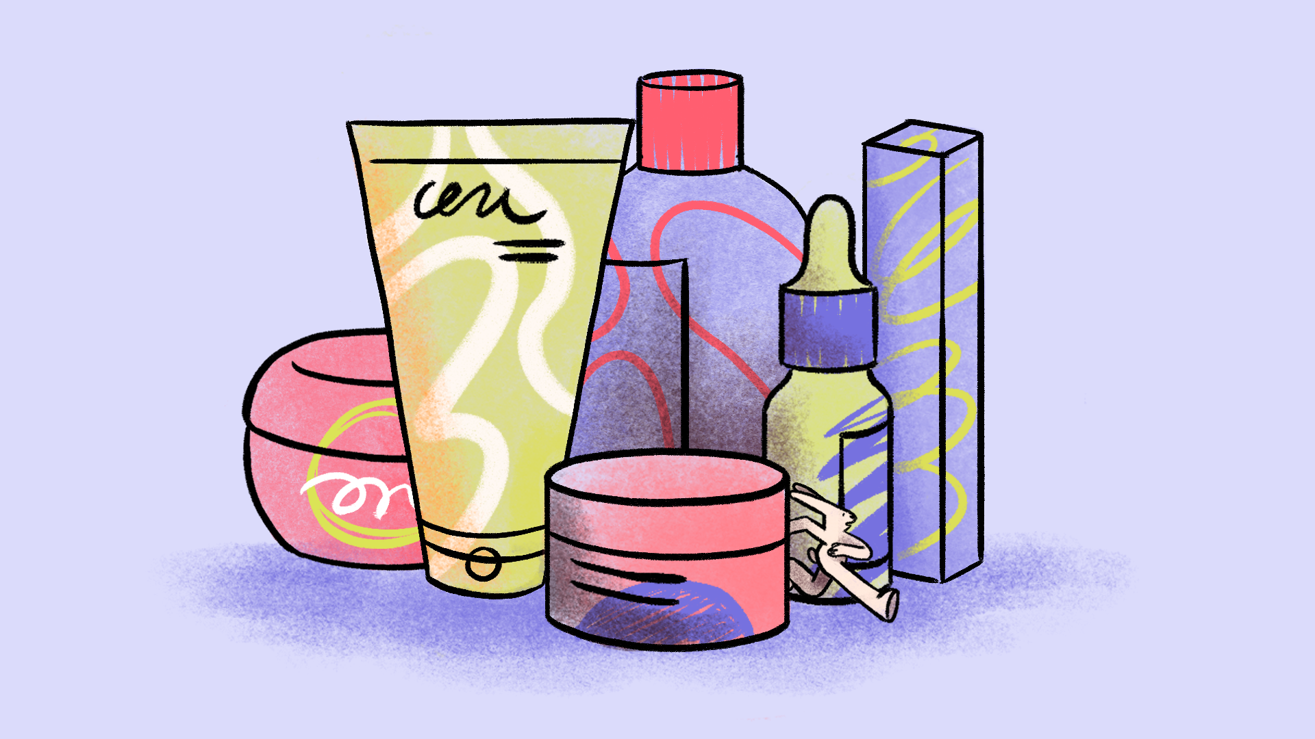
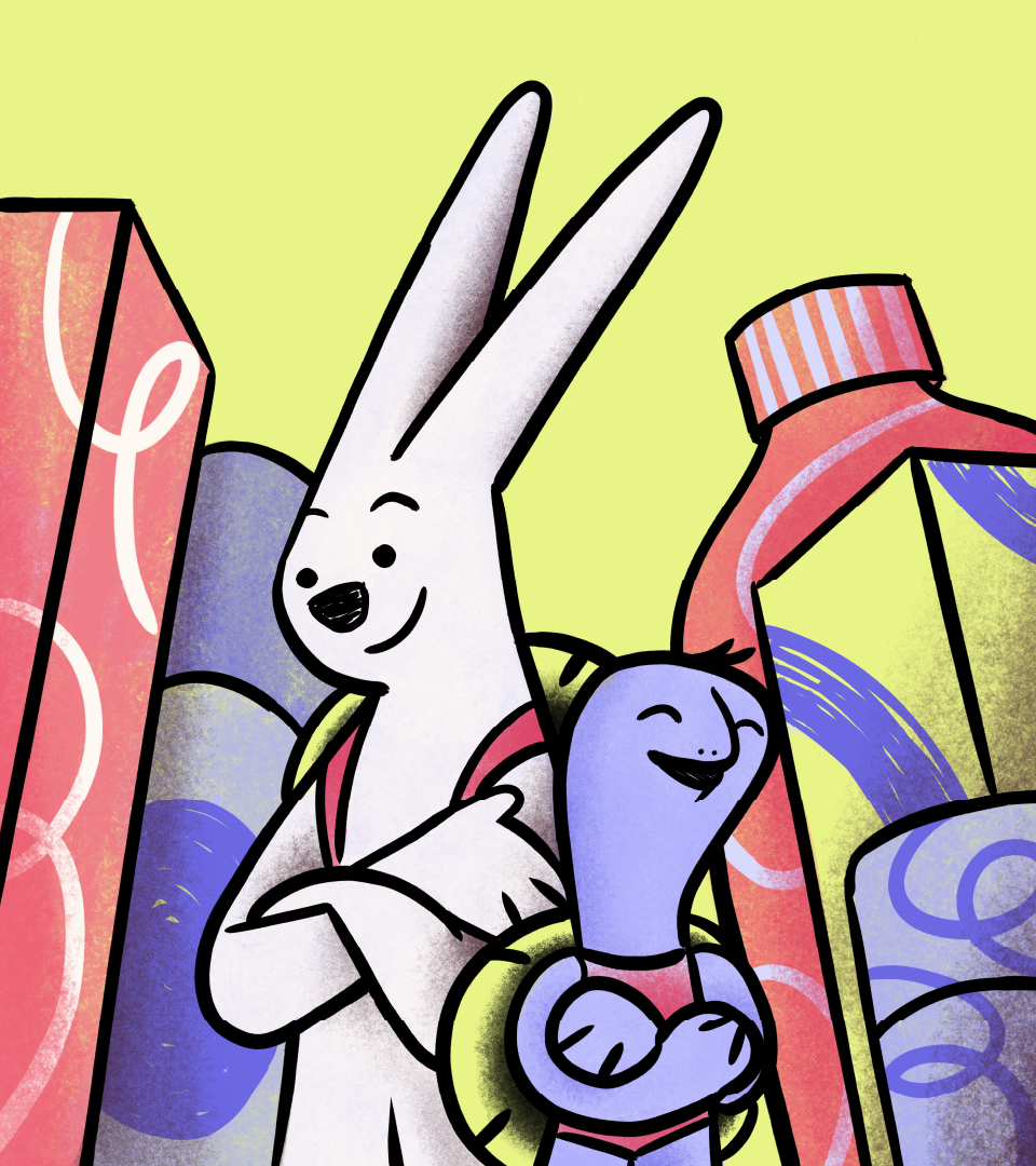
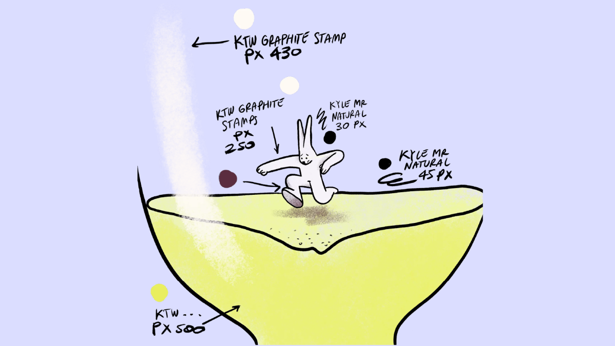
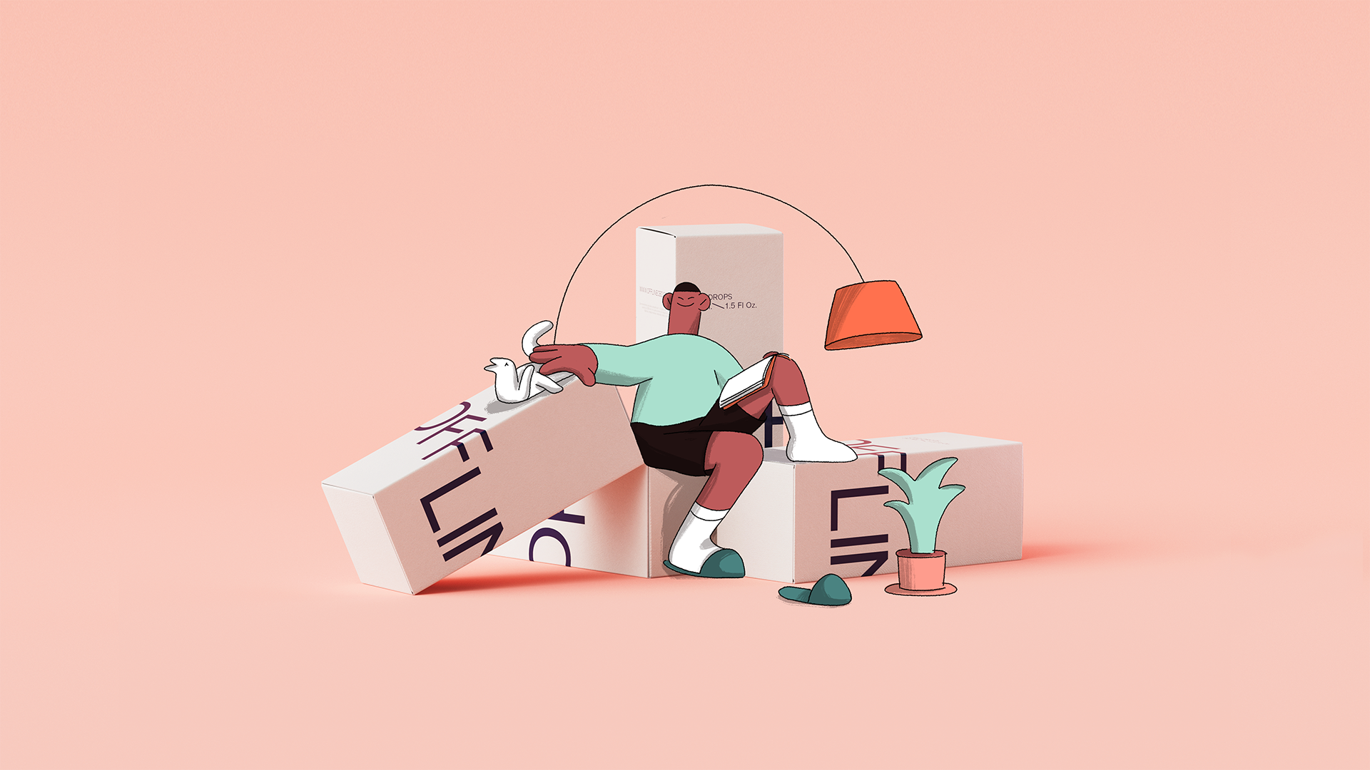
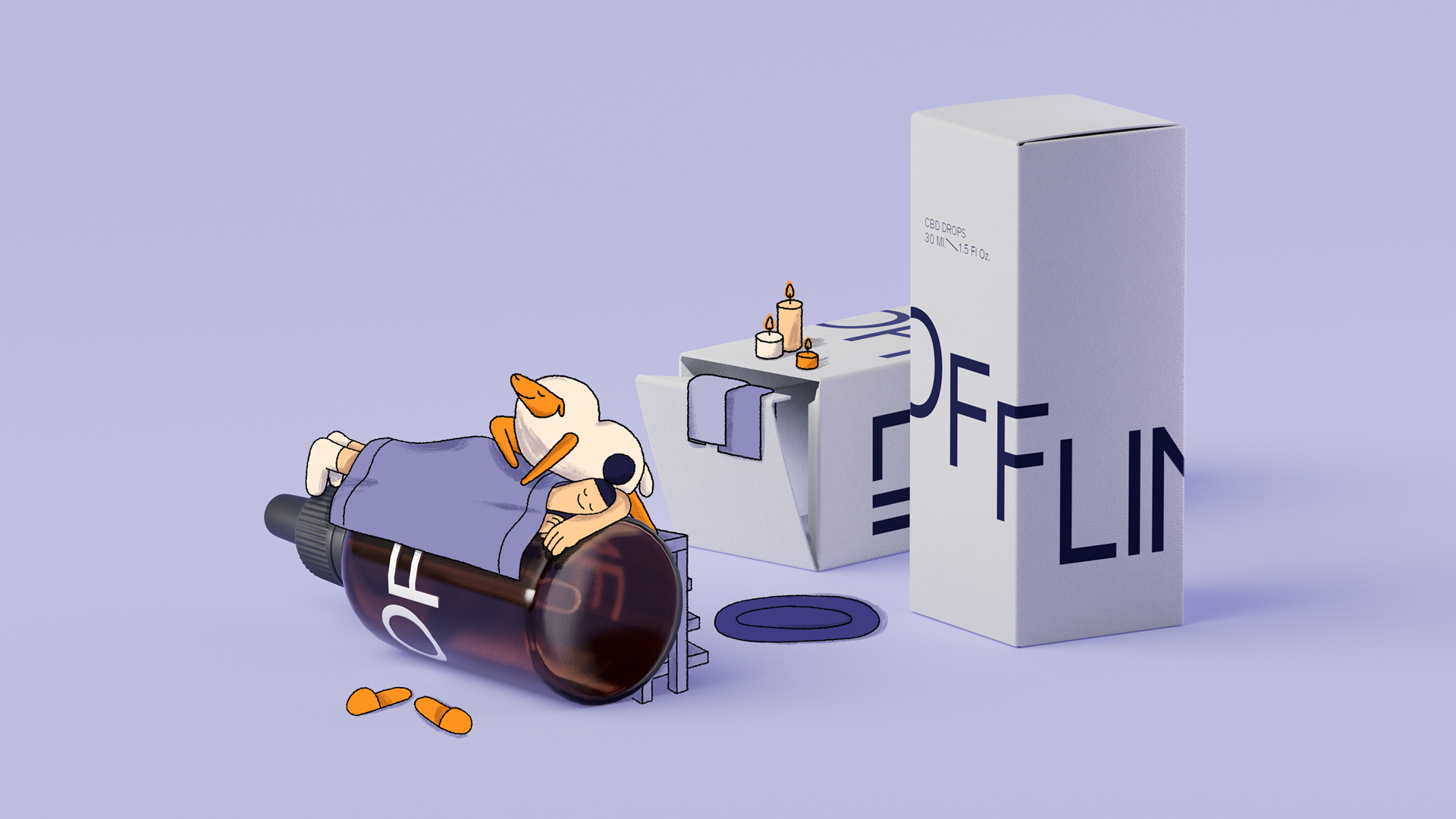
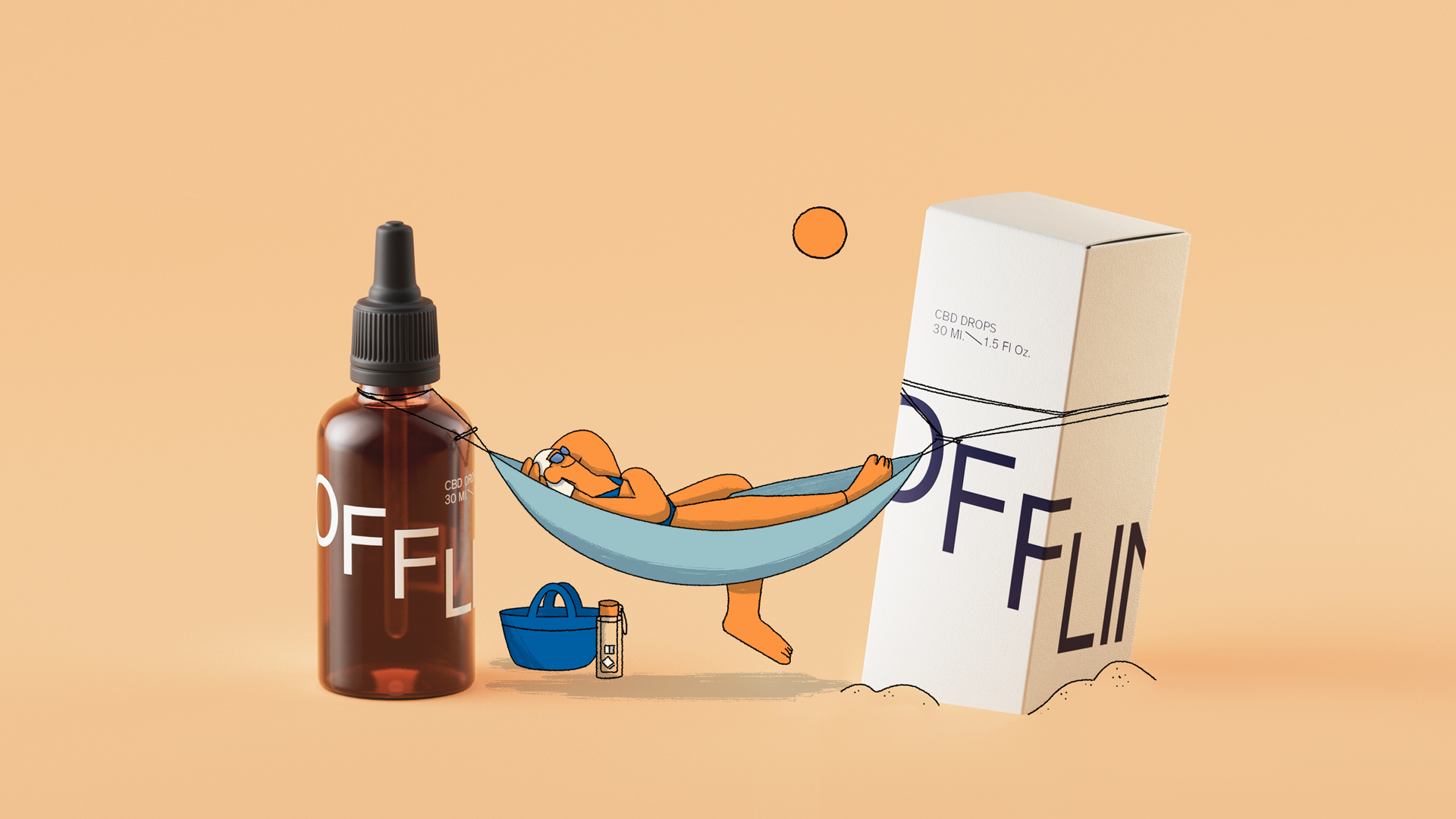
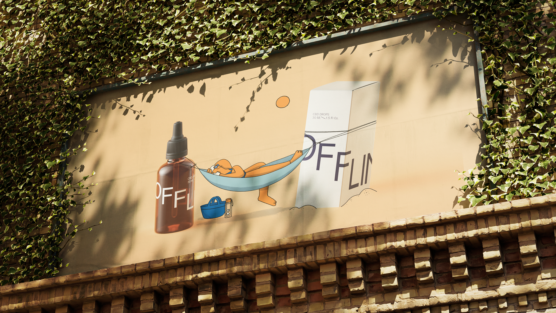
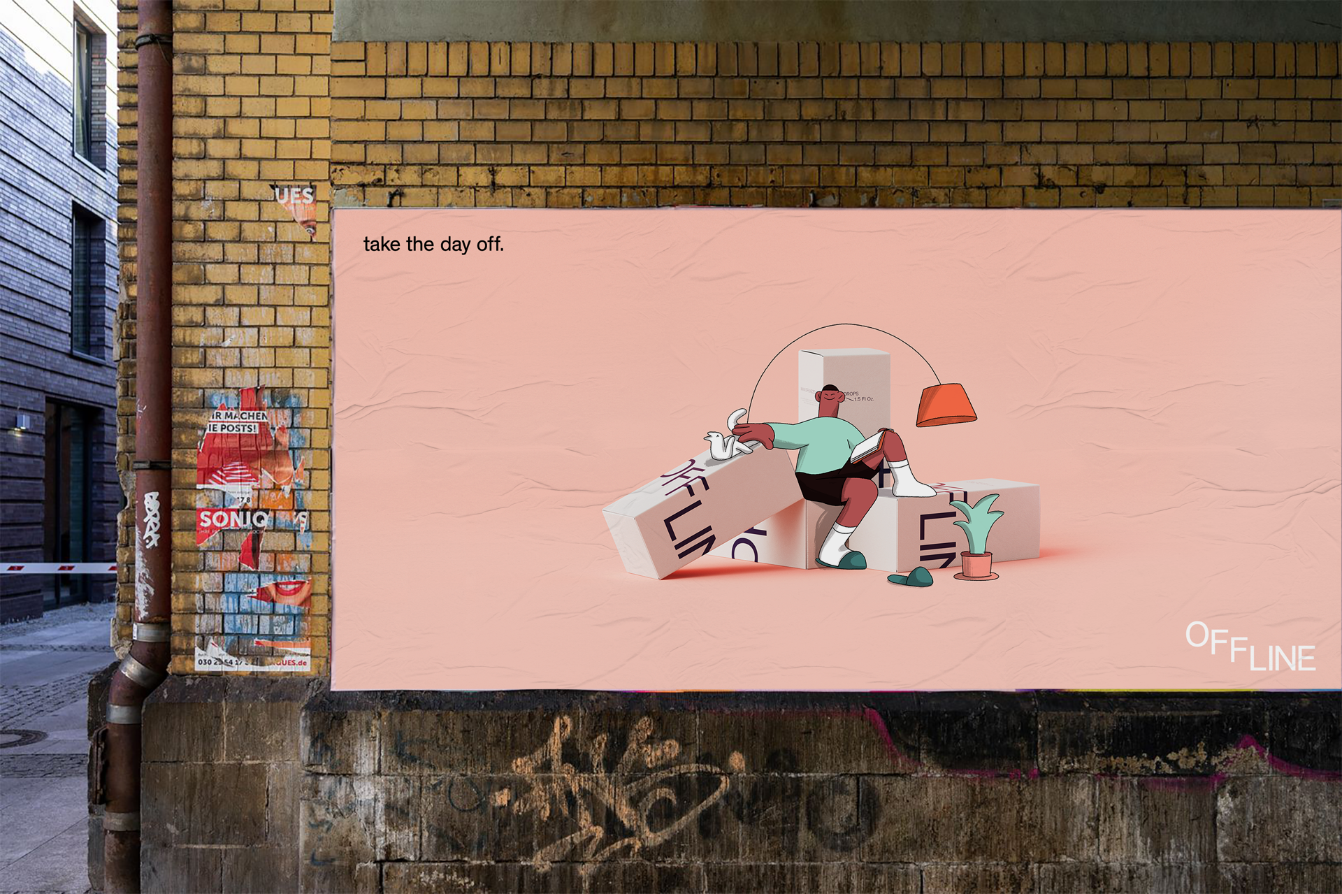
Wash the day off with Offline CBD
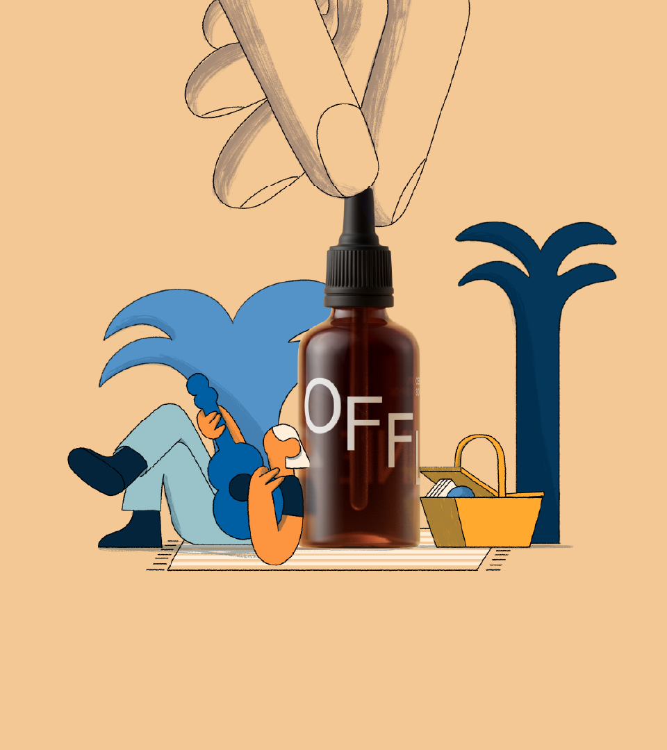
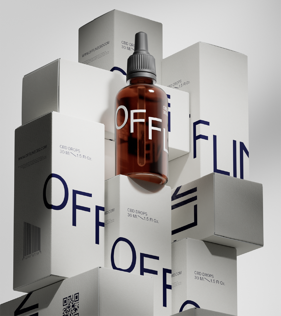
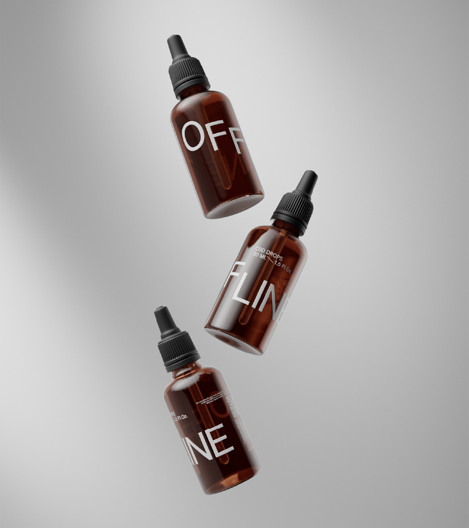
Client
Offline CBD
Produced & directed by
Niceshit
Creative Directors
Carmen Angelillo, Rodier Kidmann & Guido Lambertini
EP
Agusta Timotea
Art Director
Bianca Sangalli Moretti
Animation director
Guido Lambertini
Design & Illustration
Bianca Sangalli Moretti
2D Design
Pablo Colabella
Lead Cel Animator
Maliboo
Additional Animation
Eze Cruz, Fabio Valesini & Guido Lambertini
3d
Fede Kanno
Clean Up
Bianca Sangalli Moretti
Edit & Compositing
Guido Lambertini & Carmen Angelillo
Music & Sound Design
Facu Capece & Lola Ritcher
OPPORTUNITY
A made-up brand to show our very real process.
We’re often asked about our process when working on product and brand visual language. And since there’s no better way to show than to do, we created a brand from scratch — the Niceshit way.
We bring to you Offline CBD – an extensive launch campaign and cross-platform visual language, to show you exactly how we would approach this task for a real-world product.
Offline invites people to “turn the day off” — using CBD as a gentle switch from stress, anxiety, and sleeplessness to calm, clarity, and comfort.
STORY
We created three short films tackling three common tensions: Sleep, Stress, and Anxiety. Sleep, Stress, and Anxiety. All share a straightforward structure: a before and after, triggered by the product. A small gesture, a big shift.
Characters
We worked with a small yet very charismatic set of characters through the whole campaign. We kept them fairly minimal, illustrating facial elements just when needed, and relied a lot on body language, key poses and detailed animation to convey each expression. The result: characters that feel both stylized and human.
Music & Sound
Sound is never an afterthought. For Offline, we teamed up (again!) with our longtime audio partners who once again did an impeccable job. We love working with them — not only for their music skills and overwhelming talent—but for their cohesive understanding that each brief requires, and how they thoughtfully respond.
Product Design
As part of the creative process we researched all sorts of materials and also worked on the shape and design of the actual product. After studying the CBD market and main related products, we wanted to stand out through an elegant and very minimalistic approach: a semi‑transparent matte glass and silkscreen print of logo and legal information. It looks perfect.
The logo and branding were carefully chosen for their expression, and elegance, balancing boldness with softness.It had everything we needed with just the right number of elements.
Product Materials & CGI
We are passionate about embedding ourselves with our client partners from an early stage to explore and ideate around both emotional and functional tenants of a product, and how they can be translated visually. That meant thinking through product packaging, materials, and CGI photorealistic rendering.
We wanted to combine the playful and relatable illustration with a clean and elegant visual for the actual product. This section of the campaign shows once again how broad and integral our capabilities and service offerings are. How the product itself is represented and integrated into the worlds we create is hugely important to us — with 2D, 3D, and live action capabilities all under our studio roof, this project exemplifies how we create beautifully naturalistic hybrid work that feels fresh, unique, and memorable for every client.
Once a language is developed, possibilities are endless.
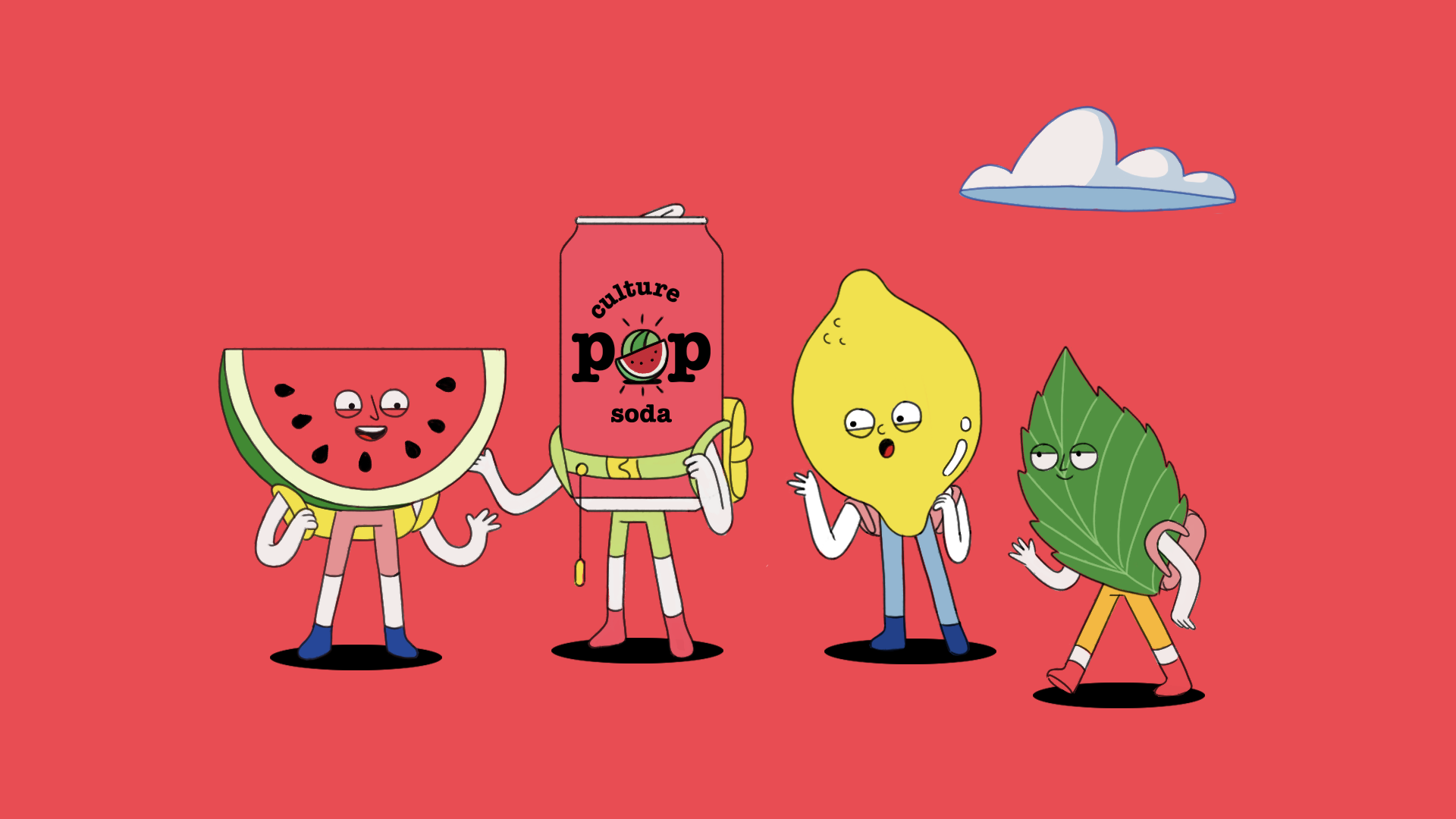
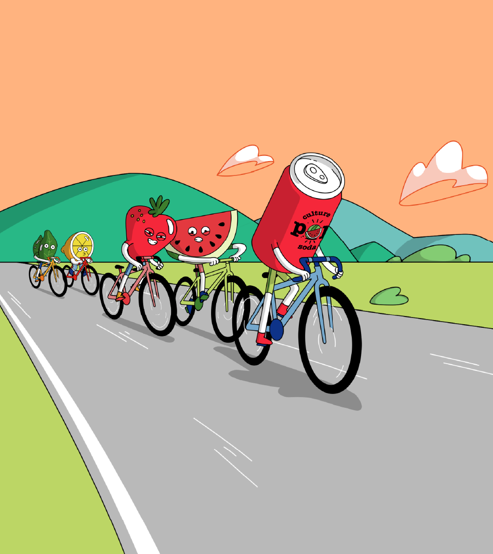
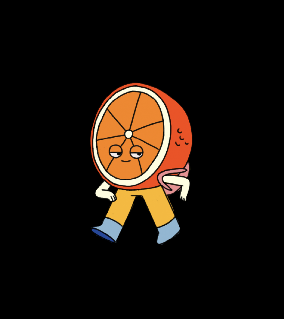
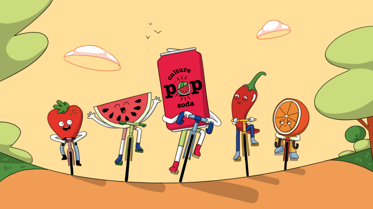
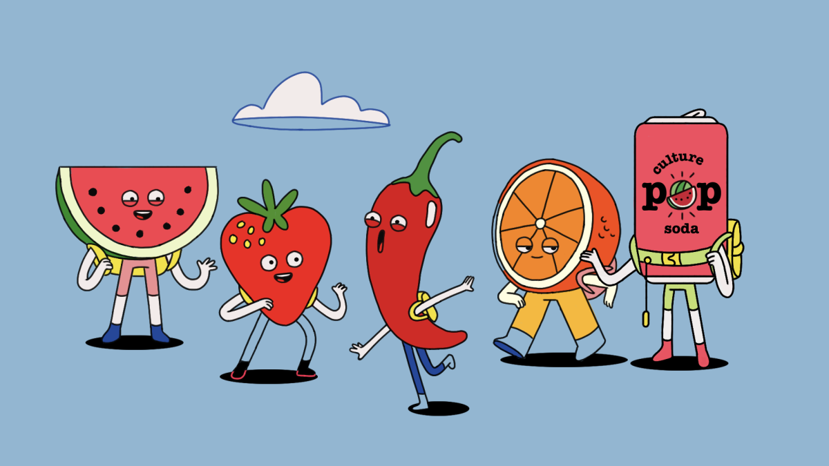
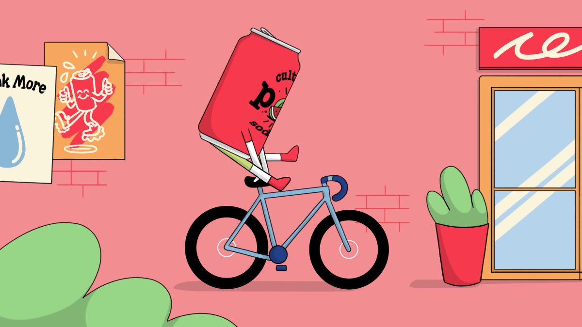
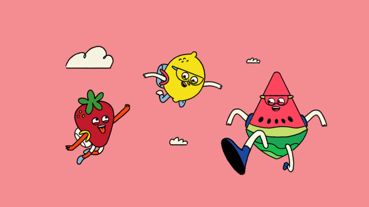
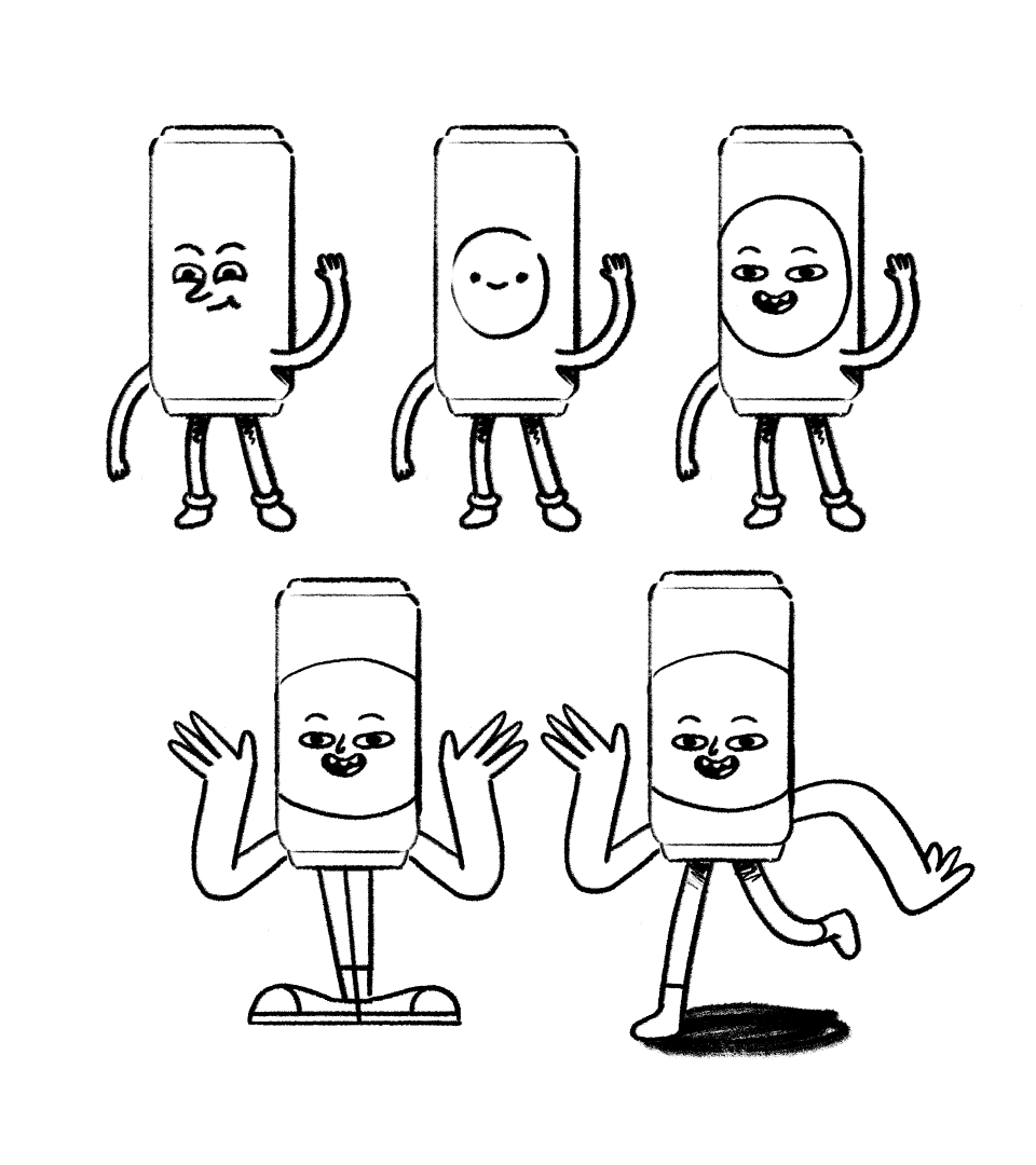
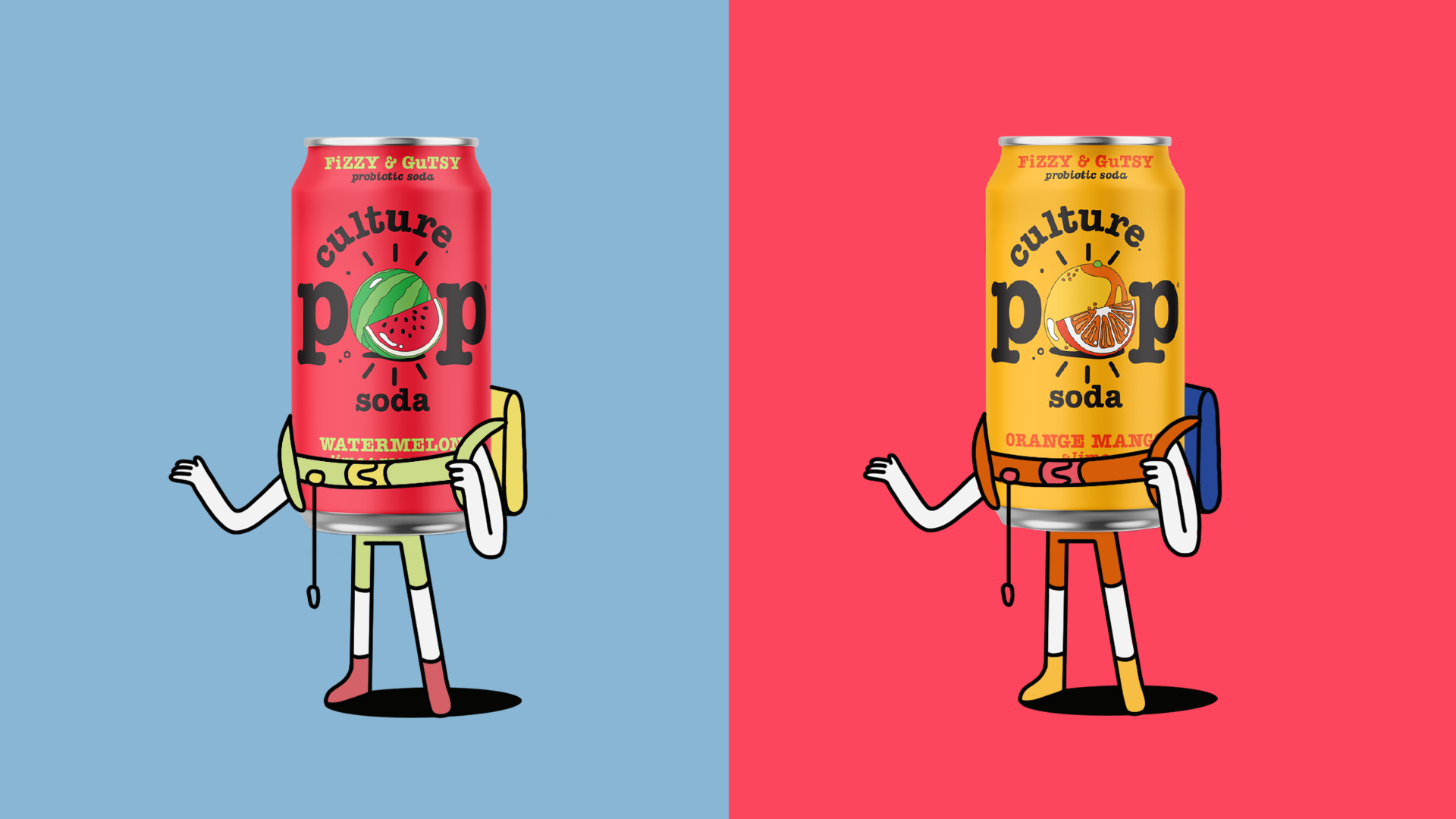
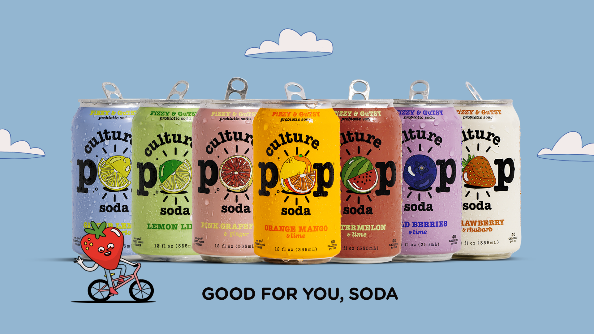
Culture Pop: Good for you Soda!
Client
Culture Pop
Client
Culture Pop
Agency
Fair Folk
Directed and produced by
Niceshit
Creative Directors
Carmen Angelillo, Rodier Kidmann & Guido Lambertini
EP
Agusta Timotea
Art director
Rodier Kidmann
Illustration
Rodier Kidmann & Bianca Sangalli Moretti
Lead Animator
Josep Bernaus
Animation & Clean Up
Gabriel Gómez, Julieta Soloaga, Bianca Sangalli Moretti, Raquel Cruz, Libardo Bohorquez Gutierrez & Ana Freitas
Edit & Compositing
Guido Lambertini & Ana Freitas
Music & VO
Fair Folk
Sound Design & Mix (Directors Cut)
Facu Capece & Lola Ritcher
CHALLENGE
Soda was born in the late 18th century and quickly made a name for itself as a mainstream drink of choice. Since then, soda has gone through a lot of changes, mostly landing on recipes that include ingredients that aren’t so great for you, and so, soda’s name was tarnished, seemingly forever.
Story
We worked on this two-part campaign to help Culture Pop in its mission to give Soda a proper makeover — so people can look at it in a new light, and understand soda itself isn’t bad for you, it’s all about what you put into it.
Working with the provided scripts, we built two mirrored episodes. When working on campaigns like this, we love to establish strong, shared structures across episodes — so they hit the same beats, the same narrative highs, and feel like one cohesive story. It also builds recognition for the brand and the campaign overall.
It’s fun, modular, and can totally be adapted to the rest of the flavors with different fruity adventures!
All the fruity characters were inspired by the different flavors of Culture Pop’s iconic cans. Since these spots were super character-driven, we poured a lot of love and attention into this part of the process. We even tried adding faces and lipsync to the main cans (because of course we did), though the brand logo ultimately stole the spotlight 😊 We explored plenty of directions — from brush-textured designs to fully 3D photorealistic cans — and landed on this adult-cartoon-inspired aesthetic that just felt right.
RESULT
Fair Folk reached out to us to collaborate on this “Good for you, Soda!” campaign.
There were three key messages we needed to get across in the films:
Soda is doing something new!
Culture Pop is made with natural fruits and spices
It’s fizzy and delicious!
Inspired by the fruit and spices illustrations on the Culture Pop cans — and cartoons from the 2000s until now — we created this adorable world for a 2-chapter ride alongside these refreshing sodas and their fruity friends!
Our love letter to the holiday heroes
Client
A Holiday Dream
Produced, written & directed by
Niceshit & Lobulo
Creative Directors
Carmen Angelillo, Rodier Kidmann, Guido Lambertini & Lobulo
EP
Agusta Timotea
Art directors
Rodier Kidmann, Lobulo & Carmen Angelillo
Edit, Animatic & Storyboard
Guido Lambertini
Puppet Maker
Lobulo
Illustration
Silvia Tack
DOP
Fernando Sotelo
1AC-Focus Puller
Tatiana Poplawski
2D Animation
Josep Bernaus & Eze Cruz
2D Eyes Animation & Tracking
Jaume Mestre, Agustin Verrastro & Romain Loubersanes
Clean-up
Julieta Soloaga, Yaiza Ortiz & Eze Cruz
Scale model maker
Gacy Sarubbi
3d Print
Tresdenou
3d Modeling
Daniel Souto
3d Cut
Xyloformas
Color grading
Alejandro Armaleo
Compositing
Matias Matrogiano, Lucas Di Rago & Carmen Angelillo
Still Photography
Agusta Timotea
Music & SFX
Ambrose Yu
VO artists
Jay Preston, Meg Hensley & Jonathan Regier
BTS
Luciano Del Pópolo
BTS Music
Manu Aguilar
Shooting Chef
Matias Lomanno
Shooting Set
Manso Studio
PR
Jenna Kirby
Special thanks to
Patricia Armada, Edi Ferreira, Aluzine, Napalm Rentals, ZigZag Rentals, Dubblelab & Ingi Guðjònsson
Story
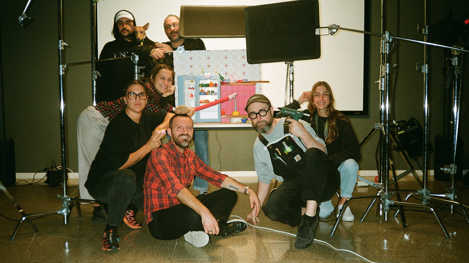
For this crazy adventure, we teamed up with our great friend, the incredible artist and director Lobulo. We have so much in common in terms of creativity, humor, and narrative, that diving into a hand-crafted film and writing it together was a complete joy ride.
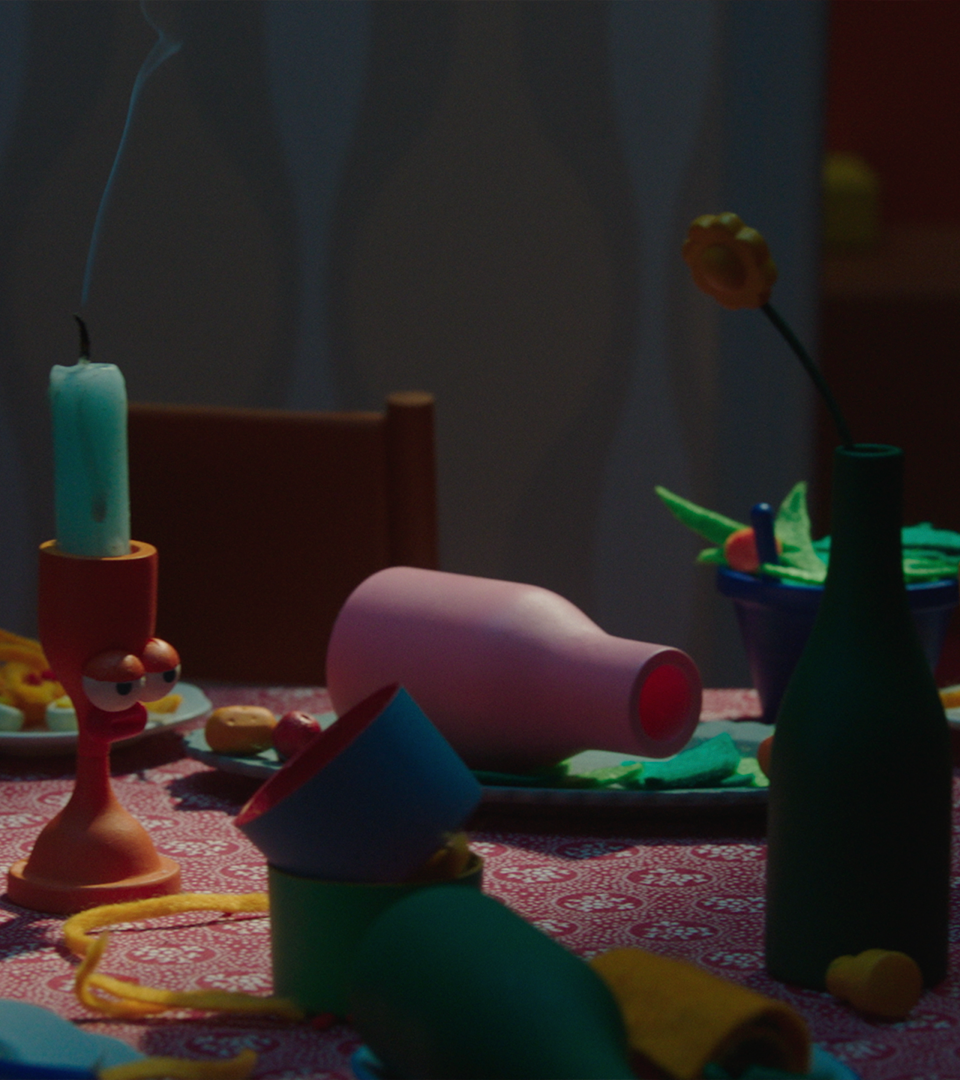
After several months of writing, developing the story, and building several scenarios — from the cast to all the tiny elements dressing each scene — we were ready for a three-day shooting adventure at Manso Studio.
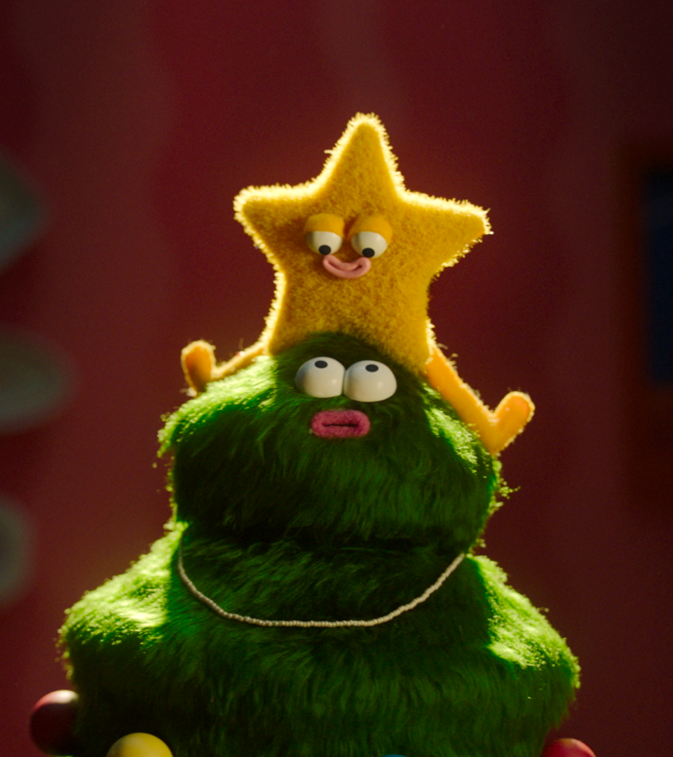
We arrived at the studio with a solid shooting plan — we knew exactly the shots we needed — but we also left room for improvisation: adding new camera angles, movements, dramatic lighting, and a few hidden inside jokes here and there 😊 That’s the best way to approach a film for us: a solid story with space for live decisions that bring freshness and dynamism.
It’s no secret that we love mixing techniques and styles, so adding a 2D animated sequence for the daydreaming part of the film felt natural. We wanted this moment to feel warm, cozy, and hopeful – Thick and loose lines combined with relaxed, harmonious coloring conveyed exactly what we wanted. The team captured the essence of this sequence beautifully, crafting it with care and attention, one frame at a time. <3
We love a good story, and if it has a message: even better. When writing the story, we wanted it to feel close to us — and hopefully, after watching the film, someone you care about instantly comes to your mind.
We did this with so much love and with so many lovely people involved. Infinite thanks to the incredible team of artists that joined us on this one — you are the best.
Don't judge a book by it's cover
Client
Penguin Books
Directed by
Niceshit
Client
Penguin Books & Meta
Agency
BBDO
Creative Directors
Carmen Angelillo, Guido Lambertini & Rodier Kidmann
EP
Agusta Timotea
Art Direction & Illustration
Tamara Bella
Music & Sound Design
Facundo Capece & Lola Ritcher
Animation & Clean Up
Ezequiel Cruz, Israel Giampietro, Juan Nadalino, Facundo Quiroga, Sebastián García, Melisa Farina, Julieta Soloaga, Bianca Sangalli Moretti & Gianluca Patti
Edit & Compositing
Matías Matrogiano & Guido Lambertini
Challenge
There are approximately 1 million new books published each year in the US — and less than 1% actually sell more than 5,000 copies. Even worse, 50% of all book sales happen online, which means the in-store browsing experience is slowly disappearing.
And we definitely don’t want that to happen.
Story
If you know a little about Niceshit, you know there’s nothing we enjoy more than telling a good story. And these were just amazing.
Each film was approached differently — inspired by the author, the tone, and the story — but with one constant: everything needed to feel as if these animations were taking place inside a book. Everything had to feel printed, like it lived on the page. From textures to transitions, we aimed to make the visuals feel native to paper — embracing ink, grain, and a tactile sense of storytelling.
RESULT
Together with Penguin, we created animated reels that take you beyond the front cover, helping more people discover new stories — and hopefully change the way authors release books moving forward.
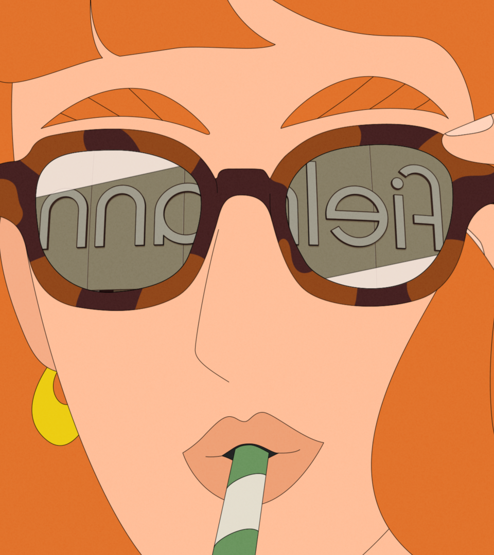
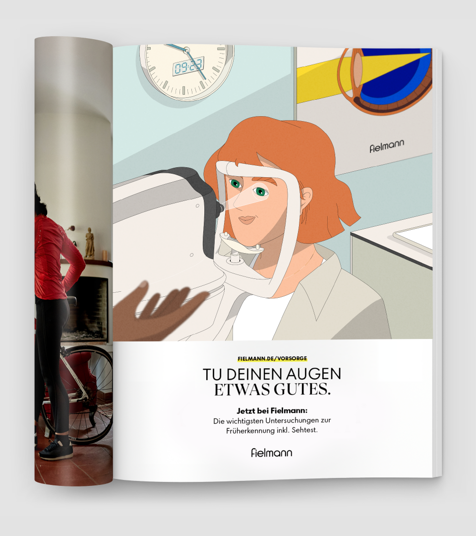
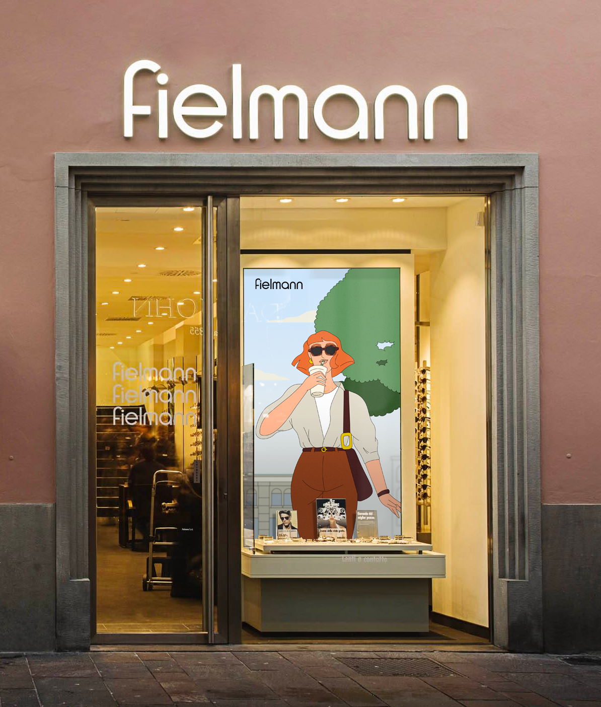
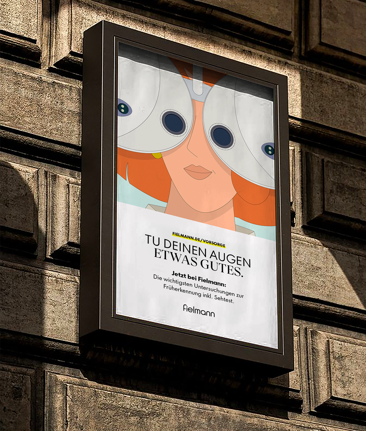
Introducing Fielmann's illustration style
Client
Fielmann
Directed by
Niceshit
Creative Directors
Rodier Kidmann & Hernando Ramirez
EP
Agusta Timotea
Client
Fielmann
Client team
Mike Gajer & Julia Cierpinska
Agency
Pocko
Agency EP
Bice Piana
Animation Direction
Hernando Ramirez
Art Direction
Rodier Kidmann
Character Design
Tamara Bella
Design & Illustration
Rodier Kidmann & Nahuel Rollan
Animation
Israel Giampietro, Libardo Bohorquez, Ezequiel Cruz, Hernando Ramirez & Guido Lambertini
Clean-up
Julieta Soloaga, Magalí García, Libardo Bohorquez & Ezequiel Cruz
Edit & Compositing
Hernando Ramirez & Guido Lambertini
Music & SFX
Facu Capece & Lola Ritcher
STORY
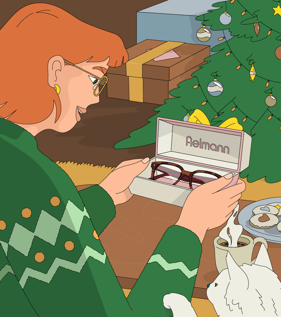
Fielmann wanted to show how preventive eye care can fit seamlessly into everyday life — making it feel as natural as grabbing your morning juice.
So, we approached this 53-second animated film as a character-driven story, following our protagonist through her day as she moves confidently through the city, ending with a spontaneous self-care check-in.
Early in the process, we treated this spot almost like a live-action shoot: creating moodboards for wardrobe and color palette, making sure each character felt diverse and confident in their own skin. We wanted these characters to feel cool, confident, but never forced — natural above all.
We developed Fielmann’s new illustration style inspired by the beauty of European cities in spring. Working closely with the brand and the great team at Pocko, we built this graphic, refined aesthetic paired with a bright yet mature color palette. Following the brand’s heritage and reputation, we aimed for a look that feels chic, elegant, and timeless, something that could live with the brand for many years, both in-store and beyond.
A cinematic rhythm of match cuts and multi-camera editing ties everything together, creating smooth transitions through space and time — all wrapped in a slightly funky tune that adds an effortless groove.
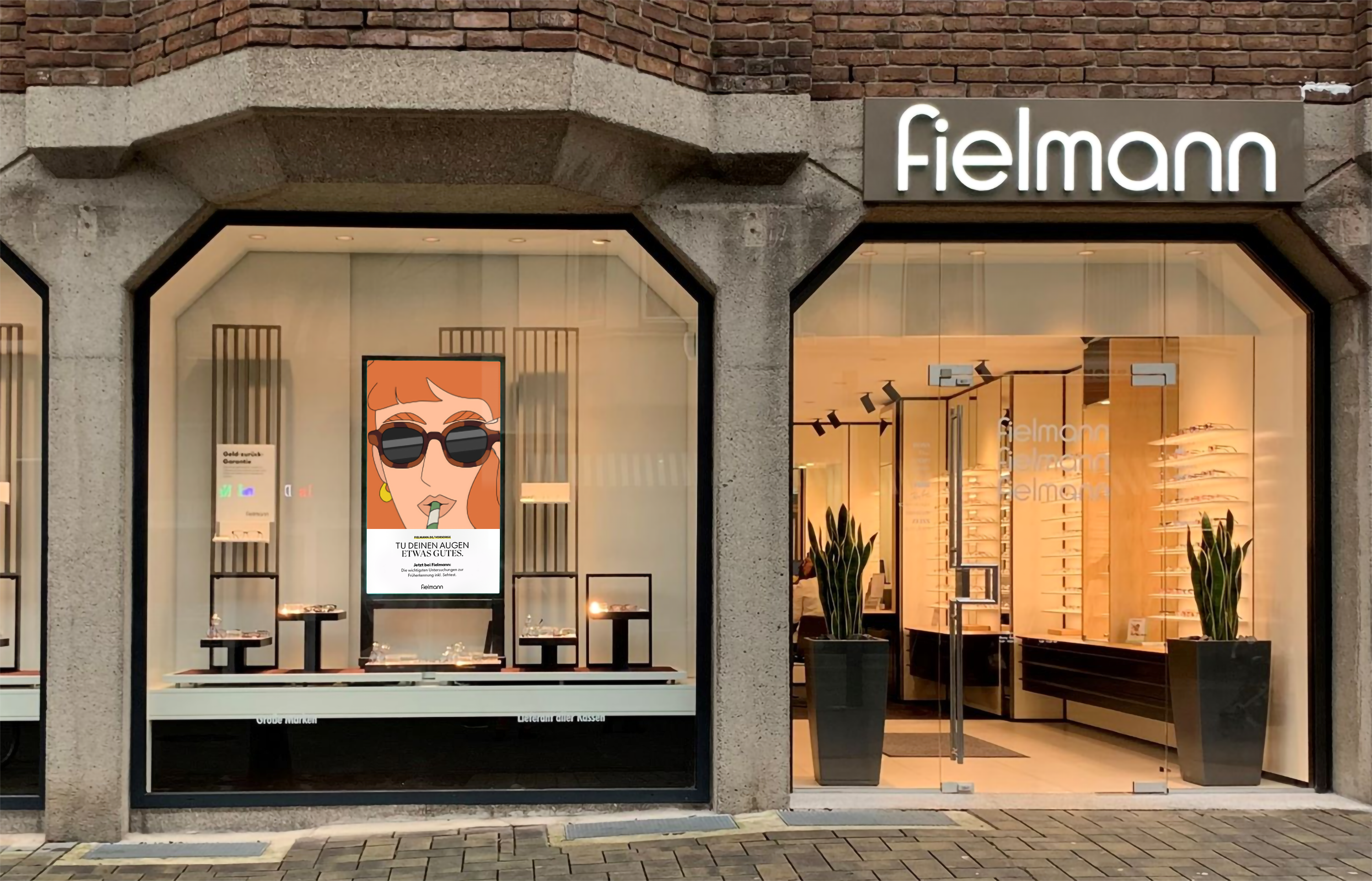
IMPACT
The campaign marks the launch of Fielmann’s new illustration system — a fresh visual voice now present in their stores across Germany and Switzerland. From high-end storefronts to glossy magazines, the contrast between elegant spaces and playful illustrations creates something truly unique. A bright reminder that taking care of your eyes can be quick, simple and actually pretty stylish.
A functional and modular rebrand for Realtor.com
Client
Realtor
Client
Realtor.com
Client Team
Nuno Ferreira , Devin Croda & Wendy Hernandez
Creative Direction
Carmen Angelillo, Rodier Kidmann & Guido Lambertini
EP
Agusta Timotea
Art Direction
Carmen Angelillo, Rodier Kidmann & Janis Andzans
Illustration
Janis Andzans, Rodier Kidmann & Tamara Bella
Edit
Ana Freitas
Music
Facu Capece & Lola Ritcher
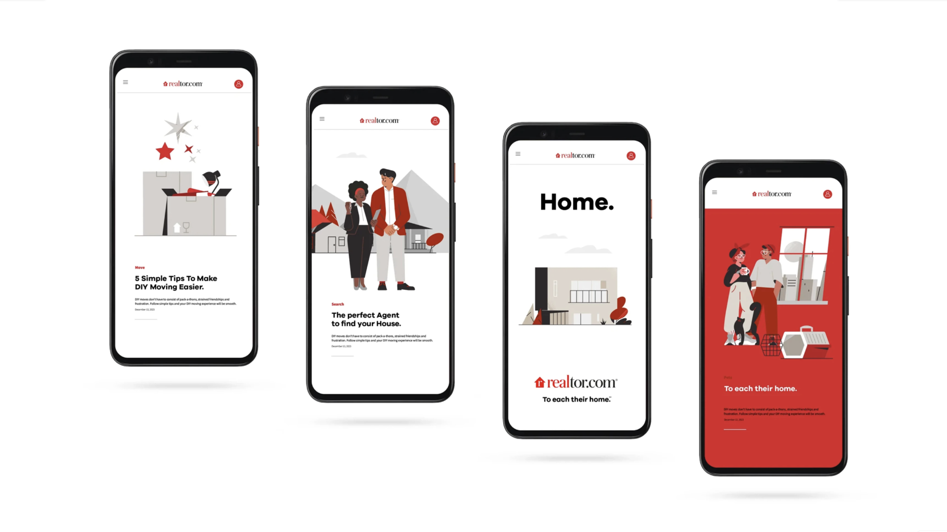
CHALLENGE
Realtor.com, the biggest real estate portal in the US, wanted to move away from the photo-driven imagery into something more inspiring and engaging, and that is where we came in.
We created a pack of illustrated assets that needed to work everywhere, from digital to print, from small to huge so going for a vector, clean and sharp look was a no brainer.
TOOLKIT
Even though properties are the actual product being rented, bought or sold we believe that people are actually the heart of the operation so we decided to create a character driven system where everything revolves around these huge sets of modular designs.
UNITED THROUGH A SET PERSPECTIVE
This is one of the more complete and exhaustive illustration systems we’ve worked on with 150+ illustrations delivered so it’s safe to say that we’ve covered almost everything. Yep.
The language includes properties from the outside, inside, vehicles, objects, plants, data and of course characters and all of these were tightly tied together through a set of perspective rules so the
RESULT
Exhaustive and integral are two good words to describe this illustration system. The toolkit works as a didactic game ready-to-use tool - the team at Realtor can instinctively and easily create new compositions from interiors, outdoors and combine these with a vast set of characters.
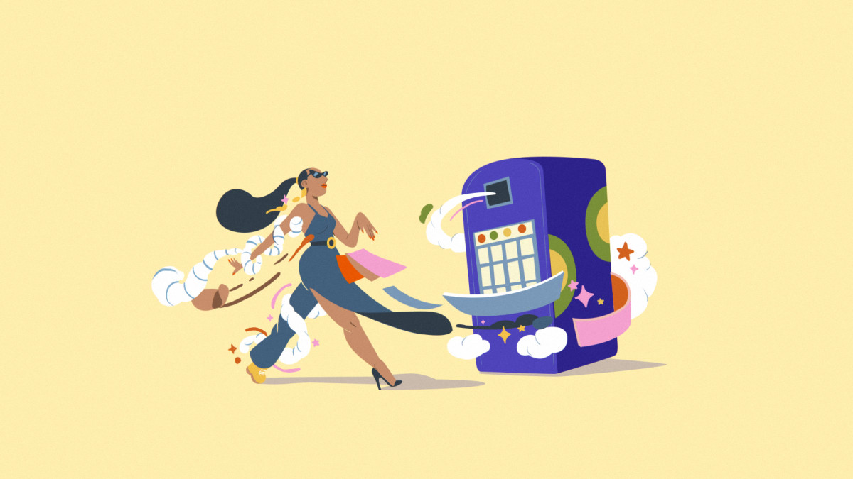
Colorado Lottery dream machine
Client
Colorado Lottery
Client
Colorado Lottery
Agency
Cactus Denver
Production House
AggressiveTV
Creative Directors
Guido Lambertini, Carmen Angelillo & Rodier Kidmann
Executive Producers
Dan Shapiro, Alex Topaller & Agusta Timotea
Post Producer
Alexander Aab
Post Coordinator
Isabella Crawford
Sound Design & Mix
Facundo Capece & Lola Richter
Art Direction & Illustration
Juan Barabani
Cel Animation
Juan Nadalino, Facundo Quiroga, Sebastián García, Israel Giampietro & Ezequiel Cruz
Clean Up
Julieta Soloaga, Ezequiel Cruz, Libardo Bohorquez & Anibal Dasso
3D Modeling & Render
Ruben Stremiz
Edit & Compositing
Guido Lambertini
STORY
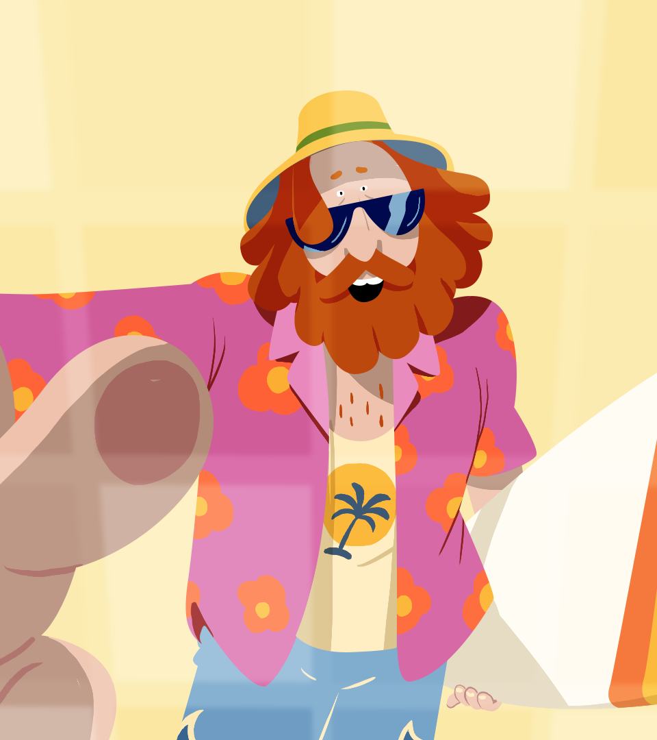
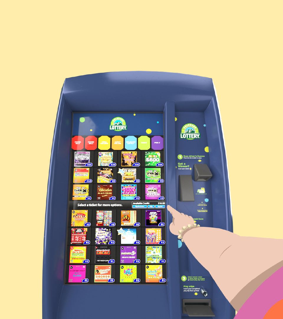
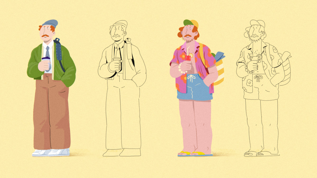
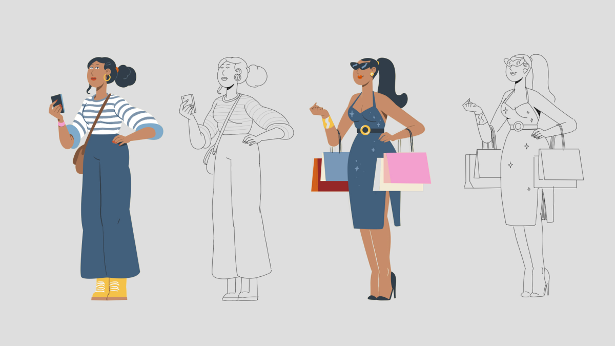
We’ve put lots of time and care into the execution of this film. Our premise, since the beginning of the project, was that ‘each frame had to feel like a print’ and we are really happy with the outcome.
Through this bold and minimalistic piece, we wanted to take viewers on a journey of emotions — from surprise to excitement — felt by our main character who stumbles upon Colorado Lottery’s Dream Machine.
It’s no secret that we love simplicity: leaving only what’s essential on screen. This time, we took that idea to the limit — keeping just the main characters and the Colorado Lottery Machine. When you strip everything down, there’s nowhere to hide, so every move and expression has to hit just right.
Even with its surreal transformations, the story is full of little human details — how people move, how they walk, how they react when something unexpected happens.
Finding that perfect mix of surrealism and realism was key. Our 2D frame-by-frame characters blend seamlessly with the CGI Dream Machine, making the whole thing feel playful and grounded at the same time. We love mixing our 2D animated characters with CGI. We believe we get the best of both worlds — the warmth and gesturality of hand-drawn animation and the volumetric realism of 3D.
With such a minimal setup, sound became key in our story telling. The music and sound design is always a big part of what we do. And in this case, having such a void, we relied on the sound to recreate the context: the sound of a door opening, the iconic bell when you enter a shop, and, within the transformation, the sound design instantly takes us to our happy place.
RESULT
A minimal world, a bold character, and the feeling that maybe, just maybe, you’re one ticket away from your lucky moment.
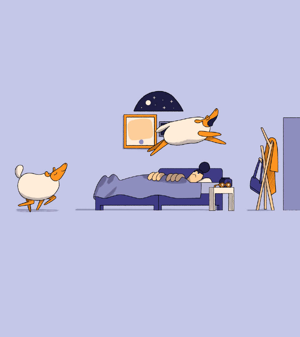
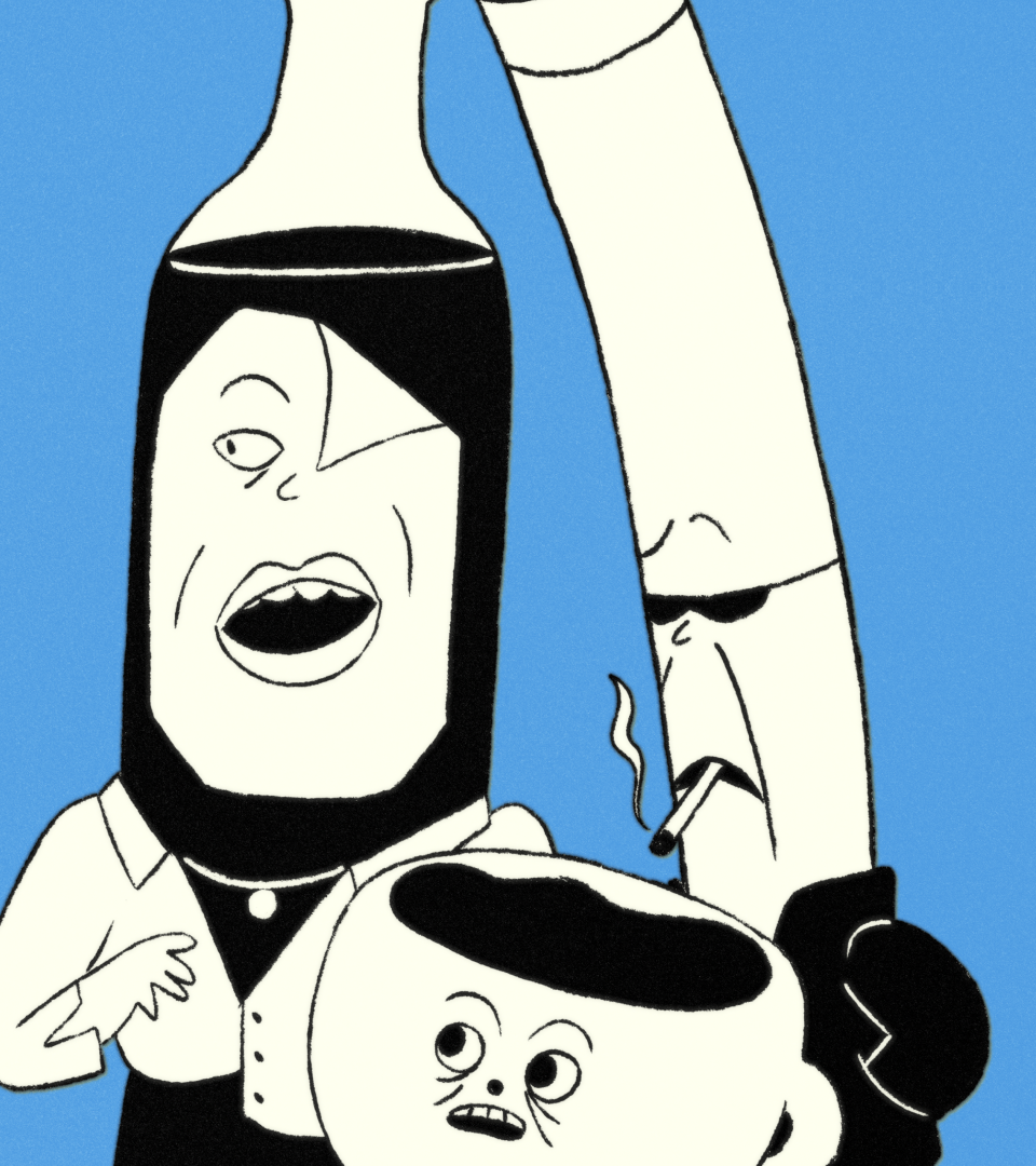
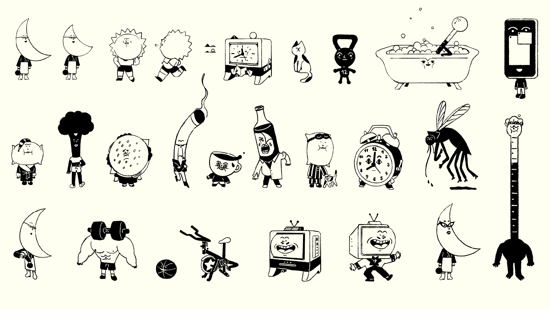
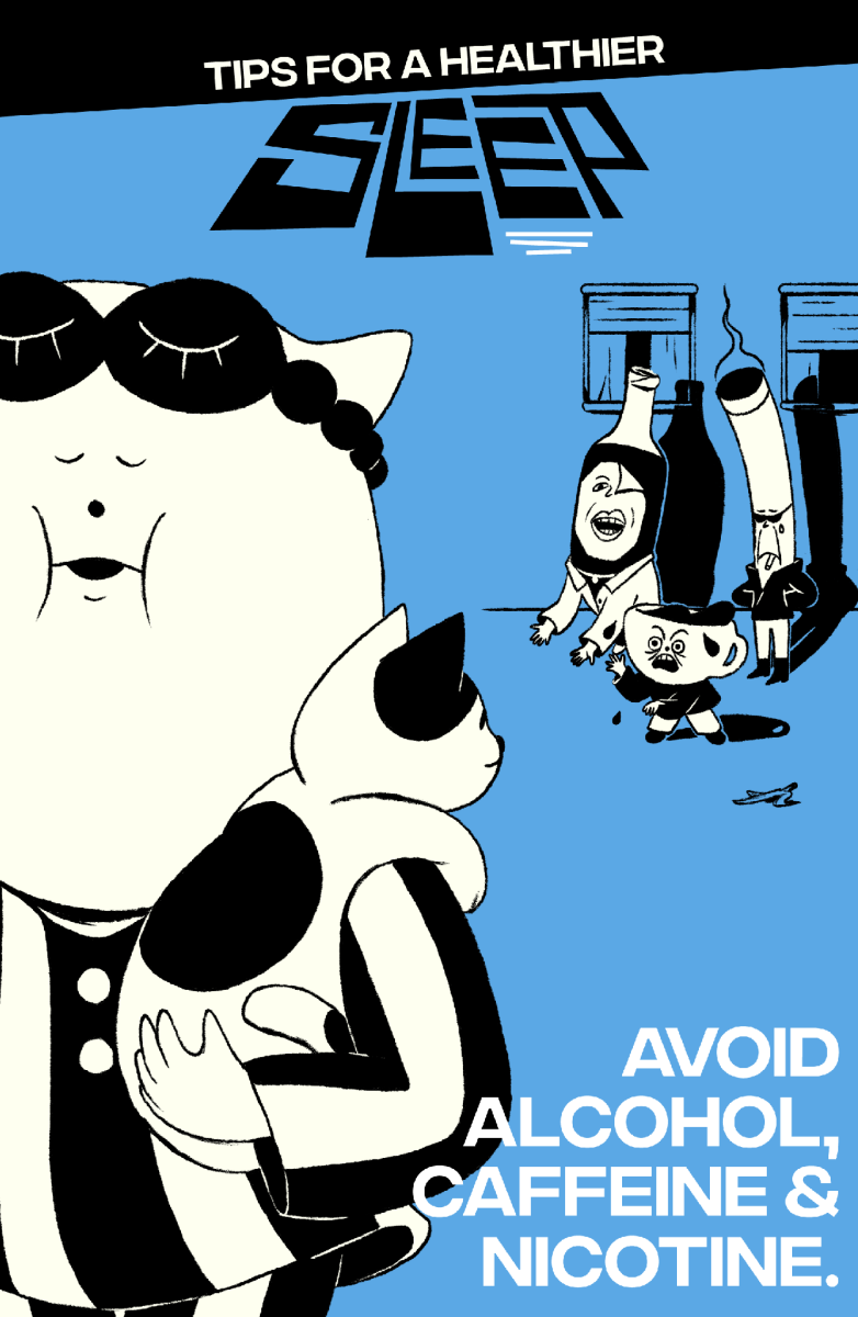
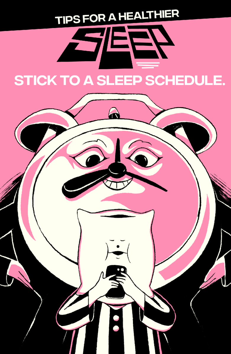
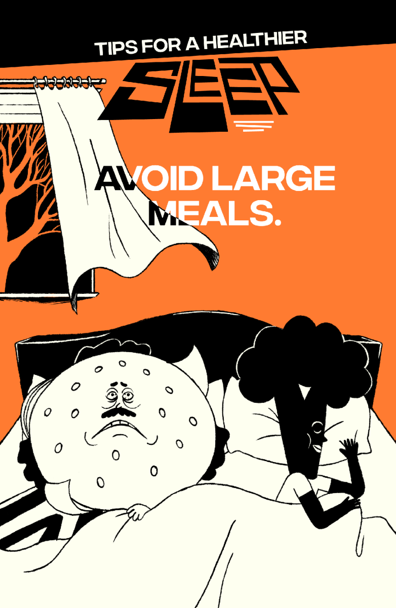
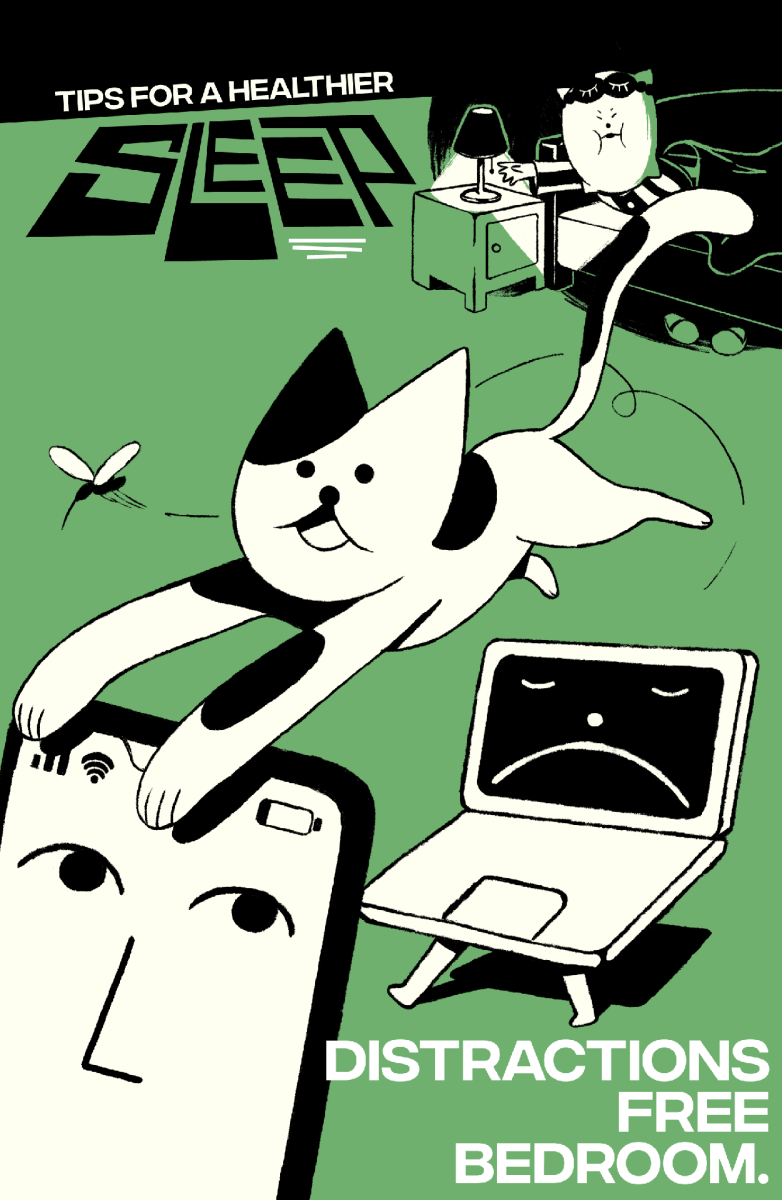
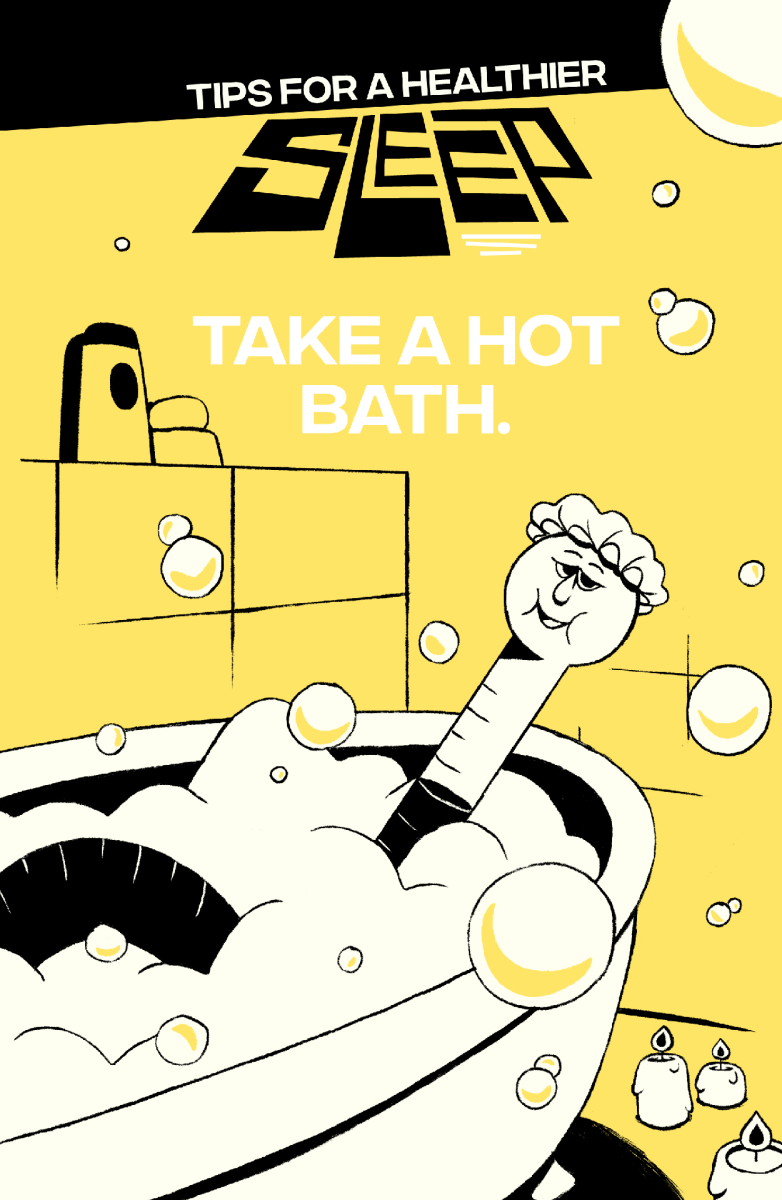
Easy tips for a healthy sleep
Client
Sleep
Direction
Niceshit
Creative Directors
Carmen Angelillo, Guido Lambertini & Rodier Kidmann
EP
Agusta Timotea
Written by
Guido Lambertini
Art Direction & Illustration
Tamara Bella
Animation & Clean-up
Israel Giampietro, Juan Nadalino, Facundo Quiroga, Sebastian García, Ezequiel Cruz & Julieta Soloaga
Edit & Compositing
Guido Lambertini & Ana Freitas
Music & SFX
Facundo Capece & Lola Ritcher
OPPORTUNITY
We’ve learned that a good night’s sleep isn’t as simple as it seems. These days, falling (and staying) asleep feels trickier than it should. So we decided to do something about it.
As storytellers, we love using “our power” for good—shining a little light on things that truly interest us. And sleep felt like one of those universal struggles.
STORY
Inspired by Matthew Walker’s Why We Sleep, we created a five-episode educational series packed with practical tips for a healthier night’s rest.
Each episode focused on one clear tip, brought to life through bold, playful characters.
As Tami, our art director said: It just made sense to use a simple design for a simple idea.
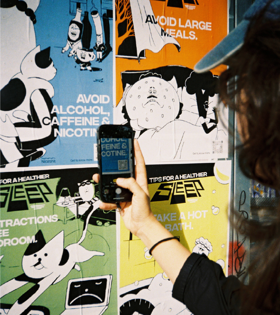
TRANSFORMATION
What started as a studio conversation became a useful series—and ended up as a playful public intervention.
For this time we wanted to push our reach and for these tips to not only live inside our screens and go beyond the illustration and animation community - so we took the streets of Barcelona, hoping that we caught the eyes of lots of random walkers.
Full honesty…we did this for ourselves too… it is just FUN having something physical and then going out at night and play being vandals even if it's for a couple of hours. It was really, really fun and as a team we enjoy these sorts of things a lot.
EA Sports App illustration system
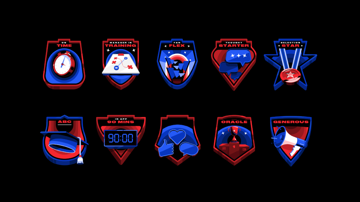
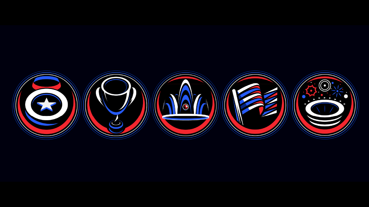

Client
EA Sports
Directed & Produced
Niceshit
Creative Directors
Carmen Angelillo, Rodier Kidmann & Guido Lambertini
EP
Larisa Barreda
Design & Illustration
Rodier Kidmann, German Di Ciccio, Tamara Bella
2d Animation
Ana Freitas, Erik Righetti, Jaume Mestre, Aleksander Saharovsky
3d Animation
Guillermo Zapiola
Edit
Ana Freitas
Music & Sound
Facu Capece & Lola Ritcher
CHALLENGE
EA Sports set out to launch a new socially-driven app that could seamlessly blend the real and the virtual, placing the brand right at the heart of entertainment, sport, and culture.
The challenge was to create an engaging in-app illustration system while the rebrand was still taking shape, making sure every illustrated and animated asset played nicely within the evolving EA Sports ecosystem.
What made it truly special was how we collaborated. Communication flowed openly at every stage, with feedback moving both ways. Our designs sparked new ideas on their side, just as their vision guided creative solutions on ours. It became a shared journey, full of trust, flexibility, and energy, where each step pushed the project forward and strengthened the bond between our teams.
STORY
The new EA Sports App is built as a hub for fans everywhere: live scores, stats, polls, social features, and interactive challenges before, during, and after games. It’s the place where milestones are unlocked, coins are earned, and levels are grown—turning the sports experience into something more connected, rewarding, and just plain fun.
To bring it to life, we teamed up with Further (formerly DesignStudio) to craft the in-app illustration system that guides and motivates users along their journey. After plenty of exploring and testing, we landed on a clean, sharp aesthetic that feels active, powerful, and engaging—capturing the buzz of winning sports prizes.
Our back-office challenge? Turning designs and animations into code. Translating them into JSON files and then into Skottie animations came with more than a few tricky limitations. The good news: we cracked it. Now we can bring illustrations and animations to life inside any app.
This was a monster of a project, and we couldn’t be more grateful to the team at Further for inviting us to be their partners once again—it’s always a joy to team up.
IMPACT
Today, the EA Sports App is a vibrant hub where sports, culture, and entertainment collide. The illustration system not only gives visual cohesion to the rebrand but also lifts the user journey—sparking interaction, friendly competition, and a real sense of community. From live stats to challenges with friends, the app keeps fans engaged, rewarded, and always ready for the next game.
Realtor's new motion language
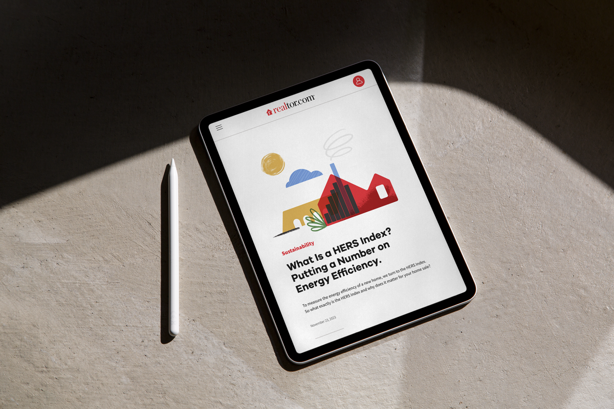
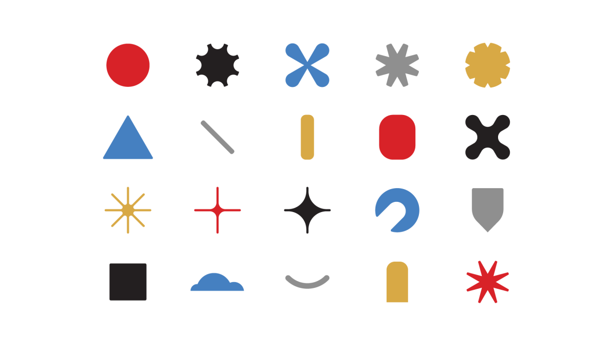
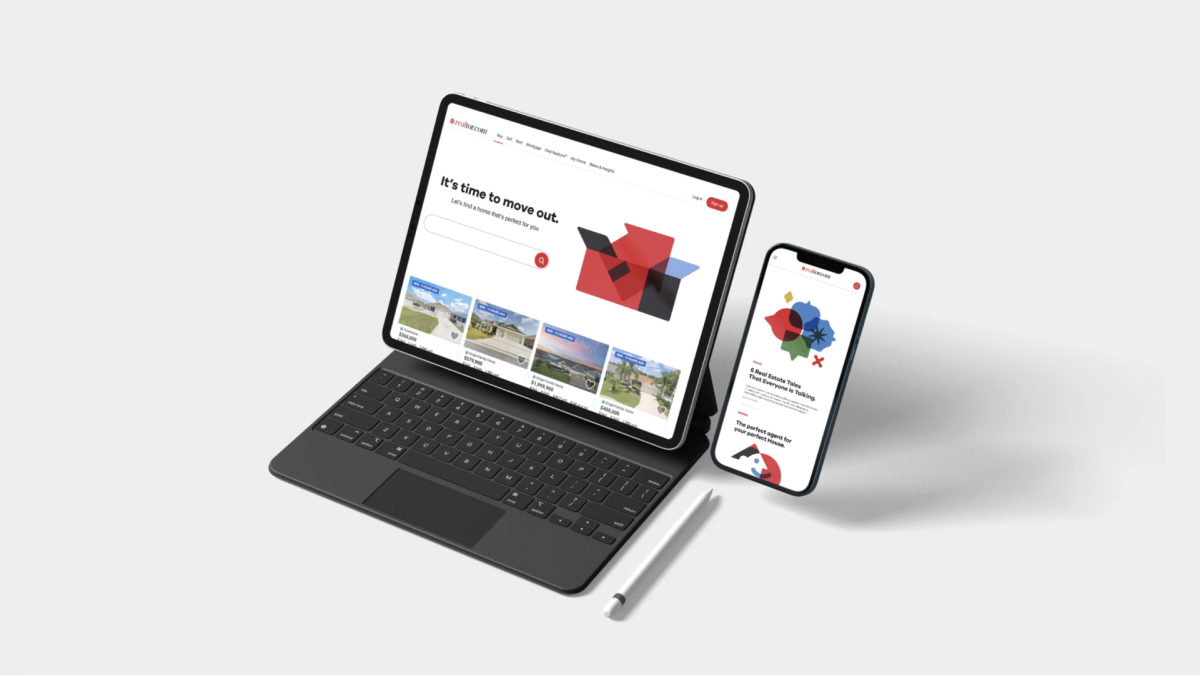
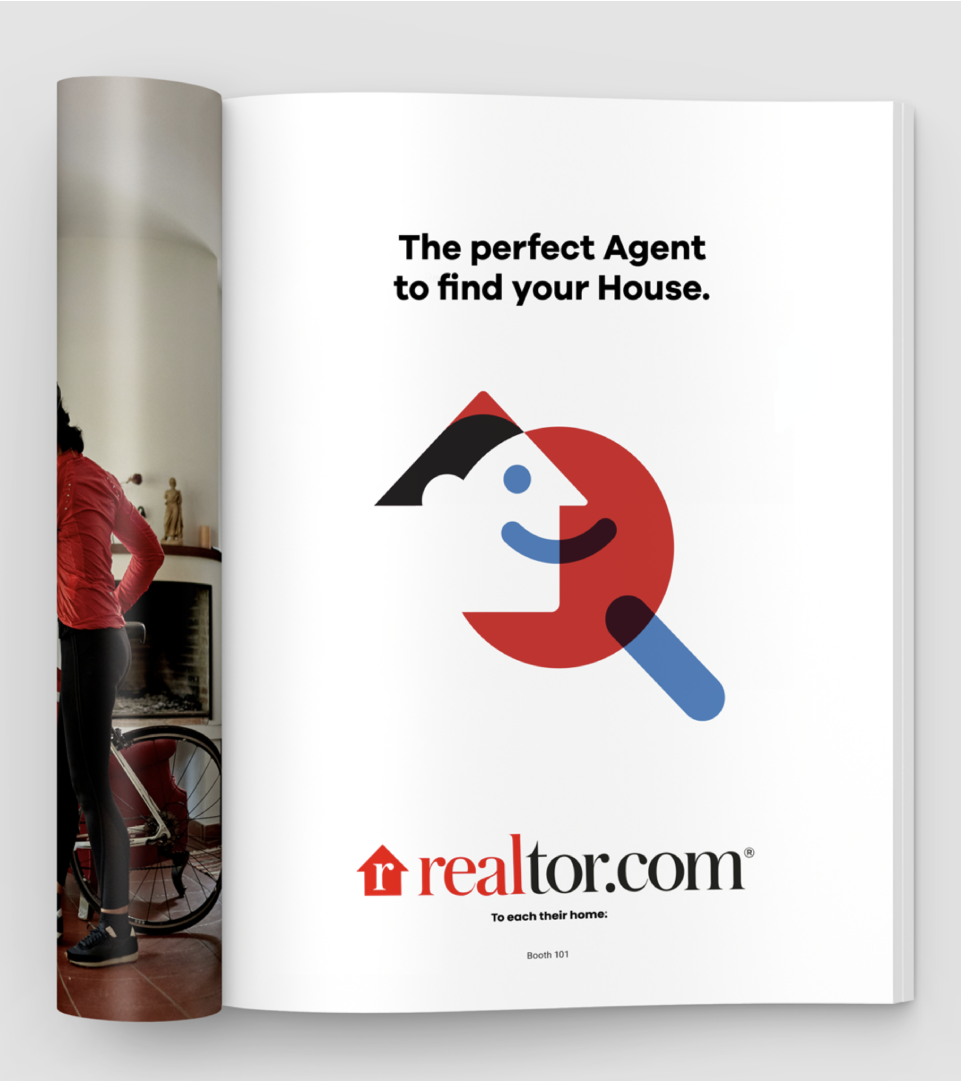
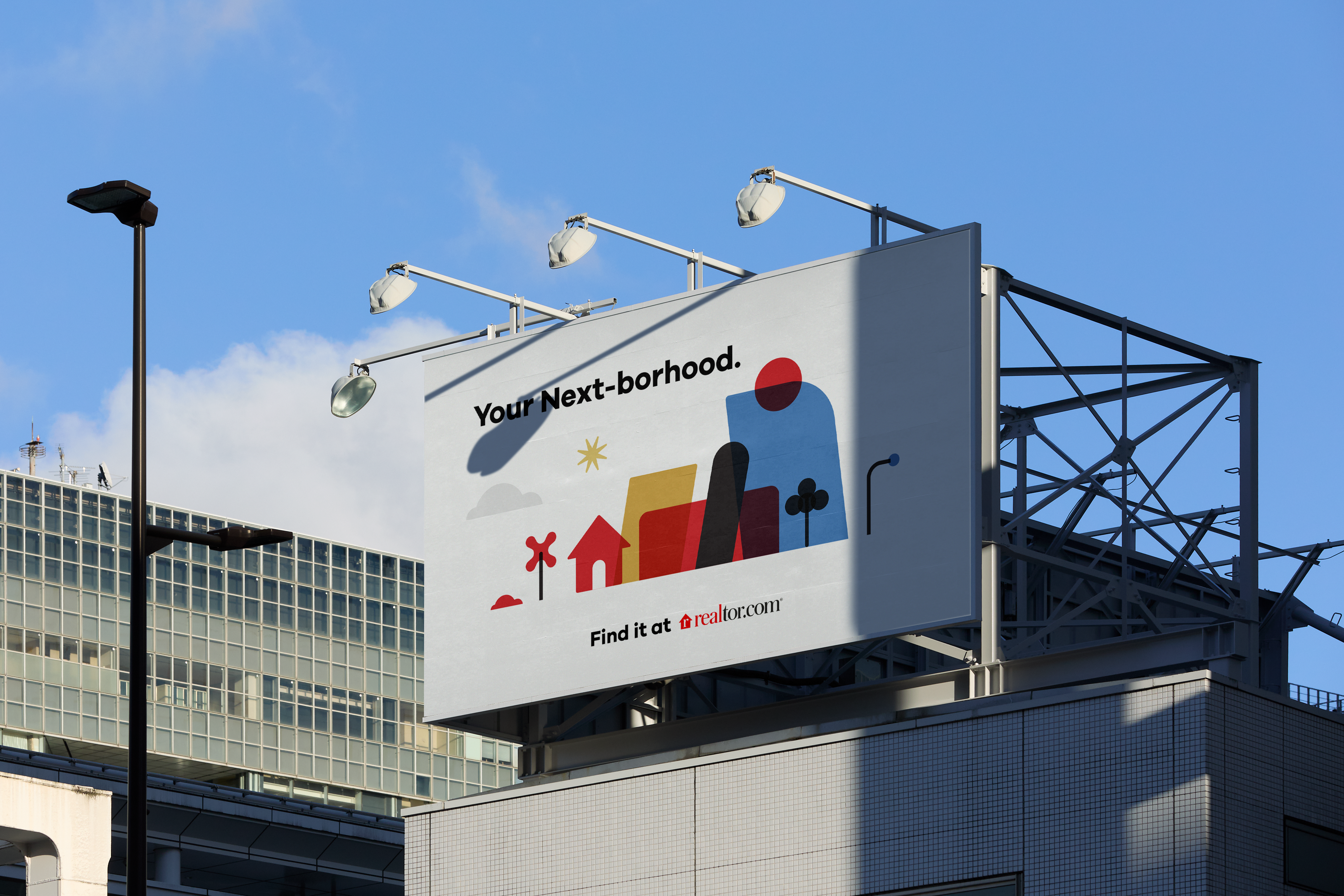
Client
Realtor
Written, Directed & Produced
Niceshit
Creative Directors
Carmen Angelillo, Rodier Kidman & Guido Lambertini
EP
Agusta Timotea
Script by
Guido Lambertini & Pablo Colabella
Design & Illustration
Rodier Kidmann, German Di Ciccio, Carmen Angelillo & Guido Lambertini
Animation
Ana Freitas & Erik Righetti
Music & Sound Design
Facu Capece
VO
Rebecca Tanwen
Challenge
Create “A consistent, scalable and flexible system that can be endlessly remixed and applied everywhere”
Story
Spoiler alert! This toolkit didn’t make it to the finish line… but we loved it so much that we couldn’t let it go. So we wrote a script, recorded the VO, and brought it to life through animation. This whole visual system came out of a 4-month exploration process to define the final illustration style for Realtor’s rebrand — which ultimately evolved into a more character-driven package.
Impact
In the end, we managed to create a consistent, scalable, and flexible system that could be endlessly remixed and applied everywhere.
Even though it wasn’t the one Realtor chose, we had a blast bringing it to life — and couldn’t resist exploring what would’ve happened if this style we loved so much had made it to the finish line.
IBM. There's only one AI for business
“We love to create work that aims to connect rather than to impress and this campaign is all about that”
Carmen Angelillo, CD.
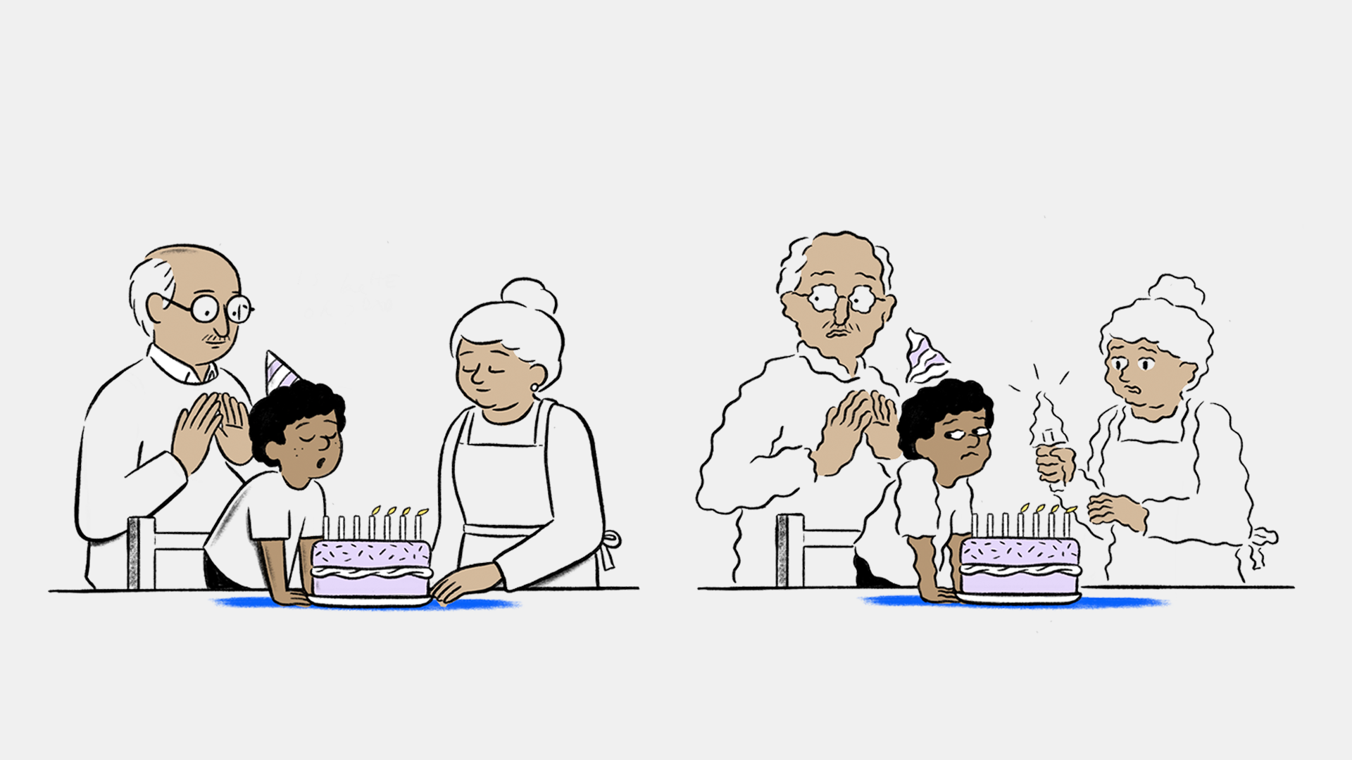
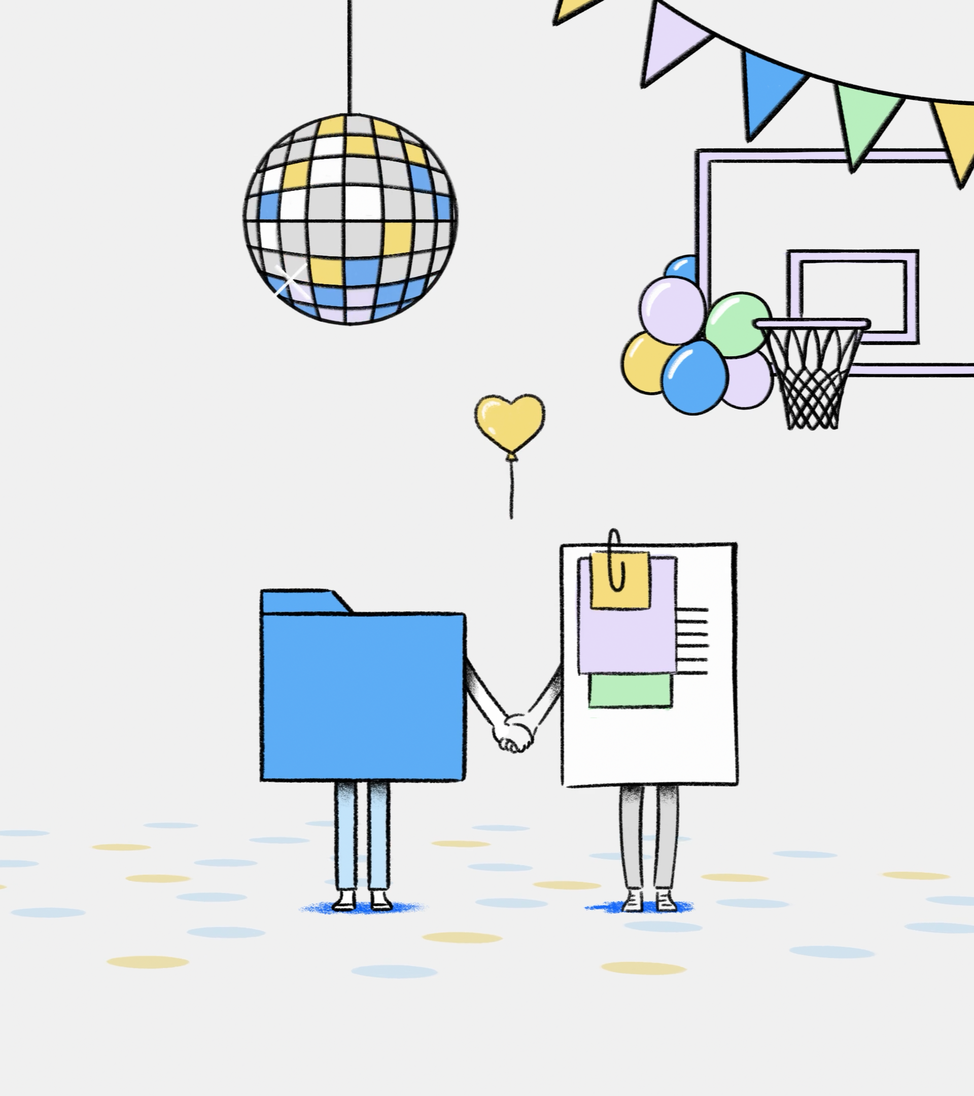
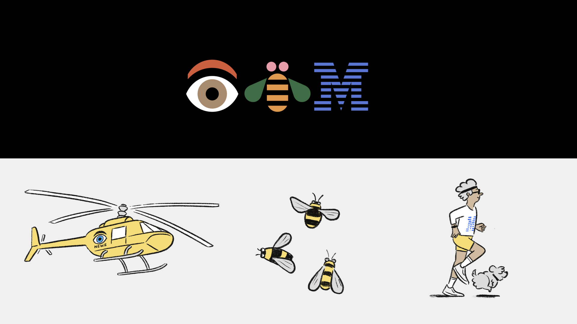
Client
IBM
Agency
Ogilvy NYC
Directed & Production
Niceshit
Creative directors
Carmen Angelillo
Rodier Kidmann
& Guido Lambertini
Art Director
Matt Blease
Head of Production
Agusta Timotea
Producer
Larisa Barreda
Animation Director
Guido Lambertini
Design & Illustration
Matt Blease, Tamara Bella & Rodier Kidmann
Animation
Josep Bernaus, Juan Nadalino, Facundo Quiroga, Sebastián García, Pablo Cuello, Ezequiel Cruz & Henrique Barone
Clean-up Supervisor
Margarita Rojas
Clean-up
Julieta Soloaga, Julieta Culaciati, Ezequiel Cruz, Raquel Cruz, Eva Tahuenca, Tamara Bella & Ana Freitas
Edit & Compositing
Ana Freitas & Guido Lambertini
Sound Design & Foley
Facundo Capece & Lola Ritcher
Original Music & Mix
Halo Music & Sound
Opportunity
To advertise AI—without using AI.
It was one of the most human and collaborative processes we’ve ever been part of. IBM and Ogilvy gave us the chance to partner with Matt Blease, whose clever, editorial style we’ve admired for years. We shared ideas, doodles, and sketches; scripts were loose and open, and we spent hours brainstorming together with Matt, IBM, and Ogilvy—speaking freely and letting the best idea win.
A HAND-CRAFTED COLLABORATION
It was refreshing to work on this campaign in such a hand-crafted way. It took a great team effort to develop these films and to embrace all the human ‘mistakes’ that come out of illustrating each and every frame.
Artists across different locations and time zones worked closely together. Our team learned and adapted quickly to Matt Blease’s editorial style, while also letting our own sensibilities shape the worlds, characters, and energy of the films. The result was a genuine sense of connection—proof that the best work is born from collaboration.
Narrative and humor aligned perfectly: The rhythm of tension and release was everything—making you feel awkward for an instant, only to laugh right after. Both Matt and everyone at Niceshit love joyful, confident and smart comedy so it was very fun to push on awkward framings and silences, pauses and empty spaces without being afraid of losing the viewers attention, quite the opposite. “We love to create work that aims to connect rather than to impress, and this campaign is all about that.” —Carmen Angelillo, CD.
IMPACT
The campaign is now live all over the world—from JFK airport to Tokyo trains and even Wimbledon. Friends (and strangers!) have been sending us pictures of our work spotted in different corners of the globe. That global reach is surreal—and deeply rewarding.
With an amazing team, we delivered a campaign that celebrates craftsmanship and creativity. Fully hand-drawn, fully animated, unmistakably human. It’s a reminder that AI may be clever, but human collaboration, curiosity, and humor will always have the edge.
Designed to be quiet, smart, and disruptive, these spots cut through the noise by simply being themselves. The result? A campaign that feels human, and entirely ours.
Once again, thank you to everyone involved in this adventure. Thanks to IBM & Ogilvy for trusting our vision, our crazy ideas, and our silly jokes. And of course, to Matt—for sharing the humor, the weird doodles, and for being the best partner throughout.